
For years, Kelly Williams has quietly been offering the best deal on Artist Alley. If you’re attending a convention where he’s a guest, you can buy a beautiful watercolor commission with multiple characters and a background for under $100. In addition to commissions Kelly has drawn a lot of comics over the years, but mostly smaller projects. When I learned he drew A Letter to Jo, a full graphic novel recently published by Top Shelf, I immediately ordered a copy. It proved to be a perfect outlet for his art.
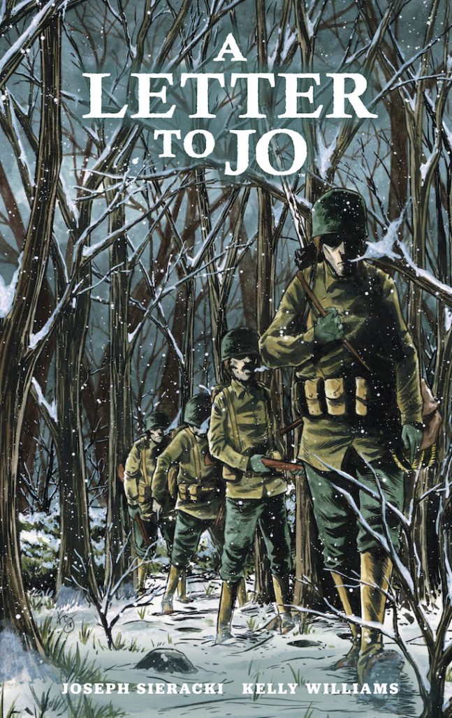
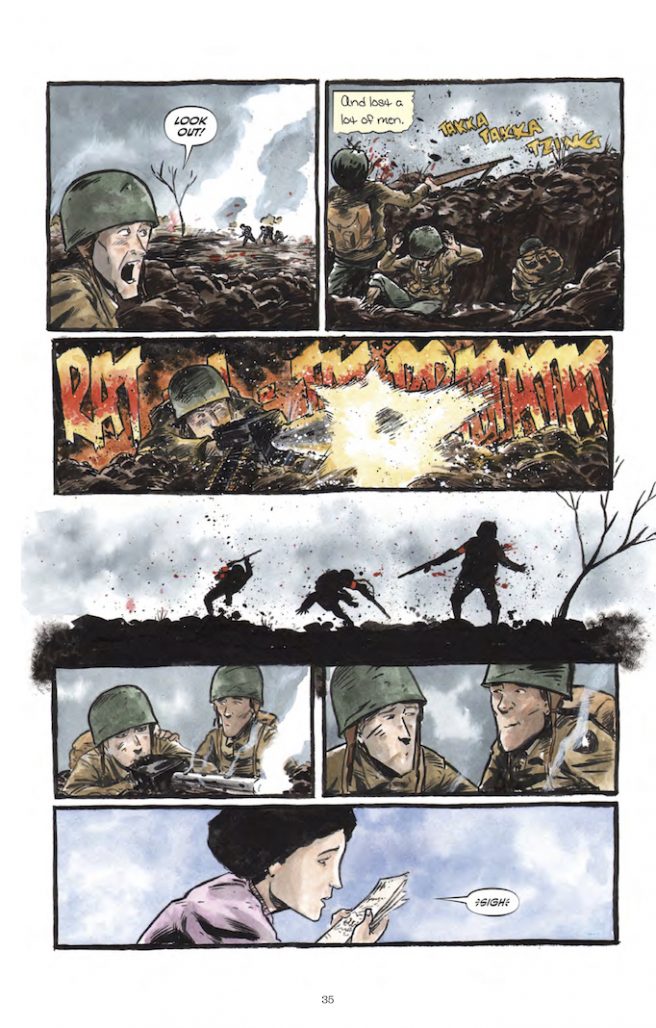
A Letter to Jo is a graphic novel based on a letter Joseph Sieracki’s grandfather sent Joseph’s grandmother about his experience serving in the army during World War II. Using the letter as a backbone for the story, Sieracki treats its subject matter with care and thoughtfully fills in the blanks the letter doesn’t answer. His writing combined with Kelly’s inks and watercolors resulted in a very beautiful and sentimental story. John Seven wrote a review of the graphic novel earlier this year which goes into more detail about what makes it special.
I was happy for the opportunity to interview both Sieracki and Williams about A Letter to Jo. Read what they had to say about adapting the story, storytelling decisions, and what it meant to them to have completed such a personal project.
Joseph, when did you realize your grandfather’s letter could serve as the spine of a story?
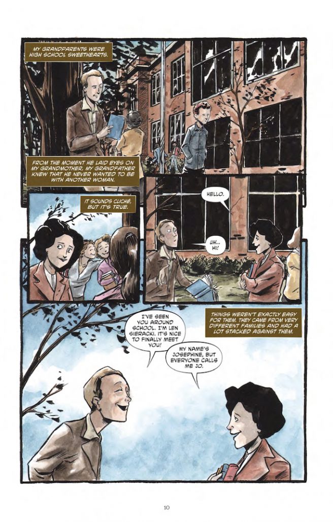
JS: It was while reading Persepolis that I came up with the idea for A Letter to Jo. In it, Marjane Satrapi depicts her childhood and teen years in Iran during the Islamic Revolution. It got me thinking about my own family’s story and my grandfather’s letter. I hadn’t read it in a long while, so I dug it out and reread it. I had read it a few times before, but as I was younger, I don’t think I fully appreciated his story, or what a young man he had been. I immediately knew that the story would be great for a graphic novel.
Why did you decide to tell that story in comic book form?
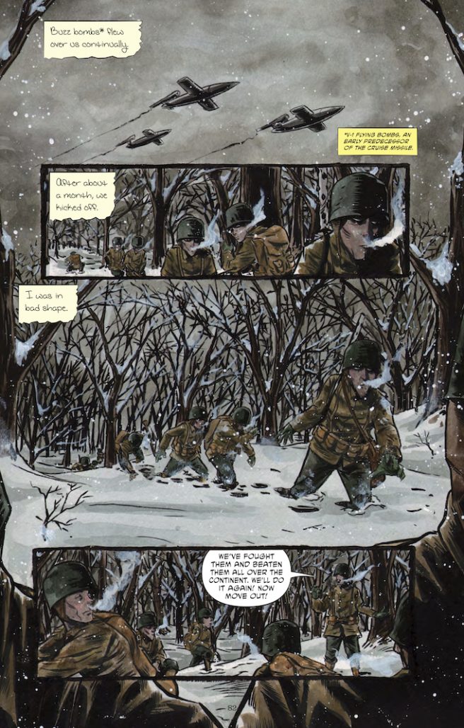
JS: While Leonard’s writing felt extremely visceral and expressive in the original letter, it lacked a certain context that only a visual medium like comics can provide. Kelly deserves all the credit for that, as he did an amazing job establishing the right look and feel for everything, bringing Leonard’s story to life. Simply writing about the scenes and events would not have given them proper justice, and certainly wouldn’t feel as poignant as it does through Kelly’s paintbrushes and Taylor Esposito’s incredible lettering.
How did you toe the line between including a faithful depiction of what occurred when your grandfather and telling an engaging story?
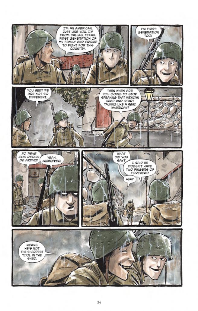
JS: I made a conscious effort not to veer too far from the source material, which is why you don’t get much of Josephine’s story in the narrative. That said, I think I could have expanded more upon what Jo was doing back home, and demonstrated her strength and independence better. I also used historical texts and WWII memoirs corresponding to each of the battles Leonard describes to help illustrate the action sequences.
Where did you take the most artistic liberty?
JS: Probably with Federico, since he is the main character but completely fictional. As I explain in the epilogue, Leonard spoke very little at all of his fellow soldiers, and no specifics whatsoever. Therefore, it was necessary for the sake of the story to invent some characters around him. Otherwise, the entire book would be just him speaking to Jo, which wouldn’t be realistic at all. I can’t say for certain why he doesn’t mention any specifics about other soldiers, but he does speak reverently about them multiple times throughout the original letter. Perhaps that part of the war was just too painful for him to remember in detail and write about.
What appealed to you about breaking down the story into chapters?
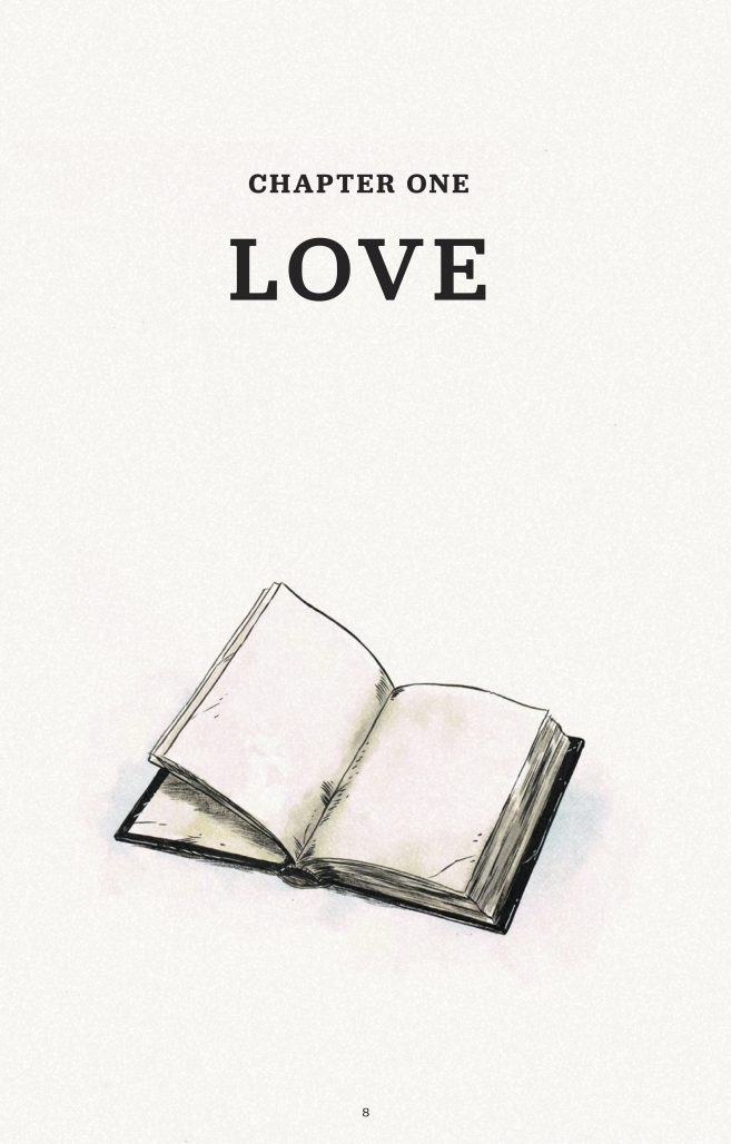
JS: Different chapters of this story with opposing titles like Love and Fear represent not only the duality of war but of Leonard’s character. This underlying theme is explored as this story of love and war progresses, juxtaposing these competing elements throughout the narrative.
KW: I think it helped me keep on track and have a nice goal to hit throughout the book. We ran into a lot of delays in personal lives and stuff so it really helped keep things focused and not feel overwhelmed by the volume with no break. I’m terrible about forgetting how much time can get sucked up by one page when you are inking and watercoloring.
In terms of the final product, I like the chapter break down because it feels natural and gives a nice moment to pause and reflect before going into the next part of the story. Especially because some sections have a long jump in time or the occasional abrupt switch from Leonard to what’s happening with Jo. The chapter breaks with this book just feel natural.
Kelly, did any war comics influence your artwork for the book?
KW: I’m a big Joe Kubert and Jack Davis fan. So I dipped in and out of some of that stuff. I think that the more human elements probably benefit from input from the Kubert stuff while the more horrific and chaotic stuff benefits more from the Davis stuff. I can’t even really point at any particular work as a whole, I just kinda re-read some stuff and just looked at a lot of it. So much so that there were times I think I almost longed to do the whole book in black and white. Just because you spend so much time looking at that black and white Jack Davis stuff and it just sucks you in.
Did you adjust your watercolor palette for A Letter to Jo?
KW: I have a tenancy to work in brighter colors. Which really conflicts with what people expect from stories like this and my horror stuff. I guess I tried to tone some of it down a bit, go a little less saturated, maybe more brown that I normally would. I’m not the best watercolorist in the world, haha. So I learned a lot during the course of this book. I really like using bright colors in conjunction with my more dark inks as a way to kinda throw readers off a little. Give a sense of calm or safety. I think that sometimes I hit it just right and when the more horrifying hits, it’s more jarring.
Can you describe the pitch process to Top Shelf?
JS: I originally gave Chris Staros, (Editor-in-Chief at Top Shelf), a five-page pitch for the book. In fact, Kelly wasn’t even the artist at that time. Chris was extremely encouraging and wanted to see more once the book was done. That other artist didn’t end up working out, so our editor Brendan Wright suggested Kelly. Of course, now I can’t imagine doing the book with anyone else. It must have been a few years after our initial pitch, but Chris remembered the project well, and the rest happened pretty quickly after that.
KW: Like Joe said, he had talked with Staros before I even came on the book. I was surprised how fast things moved once we sent the completed book over. I’m so used to comics and the process of finding homes taking forever and this happened almost immediately. Which I was happy about. I love Top Shelf and Chris is a great dude. I have a hard time imagining the book being with anyone else.
The physical book is very high quality, with sewn pages and book flaps. Were you involved in its production or was that all decided by Top Shelf?
JS: We had some input in the design process along with very the talented Jimmy Presler and his wife Conley. There were some conversations about the type of paper to be used and the French flaps, but otherwise, I think most of that production credit goes to Gilberto Lazcano of IDW.
KW: When we handed in the book, it was 100% complete, all the way down to design and everything. We knew Top Shelf would probably want to put their stamp on it though. We gave input and there was a lot of back and forth. They were very cool about anything we wanted a certain way or if there was something they did that maybe liked another way. I think ultimately though, we all know the quality of Top Shelf’s books. It was one of the most exciting things about working with them. Their books are always designed super rad and feel great. So there wasn’t a lot of need for us to push too hard on anything. I was super happy that the work Jimmy and Conley put into the book before we handed it off to Top Shelf is still represented.
What do you like about publishing the book in standard comic book dimensions rather than digest size, which is used for other Top Shelf titles?
JS: In making A Letter to Jo, we weren’t entirely sure it would be a Top Shelf title. They were always my number one choice for a publisher, but when Kelly was doing the art and laying out the pages, he did so with a standard comic book dimension in mind. Kelly could probably better speak as to why he preferred working in that dimension for this story, but I do know there was a conversation about it early on and a conscious decision was made.
KW: Actually, I did all the pages at dimensions that could work at closer to digest size too. Like Joe said, we weren’t sure who was going to wind up publishing it so, I think we tried to work with it in a flexible way. I’m terrible at remembering measurements and layouts so I couldn’t tell you without pulling out a page and measuring what the dimensions are. Honestly, I think in the back of my head I was always thinking about it being a Top Shelf book. So maybe that’s part of it.
I think A Letter to Jo is the longest comic both of you have made. What’s to hold a 100+ page graphic novel you created in your hands?
JS: To date, this is the only published comic I’ve made. Holding it in my hands for the first time was definitely surreal. It was more beautiful than anything I had ever imagined, and after spending more time on this project than I care to admit, I had imagined it plenty! So for that, I will forever be grateful to everyone involved.
KW: I’ve actually done a couple of longer books. At least one. The Cabinet with Christian Sager is more like 122 pages or something like that I think, at least in terms of my actual pages drawn. This book is the first with such high production value in the actual book itself though. I think it was an amazing feeling to hold this book, seeing how well it came out and was put together and the fact that it was a Top Shelf book. I’ve been reading Top Shelf stuff since they first started. Some of my first “professional” comics work was for, Red Plains, which was part of their 2.0 webcomic thing. I was stoked to get to do that but, holding a Top Shelf book, our Top Shelf book in my hands was a pretty awesome feeling.
A Letter to Jo is available now. Follow Joseph Sieracki and Kelly Williams on Twitter @iamjoestweet and @TreeBeerd, respectively.
Matt Chats is a twice-monthly interview series featuring discussions with creators or players in comics, diving deep into industry and creative topics. Find its author, Matt O’Keefe, on Twitter and Tumblr. Email him with questions, comments, complaints, or whatever else is on your mind at matt@mattwritesstuff.com.


