

While I try to point out aspects of good design some consider objective, art as a whole is pretty subjective. It’s unavoidable that the covers I pick each week reflect my personal tastes and biases.
Every now and then someone will point out a cover that makes me think “how did I overlook that?” For example, there were two covers last month for Elektra #2 that were both pretty good.
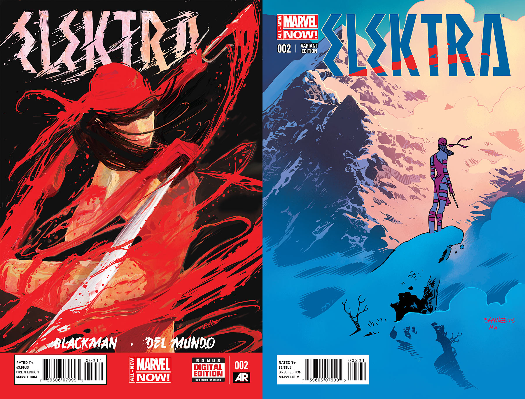
The first, by Mike Del Mundo, conveys a sense of motion using streaks of blood, both elegant and violent. The other, by Chris Samnee and Matthew Wilson, is wonderfully atmospheric and moody. Why did I overlook them?
I blame Elektra Blindness.
Elektra Blindness is a phenomenon where my strong disinterest in a series results in my looking right past it, possibly without realizing it. I guess you could say I’m in that camp who think the character should’ve been retired. It doesn’t help that Miller’s costume design popularized the idea that the standard ninja uniform for men and women differ in that one consists of about half as much material. When I look at Elektra, all I see is Mortal Kombat‘s Kitana and Mileena (and how their costumes differ from fellow ninjas Sub-Zero and Scorpion).
My first reaction to Samnee’s cover was “those mountains are gorgeous,” immediately followed by “isn’t she FREEZING?” We might disagree on whether a one-piece with ribbons is fitting battle wear, but I think we can all agree it’s not practical winter wear.
Is there a character or series that you’ve experienced your own form of Elektra Blindness with?
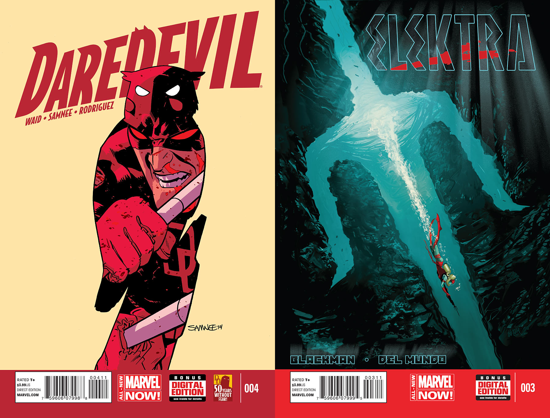
DAREDEVIL #4 by Chris Samnee & ELEKTRA #3 by Mike Del Mundo
Characters in shapes was sort of a theme this week. As much as I love Samnee’s illustration, the composition isn’t quite working for me because the two sets of eyes keep fighting for my attention. Mundo’s sai concept is something I could imagine seeing as a movie poster, though I wish the logo were just a little smaller. I don’t like how close it is to the edges.
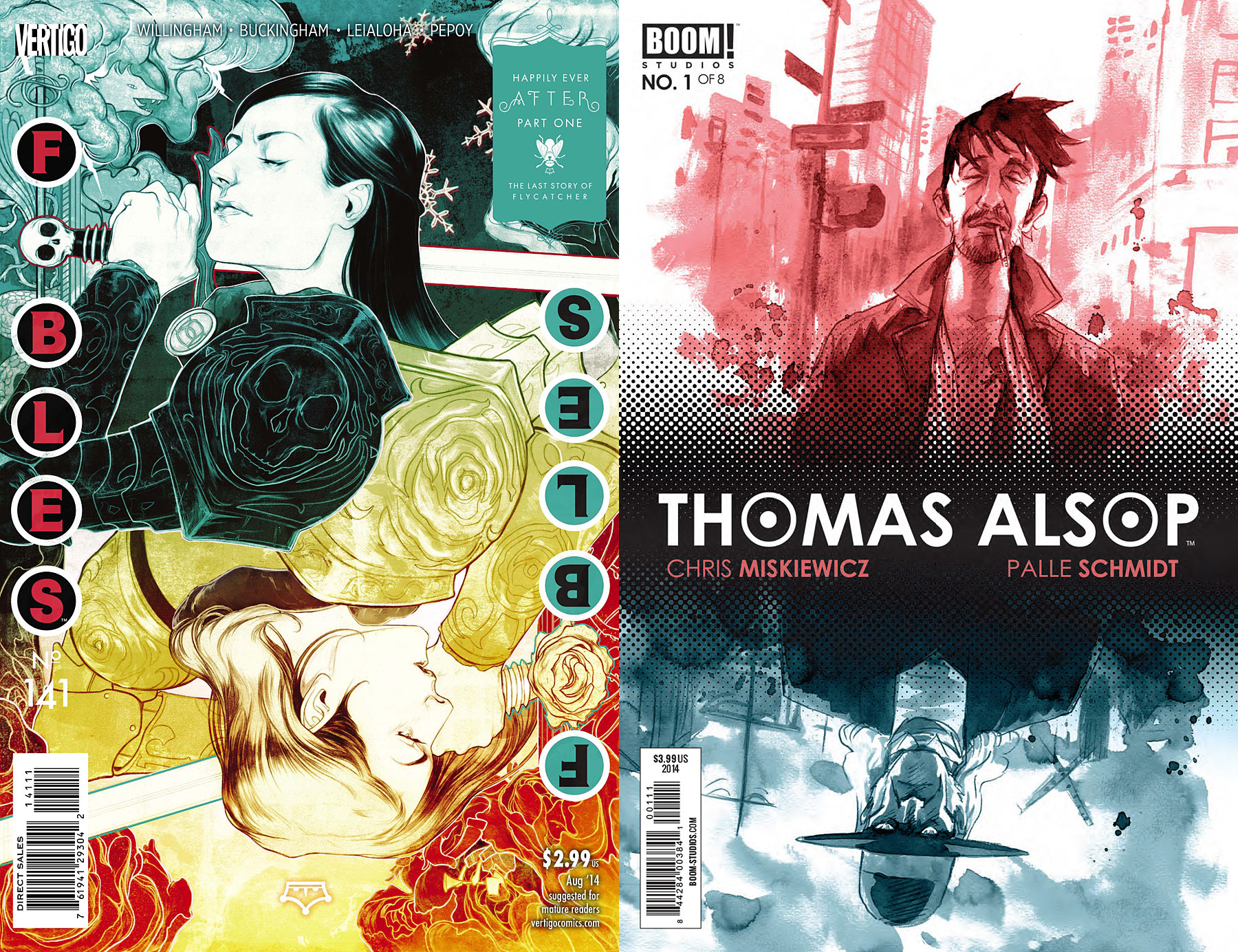
FABLES #141 by Nimit Malavia & THOMAS ALSOP #1 by Palle Schmidt
Flippable images were also a theme this week. Points to whoever is the first to do it with a functional ambigram logo. (I actually tried to create an amigram logo when I did that JLA EARTH 2 mock-up, but couldn’t get it to read clearly enough.)
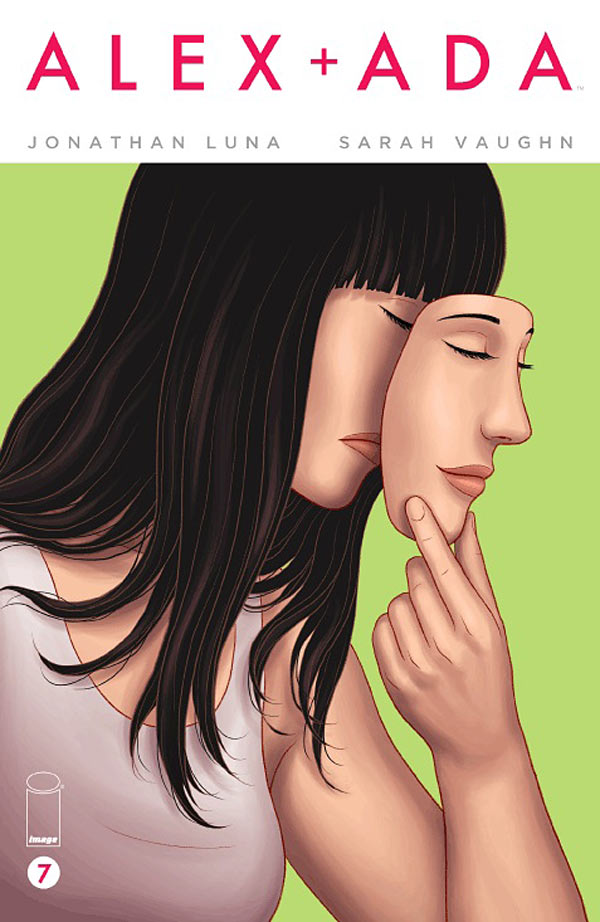
ALEX + ADA #7 by Jonathan Luna
Such a nice, clean design. I like the way her face is mostly hidden under the mask, with just enough revealed to show that she’s covering up her frown with a smile.
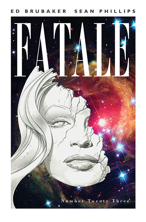
FATALE #23 by Sean Phillips
Personal Taste Alert: If your design looks like it could work as a cover for a ’70s concept album, you get an automatic win.
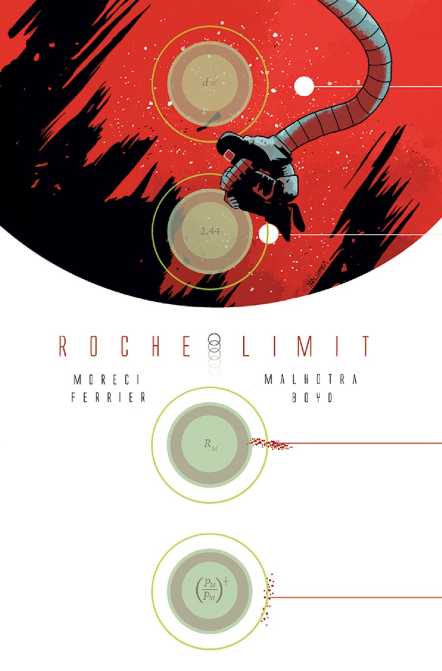
ROCHE LIMIT #1 by Vic Malhotra
The science-minded among you will probably cringe at my saying this, but I had to look up what Roche Limit meant. The four diagrams are a very cool looking design element, but I think they could’ve done a slightly better job of getting across what’s happening. But I love the use of white space, and the way everything is laid out.
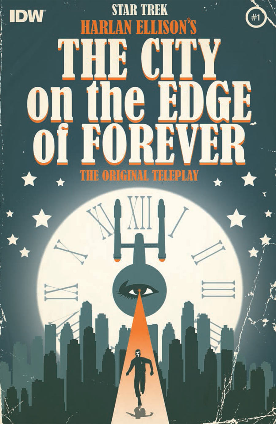
STAR TREK: CITY ON THE EDGE OF FOREVER #1 by Juan Ortiz
The composition in bottom half of this image is so great, it’s disappointing that the top half doesn’t fit the tone of the illustration at all. Even if the poor typeface choice was meant to go with the “old book” theme, I’ve seen plenty of paperbacks from the ’60s with better title treatments than that.
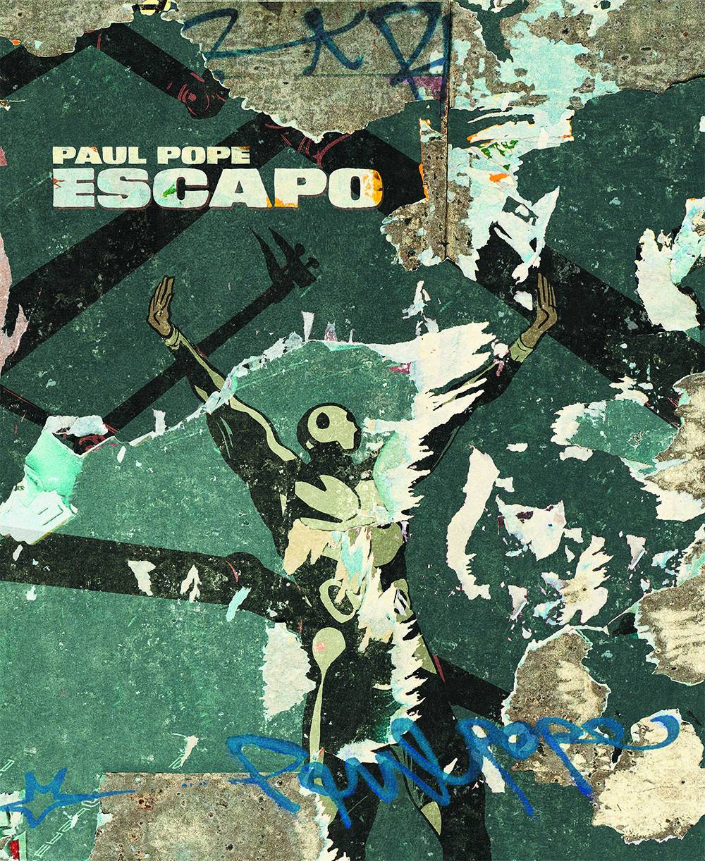
ESCAPO by Paul Pope
Personal Taste Alert: I enjoy just about any comic cover that looks like it could be an album cover, even if I prefer the ’70s concept album look to ’90s alt rock.
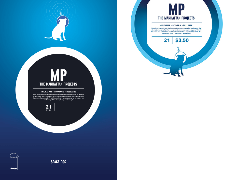
THE MANHATTAN PROJECTS #21 by Jonathan Hickman
The cover on the right is the sketch variant, though I think I prefer it to the regular cover. I just love the way the blue dog blends in with the blue ring, it feels like a more complete design. I didn’t even realize it was a sketch cover at first – I just thought it was a gutsy use of white space.
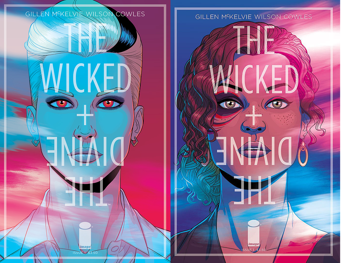
THE WICKED + THE DIVINE #1 by Jamie McKelvie
I haven’t had a chance to read it yet, so I don’t know if the lighting effects play into the story or not, but they look way cool. But instead of being two covers, I kind of wish the other cover appeared on back upside-down like a flip-book. Even better, what if the title was reversed on the back portrait to read “The Divine + The Wicked”?
Kate Willaert is a graphic designer for Shirts.com. You can find her her art on Tumblr and her thoughts @KateWillaert. Notice any spelling errors? Leave a comment below.


Juan Ortiz has designed movie posters for each episode of Star Trek: The Original Series.
Here is his take on TCotEoF:
http://www.thinkgeek.com/product/f0d2/?i=14877
Titan collected them into a book.
EAN: 9781781166703
He is doing all five of the regular covers, four of which I’ve found online.
Those are lovely.
Comments are closed.