This week’s main review is Spectrum #1, an intriguing new comic that intermingles science fiction and music. Plus, the Wednesday Comics Team has its usual rundown of the new #1s, finales and other notable issues from non-Big 2 publishers, all of which you can find below … enjoy!
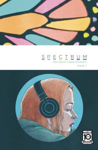
 Spectrum #1
Writer: Rick Quinn
Art and Letters: Dave Chisholm
Publisher: Mad Cave
Review by Steve Baxi
Music is a notoriously difficult element to visualize in comics. A score can make or break a movie. A sound can make or break a scene. A song can make or break you. Music can transcend your reality unlike anything else, but on the comics page there’s no way to add that device, no way to make the pages sing the way a musician might.
That is, of course, unless you’re Dave Chisholm. The challenge of music in comics has been taken up by a variety of creators, but no one has quite cracked the form like Chisholm in everything from Miles Davis & the Search for Sound to Chasin’ the Bird. In these works, music doesn’t have to be played, but it can still be felt in everything from the rhythm of the paneling to the psychedelic colors. It’s an art style that can make or break you just as easily as the perfect song on the perfect day.
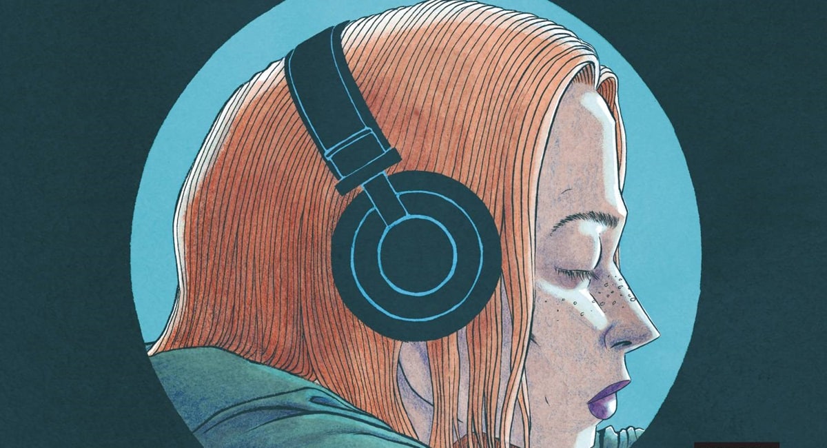
Chisholm teams up with Rick Quinn in Spectrum to put those artistic skills in the service of a reality bending story that parallels the emotional roller coaster of a good album. In the opening pages we meet Melody Parker, a homeless girl living on the streets of Seattle in 1999. She is, quite literally, in her own little bubble with nothing but the music in her ears, music we aren’t made privy to, keeping her conscious as the people and world around her fade into the lifeless concrete sidewalk and gloomy cityscape. But from here enter: an otherworldly being, a pop of color and absurdity completely at odds with Melody’s experiences and assumptions about her life. From here, the comic dovetails into a chase through the streets and through history, recounting the story of not only music but how we live vicariously through the artists that give us life. As Melody questions her reality, music animates her life in ways she can’t completely understand yet, but how far will that go and what waits for her at the end?
The tragedy of song is that the very second it starts is also the countdown to its inevitable end. Sound enters with a boom and fades with an echo. To experience these moments where we break from reality, even for just two minutes, is also to recognize how temporary, how fleeting it all is. As we follow Melody, we too are given the various starts and stops of the history of music, time starts to shift in ways that recognize the beauty of the birth of music all the way to the tragic end of an artist.
Spectrum #1 is an incredible debut from a creative pair that seem to be in complete harmony. Quinn’s scripting is often quite dense, forcing the reader to stay on the same page much longer than a typical first issue might. But the result is that we find ourselves hovering over Chisholm’s art, appreciating every detail and being made at home in that reality. As the story progresses, you quickly forget the need to ask questions and surrender to the mood of the piece, following along a rhythm of art that’s all building towards the mystery of “Melody”, in both senses of the word. What’s interesting here is that Quinn and Chisholm are able to resist giving the reader an answer while still allowing for a release or catharsis. The chase and anxiety build into a gorgeous final page that brings life to Melody in a way she lacked at the start of the story, but the song animating this transformation, this mystery of how music changes us, is still left up in the air.
I tend not to re-read single issues until I have a complete story in front of me, but I had to read Spectrum #1 a couple times already because of how engaging it was. We have in front of us a late, but strong, contender for one of the best comics of the year, and certainly one of the best looking books on the stands. I can’t wait to see where it goes.
Verdict: BUY
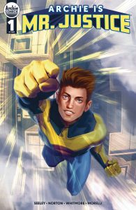
 Archie Is Mr. Justice #1
Writer: Tim Seeley
Art: Mike Norton
Colors: Glenn Whitmore
Letters: Jack Morelli
Publisher: Archie Comics
Review by Clyde Hall
Tim Seeley (Hack/Slash, The Alternates) and Mike Norton (Battlepug, Revival) launch their ambitious 4-issue miniseries this week with Archie Andrews and the Riverdale regulars in a serious superhero title. Unlike previous one-shots starring members of the Mighty Crusaders and other superheroes of the Archie Comics line, and unlike the superhero spoofery of Pureheart the Powerful, Seeley has fused the teens-in-tights concept with a Golden Age character for a new generation.
The original Mr. Justice was the corporeal form of ghostly Prince James of England. Murdered in the 18th century, James’ spirit remained trapped in the castle location of his demise. In 1940, the castle was being shipped to America when a Nazi sub sank the transport vessel. This loosed the vengeful wraith of Prince James who became Mr. Justice as related by writer Joe Blair and artist Sam Cooper in Blue Ribbon Comics #9 , published in February 1941. His revenant origins and supernatural powers were similar to DC’s The Spectre who premiered a year prior.
In Seeley’s update, Mr. Justice is just that: A superhero character from an old comic book. Until, that is, the name is used by young Archie Andrews after seeing a copy of the comic in buddy Jughead Jones’ collection. It’s part of narrator Jughead’s account of the rise and fall of his pal in the same manner Jimmy Olsen might preside over a Superman retrospective. This quirky approach to the narrative leaves many blanks to be filled in the next three issues.
We’re told Archie gained his powers after an incident at a museum during a class trip, but not how. We’re shown events that came later and shaped the course of Archie’s dual identity complications, but not told why Veronica and Reggie adopt their own costumed personas along the way. And in between, we’re given nuggets regarding the criminal enterprises headed by businessman Hiram Lodge eating at the soul of Riverdale as well as an escalating class struggle therein. The brief power set presented for Archie’s Mr. Justice is flight, super strength, and a degree of invulnerability, as well as an ‘unfairness sense’. Think a spider-sense that guides him to do the right thing.
In short, the issue sets up the relationship between Andrews and Jones and hopscotches between scenes of reveals to be made later. There’s some fun along the way, like Archie trying an original Mr. Justice-inspired costume before adopting a modern one reflecting his balanced scales of justice theme. What’s told is told with plenty of heart.
The Norton art balances aptly between that fusion of teen protagonist and superhero. His versions of the Riverdale characters are easily recognizable and true to the original spirit of the Archie titles. The style and panel pacing are straightforward, and the action scenes exciting. Not certain how well the new Mr. Justice costume tailoring works, but one downside is the secret identity maintenance despite Archie not wearing a mask, hood, helmet, etc. as part of his hero attire.
Overall, both in art and in the narration, Archie Is Mr. Justice #1 is promising but simplistic. The creators and company say it’s a love letter to the best of Archie and the underlying good nature of that character. That’s accurate. But it’s also held up as written for fans of Invincible or “Whatever Happened to the Man of Tomorrow” and that may be a stretch. It feels more like a very fine introduction to that kind of storytelling for tweens or younger readers, and as a first step toward those serious superhero tales.
 Godzilla Rivals: King Ghidorah vs SpaceGodzilla
Writer: Dave Baker
Artist: Kevin Anthony Catalan
Colorists: Heather Brecker and Kevin Anthony Catalan
Letterer: Brian Kolek
Publisher: IDW
Review by Jordan Jennings
Synopsis: With King Ghidorah and SpaceGodzilla bearing down on the devastated Musashi Island, a couple of friends, Ryuichi and Benton, risk it all to enter the island’s DMZ in an attempt to rescue Ryuichi’s father—Takao Omari. We learn through the story that Ryuichi became separated from his father when the island was attacked years ago. His father choose to stay on the island and sent Ryuichi and his sister away to safety. Unfortunately, tragedy befalls Ryuichi and he comes to resent his father, but he has not given up on him. Will Ryuichi and Benton find Takao Omari in time or will a tragic history repeat itself?
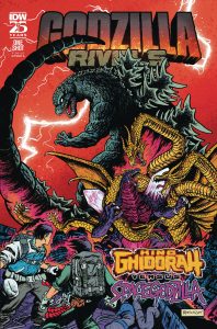
With Godzilla Rivals being an anthology series, some stories are better than others and I have been reviewing Godzilla Rivals for The Beat for a year now. With that I have concluded that the best and most memorable Rivals stories are the ones that focus on humans and their relationships in the shadows of the Kaiju. Godzilla Rivals: King Ghidorah vs SpaceGodzilla is an issue that gets that central idea.
Dave Baker crafts a story that is about a strained relationship between a father and son. That relationship became strained under the weight of tragedy and anger. Sure, that tragic event was the death of sister due to two extraterrestrial kaiju duking it out, but outside of that this is very much a real human experience. Baker’s focus on Ryuichi’s perspective gives the story that entry point because of this human experience. The writing gives the reader a strong sense of relationships. Sure, the relationships are not that deep and rely on common tropes, but given the page count, the emotional heft in these relationships pack a serious punch.
Baker takes the time to briefly touch on the plight of victims and refugees in conflicts that are often ignored by the powers that be. These moments are tragic and something that is all-to-real for many people suffering in the world. By including these moments in a Godzilla story gives the story weight and is in-line with the franchise. Remember, the first Godzilla film shows the victims of Godzilla’s first raid on Tokyo and presents it in a way to evoke imagery of victims of the nuclear strikes on Hiroshima and Nagasaki. I do wish Baker had more time to explore these forgotten victims as they were left stranded in the DMZ. Yet, given the page count in this one-shot, he is economical in storytelling decisions. This comic is a dark one but it’s in the darkness that we see ourselves.
The art by Kevin Anthony Catalan is visually stunning. Catalan brings an expressive and dynamic style to the book. To best comparison to Catalan is Jorge Carona or Daniel Warren Johnson, which is excellent company. The art has a real sense of kinetic energy about it with how dynamic it truly is. From the opening King Ghidorah fight with SpaceGodzilla to the emotional breakdowns from people just trying to live their lives, you can feel the energy emanating off the page.
It’s not unusual for Godzilla comics to struggle to imbue energy and emotion into either the human cast or the kaiju. Yet, the best stories are the ones that manage to accomplish this feat. Catalan’s line work is bold, thick, and confident. This gives everyone weight and emphasis on the page. Which in turn is channeled into the emotions of the art. What Catalan manages to bring forth from his art is powerful and complements the story being told. This is a comic about the shattered relationship between a father and son. It is critical for the emotions to feel real and Catalan NAILS IT.
Now, humans are not the only thing drawn well. The Kaiju designs are great. Catalan goes to town on the monster brawl between King Ghidorah and SpaceGodzilla. The overall page layout and pacing of the issue is tight and exciting. Baker and Catalan intersperse the massive monster battles with the human story, but they always cut back to the kaiju to remind the reader of the ticking clock in the story. This helps build the kinetic momentum of the story as it comes to a breaking point.
Heather Brecker’s colors are bold and evocative. The color palate used in this issue helps set the tone and gives a dynamic feel. Throughout the issue you find pages that are beautifully colored to maximize contrast and visual distinction. The action is crisp and clean thanks to this. One thing I appreciated was how Brecker used flat colors. Most of the issue is colored with flats and the hues and tones come from the line work and hard shadows. This makes 1) the contrast in colors even more important for visual distinctions and 2) gives the comic this classic comic feel. This is a comic that would look great on newsprint (with some small color tweaks aside). Catalan is credited coloring a couple pages, but the book feels homogenous in its design that none of the pages stick out as being colored by another artist. Overall, the issue is visually exciting with pops of colors.
Godzilla Rivals: King Ghidorah vs SpaceGodzilla is a deeply enjoyable and exciting comic. It tells a relatable story of a father and son in the shadows of a coming apocalypse. Every aspect of this comic is successful in its ambitions. I highly recommend this issue.
Verdict: Buy
 Teenage Mutant Ninja Turtles X Naruto #1
Writer: Caleb Goellner
Artist: Hendry Prasetya
Colorist: Raul Angulo
Letterer: Ed Dukeshire
Publisher: IDW Publishing
Review by D. Morris
A team up between Teenage Mutant Ninja Turtles and Naruto seems like such a no brainer. Each series features teenaged ninja characters obsessed with food (pizza for the Turtles and ramen for Naruto). They’ve also both spawned massive cross media empires. It’s surprising this didn’t happen earlier (outside of kid’s action figure battles). Thankfully both sets of ninja characters both celebrate anniversaries this year (40th and 25th respectively), so why not finally team these two iconic sets of characters up?
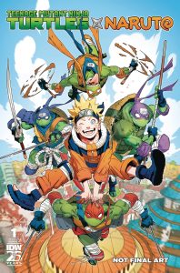
For anyone wondering how this works, writer Caleb Goellner wisely sets the story in a version of the early days of Naruto. Team 7, the group consisting of Naruto, Sasuke, Sakura, and their mentor Kakashi, still exists. Their mission is to escort April O’Neill back to her home. She gets attacked by the Foot Clan who very quickly get dispatched by a group of four familiar armored warriors.
Goellner’s script for this issue consists of a mismanaged balance of set up and fight scenes. He knows both the mythology of both Naruto and Ninja Turtles inside and out. Integrating Ninja Turtle characters and ideas into an alternate version of Naruto becomes a natural fit because mad scientists and powerful beast ninjas already exist there. Yet, so much of the opening pages over explain why April went to Konoha Village and why she has to go back home.
Then the fight sequence starts. Artist Hendry Prasetya isn’t Naruto creator Masashi Kishimoto (alas, there are no masterful double page spreads in the action scenes) but his action choreography is clear. The fight between Team & and the Ninja Turtles is pretty dynamic. His page designs (assisted by the color from Raúl Angulo) convey the movement and energy of the fight. Where his art stands out here is in his character designs for these alternate Ninja Turtles. The designs fit well into the world of Naruto with plenty of nods to that series in each Turtle’s appearance.
This is a first issue but it’s a first issue that wants to get the boring stuff done to get to the fun stuff. Is seeing Team 7 and the Ninja Turtles fight stand still fun? Yes. Could the first few pages have been seeded throughout the rest of the series to provide intrigue and conflict? Absolutely. A crossover between two iconic series should be breezy, fun. It also should take its time to make a set up worthy of this team up.
More Wednesday Comic Reviews
The Horizon Experiment: Moon Dogs #1 (Image Comics):
Moon Dogs is a one-shot part of Image’s “The Horizon Experiment” which is an initiative that sees five one-shots created as pilots and if the demand is high enough, sees them get follow-ups. I wish they could just all get the green light for full runs but…capitalism. That being said, one-shots provide a chance to really stretch the creative muscles and see what you can do with one story, telling a complete, concise and engaging story and Moon Dogs #1 is just that.
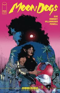
Moon Dogs takes place in Miami and looks at Black plurality with a Somali mother, a Black American father and lycanthropy in the mix. We see Nala, our protagonist, navigating how to be authentic in a relationship and a world where she has had to hide part of herself for fear of violence while her little brother Kai is navigating his own struggle for authenticity while being courted by were-supremacists. There’s something poignant about the radicalization of young men; so many people are grappling with how to counter it and writer Tananarive Due navigates an answer that I think is a solid start while also dropping some context through breaks in the form of a letter and an information page that provide insight to Nala’s identity struggles and the supernatural elements in the world. This story is also pretty bloody and as tensions sit in the air, we see that escalate and simmer in the world and our cast thanks to the art of Kelsey Ramsay and colors by Jose Villarrubia. I think the line and texture work really serve to illuminate the darkness under the surface here, adding a level of grit to Miami that letterer and designer Jeff Powell only elevates the work further. It’s a tight story navigating the struggle for authenticity, the allure of supremacy and the inherent violence in that ideology while leaving room for more should this story be picked up for a full run (which I hope it gets and that’s why you should definitely pick it up). —Khalid Johnson
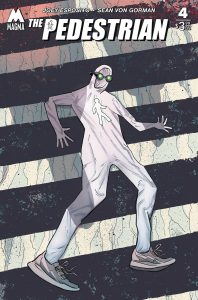
The Pedestrian #4 (Magma Comix): I’ve enjoyed The Pedestrian quite a bit since reading the book’s first issue at San Diego Comic Con, and I’m happy to report that I also enjoyed this fourth and final (at least for now) issue. As is evident by the name and cover art, this is a book about an odd and idiosyncratic superhero. And in this fourth issue, we get a big traditional superhero finale fight, but we get it done Pedestrian style, split between the narration of several characters who inhabit the same small town, which is how this story has been told from the start. There’s really just so much to like about this book, from the depth of the characterization to the confidence that a power-walking superhero will stay entertaining throughout (he does). And, thankfully, the first volume concludes on an open-ended note promising the character will return. I can’t wait. This series is written by Joey Esposito, illustrated by Sean Von Gorman, colored by Josh Jensen, and lettered by Shawn Lee. –Zack Quaintance
-
Sonic the Hedgehog: Knuckles 30th Anniversary Special (IDW Publishing): Everybody knows and loves Sonic the Hedgehog, but it’s nice to see his sometimes rival and longtime friend, Knuckles the Echidna, getting his spot in the sun to celebrate his 30th anniversary as a member of Team Sonic! The special, written by frequent Sonic creative voice, Ian Flynn, sees the guardian of Angel Island come down from his perch with a mission in mind: train the next generation of guardians, wherever they may be! Along the way, readers celebrate Knuckles’ history, his faults, his strengths, and everything that makes him, well, him! Doing what it has famously done for a while now, the book successfully weaves together all of Sonic’s history in multiple media forms into the cohesive story of the franchise in an effective way that even if you didn’t play Sonic Superstars, by the end of the issue, you get the gist of the game! It’s fun to see and participate in the franchise this way. With art, inks, and colors by Aaron Hammerstrom, Rik Mack, and Valentina Pinto, respectively, each panel jumps off the page in a vibrant way that is true to the games these comics are based on. The way the characters move on the page is commendable and continues to highlight the Sonic comics as a great adapter of other media source material. With letters by Shawn Lee to bring home the classic Sonic sounds, this special does the Sonic franchise continued justice with dedicated talent who obviously care about the quality of work they put onto the page with their favorite characters. –Bryan Reheil
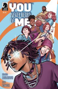
You Never Heard of Me #1 (Dark Horse Comics): In times of difficulty, we can be so consumed with keeping our head above water that we block out the rest of the world. Whether it’s just self preservation or a suspicion of those around us, we can decide that it is easier to turn inward and deal only with our own wellbeing. There is something beautiful in the simple challenge You Never Heard of Me presents. Our hero Will’s family has a gift passed down through the generations to see the best and worst moments of an individual’s life just by touch. It has been a source of pain for their family, as Will’s grandmother was determined to use the power for others’ sake. The psychic ability drove people to fear and anger, forcing them out of towns across the country, But Will’s grandmother just couldn’t stop herself from helping people, despite everything. It’s the lesson she imparts upon Will, though he tries to run from any kind of responsibility or relationship in his small town on the edge of nowhere. Iolanda Zanfardino’s script is straight forward, getting right down to the concept and challenges of this empathic ability, and the intense family dynamics that result from it. We instantly understand Will from the first moments as he sits alone on a cliff side overlooking the ocean. He is more at home among nature, far away from others–even before he inevitably receives the intense power that only makes him want to withdraw more. Elisa Romboli’s art is evocative and uses every element of the page to further the story and tell us about the characters. There are impressive spiraling layouts, that merge with infographics and when the ability is used we see the way it completely consumes the viewer visually. The scenery is meticulously detailed without being overwhelming. It invites us deeper into the page. The colors are especially expressive (both Romboli and Zanfardino are credited with the colors, which showcases how important the colors are to the story), giving an idealistic amber glow to this little slice of life the family has carved out. It is an idllylic small town, where someone can easily disappear if they want to. But beneath it all are the deep imperfections of humanity and young adulthood. This is a great first issue that sets up an emotional coming of age story. A joy to read. Dark Horse’s foray back into the world of creator owned comics continues to pay dividends. —Tim Rooney
The Prog Report
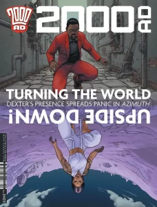
2000AD 2409 (Rebellion Publishing): It’s been a while since we’ve checked in on Rogue Trooper: When A G.I. Dies in this space. That story is, of course, by writer Garth Ennis, artist Patrick Goodard, and letterer Rob Steen. And it’s been excellent throughout, a worthy-yet-different follow-up to the team’s Rogue Trooper: Blighty Valley book. This is as good as a sci-fi war comic gets, really, and in this week’s chapter, it plants the idea that there might be a technological way to create ghosts, or at least a technological justification. Add to that some action with a nice last panel cliffhanger, and this remains my favorite Rogue Trooper story in recent memory. As always, you can nab a digital copy of this week’s Prog here. —Zack Quaintance
Read more entries in the weekly Wednesday Comics reviews series!
