Todd Klein is the dean of comics lettering in the US, with more awards than he can carry, and a portfolio of logos and classic lettering that would be hard to touch. And he’s put it all together for a seven part series on the history of comics lettering:
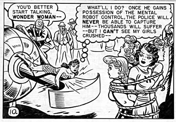
This is an amazingly concise and fact filled journey through the most overlooked aspect of comics creation. That contains not only examples of lettering through history but a ton of photos of the letterers themselves, few of whom I’d ever seen before. I’d love to read this in a little chapbook but I guess copyrights would prevent that. For instance, the above lettering from an early Wonder Woman looks like mechanical lettering but it’s actually from the dreaded Leroy lettering guide, which produced a more mechanical looking font.
In the final chapter, Klein looks at the actual rise of Digital lettering:
The 1990s were definitely a era of turmoil for letterers in comics. Once digital lettering became possible, it was just a matter of time before comics publishers adopted it. An all-digital workflow offered many advantages for them, saving time, expense and materials. It also offered flexibility for reprints in other languages they hadn’t had before. Artists and especially inkers generally hated it, as it meant they had more to draw or ink on the page, once the lettering wasn’t there. It also hurt sales of comics art to fans. Without the lettering, comics art is just pictures, the story is missing. Letterers (and colorists) faced the hardest challenges though, needing to buy expensive computers and software and learn new working methods if they wanted to stay in the market. Letterers also had to create their own fonts, a difficult task, or use commercial comic book fonts, thereby making the work they did less likely to stand out from the crowd. Many feared the changes, and much anger and hatred were directed at the pioneers in digital lettering. Alan Moore once said, “You can always recognize a pioneer — he’s the one lying face down in the dirt, pointing the way with arrows in his back,” It was true for comics lettering, and there are still hard feelings from the 90s, when some letterers unwilling to go digital, or behind the curve, were pushed out of the business. Others came around later and reluctantly, often at a cost to their ability to find work.
Despite this, we now seem to have a fairly wide field of lettering options, from hand designed fonts to the occasional mad(wo)man who still does it by hand. If you’ve ever wondered about comics lettering, get a hot drink, sit down and red this whole series.
PS: Klein reprints this chart made by Comicraft back in the day he made detailing the old way vs the new way. UPDATE: This is actually Todd’s work sorry for the misidentification!


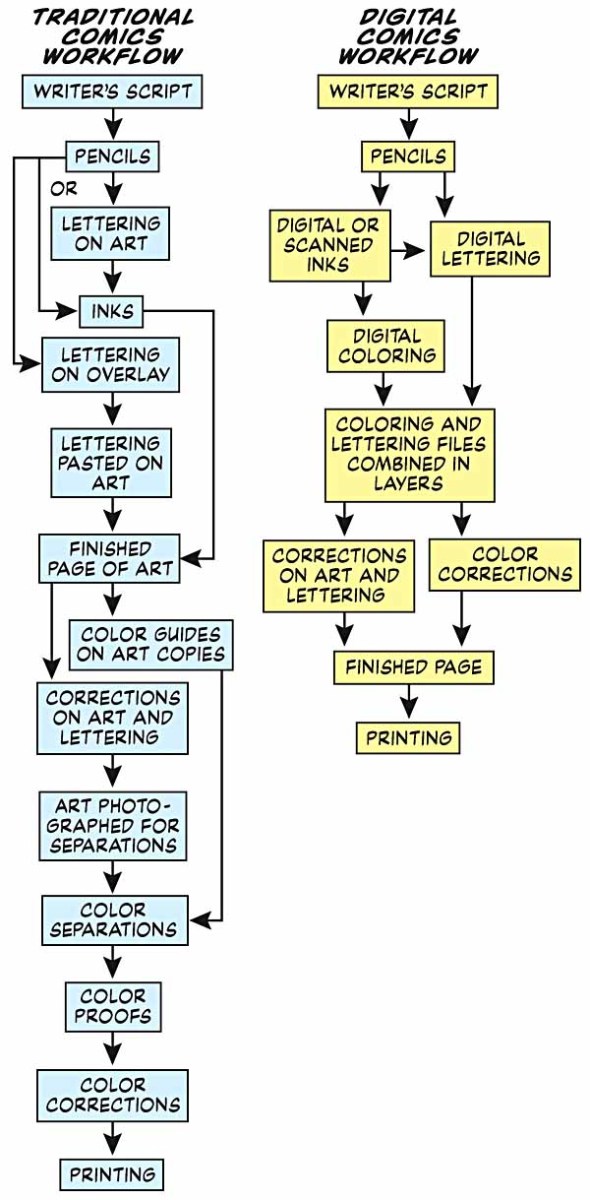





Thanks for the links, Heidi, but that workflow chart is not from Comicraft, I made it myself for the article.
My preference is lettering on the board, especially if it’s crazy display lettering, like the Ambush Bug parody of the Comics Buyer’s Guide, or a splash page.
Then it’s pasted lettering, which is rarely archival, and subject to adhesive failure.
What I really love is a black overlay on top of a color background, or full color separations.
I wonder if Mr. Klein has ever analyzed/reviewed Michael Smolin’s art and lettering?
http://www.randomhousekids.com/books/detail/174059-the-monster-at-the-end-of-this-book-sesame-street?isbn=9780375829130#.VG9dRtKjPTo
Is Leroy lettering despised? If so, why was it so widespread, especially at EC Comics?
Is anyone using movable type in comics, artistically? Either printing on a flatbed press, or via cutting-and-pasting?
And Comic Sans… there’s a bigger picture to that, which I hope to write up next week…
Great stuff. Amazing research Todd, kudos to you. Thanks for the post Heidi.
Comments are closed.