
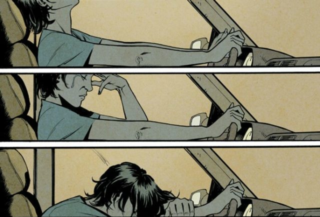
Glitterbomb is one of the very best comics I’ve read in recent years. It’s a thoughtful dive into the evil just underneath the surface of the City of Angels, with a dirty, ugly atmosphere that perfectly suits the story.
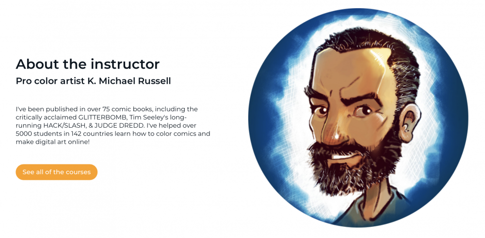
That atmosphere would not have been possible without K. Michael Russell. I was excited to interview the colorist and learned a lot about deciding on a color palette, color psychology, and how educating keeps you creative. You’ll learn all that, too, if you just keep reading.
How did you connect with Tim Seeley and start working with him on HACK/SLASH and other titles?
I actually found my way to working with Tim early on through two completely unrelated connections. Jonathan Brandon Sawyer and I had worked together in an anthology called IMAGINARY DRUGS. This was late 2013 or early 2014. Jonathan had passed my name along to them. They paired me up with Tim on this four-page short that he wrote and drew for that trade.
Then just a few weeks later, a friend of mine told me that Rachel Deering was looking for a colorist for the anthology IN THE DARK. I sent some samples – not knowing anything about the other creators involved yet, and it turns out that she wanted me for a short written by Tim. So it was the weird coincidence that we ended up working together twice within a month or so.
About a month after that, he offered me HACK/SLASH: SON OF SAMHAIN.
In what ways did the city of Los Angeles itself inform your coloring choices in GLITTERBOMB?
I think the particulars of the actual city itself was less important to me than what I wanted people to feel. I tried to avoid “pretty” palettes and wanted to convey a sense that there’s just this ugliness in the world of that book… lots of sickly-feeling palettes and moody colors.
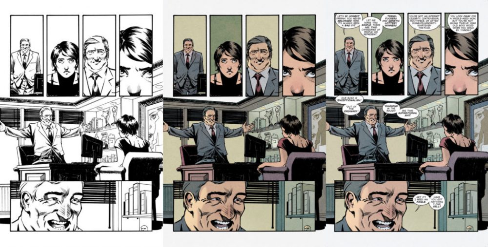
Can you describe the collaboration process between you and Djibril Morisette-Phan?
That’s one of the things I loved about working with Jim & Djibril on that series. They had a lot of trust in me right from the beginning. Other than telling me they wanted it moody and bleak, they allowed me to try what I thought I would work first, and it turns out that style was in-line with what they wanted for the tone of the book. Other than a few notes here and there, we were all on the same page throughout both arcs.
Djibril has a fairly sparse style, not adding many non-essential details to the page. Does that give you more room to play around with the colors?
I think that’s why his pages read so clearly. He’s concentrating detail in the places that matter most, and for me, that’s very freeing. I’m not having to do a ton of rendering to pull focus into the right places, and so my work becomes more about setting the mood for each scene and clarifying the storytelling telling from panel to panel and page to page.
You’ve mostly colored horror titles at this point. Are you concerned about getting boxed into that genre?
I’ve never considered it, but I don’t think people think about colorists that way. I mean — it’s not like all horror books look the same. The coloring for GLITTERBOMB was not like what I was doing in HACK/SLASH: RESURRECTION for example. That particular HACK/SLASH series doesn’t really feel like horror to me anyway… more of an action/adventure/comedy with some gore here and there, and I mean that as a compliment. It’s a vibrant book often – which doesn’t normally get associated with horror.
But I could be wrong and maybe I should start worrying! I’ll never get to color Spider-Man if that’s the case, and my bucket list would be doomed.
What is it that you think makes you excel in the horror genre?
I don’t know if there’s anything I’m doing that would make me excel at horror that doesn’t work on any other type of book. Set the mood. Keep the storytelling telling clear. Ensure the reader’s eye flows through the action easily. Create depth. That’s what I’m focused on regardless of what genre it’s in.
Are you making an effort to branch out and take on non-horror projects?
I just completed a 13-issue run on POSTAL a few months back, and I’ve done a lot of smaller non-horror projects. I’ve never really actively pursued any particular genre. I’d love to do a spandex and capes book at some point, but there’s no genre I’ve pushed for specifically.
There’s so much more to color than how it looks on the page. Each hue has its own symbolism, its own connotations, etc. How much of that are you considering when looking at a comic book page?
That’s always a big part of my process on every page – matching the palette with the tone of the scene. Some scenes lend themselves to stronger applications of color psychology, but it’s always a consideration.
Do you feel those deeper meanings behind color express themselves naturally, or are they dictated by the artist/colorist?
I think it depends on the context of the scene and the colorist. One colorist could use a particular color scheme for a horror scene and make it work, and another could probably find a way to make it look romantic on something else.
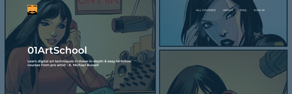
What prompted you to launch 01ArtSchool.com?
The tutorials started with the YouTube channel. I didn’t see many colorists doing tutorials regularly, and thought it would be neat to show people how I do it. Early on, I wasn’t focused much on teaching… it was just — here’s how I do this. I really didn’t know what I was doing, and I wasn’t thinking of it as a business. And you really have to to make a YouTube channel work at all.
Eventually, I had built a small following, and I thought I should step it up — really put some effort into making cool videos that would allow people to learn all the stuff that I had to learn the hard way.
01ArtSchool.com sort of grew out of the YouTube channel. The courses there allowed me to offer more depth and detail than what works on YouTube. I could offer things like private discussion boards and live classes and critiques — stuff that just isn’t suited to YouTube or social media. And it allowed me to spend more time creating videos.
Educating others often leads to teachers learning as much as their students. What have you learned from running 01ArtSchool.com?
I realized that teaching was making me better early on. It’s one thing to think some piece of art works or doesn’t, and it’s another thing to be to able to know why you think it works or doesn’t… and it’s something else entirely to be able to articulate that clearly to someone else well enough so that they get it. It really forces me to understand more and more about art. I love it.
What do you find satisfying about coloring versus teaching coloring, and vice versa?
Going from an inked page to finished color is probably the most dramatic step in the process of making comics. I love that feeling of being able to create something that just wasn’t there before. I think of film a lot when I’m working. “How would a cinematographer light this?” ya know – that sort of thing. “This looks like a scene out of True Detective… what would they do?” Coloring is a much more creative process than a lot of people realize. I really have fun doing it. I’m one of those people that will be waiting on pages, and what do I do? I go find something else to color or paint or draw.
With teaching, I’ve got to say the most satisfying thing is the feedback I get from people — when they’ve watched some tutorial or finished a course, and the light bulb has clicked on for some art concept, and their understanding is just instantly far clearer than it was before. I’ve had a few of those light bulb moments, and I think they are a rare thing for artists. So when students have cared enough to comment on YouTube or email me or tag me on social media to let me know, it really makes me happy… as corny as that sounds I guess. Learning that I’ve apparently created a lot of those moments is feels great.
That and when people write to tell me they credit my videos for getting their first gig or into some prestigious art school. I’ve gotten emotional about some of those stories. It’s amazing.
You can follow K.Michael Russell on Twitter @kmichaelrussell. Learn more about coloring on his YouTube channel and for even more about the craft visit 01artschool.com.
Matt Chats is an interview series featuring discussions with a creator or player in comics, diving deep into industry, process, and creative topics. Find its author, Matt O’Keefe, on Twitter and Tumblr. Email him with questions, comments, complaints, or whatever else is on your mind at matt@mattwritesstuff.com.


