One of the toughest things about picking covers each week is how many fantastic illustrations I have to leave out because the text laid over it just didn’t serve it well. I make a point to only display covers here that have all their text elements, because that’s just as important to the whole as the illustration, despite some publishers treating it as an afterthought.
What’s equally tough is when a cover is when both the image and text are well composed, but I end up skipping over it because the choice of color. Color can enhance an image, but it can also flatten it.
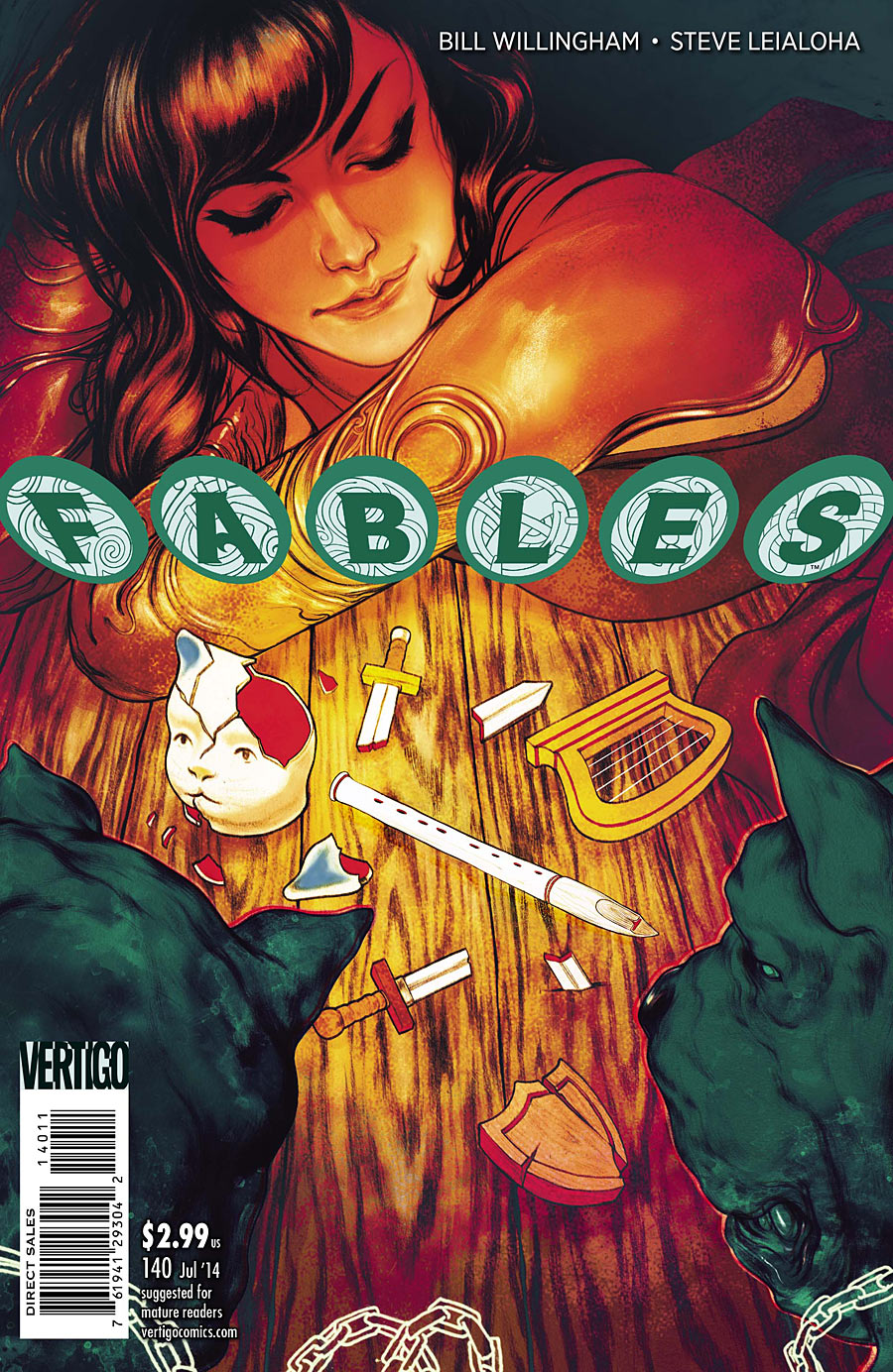
For example, this recent cover for FABLES #140. Some of the things it does with color are really great . Notice how the image gets darker the further away you go from the center? This is an easy trick for focusing attention on a particular area of an image. It works because our eyes are attracted to light areas within dark areas, and you can see the technique used often in old oil paintings by the masters. It’s also why eye liner brings out people’s eyes.
Unfortunately, there are color choices that also hurt this cover. When I first looked at it, I thought the two dogs at the bottom were holes in the table. Even now that I realize they’re dogs in the foreground, they still appear to recede into the background. How weird is that?
The reason for this has to do with color theory. Cool colors generally appear to go back, while warm colors come forward. The effect is most pronounced when vivid warm and cool colors are used side by side. This can be a useful tool when you want to create depth, but can also unintentionally flatten an image, or even reverse it.
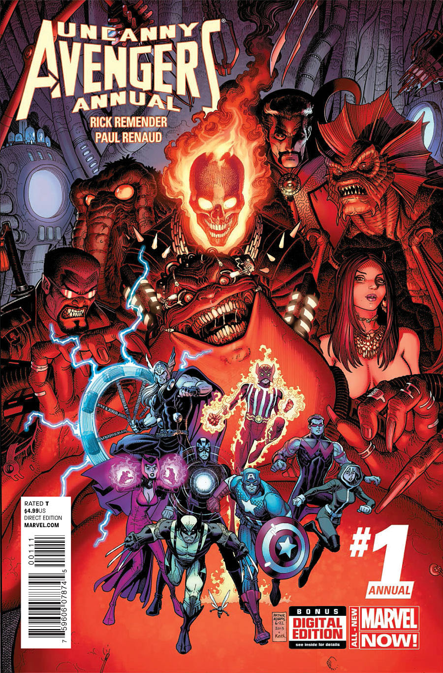
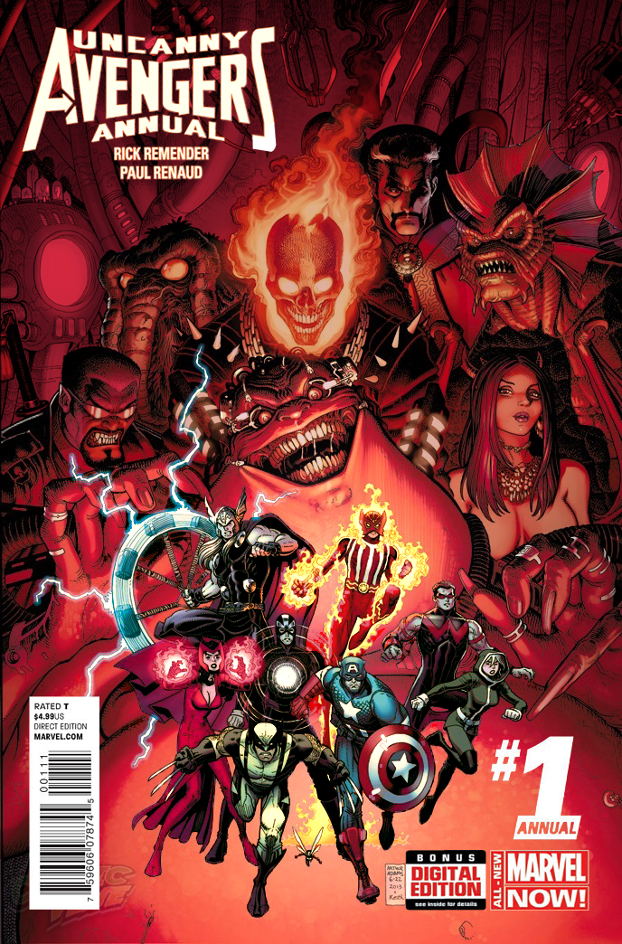
Another recent example is UNCANNY AVENGERS ANNUAL #1. Group shots that contain a lot of characters can be a real challenge for colorists, because color plays a major role in determining where people focus, and in what order they focus on each element. If the viewer’s eye doesn’t have an entry point into the image, they’ll move on to an image that does.
The colorist of this Art Adams piece wisely decided to use color to group the foreground, middleground, and background into three core areas. Unfortunately, the foreground was made a collection of cool colors against a vibrant red, flattening everything. It doesn’t help that the deep background has also been coded in cool colors, making the background and foreground seem like they’re on the same plane.
But not the only problem. When you first looked at the cover, do you remember what caught your eye first? For me, it was Ghost Rider. Then the logo, then Ghost Rider. Then that light to the left of Man-Thing…and then back to Ghost Rider.
Eventually I was able to drag my eyes downward to Mojo and the team, who in theory should be the real focus of the cover.
Here I tweaked things a little in Photoshop to try and get you to focus on the bottom half of the image. I tried to make the team as warm and vibrant as I could without recoloring it from scratch, and lightened Mojo’s stomach a little so that the characters would break away from it. I also darkened the edges to lead you towards Mojo and the team, including making Ghost Rider’s flames a little less intense. I colored the background red just so that it wouldn’t be a potential distraction in an image where red is the dominant color.
It’s by no means perfect, hopefully it gets you thinking. There are other ways to add depth using color, but I’m going to hold off until I have some good examples for each.
Now let’s look at last week’s covers:
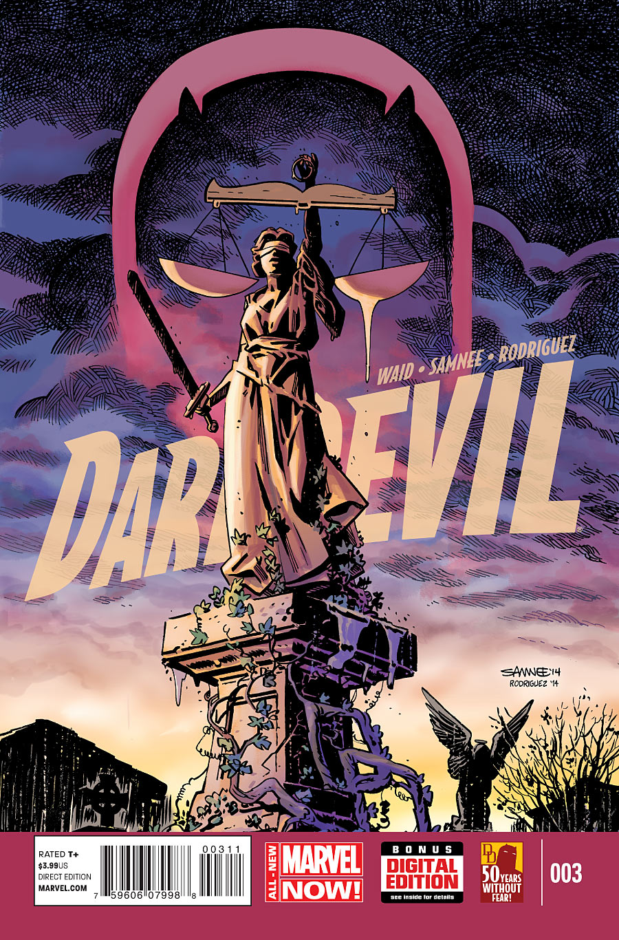
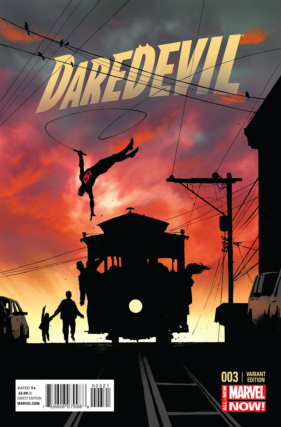
DAREDEVIL #3
Both of these covers were so great, I couldn’t decide which one to choose.
The top one by Chris Samnee and Javier Rodriguez is brilliant in the way it uses the statue’s scale as Daredevil’s eyes (with water dripping down from one). Though did the logo really need that slight transparency? I kinda wish it was just a stark, flat color.
The bottom one by Jerome Opena (and Rodriguez?) is a nice everyday moment made more dramatic by the silhouettes against the sky. The coloring could make or break this one, and the colorist really delivered.
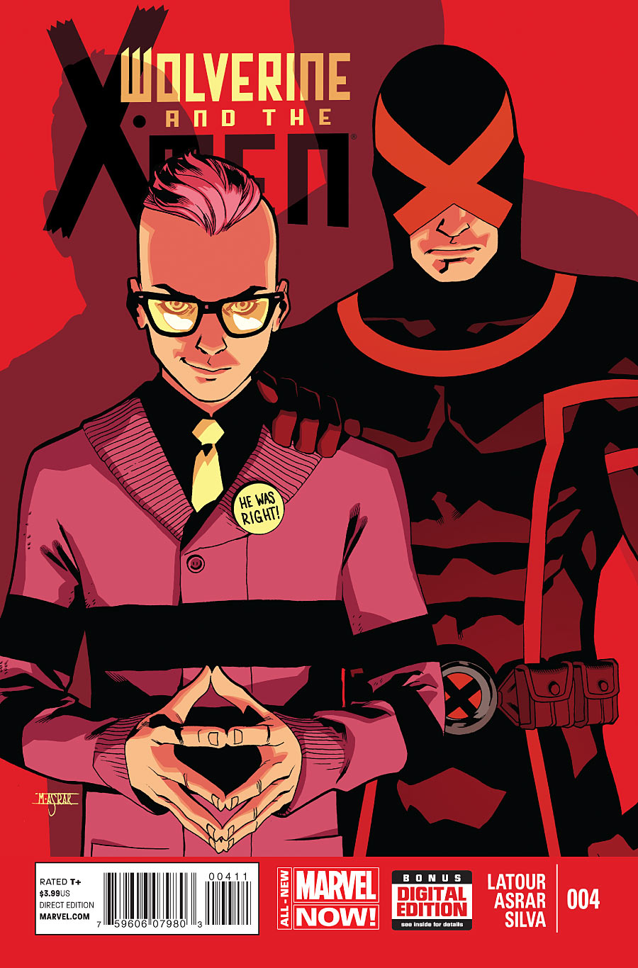
WOLVERINE AND THE X-MEN #4
Normally there isn’t really anything special about an image of just two people standing, but the dramatic shadows really sell this one. Israel Silva also did a good job of creating a cover that’s easily readable in thumbnail form when browsing a website (or an online store).
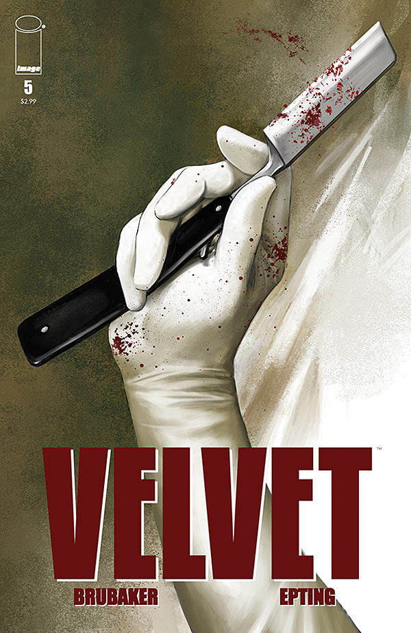
VELVET #5
Steve Epting also created an image that works really well at a small size, but that also has the eye-catching contrast of a violent image mixed with the softness of the word “Velvet.”
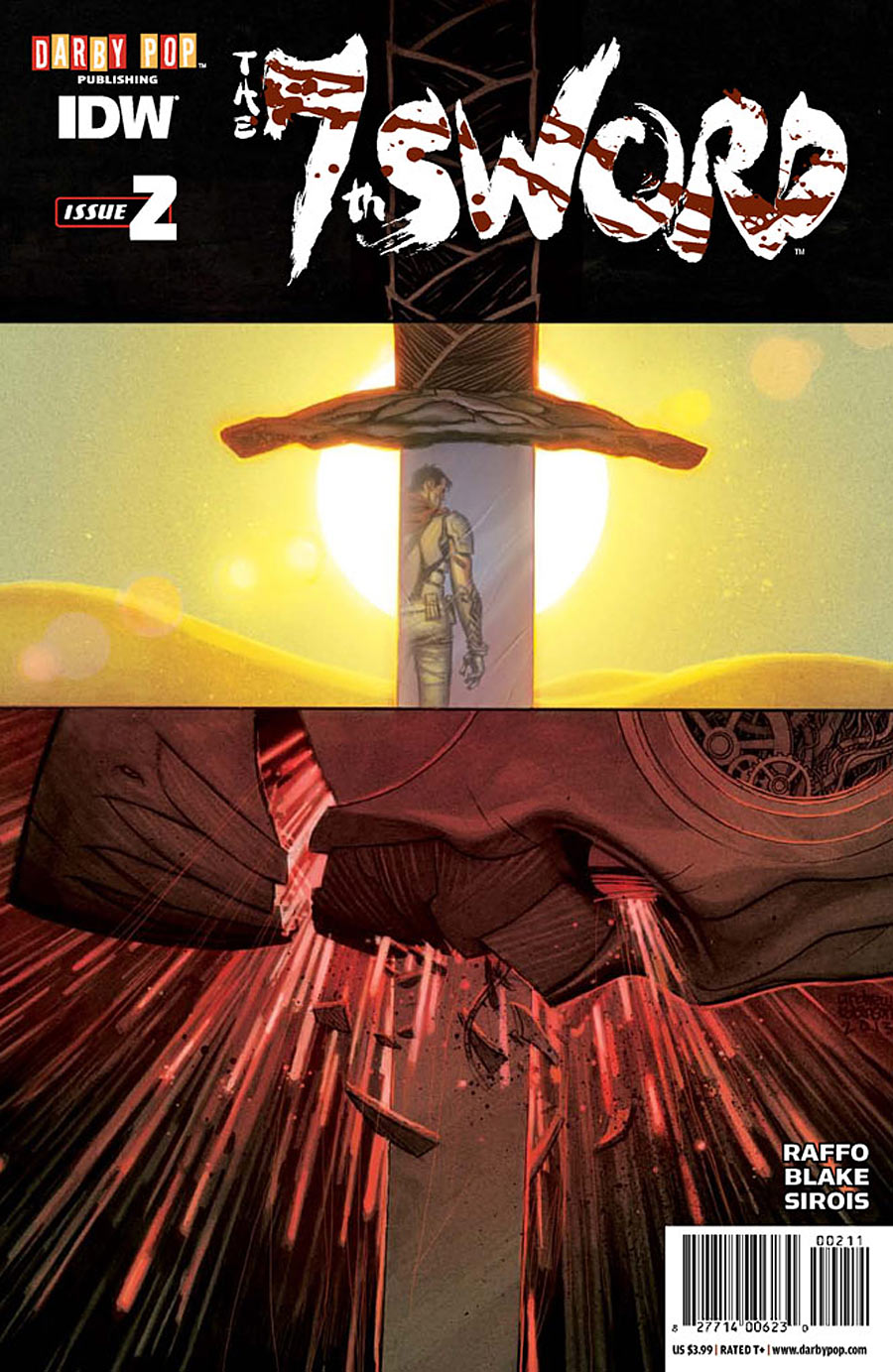
7TH SWORD #2
Seeing a person’s reflection in a sword as they walk away from it is already a pretty strong concept, but then it’s mixed with a second explosive image that lines up with the first sword. Another home run for Andrew C. Robinson, though I still wish the logo was centered.
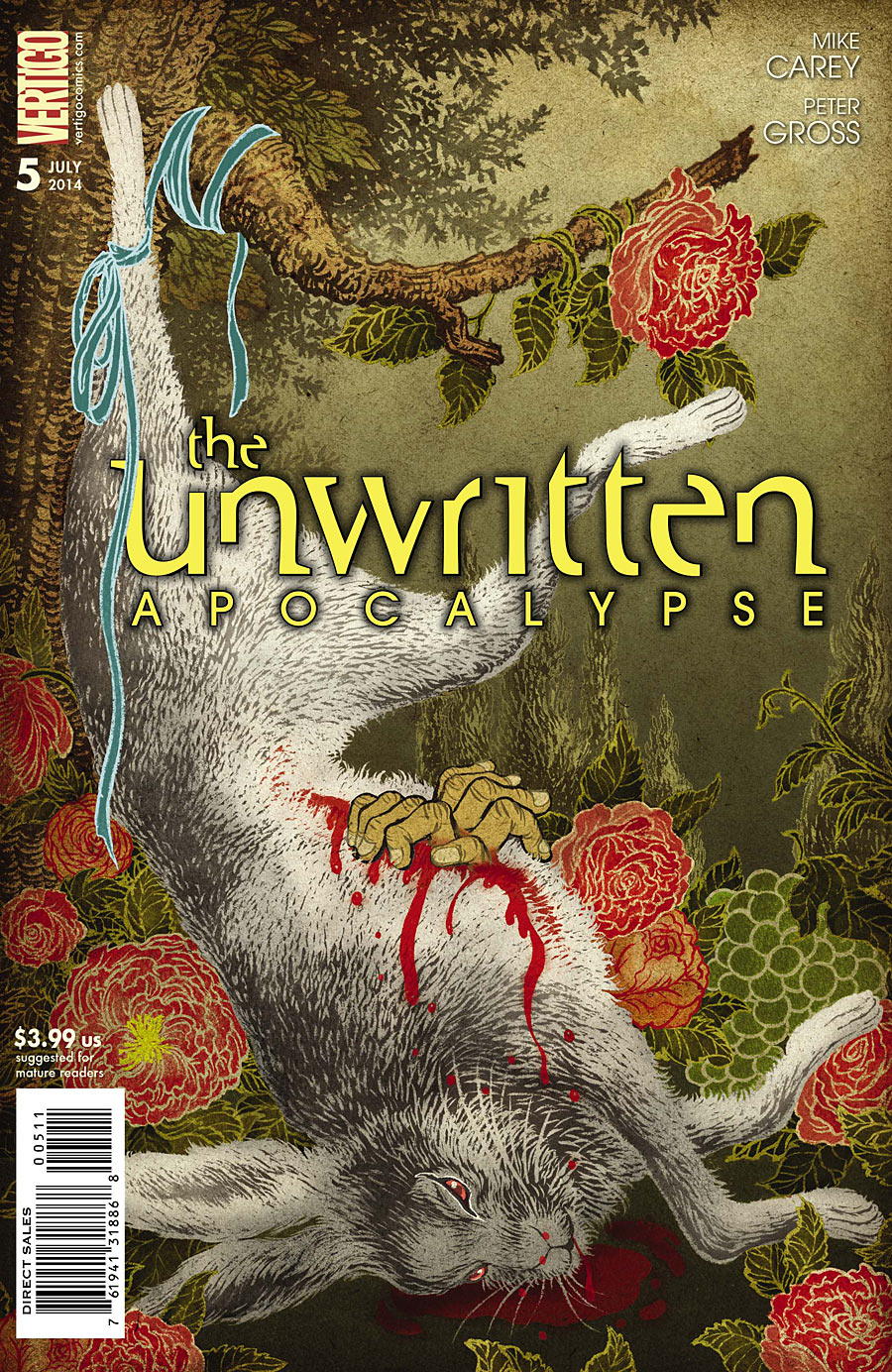
THE UNWRITTEN APOCALYPSE #5
What the hell am I looking at? Yuko Shimizu makes me a little nervous here. It’s a great, strange, disturbing image, it’s just unfortunate that it was given such poor logo placement. It looks like someone originally had it centered, and then accidentally bumped it.
And why does the ribbon overlap the logo? Overlapping the logo is typically done to create an illusion of depth, but no depth is created here. It just looks like the ribbon is holding the logo against the rabbit’s leg. And why yellow? And why the cheesy outer glow/shadow instead of a thin solid outline?
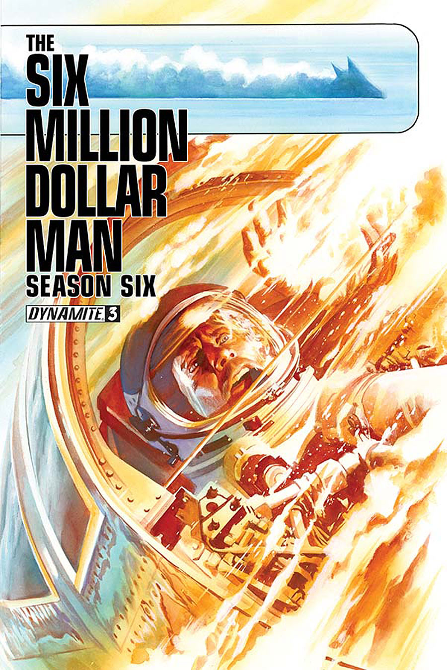
SIX MILLION DOLLAR MAN SEASON SIX #3
I like the horizontal bar at the top, and how it communicates a sense of speed in this little two-panel story painted by Alex Ross. But because the horizontal bar functions like a graphical element, I wish the logo were interacting with it more…somehow. Maybe a two line logo inside the bar? Or a two line logo under the bar?
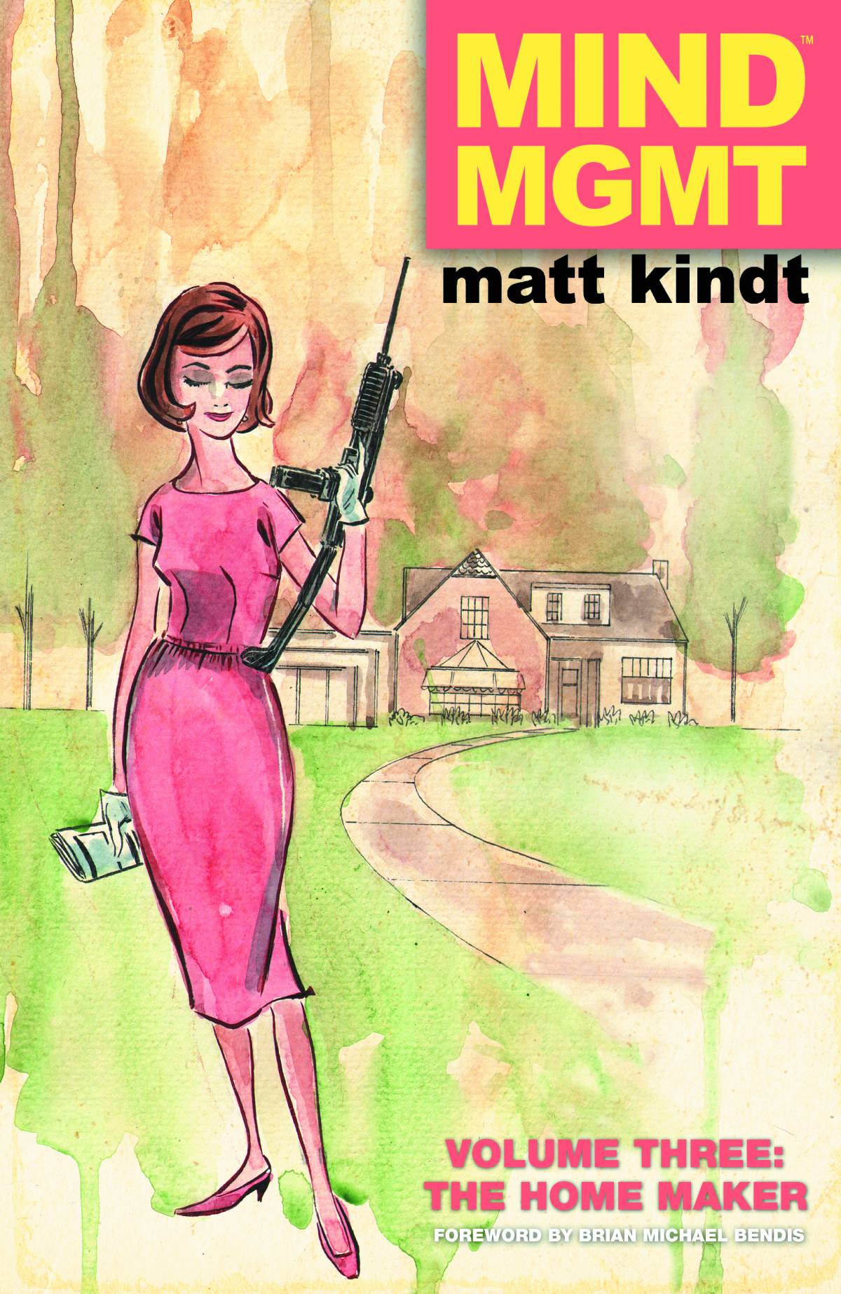
MIND MGMT VOL. 3: THE HOME MAKER
Matt Kindt’s out-of-place gun in a vintage magazine style illustration definitely got my attention, though I kind of wish it had an alternate MIND MGMT vintage magazine style logo to go with it. And what’s with the cheesy outer glow/shadow again? Magazines back then didn’t do that, so I’m not sure if it was meant to be purposely cheesy. I don’t think it was needed.
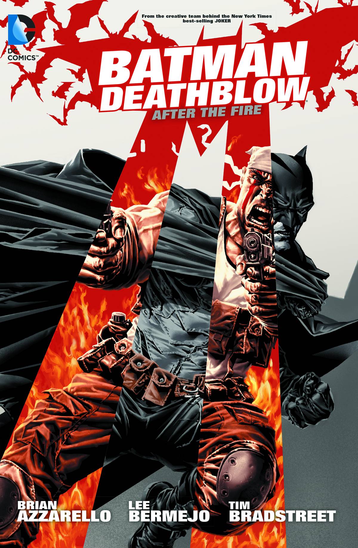
BATMAN/DEATHBLOW: AFTER THE FIRE
This cover by Lee Bermejo is almost such a great concept. If you’ve never heard of Deathblow, you’re probably wondering why the bat in the logo is shooting lasers at you. The two lines are actually supposed to represent Deathblow, whose trademark is the two vertical lines painted across his eyes. Except this doesn’t really come across when the lines aren’t actually vertical.
The other almost great idea here is having Batman and Deathblow in a similar pose, with Deathblow revealed in the two lines. Except I only realized they were meant to be in similar poses after noticing their legs, after looking at the cover for a few minutes. Having their upper bodies and heads in different poses kind of defeats the purpose.
Still, it would’ve been a fantastic cover if they’d been in the same pose, with a different image revealed inside of two parallel, vertical bars.
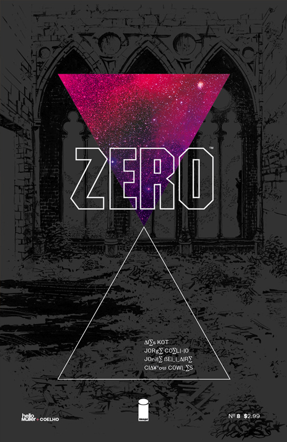
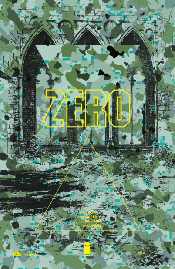
ZERO #8
I adore the concept of using camouflage to stick out on the shelf. Unfortunately, Muller & Coelho’s design doesn’t work for me because it instead camouflages an otherwise great design. I don’t know if the final printed version looked better, but I find the digital representation of it to be nearly unreadable.
Maybe if a pattern had been used that had fewer dark splotches, so I could see the art more clearly? Or maybe if there was no art, and a darker pattern was used that would make the text easier to read.
The thing is, when I zoom in, I do love the design that’s hidden in the camo. I love the outlined triangle reflecting the missing triangular section of these nice architectural shapes, and the shadows on the ground of mysterious figures approaching.
So when I came across the second image, I was like hold the phone!
I actually came across it while doing a search on Ebay to see if there were any photographs of how the first cover printed. A little digging revealed that the second cover was actually an earlier, discarded draft. Which really bums me out, because it’s hands down my favorite cover of the week. Personal Taste Alert: I readily admit that part of the reason I like the second image so much is because it reminds me of ’70s concept album slee–
Hold on, I just noticed the guy hiding in one of the arches over to the right. I never would’ve spotted that with the camo.
I don’t know what to say. But I still look forward to seeing what they do next.
Kate Willaert is a graphic designer for Shirts.com. You can find her her art on Tumblr and her thoughts @KateWillaert. Notice any spelling errors? Leave a comment below.






Lately, some of the most inventive covers have come from Daredevil.
The Daredevil cover #26, which spelled out “daredevil” on a clothesline, was utter brilliance.
The Zero cover definitely say a lot that needs several glances to figure out.
I think the Elekta #2 cover by Mike del Mundo was out of this world good.
Kate, I hear what you’re saying about the Batman / Deathblow cover, but in a way I actually like that the pose is not directly the same. It kind of speaks to the styles of the characters – that one is aggressive and the other more defensive.
It is a wonderful cover, because just the act of drawing that (speaking as an artist) means the concept has to be visualized in such a way that may not be clear until the art is completely finished. It’s a gamble.
The same can be said of the Zero cover. How that pans out is a total gamble. It could go south real quick.
Thanks for including ZERO #8 Kate. That early design was discarded because it didn’t relate at all to the actual story — hence the new camo design. Yes, the design/type is much more legible in print or when you’re reading the cover on a tablet, and the point of the whole camo concept is that, indeed, everything is slightly hidden and unclear (wouldn’t be effective camo otherwise ;) ).
@Tom: Thanks for the comment. I can totally see how camo would fit better thematically…though part of my still wishes there was a place somewhere for the space-y concept album cover. ;-)
@JImmie: I hadn’t considered the aggressive/defensive angle. That’s an interesting idea, though I’m not sure how well it came across.
Comments are closed.