This is the third season of a column that judges a book by its cover. Catch up on the current season here, or view the complete archive.
I forking love textless covers. Can’t get enough of them! So when Image Comics announced they were doing a series of textless variant covers as part of a “We Believe In Artists” initiative, I was very pleased.
My love of textless covers is linked to my love of album cover art, and before I jump right into the comic covers, I’d like to establish some context for where textless covers come from. I could honestly talk about this topic for hours, but I’ll try to keep it brief.
The first record albums were literally binders with sleeves to hold 78 RPM records, like a photo album. In 1948, Columbia Records introduced the LP (“long play”), which carried roughly the same amount of music on a single disc large, and the term “album” was carried over. That same year, RCA Victor introduced the 45 RPM record, or “single,” a more efficient form of a 78. Singles dominated the youth pop market, while LPs were more popular with fans of longer pieces of music, such as classical and jazz.
The first textless album cover [update: I’ve since found earlier examples] was a 1958 rerecording of the score to the 1943 film For Whom The Bell Tolls. It was the very first album released by the newly created Warner Bros. Records.
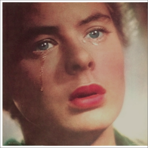
Early WB wasn’t afraid to take chances with their record packaging, maybe because they had movie money behind them. Some unknown individual decided Academy Award winner Ingrid Bergman’s face alone would be enough to carry the cover.
The daring move earned the record a nomination for Best Album Cover at the first annual Grammy awards, though only cinematographer Ray Rennahan was credited for the image, not the package designer. The Grammy’s would later rename the category Best Recording Package.
Unfortunately, the album itself wasn’t a huge financial success (it didn’t chart), which might be why they didn’t try it again.
In the early ’60s, the most adventurous and experimental album covers were the ones designed for jazz records, whose audience was a little more interested in cerebral and unusual art.
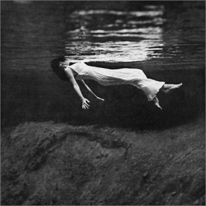
The design team of Frank Gauna with Alan Douglas saw this amazing 1947 photograph by Toni Frissell and decided to run it without text as the cover to 1962’s Undercurrent by Bill Evans and Jim Hall.
That it wasn’t even nominated for a Grammy when it was clearly the best cover of the year — and possibly the decade — is nothing short of criminal. Gauna and Douglas did a couple more textless jazz covers in 1963, but seemed to give it up after that.
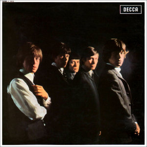
The first pop act with a textless cover was The Rolling Stones with their self-titled 1964 debut album.
Back then, bands had to prove themselves with singles before they earned a full-length album. The Rolling Stones were rising stars in the UK, and were given a great contract with Decca, who were still smarting from having turned down The Beatles.
Band portraits were the standard of the day, but manager Andrew Oldham liked the idea of doing it textless, with a “you already know who they are” attitude. But I guess he couldn’t convince Decca to leave off their own logo, and they weren’t the only label in the ’60s who wouldn’t cave there.
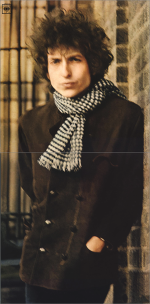
Outside of the UK, where The Rolling Stones didn’t yet have a following, all sorts of text was added to the cover. That means that US pop fans didn’t see a textless album until Bob Dylan’s Blonde On Blonde in 1966.
It was also the first textless wraparound gatefold cover. But it opened along the bottom instead of along the side, essentially giving fans a free high-quality poster.
Traditionally, the artist name and title had been placed on the top half of the album, so it was easier to see when customers browsed through the racks. But in the mid ’60s, pop acts began treating their albums like its own complete work, rather than merely a collection of singles. According to the 1977 book Album Cover Album, “it was now realized that a simple visual statement had a strong impact and was more likely to encourage impulse buying…”
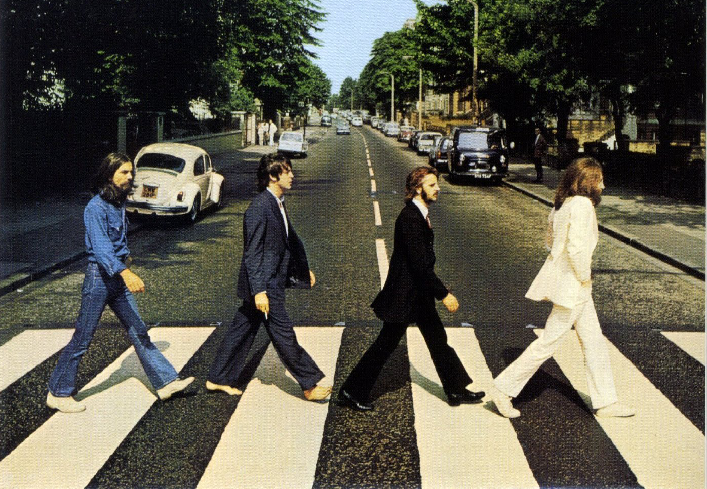
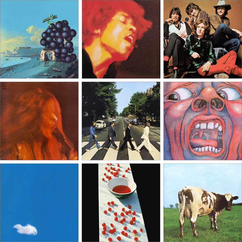
By the end of the ’60s, it seemed like everyone was jumping on textless covers. Among them were Wow by Moby Grape (April 1968), Electric Ladyland by Jimi Hendrix Experience (October 1968), Traffic by Traffic (October 1968), I Got Dem Ol’ Kozmic Blues Again Mama by Janis Joplin (September 1969), Abbey Road by The Beatles (September 1969), In The Court Of The Crimson King by King Crimson (October 1969), Live Peace In Toronto 1969 by John Lennon/Plastic Ono Band (December 1969), McCartney by Paul McCartney (April 1970), and Atom Heart Mother by Pink Floyd (October 1970).
Eventually the textless cover fell out of fashion — after all, it has the greatest impact when the fewest people are doing it — but it comes back every now and then.

Some people refer to these as “virgin covers.” If you’ve spent enough time in the comics industry, you’ve probably heard it (or used it yourself), but it’s a bit of jargon that doesn’t exist outside of the comics industry.
So where did it start? I put on my detective hat.
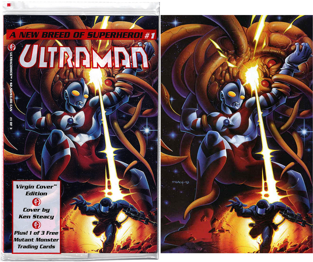
“Virgin cover” was first coined during the gimmick cover boom of the early ’90s, where it was first used by Ultracomics for Ultraman #1, which came sealed in a polybag with the trade dress printed on it.
You can see below they even added a little “SM” (a variation on “TM”) to try and protect their new phrase, the naive fools.
The term of course refers to the cover inside being pure and undefiled, which is…kind of gross, in a very ’90s comics way. And if you’re the type to overthink things (i.e. the type of person who would write a regular column analyzing comic cover design), the printed bag makes the concept additionally awkward by asking the reader to slip off the restrictive outer wrapping to see the bare virgin cover.

(I’m not going to post the full wraparound cover.)
During the mid-’90s, “virgin covers” were almost exclusively the territory of “bad girl” books like Shi, Double Impact, and Vampirella. From there it spread into price guides, and now even Diamond labels every textless book as a “VIRGIN CVR” in its weekly shipping list, where it became a standard industry term.
I don’t expect it will go away anytime soon, but you won’t ever see me use the phrase when discussing my precious textless covers.
And now that we’re done with that short history lesson, let’s discuss some covers!
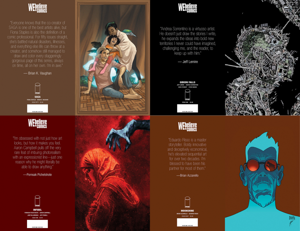
Image Comics released a ton of #WeBelieve covers last month — most excitingly a load of textless wraparounds — but I’ll get to those later. This week I want to focus on just the first four that were announced.
The first thing that strikes me about these covers is that none of the compositions look like something’s missing. This usually happens when an image is weighted towards the bottom, to leave room for the logo at top, but all of these place focal point roughly in the center. The only downside of all of them being centered is that they start to feel a tiny bit same-y.
The covers smartly place all the important information on the back cover, an advantage Image Comics has due to their not needing to rely on ads. It’s a little tougher for DC and Marvel.
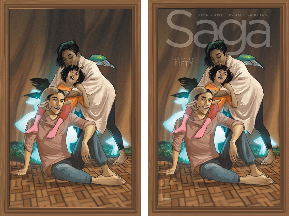
SAGA #50 by Fiona Staples
This cover comes closest to the “you already know who they area” ideal, being a long-running series with an existing fan base. And unlike iconic heroes like Batman, X-Men, etc., these characters only exist in a single series with a single set of non-confusing numbering. This issue could easily get away with not having a with-text variation in a way that the big heroes can’t.
I particularly like the picture frame, because I’m a big fan of comic covers that try to say “this is not a comic cover.” They weren’t posing for an audience, they were posing for a portrait just for them. I like the text treatment on the right, but it makes the image feel less like we’re holding an object from another world, and more like someone else found the object first and printed it as a magazine cover.
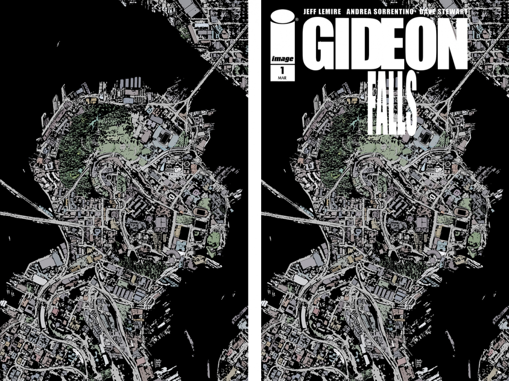
GIDEON FALLS #1 by Andrea Sorrentino
This is the only composition of the four where I really hate the text treatment. Part of it is the way the word “FALLS” has been noticeably stretched to imitate a condensed weight, and that’s just something you don’t do. Please don’t do that.
There are all sorts of nitpicky little things that make it feel off to me. “FALLS” doesn’t look like it’s centered with “GIDEON.” I don’t like how big the Image logo is and how unbalanced it makes the composition. I don’t like how the text feels like it’s fighting the image rather than complimenting it. I just don’t like the ’90s comic design feel of it in general.
But the image! This is my favorite category of textless cover, the mysterious surreal image. It reminds me of surrealist album cover designer Storm Thorgerson’s “Tree Of High Life,” but actually even better, maybe? The only way it could be improved is if it was a painting instead of line art, so that it might trick people at first into thinking it’s a photo.
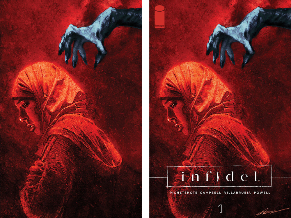
INFIDEL #1 by Aaron Campbell & Jose Villarrubia
It’s a little awkward having two covers in this set that feature a person person hunched over and turned to the side. This is a solid cover that’s definitely better than a lot of covers this month, but doesn’t hold up as well in comparison to that great surreal Gideon Falls cover. On the other hand, the with-text treatment is far superior to the Gideon Falls cover.
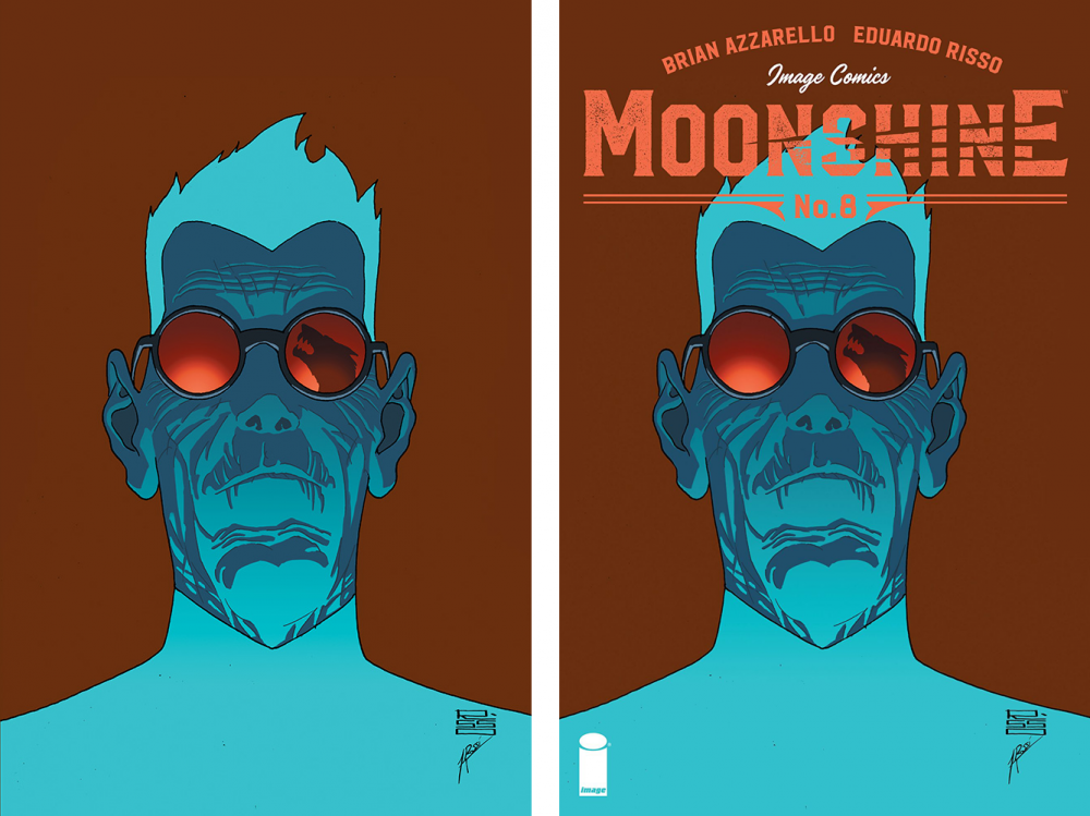
MOONSHINE #8 by Eduardo Risso
I like the logo to this book, but I don’t like the way the color chosen vibrates against the shade of blue in the character’s hair. It could very well be intentional, but I’m not a fan.
The textless version works much better. It’s very vibrant and bold, and would definitely get me to pick it up to look inside, partly because I forking love textless covers.
This Week’s Covers
Every week I pick a handful of covers that I consider particularly well-designed, not just well-illustrated. My personal criteria for a well-designed cover is that the illustration and design elements compliment each other rather than fight each other, and that the resulting image stands out from the crowd.
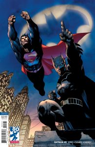
Hey look, it’s an almost textless cover! This is part of a new series of variants coming out in May, but the first one snuck out this week!
It’d be easy to complain that DC isn’t going far enough with these when Image is doing textless wraparounds, but like I said earlier, DC and Marvel are working under a different set of constraints. My understanding is that they need the back page ad to help keep the price down, which is why their wraparound covers tend to cost more. So they’ve got to keep their barcode on the front.
My one nitpick about this cover is that Superman and Batman are pointing me right off the page to the cover sitting above it on the stand. Normally there would be a giant logo there to stop us, but now it’s wide open. The colorist’s addition of a bat signal helps a little, but it’s not stopping Superman. Moving the line of text from the bottom right to the top left corner would do it, though. Or possibly placing the DC logo there, which it looks like they’re doing with the rest of these variants. More on that in the next column.
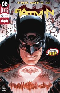
The regular cover for this issue is kind of special too. It’s got the usual DC problem of a non-centered logo behind a centered head, but I like the composition of the image itself.
You’ve got a nice dramatic floating Batman head above a city skyline, with the bat signal doubling as his chest emblem, which is a very nice. A hint of clenched fists, which are probably unnecessary, but they heighten the intensity of the image so that the dialogue balloon is even funnier by contrast: “Booster Gold Must DIE!” It’s a perfect modern update of the classic Silver Age concept of making you go “buh-WHA?! I need to read this!”
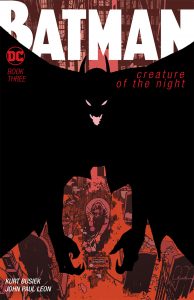
I guess Batman covers really killed it this week.
Mainly, I just love the way the image interacts with the text elements. There’s an odd effect created when the black shape cuts off the main logo, but then includes the other cover elements.
Also, the arms hanging down to frame the second most important part of the image, that we don’t immediately see until the bat draws us in for a closer look. John Paul Leon is just great in general.

I love the trade dress for this series so much, though I wish they would change up more than just the colors.
Taken by itself, though, it such a wonderful weird design. It’s so messy that I feel like it shouldn’t work, and yet it’s so visually interesting and works perfectly. It’s also a great example making the title of the book louder by making it super quiet.
I also like how there’s a weird, unreadable symbol where you might normally expect the book’s title, as if it’s there but it’s in some incomprehensible alien language.

This is such a great use of two colors to create an image that really pops.
I think what makes it work so well is that the only elements not colored red are the text and the jumping figure, so they become connected visually.
The other thing I like is how all the text elements are left-aligned and all light up with each other. It’s very Swiss design (which I love), but with a bit of punk thrown in.
The only problem is that after I stared at it awhile, I realized it was very similar to that Dwayne Johnson Skyscraper poster people were making fun of on social media awhile back. But what can you do?
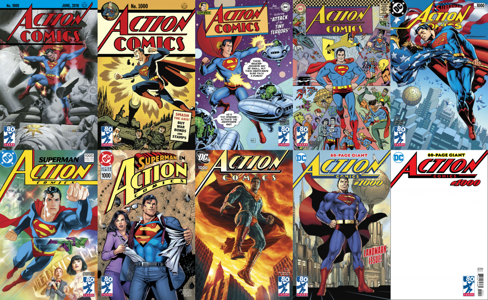
ACTION COMICS #1000 by Steve Rude, Michael Cho, Dave Gibbons, Michael Allred, Jim Steranko, Joshua Middleton, Dan Jurgens, Lee Bermejo, Jim Lee and Blank Cover.
This is the kind of set that works better as a whole than any individual cover by itself. I mean, the fun part is looking at them all together and seeing how the trade dress changes each decade, right? Or is that just me?
Also, I don’t get why Blank Cover is such a sought after variant cover artist, all of his covers look too similar.
But seriously, I think there was a big missed opportunity here with the blank cover by including a logo at all. The series is showing how the trade dress changed every decade, so the blank could’ve represented “the future,” where you get to draw in your own! Design your own Action Comics and DC logo! Or…leave it completely blank, since textless covers are clearly where everything’s going!
I’m also a tiny bit disappointed that Steve Rude and Michael Cho didn’t go for any of the weird ’30s/’40s chest emblems, but maybe that’s just because I once researched Superman’s changing “S” for an infographic.
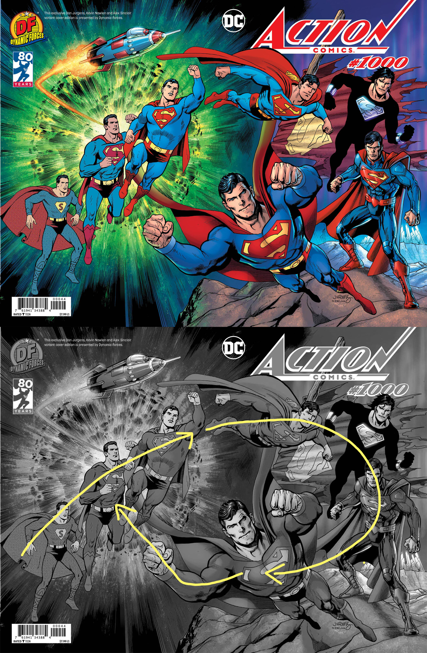
I think the most successful Action Comics #1000 variant is the Dynamic Forces exclusive wraparound by Dan Jurgens, with finishes by Kevin Nowlan, partly because it has all the Supermans together.
Do you have a favorite?








Just wanted to say how much i enjoy these columns. Since I possess all of the artistic and design skills of a turnip (sorry turnips) I love the ‘aha’ moment as something I vaguely feel isn’t quite right comes into focus through the explanation.
That Eduardo Risso cover is great. Reminds me a little of a Dean Motter ‘Mister X’ cover. (A classic case of covers selling me a comic – I have literally no idea what ‘Mister X’ was about).
But the big takeaway this time is that ‘For Whom The Bell Tolls’ LP which sent me off to YouTube and some time musing on Spanish themed light orchestral music and Miles Davis recording ‘Sketches of Spain’ the following year. Fascinating choice of cover image, not least given the degree to which Bergman was still somewhat controversial, something which I imagine played it’s part in the design decision.
Thanks!
Comments are closed.