
The column that judges a book by its cover, focusing on the month’s best-designed comic covers. For the month’s best-illustrated comic covers, see Best Comic Covers Ever (This Month).
Note: Apologies for the delay this month. I’ll try to get the next installment out super quick!
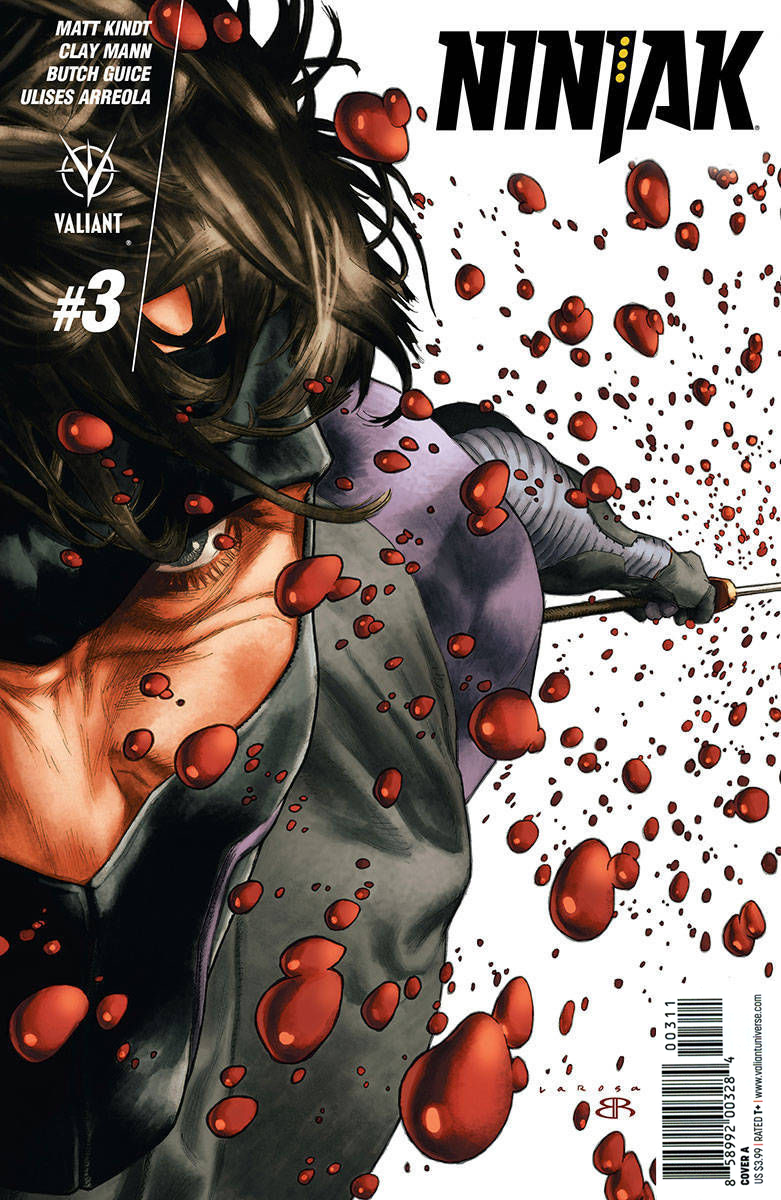
Ninjak #3 by Lewis Larosa
Wow, that is an extreme perspective. The easiest way to make a composition feel dynamic is to have something in both the extreme foreground and in the background, and this has a single person existing in both. That is something.
The expectation that comic solicitations have some cover art to go with them means that artists are asked to create the art well in advance. When it comes to designers who are never quite happy with their designs, this means you can get a glimpse of their thought process when they tweak the cover before final publication.
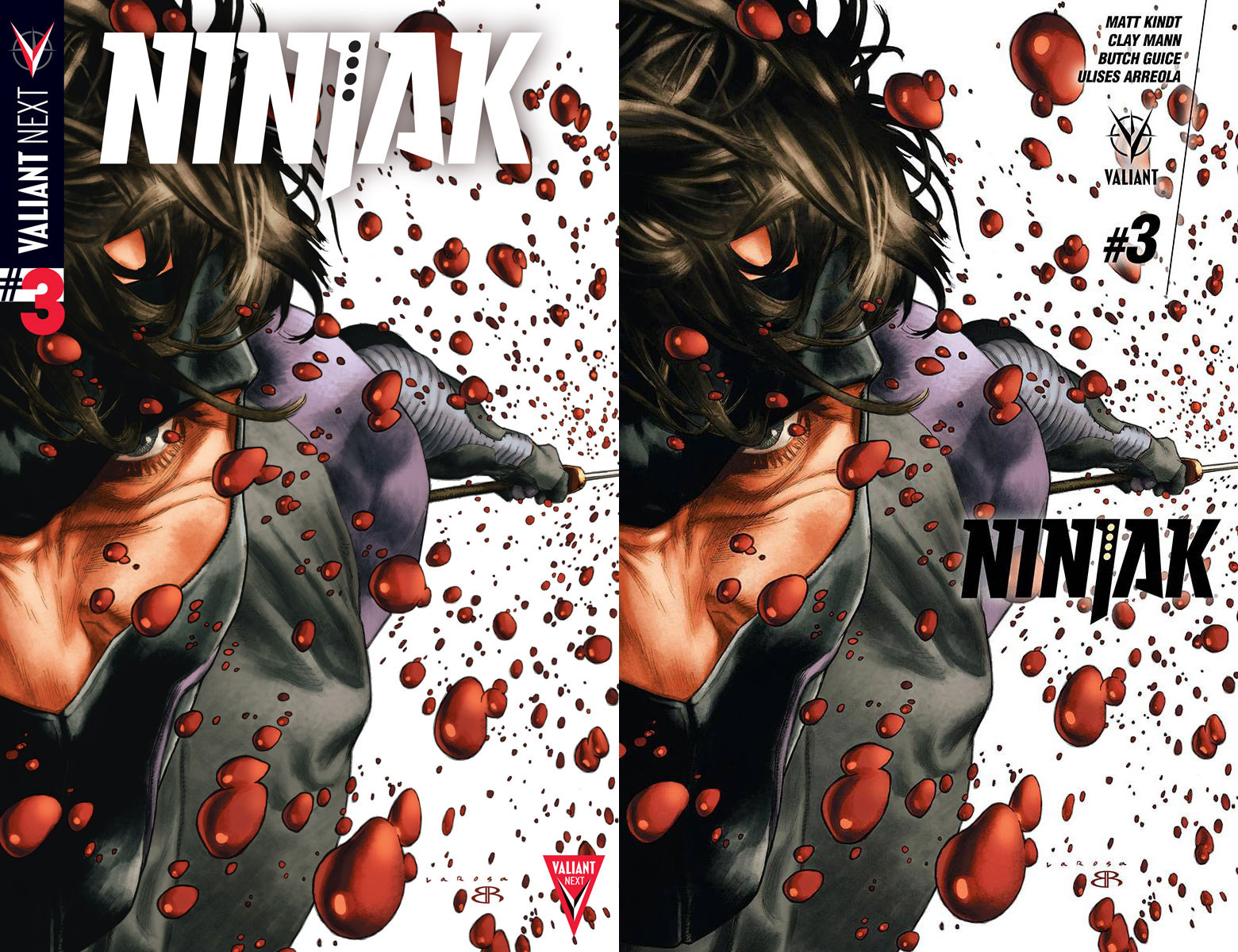
The layout on the left is pretty standard and boring. Using a drop shadow to separate the text from the image is a quick solution, but not very elegant and often a sign that the design just isn’t working yet. The image on the right is getting closer, but the glow around the logo is just as bad as the drop shadow, and is actually flattening out the art and ruining the illusion of depth.
The final printed version at top is clearly the best solution. Having the publisher logo and credits in the character’s hair feels a little bit weird maybe, but it works for me.
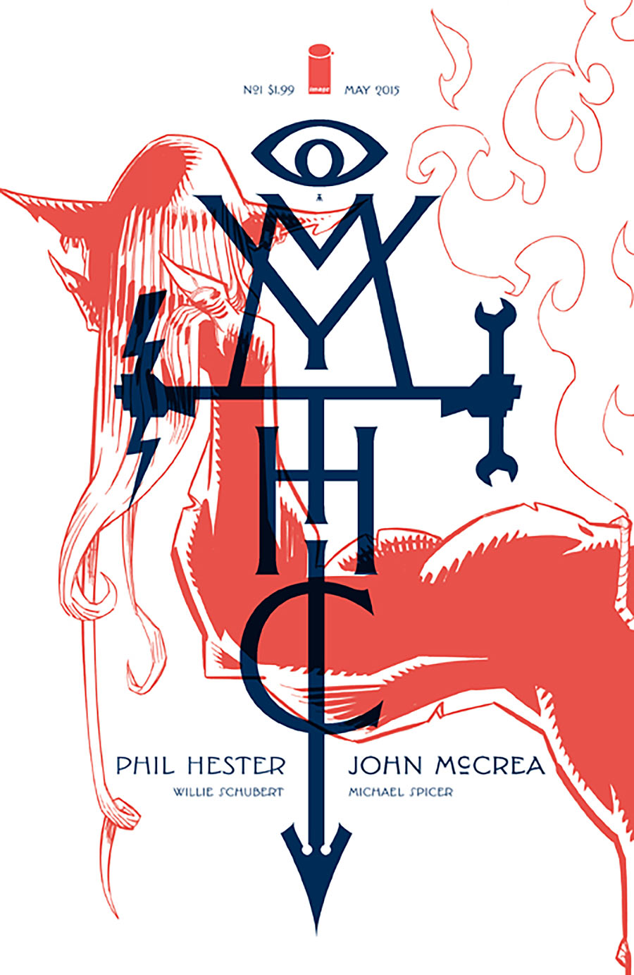
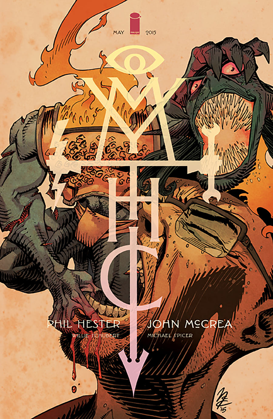
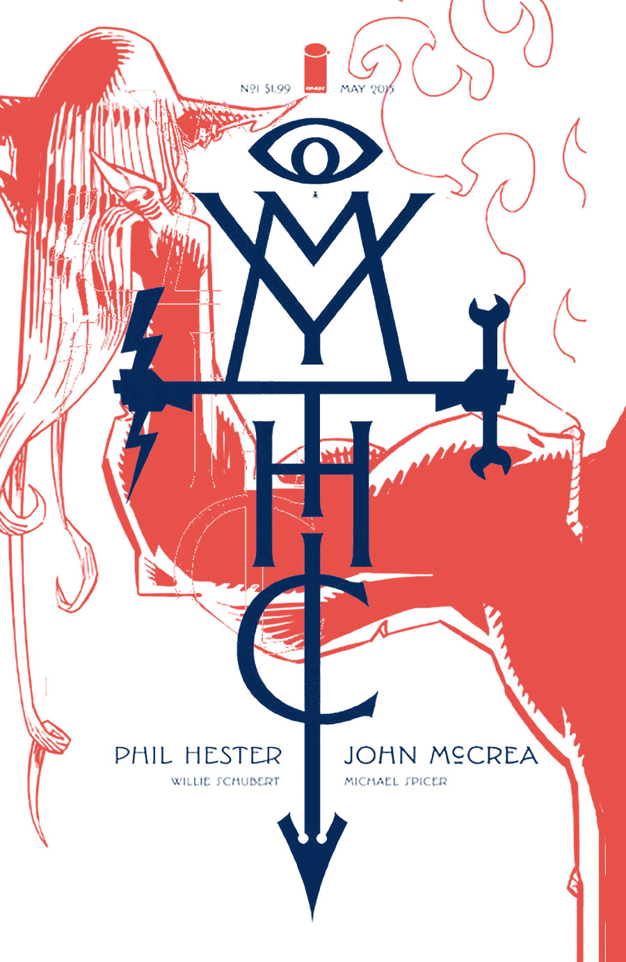
Mythic #1 by John McCrea (A), Matteo Scalera (B), John McCrea (C)
I enjoy the concept of vertical logos and the design possibilities they open up. It’s just unfortunate that this one is nearly unreadable.
The two-color look of the cover above is really nice, but I think the composition could’ve been improved. It feels to me like the logo and image are fighting each other for focus. In particular, I’d try to move the head-in-hand out from under the logo and more into the upper corner where people might look first. Here’s a quick rough example of what I mean. It’s a little easier to make the image out now, right?
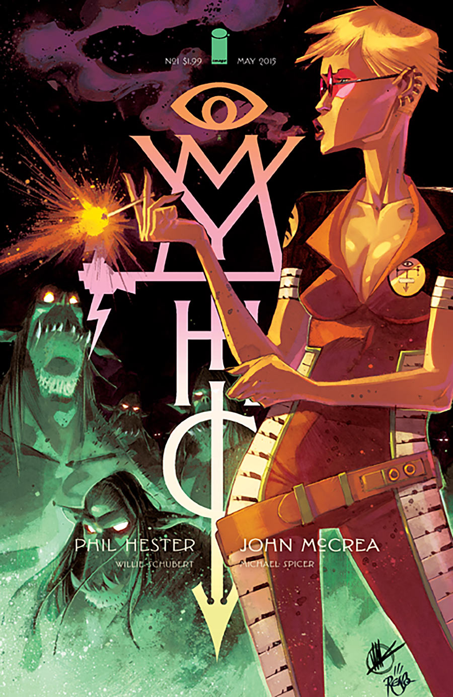
I enjoy this composition slightly more because it has a foreground figure overlapping the logo, creating a dynamic sense of depth, and the vertical logo makes the vertical figure feel extra tall (at least to me). Again, if only it was readable.
I’ve included this one just as an example of the worst aspects of both of the above covers. An interesting full cover image, but it’s being drowned out by the logo clumsily stamped on top of it. At the same time, the colors chosen for both the art and the logo are causing the logo to recede somewhat, which would make it harder to read if it wasn’t already unreadable. The other two variants are pretty solid, though.
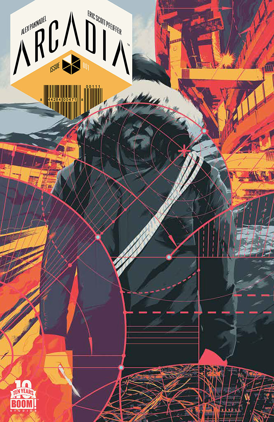
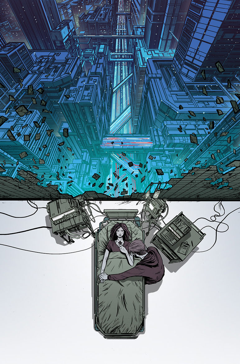
Arcadia #1 by Matt Taylor (above), Eric Scott Pfeiffer (below)
I absolutely love this logo box, and how it integrates the issue number and even the bar code into an interesting design. This logo is such a win (does anyone know who designed it?)
Unfortunately, the extra-busy cover art kind of clashes with the simple and stylish logo. Matt Taylor’s collage of lines worked really well last month with the lock theme of his Deep State cover, but here it seems like it’s more actively obscuring the art than just adding texture. And I feel like the the logo would work better with art that’s simpler and more open.
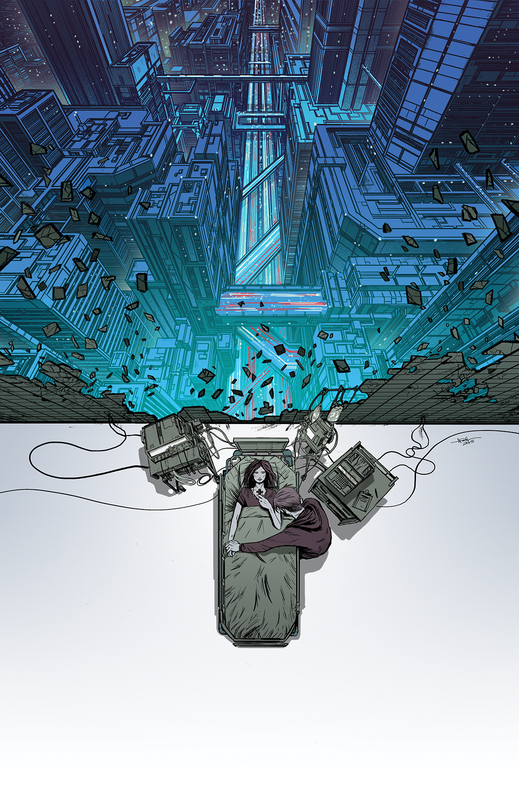
This is my favorite of the Arcadia variants, a rare example of a comic being printed without any text on the front cover. Which I’m a huge fan of, because it reminds me of the glory days of rock album cover design. Even better, the concept of this image even looks like something that might be photographed as a rock album cover.
My one problem with this design is that the space below the bed seems like its just screaming out for a logo or text of some sort. White space is great for leading the eye around, but this is a case where the art feels a little unbalanced, like it needs a thing under the bed to balance it out. In case I sound like a crazy person to some of you, here’s a quick rough example of how I might rebalance the image without adding text. all I did was “zoom in” on the bottom half of the image. Do you see what I mean about the balance working better?
Update: Eric Scott Pfeiffer mentioned on Twitter that he originally composed it with the intention of the logo being at the bottom, and was just as surprised as me to see it without text.
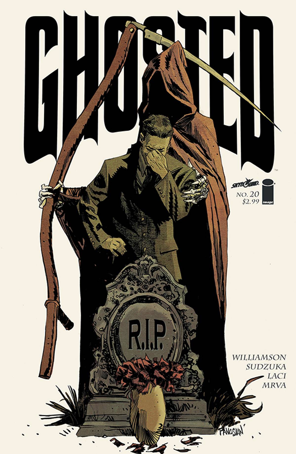
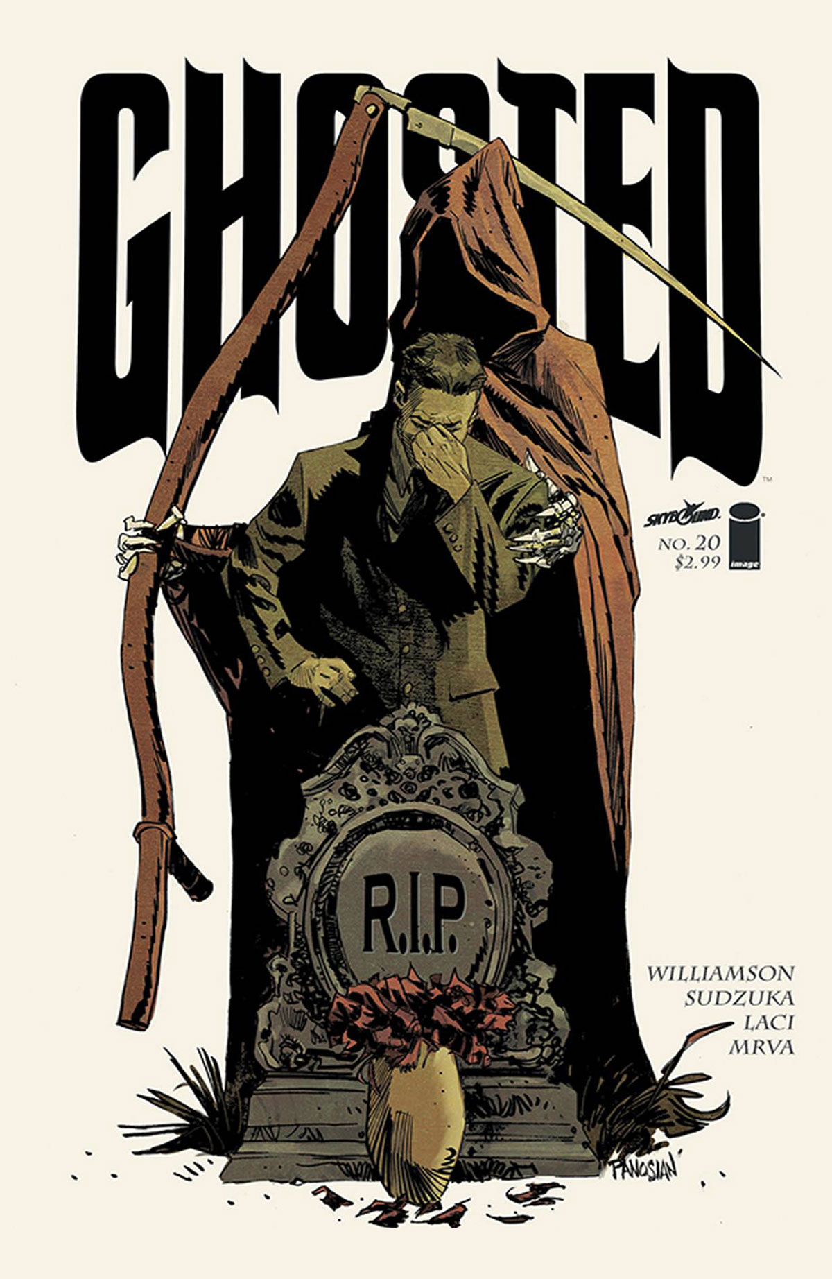
Ghosted #20 by Dan Panosian
Speaking of rock album covers, this looks so metal. Even the treatment of the logo would work for an album cover. “R.I.P,” the new album from Ghosted.
The one thing that bugs me a little is the flower petals touching the bottom of the frame. I kind of want just empty space all around the image so that you focus into the image and stay there, without being led out of the image through the bottom. Rough example — do you see what I mean?
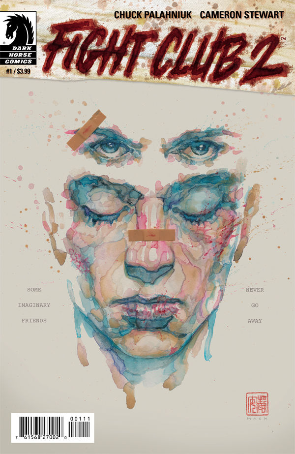
Fight Club 2 #1 by David Mack
I love the concept of this illustration, representing Tyler “waking up” while the narrator remains oblivious. I just wish the text around it had been placed better. ‘Some imaginary friends never go away” is a nice way to sum up the story, but its so hard to see here, it might as well not be there at all. And I’d rather the Fight Club 2 logo had been centered horizontally on the same background color as the illustration, rather than the so-so trade dress block that’s been designed.
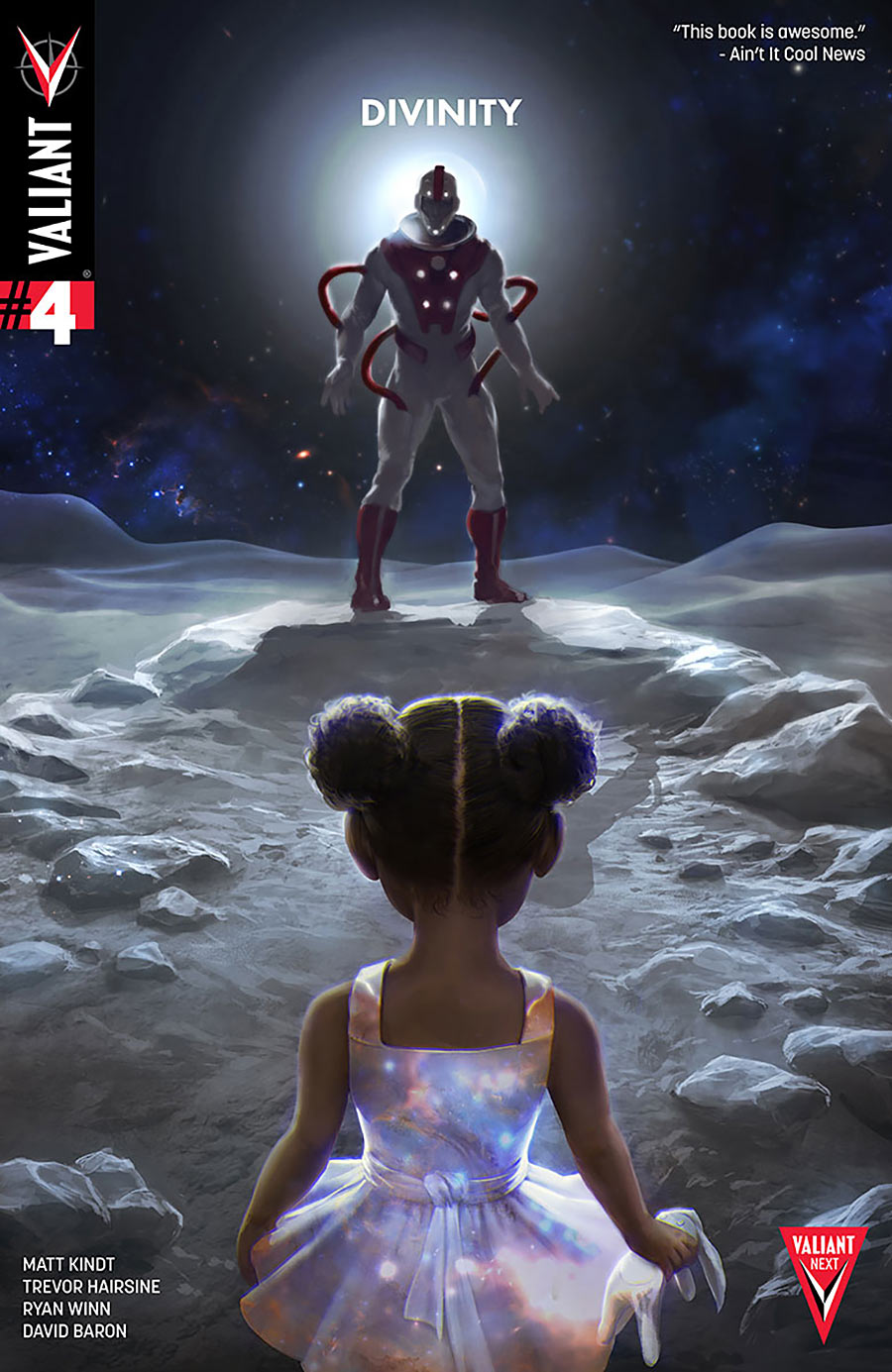
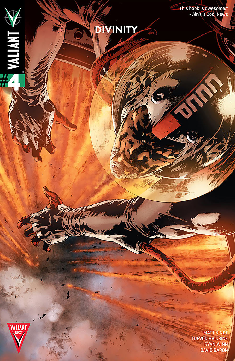
Divinity #4 by Jelena Kevic-Djurdjevic
This is a great example of an illustration where having a tiny minimalist logo really works. We’re focusing in on the distant character (with dramatic lighting behind him just to accentuate him that much more), and the logo is right there. Compare to this variant, where the logo placement just doesn’t work at all.
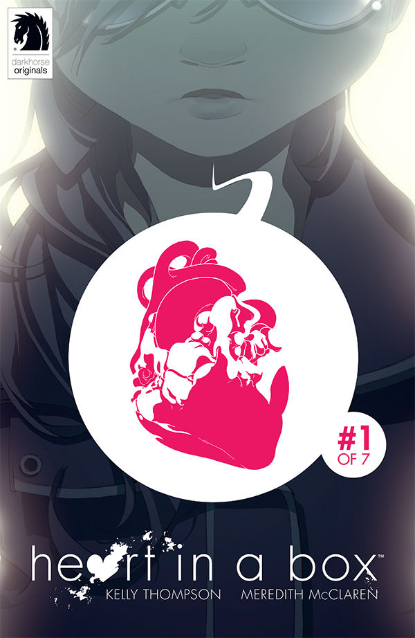
Heart In A Box #1 by Meredith McClaren
Wow, this is striking. The large field of white surrounded by darker colors draws our eye in, and the field in question is a word balloon with a character speaking…an image of a heart (plus the issue number). What does it mean? I don’t know, we should find out by reading it.
My one critique would be that the heart is so busy. The white areas had me wondering if something more was going on, like if it was being pulled apart or something? It would’ve been less confusing if all the pieces of the hard had been colored red, no white negative sections. Or maybe even simplified a little.
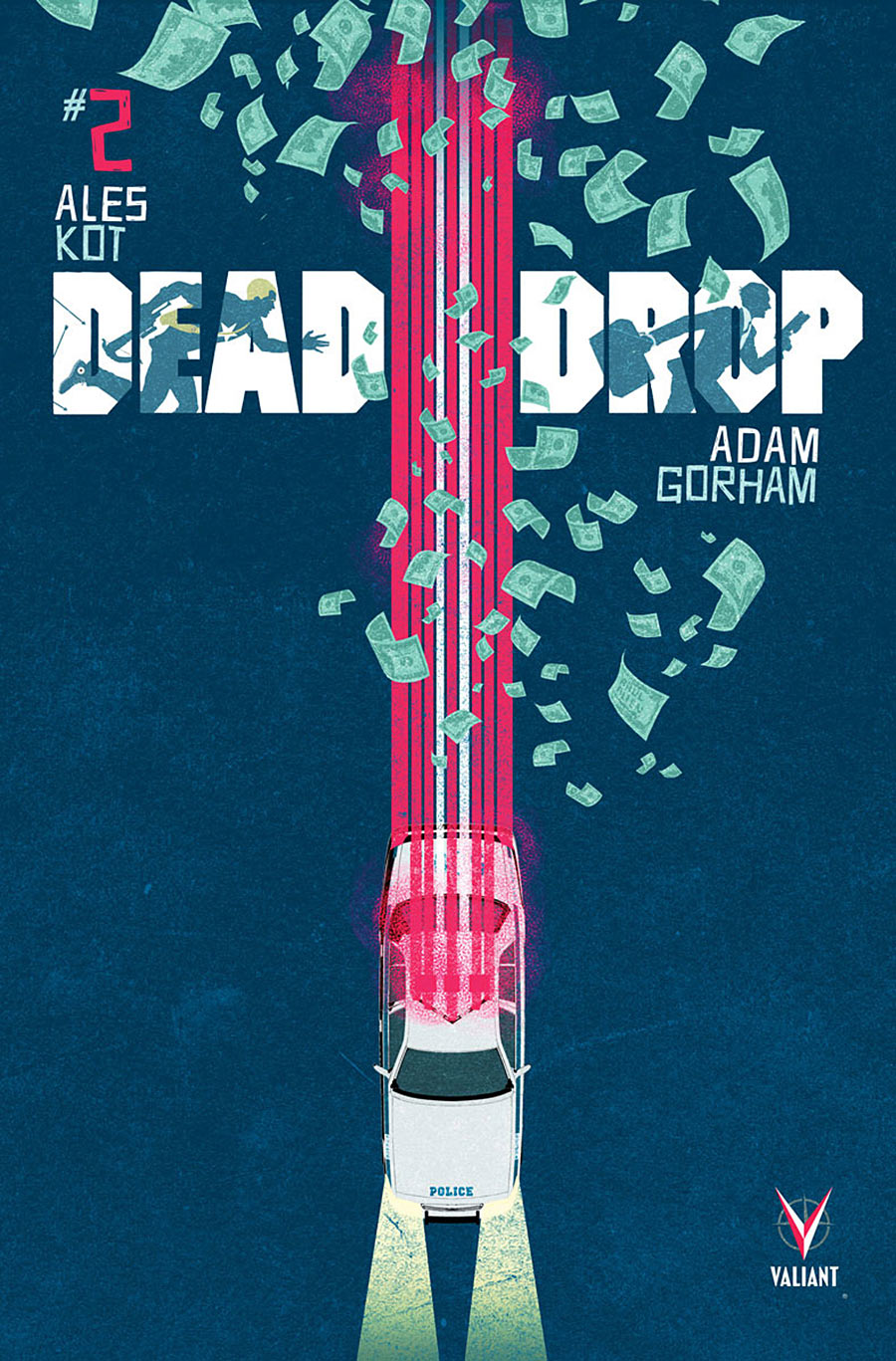
Dead Drop #2 by Raul Allen
This is the sort of cover I was saying would’ve worked better with that Arcadia logo. Simple and graphical. The speeding police car and the money flying away tells a slice of a story without even having to show us (presumably) the car being chased. There’s a great sense of movement, and yet the police car also feels like it’s a piece of the logo. Are the people running inside the logo necessary? Not at all, but they don’t hurt it, either.
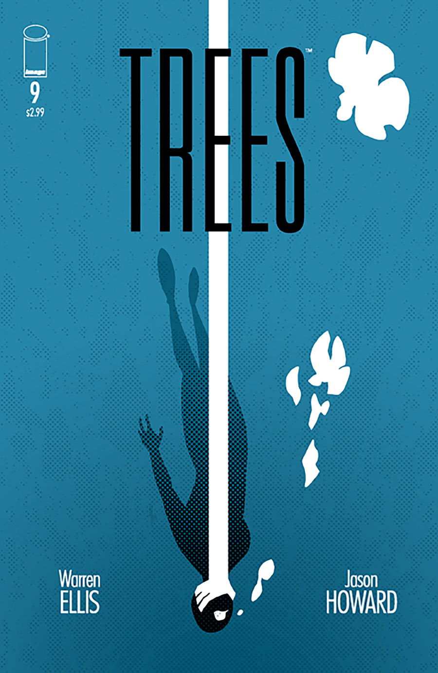
Trees #9 by Jason Howard
It’s a little mean for me to put this cover right after the last one, but I wanted to show how they coincidentally had a similar layout and similar movement in the same month of comics. But instead of a dramatic chase, this one conveys the feeling of being drowned.
The main problem with it (other than being placed right below Dead Drop, which looks a little more refined as an illustration) is that the bubbles floating upward don’t look much like bubbles. I wondered briefly if the bubbles were maybe transforming. Imagine if the one up top looked like a butterfly escaping, and what that might symbolize. But it’s not, it’s a sloppy group of bubbles.
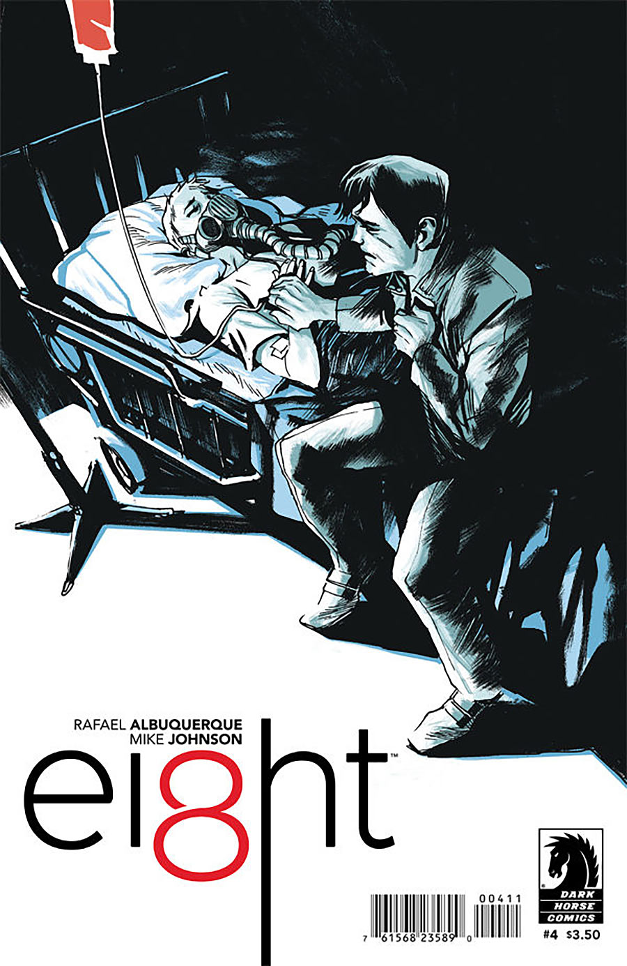
Ei8ht #4 by Rafael Albuquerque
I think this is the most successful Ei8ht cover yet in terms of the balance of space around the logo and how it relates to the main image. It’s also a nice contrast to go from the previous action images on a diagonal to a quiet, sad image on a diagonal. The large amount of black also helps a lot. The added contrast puts more focus on the white areas, which smartly includes the character on the bed.
Kate Willaert is a graphic designer for Shirts.com. You can find her her art on Tumblr and her thoughts @KateWillaert. Notice any spelling errors? Leave a comment below.


That Arcadia variant does look better balanced that way, yes, but I wonder if the imbalance wasn’t the point. It’s difficult to believe it wasn’t deliberate.
For me, it works this way. The white space on the bottom and the space on the top are at least roughly balanced. It gives the sense of alternatives, possibly choices being made. The position of the figures in the white space is imbalanced; they’re pushed towards the top. It gives a sense of movement, and it’s unsettling, precisely because the amount of white space below the figures doesn’t seem neatly calculated. You get uneasy with it, thinking something’s missing or out of place.
The rest of the picture adds to that sense that things are going out of control. It’s literally disorienting — it’s being made ambiguous what’s horizontal and what’s vertical. Since the figures in the white space are pushed towards the top, they seem to be rising. There’s a vanishing point in the top space right in line with the bed, as if the woman was heading upward. But that part of the picture is actually a street, so it’s horizontal, not vertical — the woman in the bed is moving forward. Similarly, what looks like a ceiling is actually a wall. And what’s she moving towards? A fall, it looks like. Pieces of the wall are tumbling down, and the piece of equipment on the left looks about to tip over. Is she ascending, or is she just breaking through the side of the hospital room and headed for the street?
I don’t know what Arcadia’s about, so this may or may not fit with the story, but the cover gives me a strong sense of a huge risk being taken. Sort of like Icarus flying too close to the sun and falling when his wings melt. It isn’t entirely clear, but given the size and and posture of the man, as if he were pushing the bed forward, and the somewhat phallic composition, it looks like male hubris, or desperation, anyway. There seems to be the potential for disaster, or transcendence, or both.
Looking at the original and the modified version, the trimmed version feels more balanced and solid. But the whole point of the original, I think, was to imply that solidity in order to depart from it. (It can’t be an accident that the picture is so statically perfect if you make that one modification.) The imbalance was supposed to bother you, the way a deliberate discord in one of Haydn’s string quartets does. The balanced version just kind of sits there, while the original version tells a story and makes you feel something.
I enjoyed your interpretation, though I have to disagree with your last sentence. When the bed is rooted more towards the bottom, it shoots my eye up past her head and into that awesome background. When the bed has that overwhelming empty space underneath, the bed shoots my eye downward and out of the cover (which is why it feels like it needs some text to stop me from leaving).
Update: Eric Scott Pfeiffer mentioned on Twitter that he originally composed it with the intention of the logo being at the bottom, and was just as surprised as me to see it without text.
https://twitter.com/Eric_S_Pfeiffer/status/616112827632361472
https://twitter.com/Eric_S_Pfeiffer/status/616113145313144832
Comments are closed.