The column that judges a book by its cover, focusing on the month’s best-designed comic covers. For the month’s best-illustrated comic covers, see Best Comic Covers Ever (This Month).
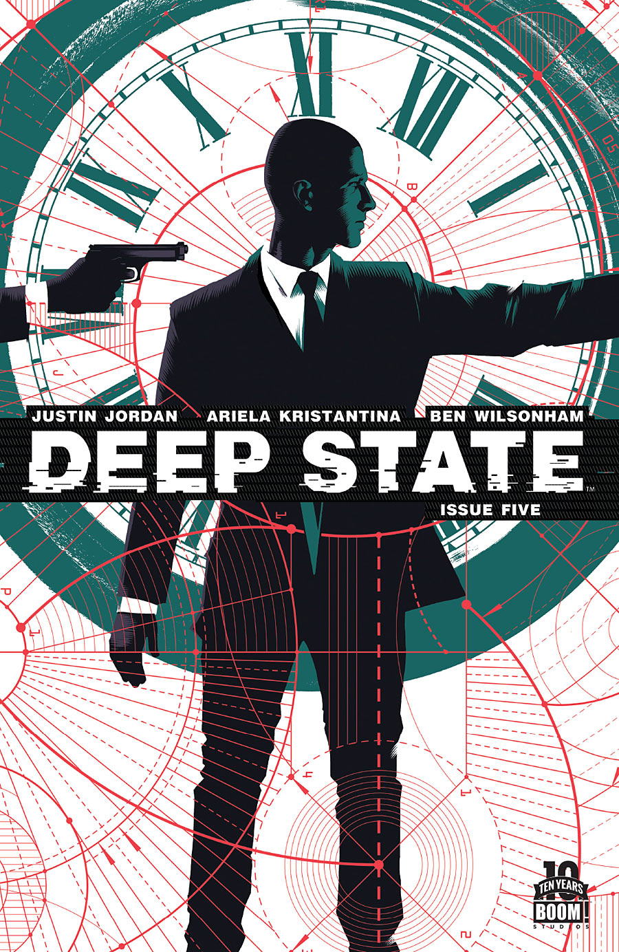
Deep State #5 by Matt Taylor
There are a lot of things working really well in this cover. The core image is very simple, while the complex red lines add texture. The color scheme is solid. But the thing that really grabs my interest is the realization that the gun to the back of his head looks like it could be his own, disappearing off to the side and coming out the other. Depending on how well the comic was trimmed at press, you could line them up side-by-side and create a repeating image (except for the texture that doesn’t quite match up). It’s a fun concept.
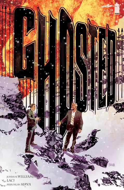
Ghosted #19 by Dan Panosian
I always enjoy seeing clever attempts at integrating the logo into the image. Filling most of the cover with the logo, dwarfing characters placed in front of it, gives the image an epic feel. Unfortunately, the other text elements seem like afterthoughts in comparison. Also, while I noticed right away that the logo was part of a fence, it took me awhile to realize that the “O” was a door opening.
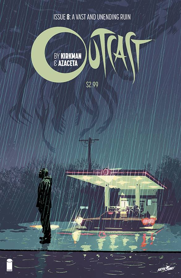
Outlast #8 by Paul Azaceta
I love the color palette of this image, except that the darkest black seems a little too loud. It could’ve been just a little more subtle. I love the mood of the cover, which reminds me a little of the indie game Kentucky Route Zero, but there’s something goofy happening with the perspective of the figure in relation to the background. He’s towering over that car. I like the placement of all the text elements, but every time I see the logo, I think it says “Outlast.”
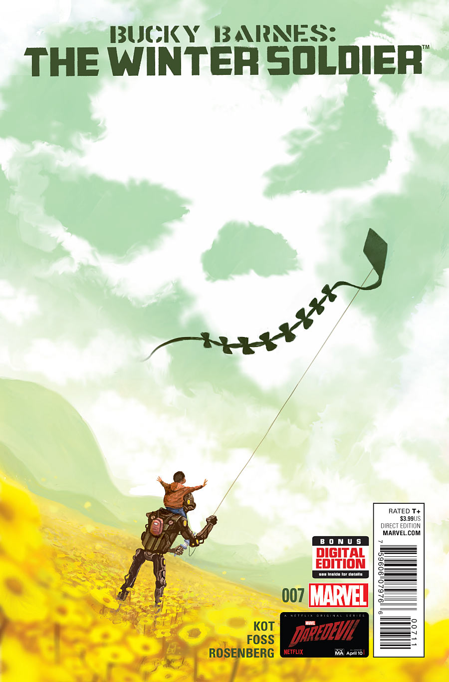
Bucky Barnes: The Winter Soldier #7 by Mike Del Mundo
The only problem with this cover is that it disappoints me by being for an issue of Bucky Barnes: The Winter Soldier, a series that is very clearly not about a boy flying a kite with his robot while death looms overhead. Unless I’m wrong, and the series has been transformed into a quirky indie book?
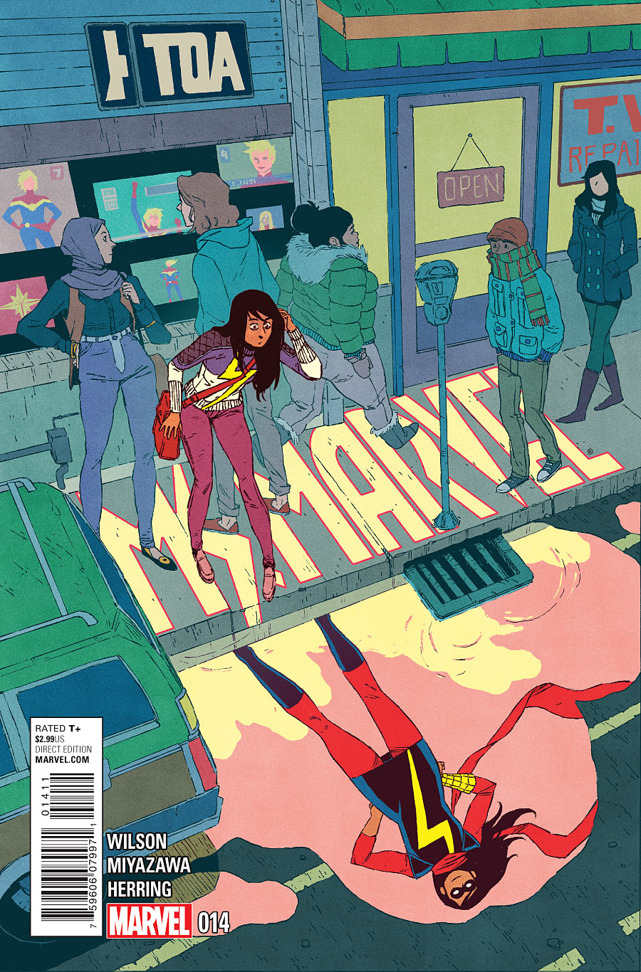
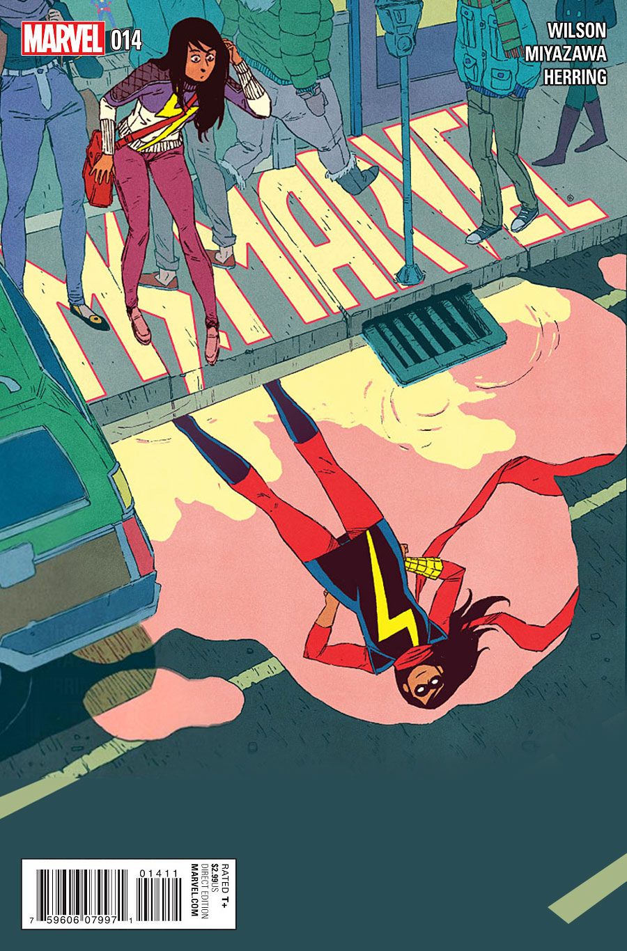
Ms. Marvel #14 by Jake Wyatt
I love the idea of integrating the logo in this way, but I think the composition would be much stronger if it was all moved up and to the left a little, kind of like this (please excuse the sloppiness of the edit).
Adventure Time #36 (2nd Printing) by Jay Shaw
This might be the most epic Adventure Time cover I’ve ever seen. Unfortunately, the text placement on the printed cover kinda screws it all up. It might’ve worked better to make the logo smaller and move it to the lower right corner above the barcode.
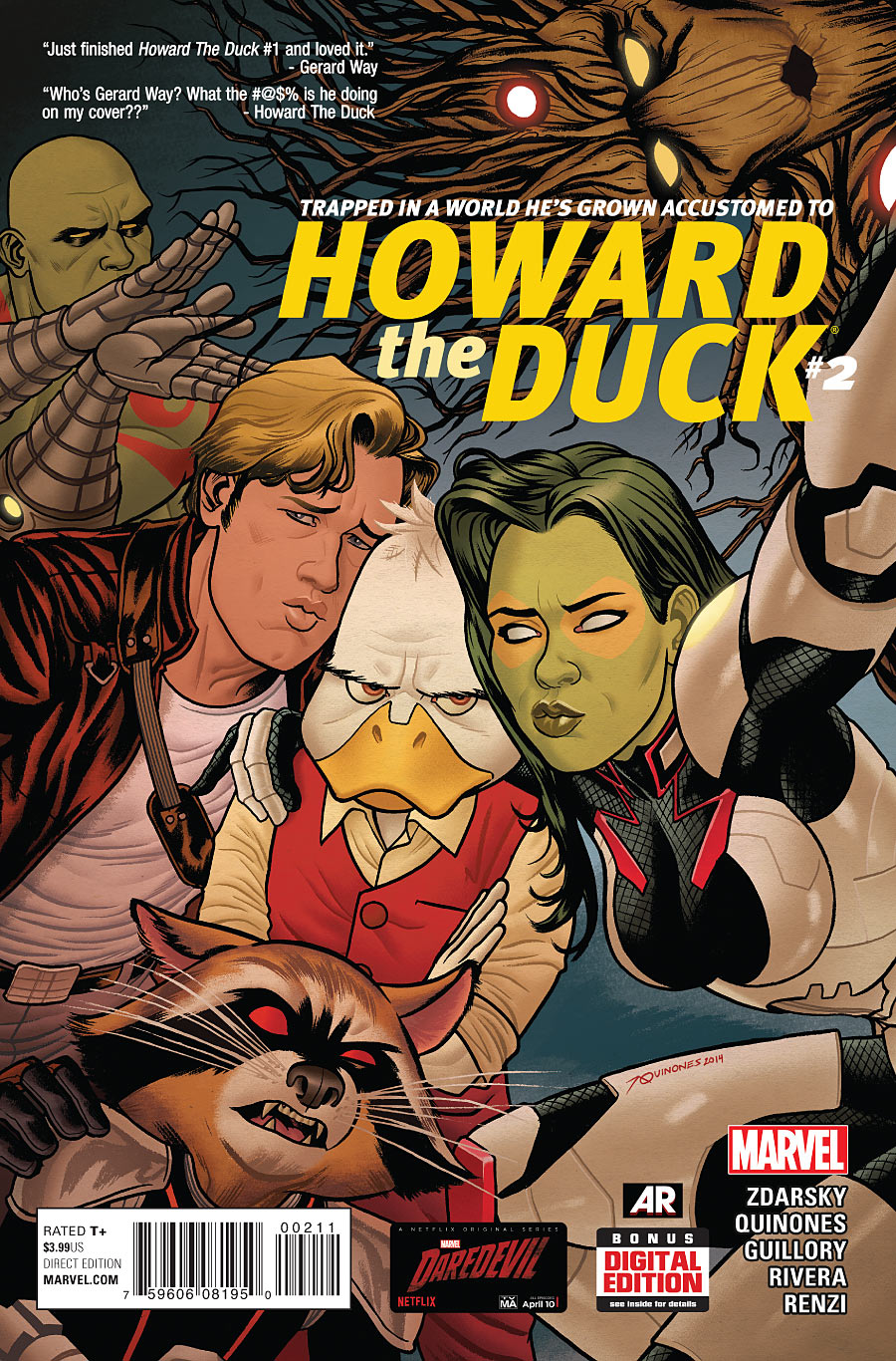
Howard The Duck #2 by Joe Quinones
The bottom is so cluttered with randomly placed elements, but the illustration made me smile, so it gets a free pass.
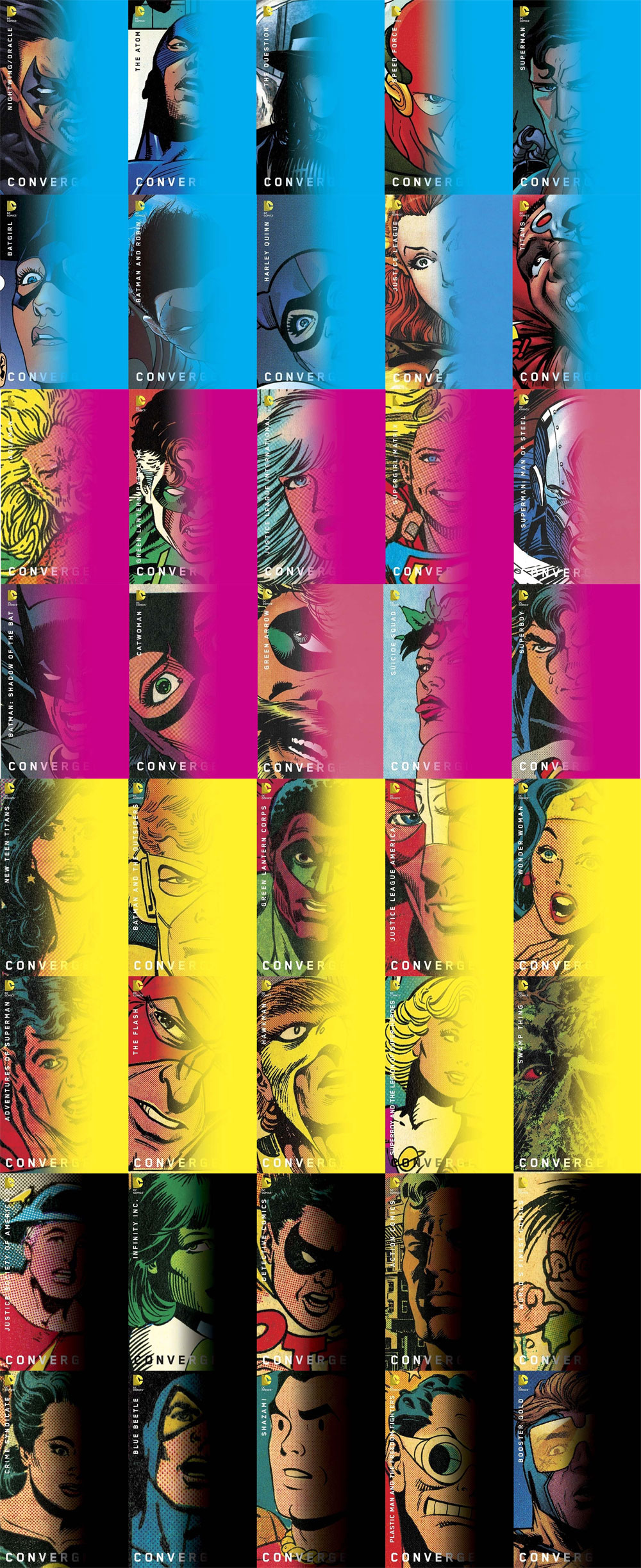
Convergence Variants by Chip Kidd
I was tempted to be a smart ass and just copy/paste the text from my very first column, where I talked about concept dilution. Instead, I’m going to be a smart ass by linking to that installment, so you can see just how similar these covers are to the original example I used.
Apologies to Chip Kidd — I do enjoy your work a great deal. :-)
Kate Willaert is a graphic designer for Shirts.com. You can find her her art on Tumblr and her thoughts @KateWillaert. Notice any spelling errors? Leave a comment below.


Do you like when things are quoted on the cover?
Really enjoy your column.
I hadn’t noticed the CMYK theme of the Kidd covers. Maybe if they had scattered a few of each color into every week?
I think quotes on the cover are as fine as any other element, the important thing is how well it’s placed. The All-New X-Factor covers did a good job with quotes.
Comments are closed.