
They say you shouldn’t judge a book by its cover, but that’s never stopped us. We can’t help it. If we could, publishers wouldn’t be hiring the industry’s top names to illustrate them. Covers are the first thing we see, and its important that they make a good first impression.
Every week I’ll select a few covers that I felt were particularly successful – and a few that were slightly less so – and try to explain why.
There’s a fair amount of personal taste involved, of course. Each of us has our own idea of what makes for a great image, but I think what makes for a strong cover can be boiled down to essentially three things:
1) It should stand out from the crowd and get your attention.
2) It should convey in a single image what the story is about, or at least give you a sense of the story’s general tone.
3) It should intrigue you enough that you want to know more.
A good cover can get away with two out of three, but one of those must include standing out from the crowd. Getting the viewer’s attention is by far the most important, since everything else is a wasted effort if you can’t get them to stop and look at the cover.
Fortunately, I have One Weird Trick that will almost guarantee that you’ll succeed in standing out from the crowd. Are you ready? It goes like this:
Look at all the books racked next to yours, and do anything but what they’re doing.
It sounds simple, but there are still plenty of books each month that have clearly been designed to look like something familiar rather than something different.
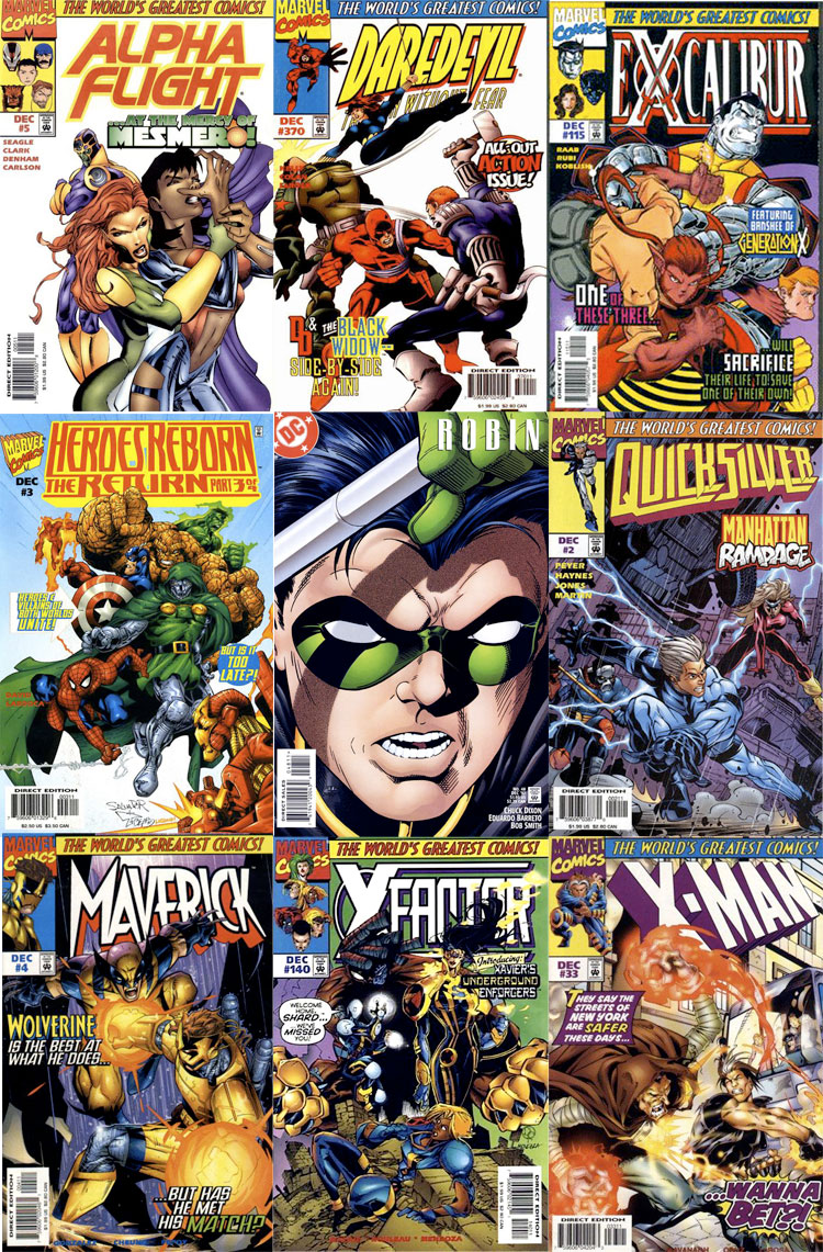
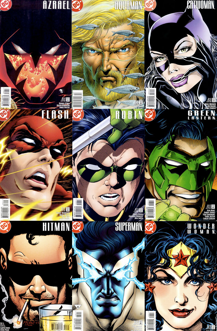
To demonstrate using an older example, let’s say most of the covers on the shelf are action shots of characters gritting their teeth at each other beneath colorful logos. Standing out could be as simple as using an extreme close-up and de-emphasized text that lets an iconic character’s face function as the logo.
However, you can easily undermine your efforts by creating covers for your entire line of books that are in the same style.
How much your design stands out is directly proportionate to how different it looks in comparison to what’s next to it. There might already be a name for this (and if you know it, let me know), but I’m going to call it “concept dilution.” (This rule can also apply to knock-offs, and even your own spin-offs.)
If your competitors like what you’re doing and start to imitate it, you’ll have to keep changing it up to stay one step ahead. You don’t become a trendsetter by being a trend follower.
Now let’s take a look at a few of last week’s books:
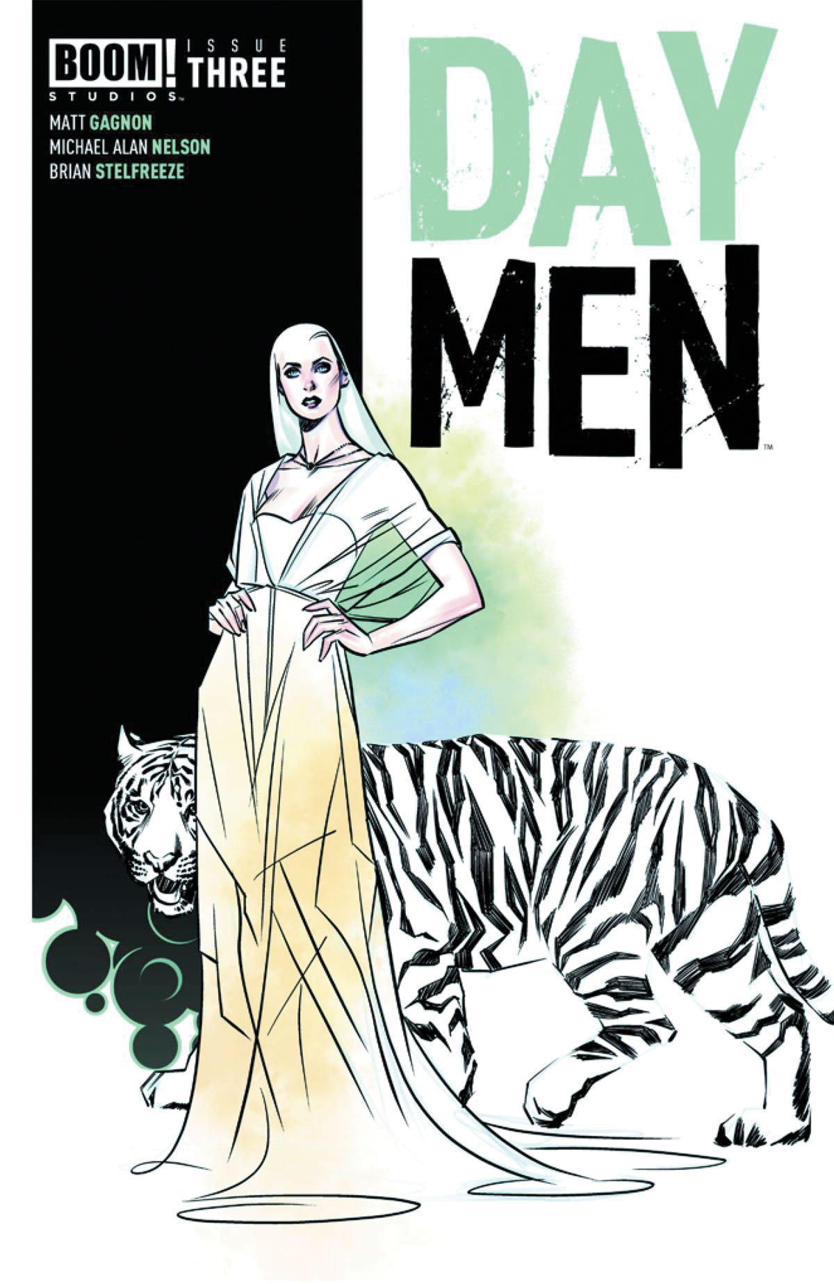
DAY MEN #3 (2nd Printing)
I love when shapes are allowed to blend into the background like the white areas of the tiger in this Brian Stelfreeze illustration. The black shapes hint at the tiger’s outline, and your brain completes the rest. Though I kind of wish the stripes had just been flat black shapes instead of filled with scratchy hatching. I’m a huge fan of hatching, but I’m not sure it really serves the image here. The restrained watercolor accents are a nice touch.
The black vertical bar on the left is a nice design element. It helps the characters pop out, and also gives the logo a nice space to live. Whereas title logos on may traditional comic covers appear just slightly off-center, this logo here is centered and contained within a designated white area, and the other information looks like it belongs in the black area.
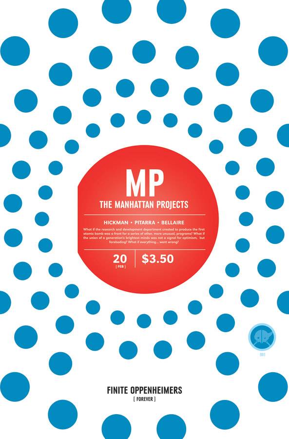
THE MANHATTAN PROJECTS #20
I’ve been really enjoying the covers for this series. Standard practice is to position the trade dress at top – or in rare cases at bottom – but Jonathan Hickman has designed this one to always appear dead-center, with different graphical design appearing around it. Also, I admit that at least part of my reason for liking it is that it reminds me of an LP label.
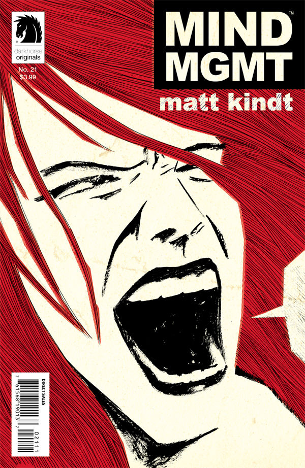
MIND MGMT #21
My first reaction to seeing this image was: “What’s up with that cropped-out word balloon? Is this a panel that was blown up to look pop art-esque? Or the character yelling because she can’t be heard?”
Intrigued, I dug further and discovered it’s a silent issue. Clever idea.
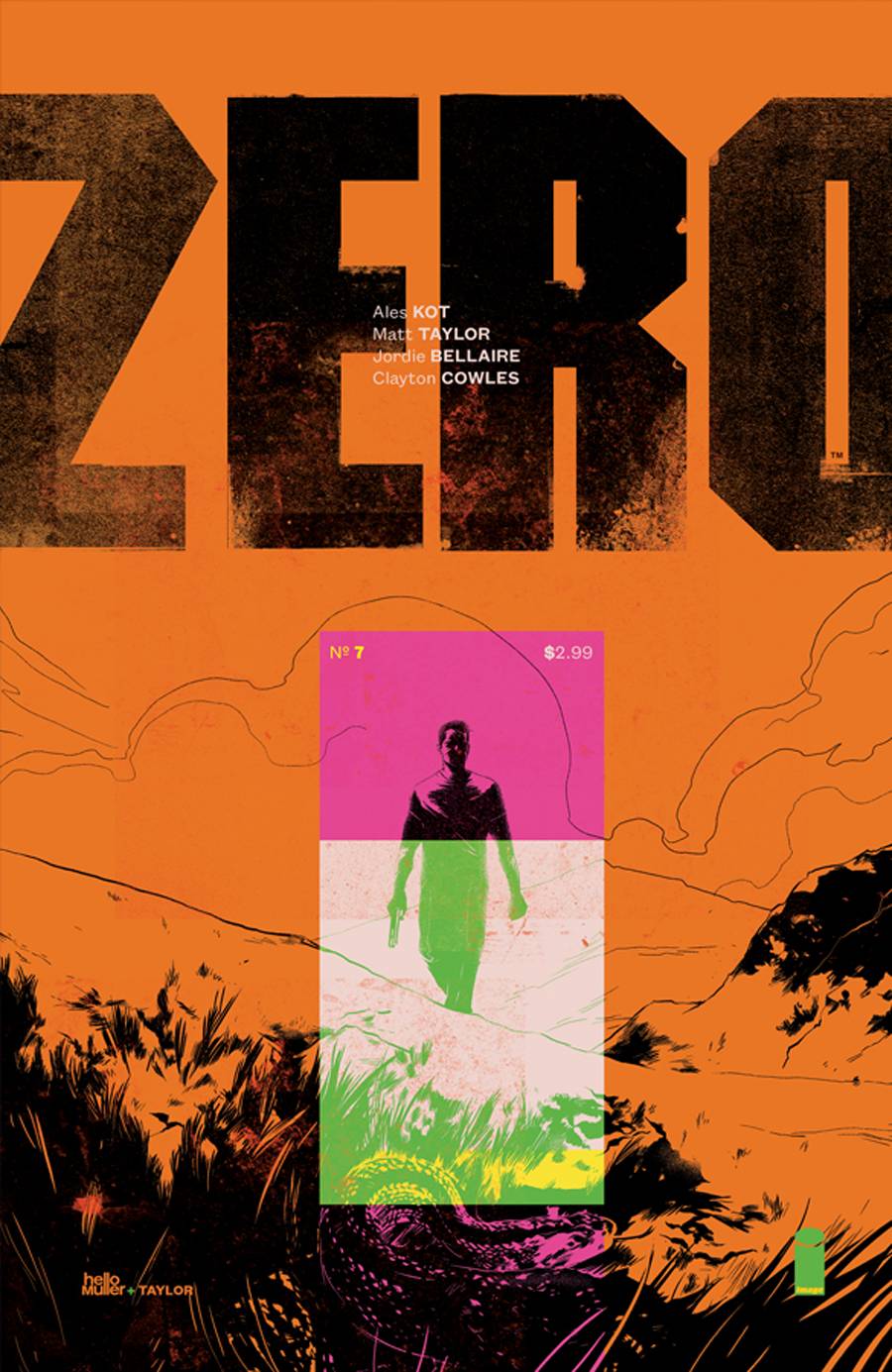
ZERO #7
Designer Tom Muller, with illustrator Matt Taylor) are doing things here that seem like they shouldn’t work…and yet they do. The colors look ugly, but ugly in a very striking, purposeful way. Usually that isn’t really my thing, but I love how it’s designed: the way the credits are placed at the center of the logo, the way the magenta box frames the character, the way the issue number and price fit into the corners of the magenta box… It’s a strange cover, but it has me curious to look into the series.
HONORABLE MENTIONS:
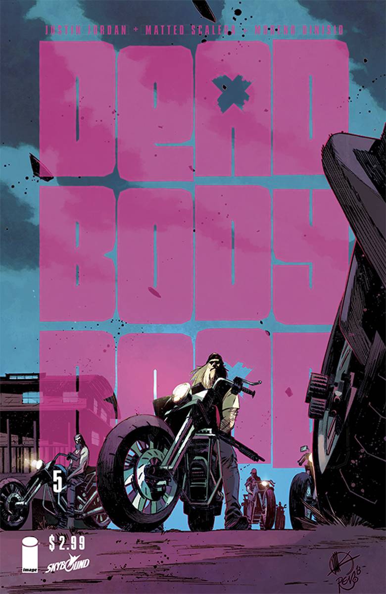
DEAD BODY ROAD #5
The giant logo definitely got my attention. I like the way Matteo Scalera has created depth by having the center biker overlaps the logo, but I think it was a mistake to also have objects overlap the “R” and “D.” Our brains can still read words that have the middle letters out of order or obscured as long as the first and last letter are visible, but I had to look up the name of this book because I couldn’t read that last word.
Also, the placement of the issue number seems kind of arbitrary and random, the way it’s just floating out there. But it was still a strong enough cover that I wanted to mention it.
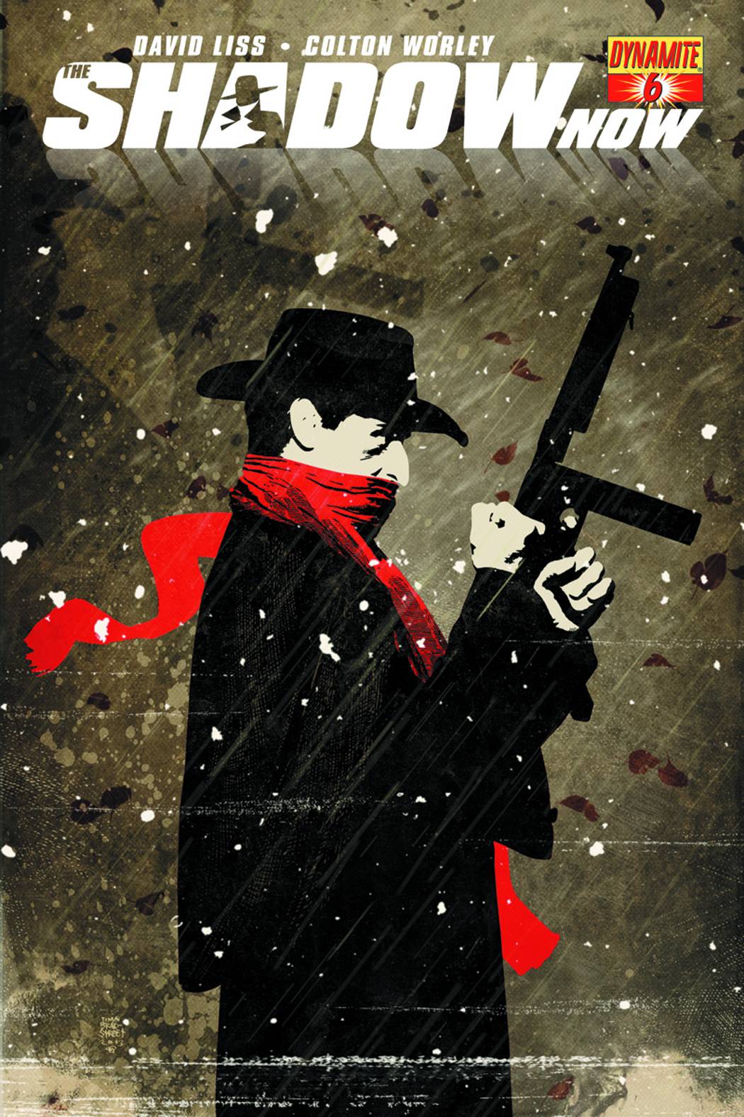
SHADOW NOW #6
This is such a fantastic illustration by Tim Bradstreet. I like the contrast of the flat colors on the character against the heavily textured background. The only thing that I think really hurts this cover is the bright yellow Dynamite logo. The stylish white letters of the title logo fit nicely, but the bright yellow box clashes with the tone of the image, and the playful font used for the issue number looks really out of place.
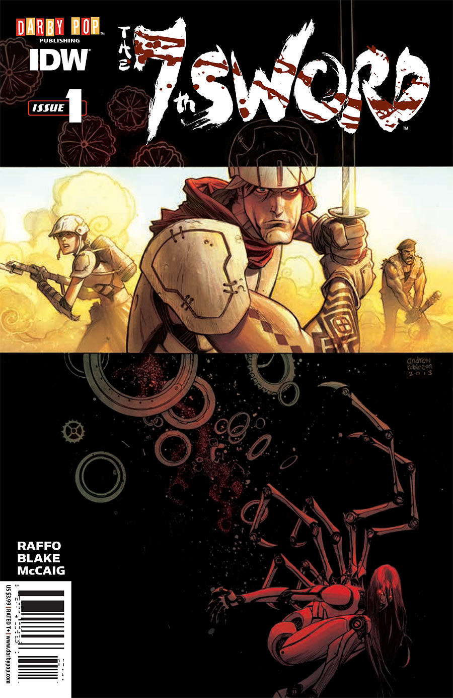
7TH SWORD #1
I like the way Andrew Robinson combines two different image planes on this cover. The wide image suggests that the story will have a cinematic feel, while the color scheme of darker image reminds me a little of Hellboy covers. I just wish the logo wasn’t pushed off-center, and that Darby Pop logo has similar tone issues as the Dynamite one.
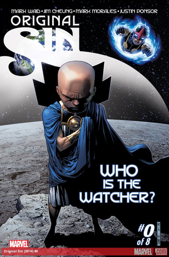
ORIGINAL SIN #0
I admit this cover mainly grabbed me because the white logo reminded me a little of a Cerebus cover. Am I the only one?
From a distance, the logo looked like it formed a moon or planet, which I thought was cool. Except he’s already on the moon, right? Upon closer inspection, you can clearly see stars through it, suggesting that it’s a force field? It’s a strong illustration by Jim Cheung, at any rate. I do wish the “Who Is The Watcher?” lettering was just a tad smaller, though.
That’s all for now. See you again next week (or sooner)!
Kate Willaert is a graphic designer for Shirts.com. You can find her her art on Tumblr and her thoughts @KateWillaert. Notice any spelling errors? Leave a comment below.


Love the new column! I hope it’s a regular feature. There are a few incorrect credits here though. Dead Body Road and 7th Sword covers are by Matteo Scalera and Andrew Robinson respectively.
The Original Sin cover isn’t Rivera (though he is awesome at covers). It’s Jim Cheung. Sig is in the lower right corner.
7th Sword cover is by Andrew Robinson, not Blake who is on interiors.
Thanks for the corrections. I guess it goes to show that I can’t just trust what it says in the solicits.
I kind of wish designers were credited more often, so I could give them a mention as well.
Wonderful new feature! Please keep this up!
Good cover design is an art in itself.
Good cover design amazes me. I totally suck at it.
I think Matt Kindt is the most interesting artist working today. He’s constantly taking chances and trying new things. The Mind MGMT covers have all been amazing.
Some great comments and observations about graphic design in comic covers. Looking forward to reading more!
Comments are closed.