
Among comics reprints there are few holy grails left. We’ve finally got Miracleman (and no one cares) we’re getting Master of Kung Fu, and now, perhaps the last great library. Via Dark Horse media partner Bleeding Cool comes word that DH has gained the rights to put out a “lavish series of hardcover volumes” reprinting “the library of Mœbius.” Terse but cherce. One imagines it will be similar to the Milo Manara library being reprinted currently.
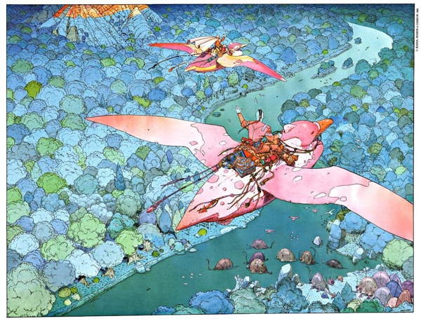
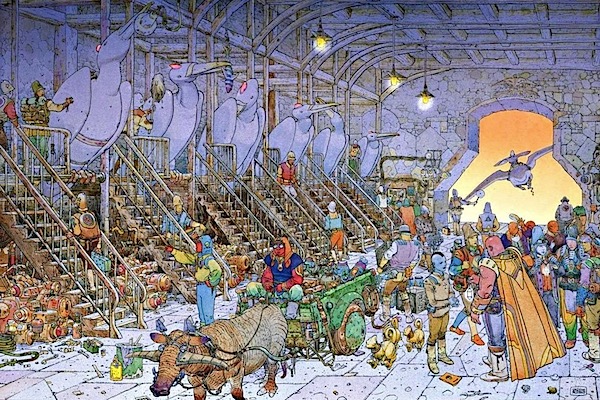
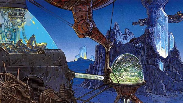
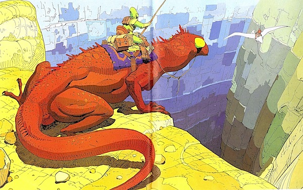
Mœbius, the pen name of Jean Giraud, is one of the all time top 20 cartoonists, at least in terms of influence. His dreamy fantasy worlds, all rendered in a meticulous fine line, display an imagination that ws never surpassed. While his writing wasn’t perhaps as insightful as some other comics greats, visually he’s sublime, and his work has had a mighty influence on all the modern SF comics you see coming out. Among his key works: Lieutenant Blueberry, a French cultural appropriation of American Westerns, Arzach, The Airtight Garage, and the Stan Lee penned Silver Surfer graphic novel that a crewman in Crimson Tide thought superior to Jack Kirby’s Silver Surfer. And dozens and dozens more. The announcement leaves the actual contents of the reprint series to our imagination…but we can imagine quite a bit.
The Mœbius library has been out of print for many years. Like, 20 years, although the Incal spinoff The Metabarons by Giminez has been in and out of print several times. The reason for this? Business affairs were run by Giraud’s second wife and she drives a very hard bargain. Many, many publishers have attempted and failed to negotiate a deal to bring his work back into print over the years, but Dark Horse seems to have struck gold, if this report is true. I’ll be very interested to hear what finally broke the dam.
ALSO, a plea. If you’re looking at the samples of Mœbius art in this post you have surely noted how amazing the coloring is. I am not an expert on who colored Mœbius (Frank Santoro! Brandon Graham! I summon thee!), but whoever it was, the coloring was utterly on fleek. The simple values, subtle gradations and basic but powerful use of complimentary colors are a master course. In fact William Stout, himself a great artist, has a fine post on the colors of Moebius right here. Dark Horse is too good a publisher to mess up these reprints with horrible “modern” coloring, which would be utterly antithetical to Giraud’s intent, but just in case anyone has any funny ideas, check out this post (if you dare) from 7 years ago where I reveal just how bad recolored Moebius can be.
Anyway, exciting news, and we look forward to more details!


I too cannot wait for Dark Horse’s recolor masters to turn another river with a bridge over it into a grass field.
I remember there were quite a few complaints about the coloring of the Manara volumes, specifically that some of them stripped out the coloring and published some of the works in b&w. This wasn’t clear from the initial solicitations.
I hope they can negotiate with the various entities like Humanoids and Marvel who own pieces of his work to allow for inclusion of the full Giraud spectrum.
Will we finally see a complete Blueberry?
If Moebius’s second wife drives that hard of a bargain to release the works in English… let’s hope she’s strict about keeping the art as it should be, and not “recoloured” to hell and back like Miracle Man
Dark Horse have just redone Geof Darrow’s Big Guy and Rusty with Dave Stewart on colours and to me the work suffers the same way Moebius’ did with the Beltran treatment though not to the same extent. So I’m hoping Stewart isn’t in charge if there’s a recolour (which hopefully there isn’t). One characteristic of Moebius’ work is his ability to convey layers of depth and he uses colour to emphasise that – to unify some elements and contrast them with others – not on a micro level but with consideration to the larger elements that make up the picture. The attempt to emphasise the sculpting of all forms just flattens everything into the same plane which is a little ironic. I think Darrow’s work has suffered in this way too. I don’t doubt that it can be done but I think that high contrast across the different elements at different depths has to be maintained and the gradations within must tend to remain subtle.
I had thought the Beltran recoloring of the Incal was done for the American market re-release but I noticed that ‘After the Incal’ which only has a very limited availability in English unlike the French editions has the same horrible colour treatment and I think this is partly why it’s seen as an inferior Moebius work. It was certainly done while he was ill (and if this is possible for Moebius – not entirely focused on the job) but I think the work is better than it is generally considered – I’d love to see it coloured properly.
Comments are closed.