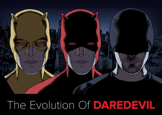
Speaking of Daredevil, infographic whiz Kate Willaert created this diagram of Matt Murdock throughout the years for Shirts.com
. It is a notable fact that while the Kirby/Ditko/Bullpen team generally hit a home run with all their character designs, the one that was a little squibbler straight to the pitcher was Daredevil’s red and yellow guise. Even in a “four-color”, one would long for a turn to the current grim and gritty basic black.
Plus, no codpieces.







As weird as it is to say, Daredevil didn’t change nearly as much over the years as I would have expected.
Brian,
No kidding, those three black outfits look almost exactly the same, give or take some loose fitting areas on the middle one. Hard to beat Wally Wood honestly.
It was too leathery, but the movie DD design is up there for me. I don’t see DD as superman, so I don’t like him having such a big logo on his uniform.
Gene Colan, DD’s artist from 1966 to 1973, regarded the costume as black, with red highlights. Whether it looked that way depended on who was inking on a given month.
Here’s a look back at that largely forgotten 1989 made-for-TV movie:
http://screencrush.com/daredevil-hulk-television-show/
In my opinion it changed a lot even if doesn’t feel so. I loved the TV series and hopefully they will renew daredevil for a third season.
Comments are closed.