
The column that judges a book by its cover, focusing on the month’s best-designed comic covers. For the month’s best-illustrated comic covers, see Best Comic Covers Ever (This Month).
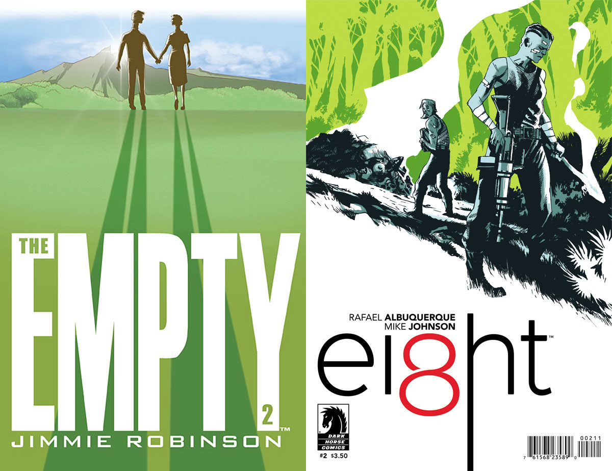
The Empty #2 by Jimmie Robinson & Ei8ht #2 by Rafael Albuquerque
Last month I featured the first issues of The Empty and Ei8ht, which both used warm/cool color schemes and had strong compositions. This month they’ve both stuck to very similar compositions as their previous issues, and have both switched to a green color scheme. I assume purely by coincidence, though one of you may want to check to see whether your office has been bugged.
When doing a series of monthly covers with a similar layout, changing the color like this is extremely important in order to avoid “did I already by this one?” syndrome. But even when changing up the colors and one area of the illustration, I would highly recommend only sticking to the layout for a single storyline at most, and then dramatically changing it up. This is a great way to signal that a new storyline, while visually tying together the individual issues within a storyline.
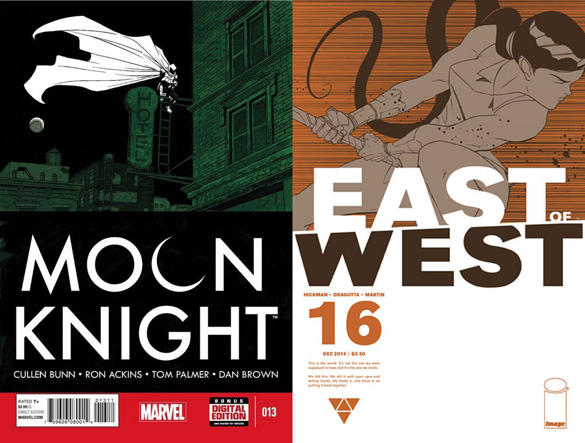
By contrast, if you stick to the same layout for a year or more, you increase the changes of “did I already by this one?” syndrome, not to mention readers potentially bored of looking at it. For instance, I love the cover design of Moon Knight and East Of West, but I loved them a lot more the first time I saw them, and a little less each time after. After a year of these, now I just want to see something — anything — else. That said, I probably get bored more quickly than the average reader.
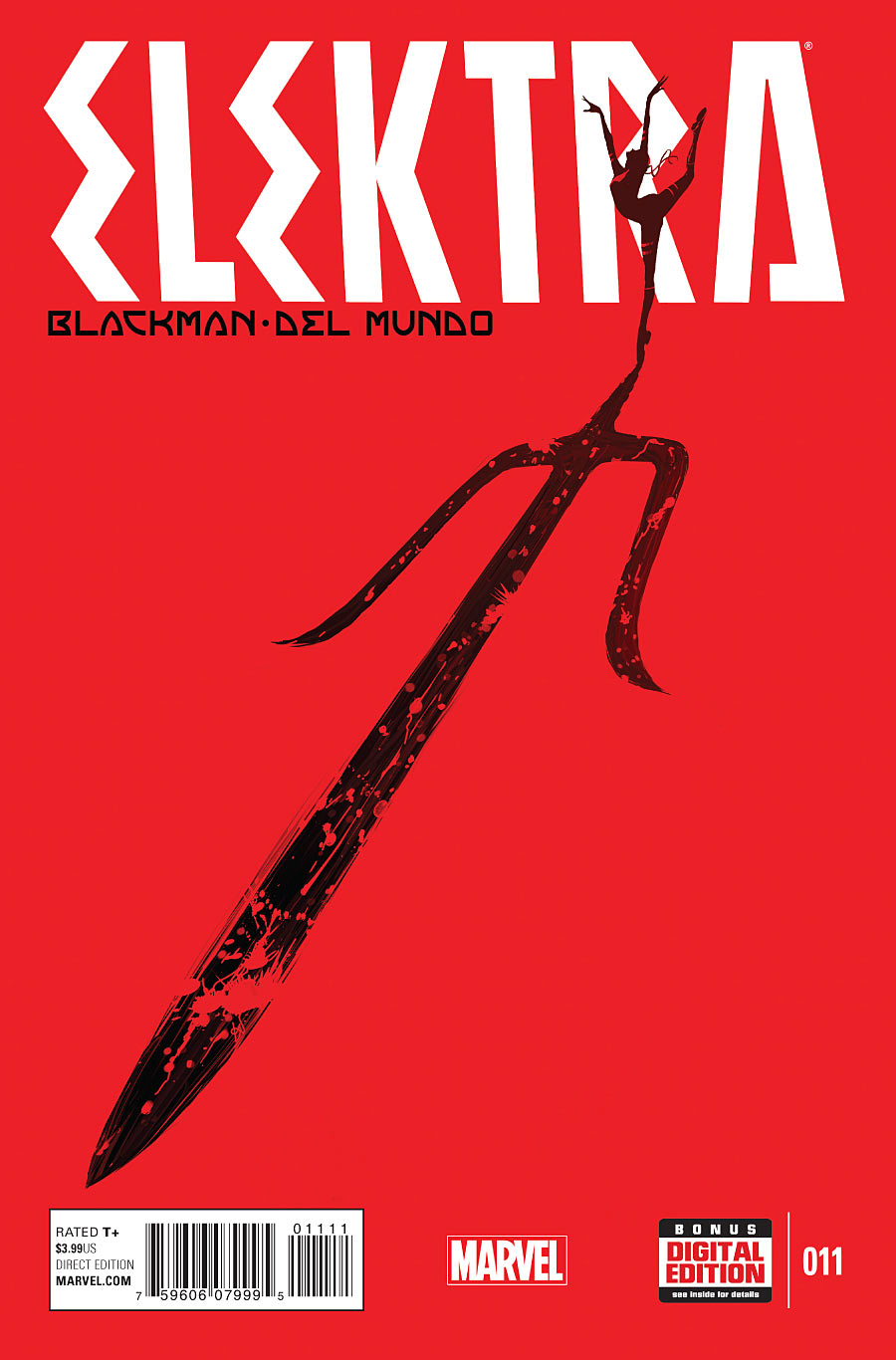
Elektra #11 by Mike Del Mundo
This might be my favorite Del Mundo cover yet. It’s just so bold and striking, achieving iconic simplicity and sticking with three colors. I like the way Elektra overlaps the logo, creating depth while also making the logo look huge in comparison.
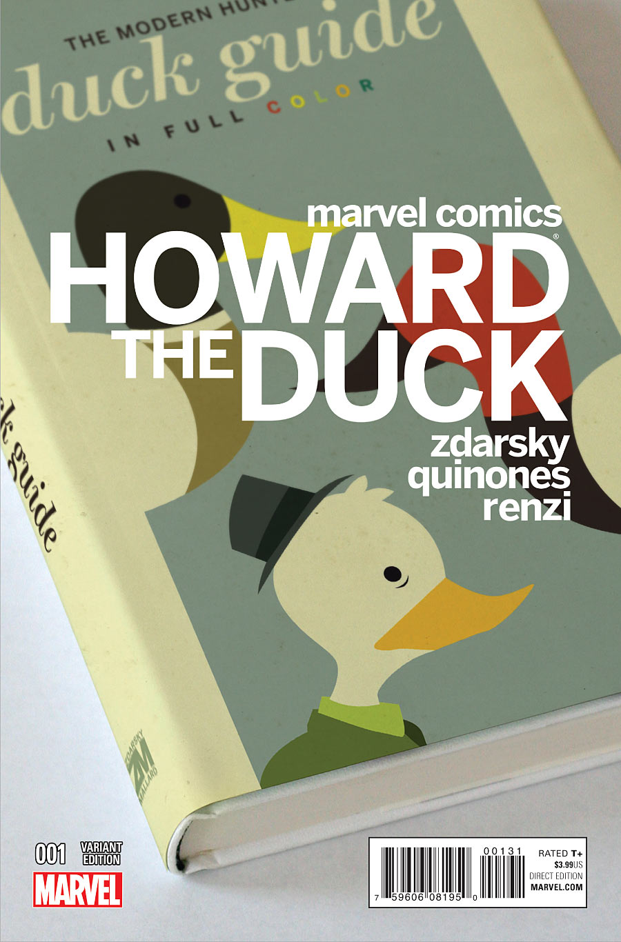
Howard The Duck #1 by Chip Zdarsky
I enjoy this cover for several reasons. There’s the dry humor, of course, but it also appeals to me because I’m drawn to comic covers that aren’t designed like comic covers. The right-aligned text is arranged very nicely, as opposed to a lot of Marvel variants that get creative with the logo placement but then throw the creator credits on in a way that looks random or arbitrary.
Also, notice that “001 Variant Edition” has been stacked on the Marvel logo to create a block, and the block is the same height as and lines up with the bar code. Arranging elements so they line up in a pleasing way is something I don’t see enough in comic cover design.
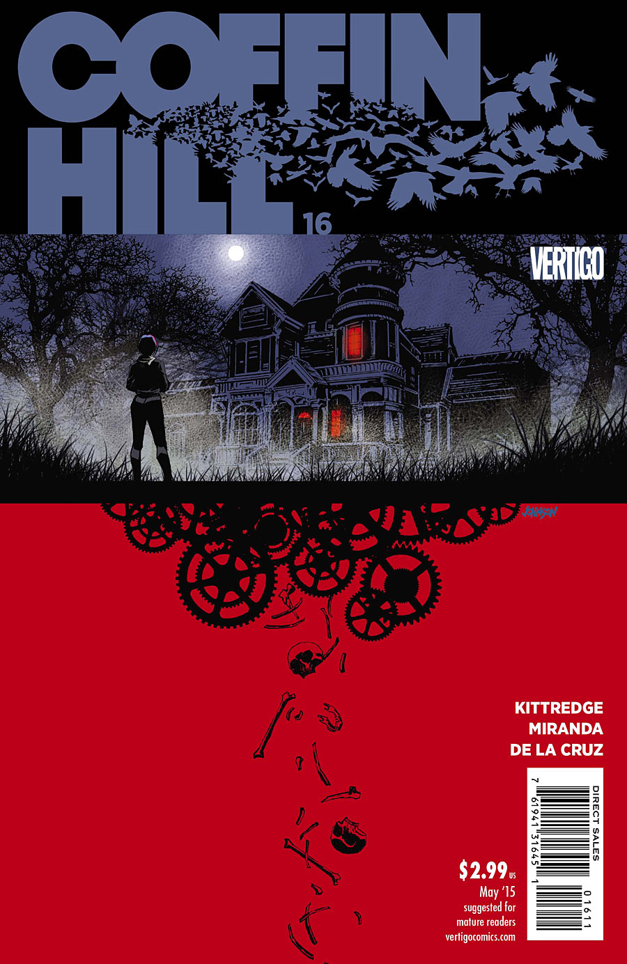
Coffin Hill #16 by Dave Johnson
Remember what I said just a moment ago about design/text elements not lining up in a pleasing way? Yeah. But let’s just pretend those aren’t there. The illustration itself is very nicely designed, looking sort of like Johnson’s take on what Robinson did with his covers for The 7th Sword. I like how the placement of the bottom image suggests that the house is machine churning through bodies. The bottom and top image are also connected by the red windows, which hint that the bottom image is a reflection of what’s inside. A nice touch.
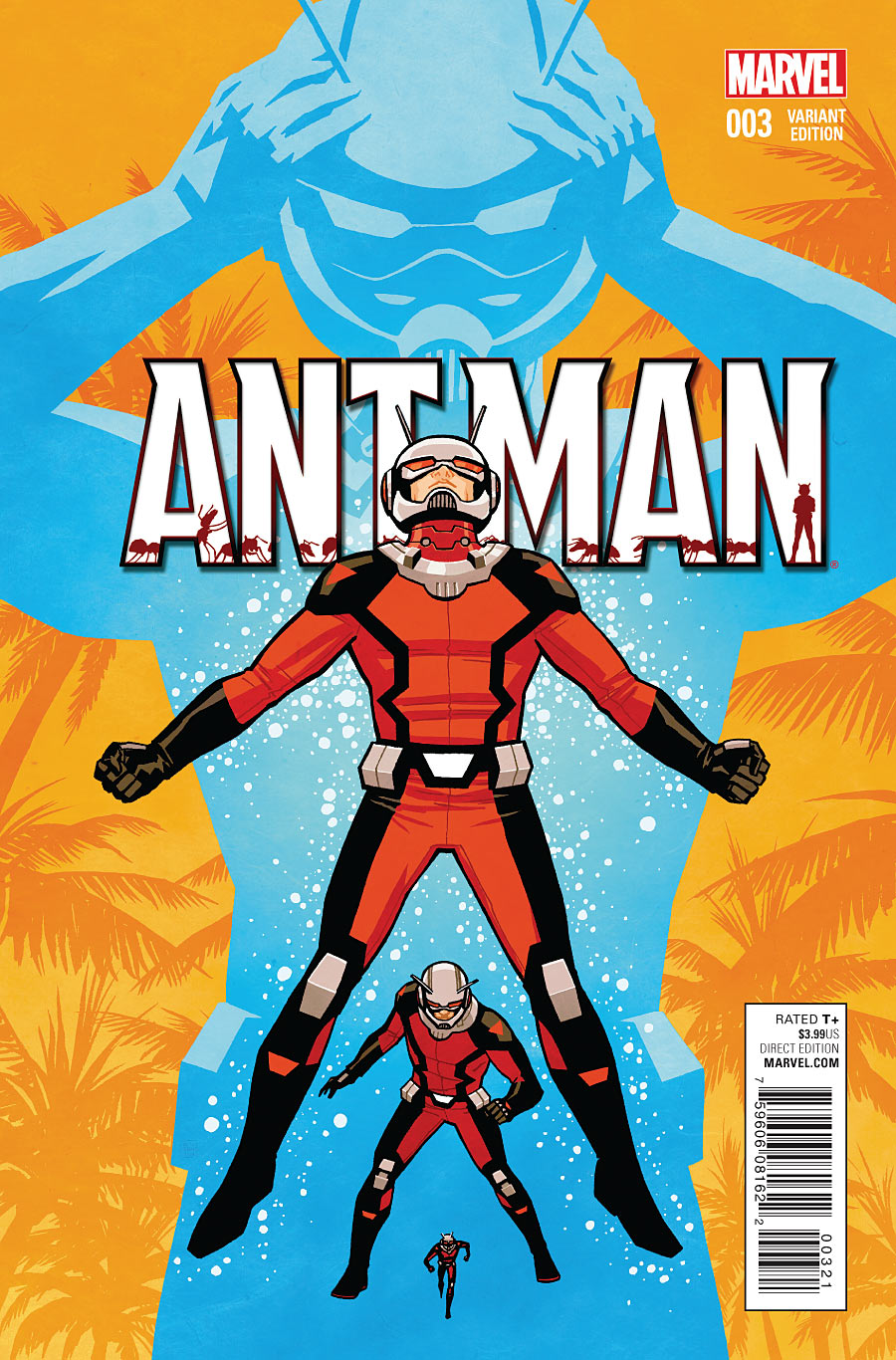
Ant-Man #3 by Cliff Chiang
I keep having to remind myself this is issue #3, but the image seems so iconic it looks like a first issue. It visually represents his power in a well designed way, and the colors push him forward. Really solid.
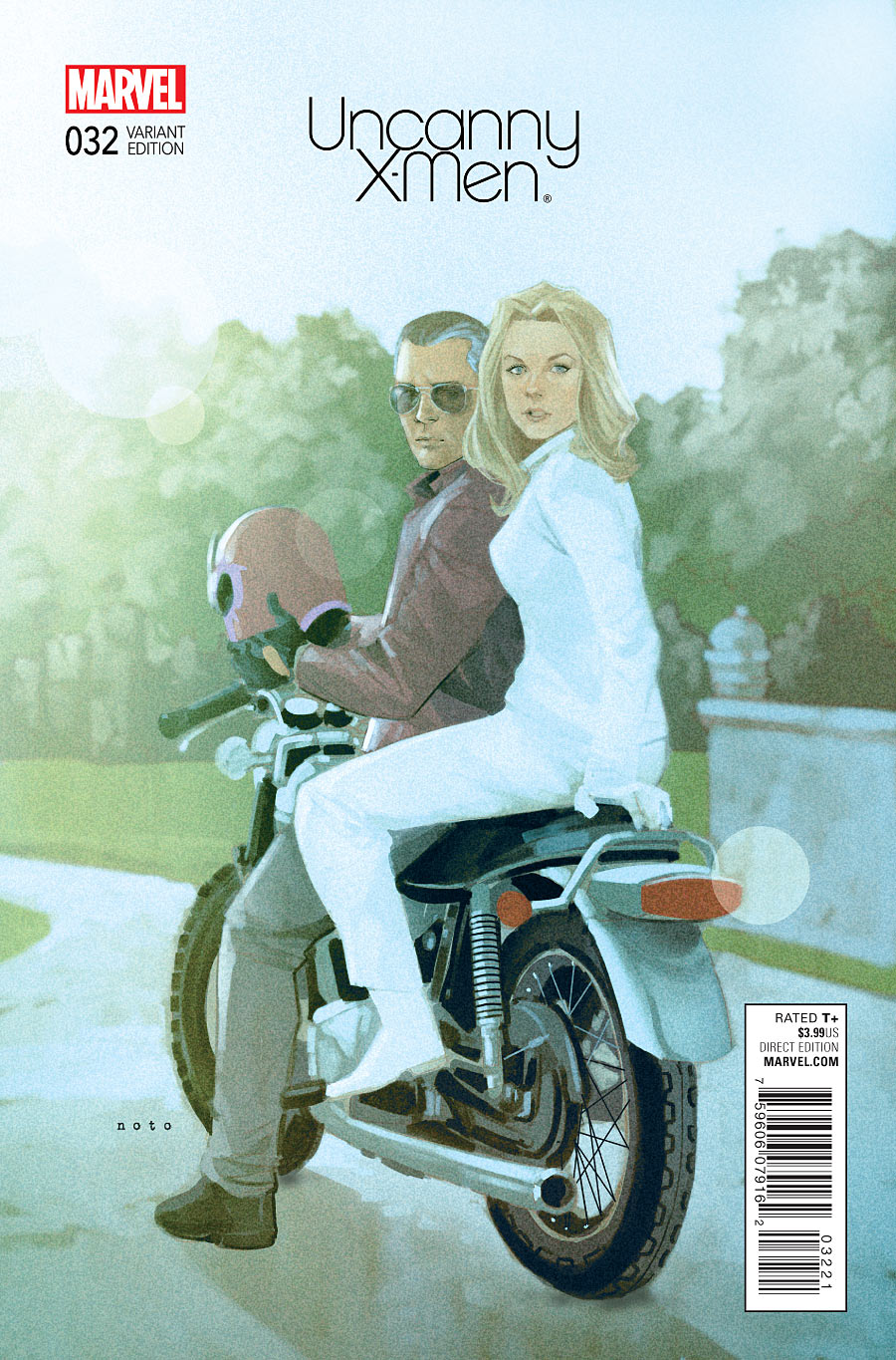
Uncanny X-Men #32 by Phil Noto
I think this is the last of the variants from Noto month? These covers were a breath of fresh air, looking so different from anything else out there.
If I had one complaint, it’s that the speed at which Noto no doubt had to pump these out resulted in some repetition in designs. For example, I got a little tired of seeing “the figure on the right is partially cropped and out of focus”:
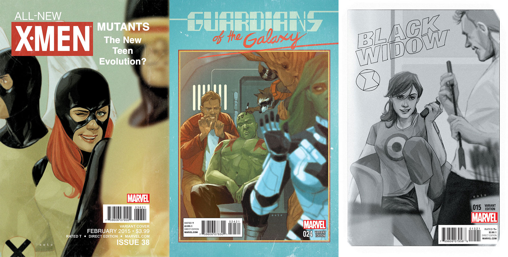
If I had a second complaint, it’s that too many of the covers reflected bad design from various eras rather than just sticking with good design from each.
That said, the Uncanny X-Men #32 cover above is one of my favorites, because the logo and its placement looks retro in a timeless way that would work as a permanent logo for the series.
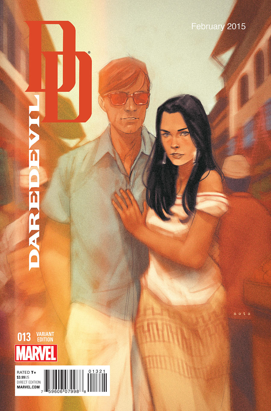
I also liked this Daredevil cover, because I think the “DD” in the corner (minus the word “Daredevil”) would work great as a modern logo for the series.
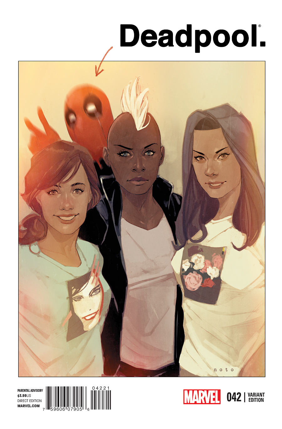
And there’s something about Deadpool’s logo being in plain black-on-white Helvetica that makes me laugh, but maybe I’m just odd.
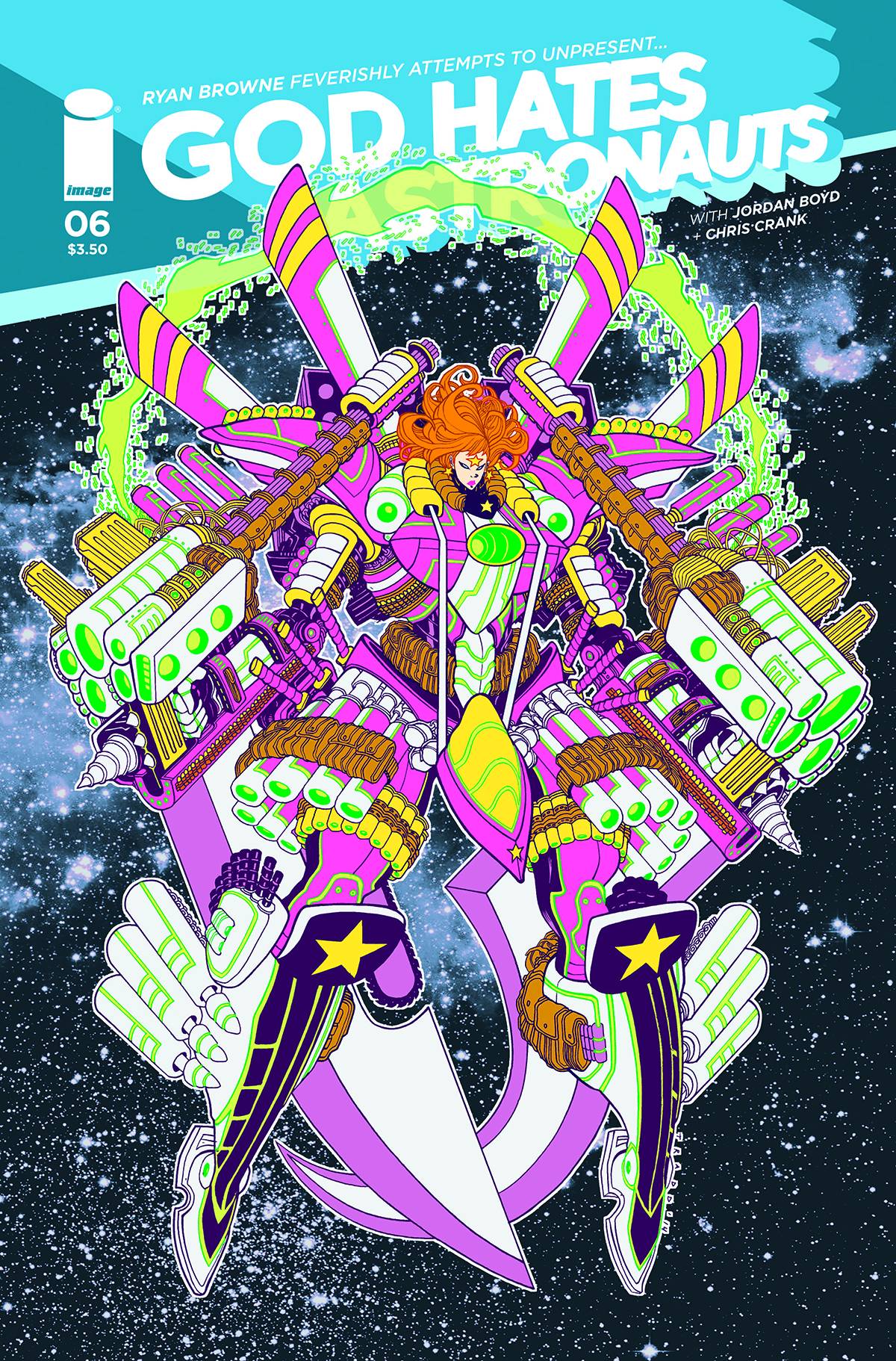
God Hates Astronauts #6 by Tradd Moore
Liefeld wept! This isn’t a Noto cover, but I had to save the best for last. I saw this, and my brain instantly overloaded. Even the guns have pouches! I just have no words. So I’ll end it here for now.
Kate Willaert is a graphic designer for Shirts.com. You can find her her art on Tumblr and her thoughts @KateWillaert. Notice any spelling errors? Leave a comment below.


Please, Mr. Moore, sell that GHA cover as a neon blacklight on black velvet poster!
If black velvet has been deemed carcinogenic, then a nice thick card stock would be nice, like those Jack Kirby fluorescent posters!
Comments are closed.