
I first noticed Jenny Frison’s work with the cover to Revival #1. While her painterly covers were very distinct from Mike Norton’s interiors, the two styles served the story well despite how different they were from each other, in fact, probably because of it. Image Comics ran a feature outlining her style and mindset creating covers. I was excited to learn even more about her artistic process and details on some of her many projects in our interview.
Who were some of your early artistic influences?
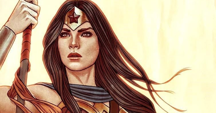
Many of my very first comic influences were all from Wonder Woman. Brian Bolland’s Wonder Woman #72 cover, Jose Luis Garcia-Lopez’s #128 cover, and Adam Hughes’ entire series of covers for Wonder Woman were huge influences. Later, James Jean sort of redefined my idea of what comic cover art could look like. It could be painterly, and conceptual. Outside of comics, I’ve always been inspired by the work of Alphonse Mucha, J.C. Leyendecker, N.C. Wyeth, Arthur Rackham, all the great illustrators.
Your work makes me think of Fables cover artist James Jean, especially when looking at the pencil version. Do you believe you two share similar sensibilities?
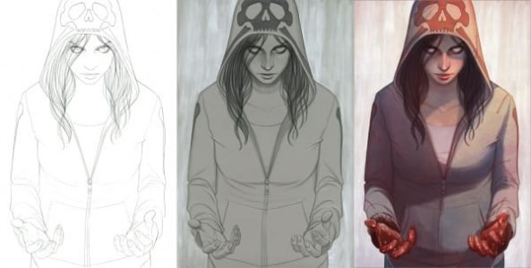
I’m not sure…He is certainly an inspiration of mine, especially when I first started working professionally. Often I find my line art becomes very stiff over the course of my process. I am always chasing that spontaneous quality his linework had, even though every part of my process is so deliberate. My process for creating a cover usually involves 4 separate steps:
First, the sketch. Nowadays, much of that is done on the computer. It’s usually not pretty but it helps to adjust and re-adjust layouts over and over quickly until I find what I’m looking for. By the time I move on to the next step, I usually have a detailed layout of exactly what I want the cover to be…and sometimes an idea of colors.
The second step is the linework. I print out my sketch in blue line on white paper and pencil over it. This step is really more like inking…I just use a pencil.
Next, I print out the linework on a grey toned paper and use graphite, copic marker, chalk, and acrylic paint to create a grey tone drawing. This is where I do all the shading and rendering. Because I have the linework separate, I am able to keep a dark line on top and color the greytones however I want easily.
The final step is layering them together in photoshop, and then coloring. The whole process is built for speed…comics have a very short turnaround time. And it allows me to be painterly and spontaneous when it benefits me and deliberate and meticulous when that benefits me. All within a couple days.
What’s your philosophy behind drawing covers?
I think my philosophy is more and more about creating a compelling image rather than telling some aspect of the story. As a cover artist, my job is really to get people to pick that book up rather than the hundreds of other comics on the shelf. I think the way to do that is to create an image that draws the viewer in…not one that tells you what will happen in the issue.
For me, that’s all about emotion and character. I always want the viewer to either know what the character is feeling (and maybe feel it themselves) when they look at the cover or want to know more about what that character is feeling. That reasoning definitely doesn’t work on all types of comics but I find I tend to seek out books that can accommodate that viewpoint. Variant covers are great for that.
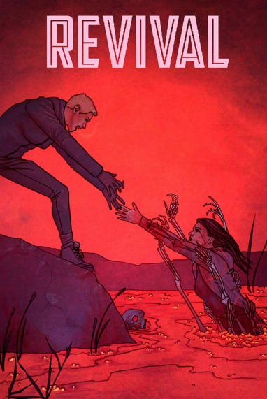
How did you grow over the course of drawing all 47 covers of Revival, both in the context of that series and in terms or your overall skills as an artist?
I feel like that philosophy of emotional focus was one of one of the strengths that I brought to Revival… but it was also a struggle because it was a sharp contrast to Norton’s and Tim’s ideas of what a cover should be. But one thing that really changed for me over the course of Revival was the way I did a sketch for a cover… which I think has strengthened me immensely.
I learned that sketches and concepts had to be disposable. I couldn’t be too precious about an idea because it might get totally shot down and I would have to start all over. Although, when I first started doing covers for that series, I got a lot more from Tim as far as what would happen in each issue. For the first several issues, I would receive a full script. As the book progressed, I would get less and less (the cover to a comic is often done before the script is written as it has to be completed in time for the solicitation catalog that retailers use to order their books…several months before the issue comes out).
I think, for me personally, that shows in the covers. But as the book progressed, I became better at creating an image from less… it was a big learning experience.
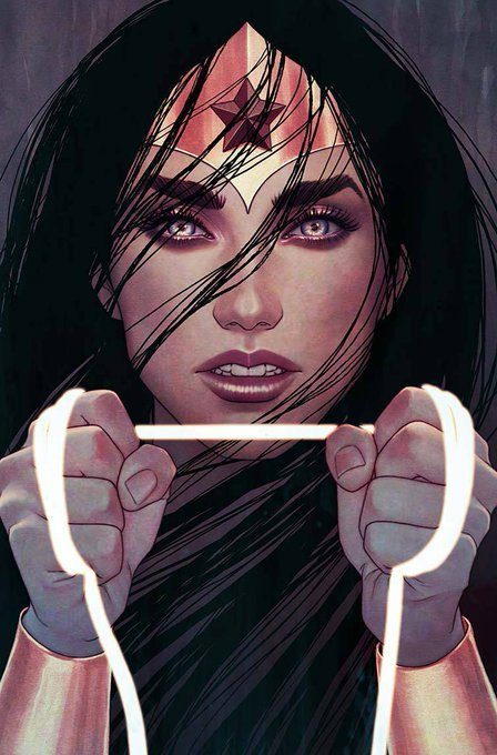
You started drawing Wonder Woman covers after the Frank Cho quit due to disagreements with Greg Rucka. Was there any hesitation to take over when there was a lot of contention in the air?
Actually, when I agreed to do covers for Wonder Woman, I had no idea there was any contention. All I was told was that Cho didn’t want to do them anymore. I even brought that up to my editor at the time… that I didn’t want to step on anyone’s toes and I was assured that wasn’t the case. I don’t think there is any bad blood between Frank and I (at least I hope there isn’t). I’m a big fan of his.
What does it mean to you to draw women powerful, sexy, but not exploitative?
Umm… I think for me, it’s all about focusing on what aspects of their nature I want to demonstrate. Red Sonja is fierce and dangerous. Wonder Woman is loyal and honorable and joyful. Vampirella just exudes sexuality but with a hint of sadness. And I always try to bring an amount of both strength and vulnerability to a character. All of those things are sexy on their own…the sexiness just happens naturally when you are drawing those things.
What goes into the decision to take on a new assignment? How much of it depends on the subject the material, the creators involved, the publisher, etc.?
It really varies book to book. I take all of those things into account after my schedule. But I would say as far as picking books to work on, especially with one-off variants, it’s mostly the character that I consider. I’m so much more likely to fit a book into my schedule if it’s a character I love. Although, it can be a big gamble working with a new publisher or editor because you don’t have any idea how the process will go so I love to work with people I’ve already worked with.
Are you interested in drawing comic interiors at some point?
Nope!
What’s going on in comics right now that’s exciting you?
Hmm…this isn’t really what you are asking but I just got back from C2E2 and am still pretty excited by the energy from that weekend. I don’t do very many shows and comics can be a very isolating job. When most of your interaction (or really, observation) with the comics community is online it can become exhausting and sad to love something so deeply and have it feel a bit…abusive?
But being at C2E2 last weekend was reinvigorating. Meeting new fans, new creators, seeing regulars and friends. It’s great to be reminded that there’s so much love and creativity and talent in this industry and medium. I feel revitalized.
You can follow Jenny on Instagram, DeviantArt, and at her website. Keep an eye out for her future cover work. It shouldn’t be difficult, her work is so striking that it easily stands out.
Matt Chats is an interview series featuring discussions with a creator or player in the comic book industry, diving deep into industry, process, and creative topics. Find its author, Matt O’Keefe, on Twitterand Tumblr. Email him with questions, comments, complaints, or whatever else is on your mind at [email protected].


I would have placed Frisson alongside her influences, in covers that stick out to me and that I like, so that’s about right
Comments are closed.