

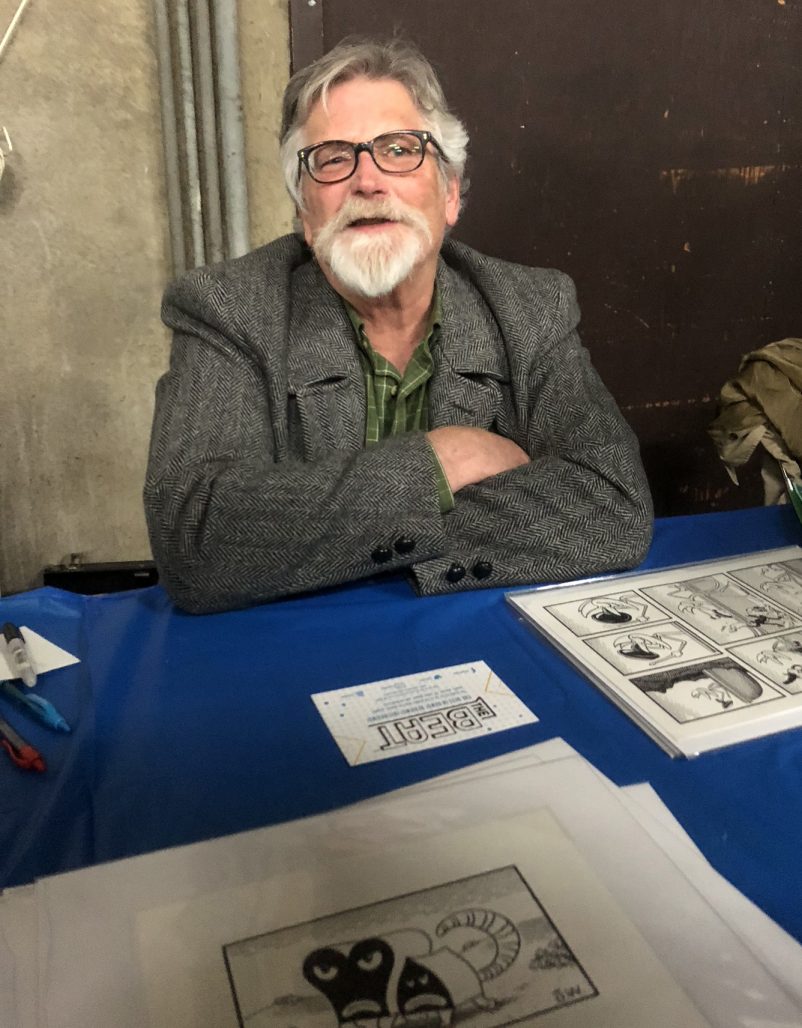
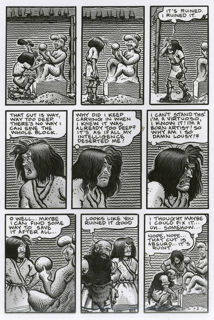
Jim Woodring’s new Fantagraphics book Poochytown is a tour de force of wordless storytelling. Woodring is one of our best cartoonists, but strangely, for a long time, the only comic I had of his was JIM v2 #1. That was because I particularly love “Quarry Story,” a strip based on a recurring dream the artist had, about one night in an apprentice’s life in a sort of medieval-ish sculpture studio. The protagonist is subject to the bizarre whims of a superior, the competitive impulses of his fellow apprentices and the consequences of his own bad decisions (in his case, being “beaten with iron bars”).
It points up one of Woodring’s strengths to me—that he hits mysterious chords in his readers that hide deep within themselves. As we scan his stories, we find ourselves seeking to make sense of the work by filtering it through our personal experiences; while we do this, we bond more strongly to it, we become involved in it, as opposed to being just passive spectators in thrall to the weirdness. Woodring’s abstract and surreal imagination tweaks us, as for instance the way that “Quarry Story” reminds me of the times that I myself spent laboring as a subordinate gremlin in the animation business. Other stories he’s done remind me of times I was ill with a fever as a child, or of psychedelic experiences I had years later.
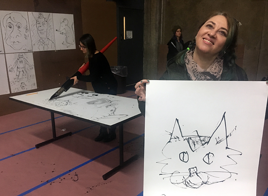
Woodring was a guest at Comic Arts Brooklyn a few weeks ago, and there, many participants took turns wrestling with Woodring’s humungous nibbed pen to do drawings. I even spied The Comics Beat editor Heidi MacDonald giving it a go:
I waited until there was a lull in the line of people waiting for Woodring to sign Poochytown at his table, and then I approached the cartoonist to ask him about his time working as a colleague of the great Jack Kirby at Ruby-Spears animation studios during the early-mid-1980s. I wanted to know if he had actually collaborated with Kirby on the large presentation comp pieces drawn to visualize the company’s animated TV show concepts. Heidi overheard this exchange and suggested that I interview Woodring for The Beat, so here we are.
This interview was conducted via email in December 2018.
(A belated report on Comic Arts Brooklyn follows the interview.)
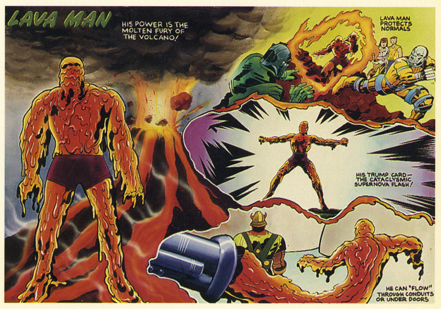
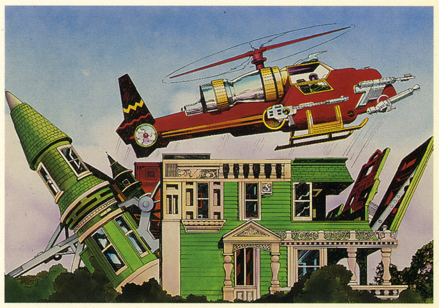
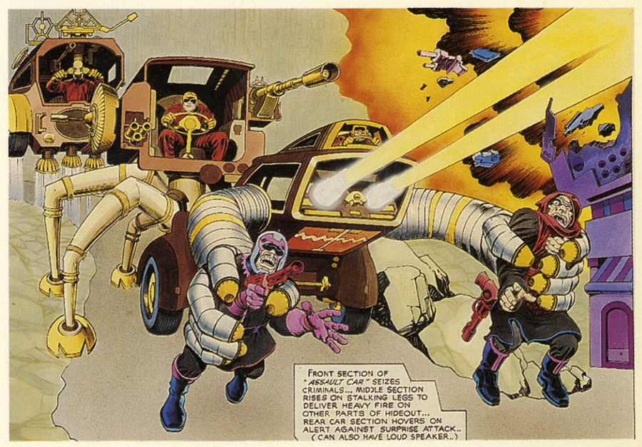
James: As I mentioned to you at CAB, here are some of the cards that Comic Images did in 1994 using some of Jack Kirby’s Ruby-Spears art—can you confirm that you inked and/or colored any of these? —they are beautifully finished.
JW: Of these I inked and colored Lava Man and the one with the green house (I think… it’s been over 30 years); in any event I worked on both of them. Jack brought in these pencilled drawings on half sheets of Crescent board. There was about half an ounce of graphite on each one; I think he used a soft lumber pencil and he bore down. I inked most of them, using a big sable brush and india ink, and lettered a lot of them, and colored maybe a fourth of them.
James: And likewise, did you ink and color these other drawings for Power Planet?
JW: I think I inked, lettered and painted Tiger Shark. It’s easier for me to remember the ones I painted than the ones I inked.
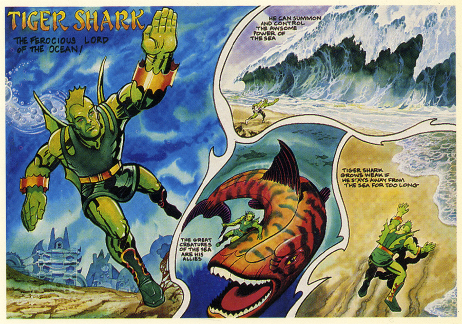
James: It isn’t a small thing to say that besides your many other accomplishments, you turn out to be one of Kirby’s best inkers, and absolutely his best colorist ever.
JW: Thanks, but in all honesty, I have to say no, I was not the best colorist at Ruby-Spears to work on these things. Duncan Marjoribanks, for just one, put me in the shade. All of the people in John Dorman’s storyboard department were terrific artists. In fact I begin to wonder if I really did paint that aquatic one with the beautifully-painted wave. I remember working on that, but it looks like someone else’s finesse. Diverse hands worked on many of these. The ones I painted were bold and garish…I’ll say that for them. As for inking them, it was simple: cover his pencils exactly. It was very crisp.
James: That would echo my limited experience working in animation in the later 80s here in NYC at Broadcast Arts and elsewhere…most art had the hands of multiple specialists on it. With an ego big enough to not be much of a team player, I opted out after not very long. Haha, that was something that “Quarry Story” reminded me of—working in animation. I worked for this guy who made cel commercials and had us laboring at seemingly pointless tasks for ages because he would change his mind about the scene; or he would have us spend months in-betweening a duck morphing into a bug, into a blond lady, into an alien for a 3D lenticular winkie. Ugh. Once he said he had an appointment and then as he left, he locked me in. It was a storefront and the gate he locked had bars like a jail! This cartoonist Dame Darcy presently came to the door and demanded that I let her in. I said sorry, I can’t!– but she said, “I’ll show you my panties if you do!” and threw up her dress. I was like, “Those are very nice, Dame, but I’m locked in!” Haha. At least I wasn’t beaten with iron bars.
JW: That Dame Darcy is a live wire.
James: I am trying to talk my pal Rand Hoppe of the Kirby Museum into getting the rights to print a whole book of Jack’s art from Ruby-Spears and Hanna-Barbera–besides the color comps in the way-too-small card set— which I guess only scratch the surface of Jack’s animation drawings—he has a lot of large xeroxes of Jack’s R-S pencils. Some are insane, or goofy, some are really beautiful! If they do, they should show you the art so you can ID the ones you worked on for posterity and maybe annotate those that you confirm.
JW: The truth is that I don’t think I would be able to make dependably accurate analyses of these things. Just looking at the few you sent I realize how little I can say about them with any certainty.
In any event I never dreamed that these things would ever been seen outside the studio or anticipated any scholarly interest in them or I would have paid more attention to my work and perhaps tried to steal a few. But the only souvenir I have from those days is a Kirby drawing pencil drawing of 2 insane-looking dobermans, like torpedos on legs, that he drew for The Mr. T Show. The scene was cut and I saved it from the wastebasket.
But I worked and socialized with all these great artists including Gil Kane and never took anything but those dump-bound dogs.
James: That’s cool! Do you have any of your own artwork from Ruby-Spears?
JW: No, I don’t, unfortunately… some of it was okay, too.
James: Sorry to hear that! I know you are a fan of Justin Green. IMO very Greenish in look and tone: the multi-part story “What the Left Hand Did” from the JIM collection.
JW: Yes indeed, Justin was a great teacher for me. In all those old JIM comics you can see that my cartooning ability hadn’t jelled and the swiped techniques really show. But even so it manages to be original to the necessary degree, and the tone they have is very close to what I wanted.
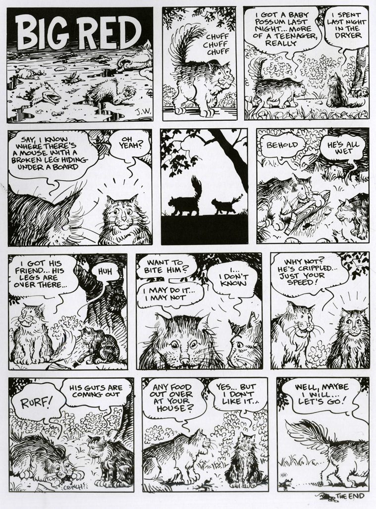
James: I also love the two cat stories “Big Red” in JIM; well, I love cats, but they are inscrutable killers and your strips come closest of any that I have seen of depicting what they might actually be like, if stripped of the glamor we impose on them. Haha, if you did a whole book of these, it would be a best-seller. Cats and dogs are huge in the book market.
JW: Those were some of the very first comics I ever drew, back in the mid 80’s. Big Red was a real cat. I don’t think I could draw a really popular cat book, unfortunately.
James: That is incredible that those are some of your first comics pages—they are excellent! Many of the prose stories and text-heavy ads in the JIM collection remind me of the strong aspect of illumination in Rick Griffin’s Man from Utopia. As in illuminated document; so you were sort of like a psychedelic monk, with no faith per se but to the chaotic jellyfish swimming in your brainpan. However, that illuminated quality was due to the presence of your hand in the hand-lettering; it is lost when you set the type, as you did occasionally.
JW: Well, as for the hand-lettering, that was originally because I was self-publishing JIM and I wasn’t about to pay for typesetting. I carried that over into the first Fantagraphics- published JIM and soon I was being begged to use type instead. The hand-lettering was “hell to wade through” for many. But Fanta paid for the typesetting, so no problem.
All that old JIM work was done while I was learning to draw. It has a quality that I admire tremendously in work by others; that unique energy that occurs when young artist’s long-pent-up ideas outstrip their flimsy new drawing skills. The drawing is green and amateurish in a lot of places, but the content is so charged up and expressive and earnest. I like that, even in my own work. Justin Green has somehow managed to keep this precious formula alive for his entire career.
James: The color Frank story in JIM v actually takes away from the strip–it locks down the meaning in what feels like a sort of flippant, silly way.
JW: That story was drawn for a publication in magazine format, so when I ran it in the comic it was too short. I thought it would be funny to fill that gap with a children’s narrator who doesn’t know where to look or what to say during the silver flesh carving scene. Personally I like the effect. I had only done a few Frank stories and I felt free to experiment.
James: Oh okay, that explains that! Poochytown by contrast functions perfectly well without text—it allows the reader space for interaction, to enter into your world and interpret with some latitude what you show us.
JW: Well, the last 600 pages or so of Frank comics have been wordless, and I agree with you that it works okay.
 James: In the interview that Gary Groth did with you for The Comics Journal in 1993, you speak of seeing “apparitions” as a child that sound very much like what are called eidetic images. They appear not usually superimposed on the external world (although obviously they can be) but often as if projected on the insides of eyelids. Brightly, even supernaturally colored, rapidly-shifting and morphing icons that feel alive and like they come from an alien world that yet is our own, but old or timeless, from shared ancestral memory perhaps. They are most usually associated with the psychedelic drugs—LSD, psilocybin, peyote etc. These sorts of visuals have also been associated with schizophrenia, I believe. You say you had a bad trip in your youth, but I didn’t see if you did acid more later. Did you begin to do these kind of artworks after acid or were they always in your artistic reservoir?
JW: It’s true, my early years were marked by psychic and sensory turmoil and confusion, including hallucinations and apparations. And I had a hard time telling what was real, or rather what wasn’t real. The hallucinations persisted but slowed in frequency…the last one was seven years ago. It was of a man standing at the end of our upstairs hallway in khaki pants and white shirt, with a leather harness that encircled his head. He was staring and grimacing in a really appalling way. And of course I was horribly shocked until it vanished and I realized it was just a neurological misfire, and the shock vanished also.
Eidetic images…I never heard that term before. I did have some experiences on LSD where I saw flat, vivid, decal-like, emblematic shapes that changed rapidly with a kind of didactic visual vocabulary that seemed to be saying something significant but incomprehensible.
LSD, psilocybin and other hallucinogens have provided me with many valuable hours of entertainment and insight, but the core of my work derives from something innate within me, which drugs have never really touched, let alone fed. Most of the JIM material was produced in my 30’s when I finally was able to draw well enough to capture my longstanding obsessions. The first few successful charcoal drawings I produced were like customized metaphysical porn for me… they enthralled me, actually gave me a kind of ecstasy. Well, jackpot, don’t you know. The Frank comics have always come from a different agency, one that has very little to do with my personal bugaboos
James: Gee, Jim, I can hardly think of another artist other than Rick Griffin, Abdul Mati Klarwein or Ernst Fuchs whose work looks more exactly like the sorts of images I saw on acid and mescaline. Your childhood visions sound very psychedelic, too. Your average surrealists or other artists who are inspired by dreams or religious visions really don’t use that particular sort of saturated color. You say in the Groth interview, “I’m sure my folks had no idea what was going on with me.” I’ll grant that 4 or 5 is pretty young to even be taken seriously if you DID tell anyone. I wonder what more “professional” opinions would have been about your apparitions.
JW: Oh, I’ve done a lot of thinking about that… what would have happened if my folks had sent me to a late 50’s-style child behaviorist? Christ. I’m sure they thought about it. Probably the stigma of having a certified nut for a kid prevented it. But the truth is that these visions and things were peripheral to an innate and intense metaphysical longing, that well-known nostalgia for the infinite that drives so many of us, which was and still is at the forefront of my consciousness. So I’m glad I didn’t get diagnosed, held back, drugged, shocked or subjected to whatever other barbarous rehabilitation techniques they used on wayward children in the Beaver Cleaver era.
James: The single complex images you were posting on Facebook remind me a bit of Moebius’ late great work 40 Days in the Desert. Those seem to be similarly freestyle linear improvisations.
JW: Those standalone Frank drawings are made to work up ideas for works in progress, to see how characters relate, how they read in a landscape, how a situation comes off, things like that. I make them into finished drawings because you never know when somebody might want to buy one. When Charles Barnard contacted me about making a 3D Frank book I could take him up on it because I had ten years’ worth of these images on hand already. So there you go.
James: Poochytown has some of that improvisational feel as well, although your stuff always seems more carefully drawn and follows a mostly clear narrative trajectory than Moebius’ riffing does—there is a definite and somewhat decipherable forward momentum to the book. There are threads of friendship, I think, and of change and rejuvenation that carry through to varying degrees.
JW: As a draughtsman and pen artist I am not fit to wipe Moebius’ nibs. But unlike him, I don’t really improvise much at all. I have every action in every panel thought out and worked up to a fare-thee-well before I start the final penciling. I wish I could improvise a comic, like Moebius or Crumb…but on the occasions when I’ve tried drawing a comic in a straight-ahead manner, I find too many things wrong with the finished work for me to live with. So I work out everything as carefully as I can beforehand.
Before I begin to draw and ink a Frank story I have to be convinced that the story shines with that good old mystifoo, the real mysterio autentico, and that it has depths that justify its existence. As I’ve said, I don’t consider myself the author of the Frank stories.
James: You venerate Moebius obviously, but I should point out that left to his own devices, he often meandered fairly pointlessly through his improvised strips. I wonder if he ever realized that his color was one of the most attractive and unusual things about his work; at least, that is a large part of what drew me in from the original Metal Hurlant. He fairly soon left the color to others, with the result that I lost a lot of interest. Yes, he always drew beautifully, but that of itself couldn’t carry the material a lot of times. You seem to have a more directed focus than he did, so I don’t consider you to be much in his shadow, let’s say. Your visionary status is pretty impressive, too— just sayin’.
JW: Well, my favorite Moebius work is Blueberry. He was a great, great draughtsman, a real virtuoso. I always liked looking at his work in Heavy Metal, but I was never transported by it. I never felt it was profound or symbolic in any meaningful way. Even, especially the Jodorowsky stories. I don’t know why…I had friends who had mystical experiences in The Airtight Garage. I tried. I couldn’t get into (Pink Floyd’s) The Dark Side Of The Moon in that way, either.
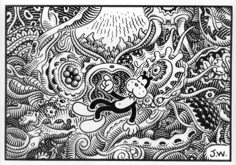
James: I am coming around to thinking Poochytown is my favorite stuff of yours. I love the pacing of it, and the spreads. I also love the way you hold off on some things—Frank and Manhog are horror-stricken a few times by something, but even though what you are showing us is so weird throughout, in these cases you withhold it from us. What was your thinking behind that?—and also, you show us several alternative views of the weird collision when Frank and Manhog are “driving” the steering wheel shaft through the landscape—but why? Or would you prefer to preserve these mysteries?
JW: Well, thanks. I work hard on the pacing, panel sizes, page breaks, reveals and all that stuff. There’s a scene in the book where Frank and Manhog are at what looks like a neglected, mouldering roadside attraction, and there is an immense diseased fish almost filling its pond. But it’s actually a simulacrum, an exhibit, and when Frank pushes the button, something happens that horrifies him. But as you say, you don’t see it. In fact I originally drew what happened and decided it wasn’t effective enough, exactly because it was too specific. The reader is invited to imagine something much worse than what I drew and I bet they do.
When I wrote down the steering wheel sequence there was an understanding that Frank and Manhog would land in a comfy bed, safe and sound. But it was necessary to show that this was utterly providential; they were far more likely to be killed in any number of horrible ways. Those actual ways were left up to me to invent.
James: Again, your dreamscapes (for lack of a better word) have that eidetic quality of psilocybin visions, even to the occasionally mandalic, or at least largely symmetrical organic lifeforms that infest your landscapes. Were these sorts of things, and the ambulatory old-style tube radios that you constantly draw, what you saw in your visions as a child? They also appear in earlier forms in the Jim book, but are refined by Poochytown.
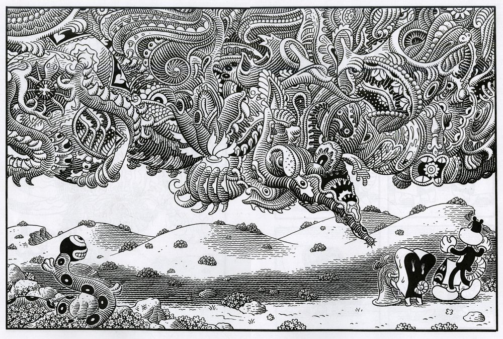
JW: I suppose that the impulse to create symbolically anthropomorphic shapes that I find innately attractive is tied to my youthful misreading of the world and the subsequent fetishization of everyday objects, like those old radios and vase-tables. There is something infantile about it all, for sure. I didn’t have visions about radios, endtables, walls, arches, pools and so on, but some of them did seem charged with extrasensory power. God only knows. It was very pleasurable.
James: I see that The Frank Book has an introduction by Francis Ford Coppola. Do you know him?
JW: I’ve never met him. He likes my work, evidently. He invited me to be a guest designer of his early Zoetrope magazine, and so I asked for that intro.
James: My late friend David who wrote my book 7 Miles a Second had a habit of keeping a notebook by his bed so when he woke up at night, he could write down his dreams—and they formed a reservoir for him of material to work from later. I wonder if you do something similar, or if at least for JIM that was sort of how that material formed.
JW: I used to keep a dream diary when I was doing JIM, but I haven’t been able to remember my dreams for years. 7 Miles A Second is a hell of a book, incidentally.
James: Thanks! Finally, can you give us your impressions of Comic Arts Brooklyn?
JW: It was beautiful. So many great cartoonists and publishers, such appreciative attendees, such a relaxed and real atmosphere. I had far too many great experiences to even begin to try to list them. As these things go, it was as close to perfect as I could ask for. And all in one day! Miraculous.
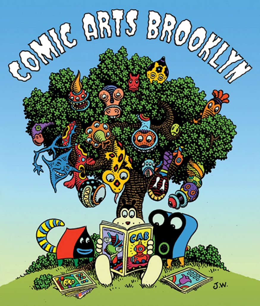
The festival known now as Comic Arts Brooklyn began in 2009 as The Brooklyn Comics and Graphics Festival. At that time it was run by the proprietor of the esoteric alt-lit artcomics shop Desert Island, Gabe Fowler, along with comics scholar Bill Kartalopaulos and critic Dan Nadel. For the past 6 years it has been organized solo by Fowler. He does a great job; CAB is my favorite annual NYC comics show, displaying incredible diversity in its talent as well as in its audience, far more so than any mainstream comic convention. CAB is also a free show, which sets it apart from the “other” NYC alt/lit comics gathering, MOCCA Fest, which is organized by the Society of Illustrators. Though free, CAB also boasts programming to rival that of MOCCA.
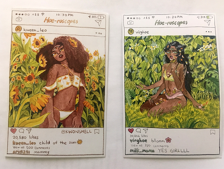
One of the first things one notices at CAB is the presence of women—lots of them!–tabling and browsing. In fact, the first thing I bought there was a set of nicely done “Hoe-roscope” cards by a young artist, Michelle Kwon.
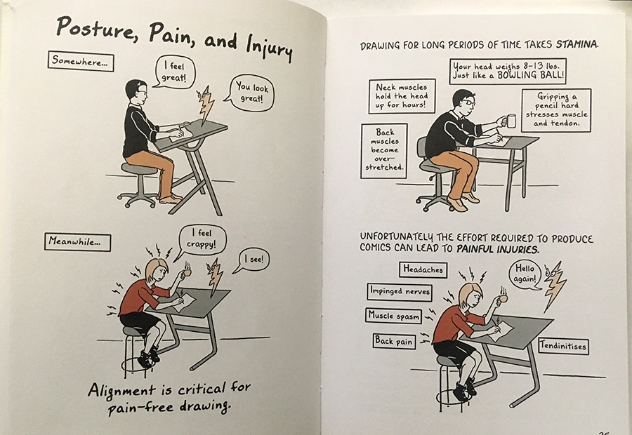
Another happy acquisition was artist/health educator Kriota Willberg’s incredibly useful collection Draw Stronger: Self-Care for Cartoonists and Visual Artists, a long-overdue preventative graphic study of the physical dangers of our artform, published by Uncivilized Books.
Uncivilized have also just released a scholarly tome, Sweet Little Cunt by Anne Elizabeth Moore, about CAB’s other main cartoonist guest this year, the brilliant and beloved Julie Doucet. Uncivilized here shows the more cautious publishers of profane titles such as Chuck Forsman’s popular The End of the F***ing World how it should be done.
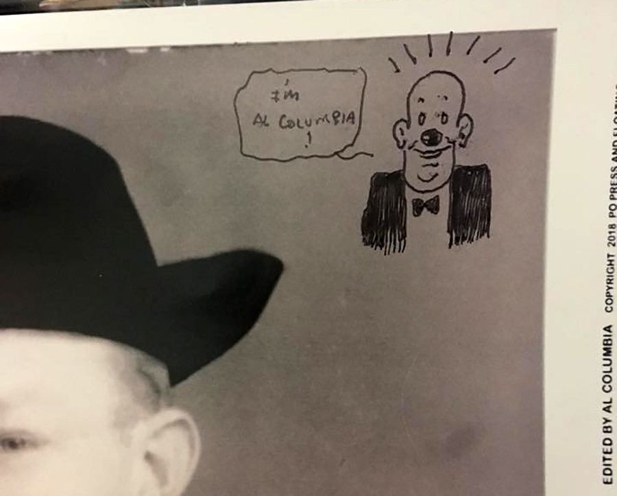
There is really something for everyone at this show. I greatly admire Al Columbia’s fearsome hardcover Pim and Francie: The Golden Bear Days from Fantagraphics a few years back, so I waited in a quite long line to get the artist to sign his new oversized floppy from Floating World, Amnesia: the Lost Films of Francis D. Longfellow. We waited, and waited. He had wandered off and was nowhere to be seen! Finally he appeared and then—he just drew a tiny glowing sun (that looked more like an asshole) beside his John Hancock! But–but–I wanted something in his patented old-school animated/sinister perversion style!
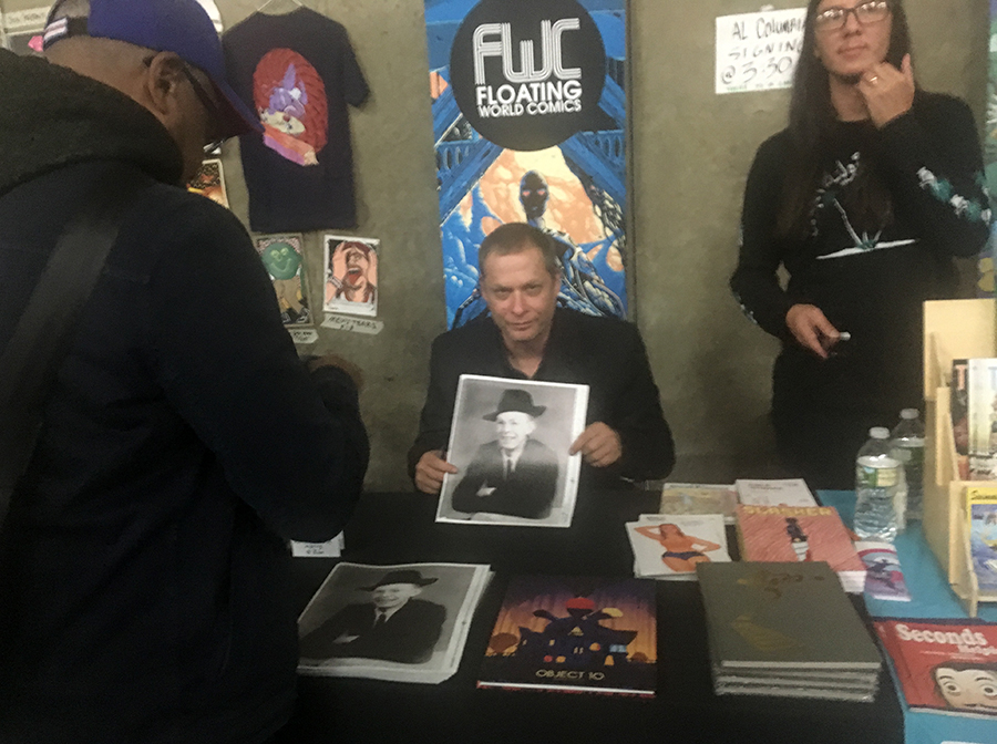
So when the line was finished, I went back to Columbia and prevailed on him to draw a slightly more elaborate sketch, which he did without hesitation, but with a smeary pen.
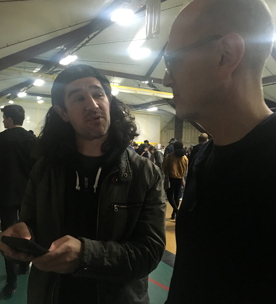
I do really love to catch up with old friends at CAB, like Frank Santoro, whose new book Pittsburgh has just come out in France (before the USA! Drat.) and has already been chosen as a selection for the 2019 Angouleme Festival. Hurry up with your edition, New York Review Comics!
Anyway, it was a great show and I can’t wait for next year!


