
The other day we told you about a Frank Miller DKIII variant cover that had everyone talking about its (depending on your point of view) minimalist and/or shockingly incompetent art style.
After some twitter discussion, artist James Harvey took it upon himself to show that Miller’s recent work might be suffering from a misplaced coloring esthetic.
And then all hell broke loose.
Harvey is best known as the creator of Masterplasty, which was once a free to read webcomic, now published in startling print form by Image Comics. Harvey’s work makes heavy use of flat color, color holds, collage and other techniques for a very unique look.
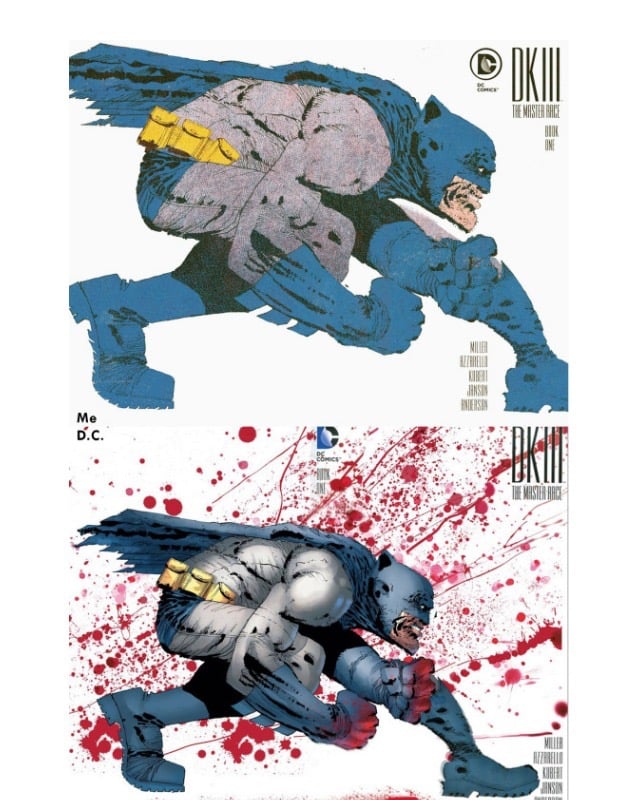
His approach to Miller’s work (top) was much the same, with flat areas of color smoothing out some of the linework that the more modeled published work by Alex Sinclair (below) perhaps emphasizes to its detriment.
Harvey goes on to analyze some of Lynn Varley’s work over Miller. Varley is truly Miller’s collaborator on his most striking works, including DKI and 300 and even the much maligned DKII.
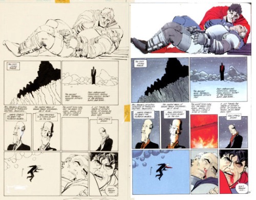
Above is a page from 1986’s The Dark Knight Returns. You can see just how much trust Frank placed in his colourist, Lynn Varley, to finish his work. As you can see, some of those panels aren’t even THERE in the original inks. Panel 6 is just an empty box.
This approach has been proven to work very well, but the problem is it places the burden of the image’s success or failure squarely on the colourist’s shoulders. And if the colourist and Frank aren’t on the same page, we end up with covers that are the laughing stock of the whole internet.
The cover and Harvey’s take engendered quite a lot of discussion on the internet. Unusual, I know. Colorist Nathan Fairbairn pushed back a bit, defending Sinclair (who is truly a great colorist) explaining that Miller undoubtedly has a say over the finished coloring.
https://twitter.com/nathanfairbairn/status/727588695851700224
https://twitter.com/nathanfairbairn/status/727588791372775424
https://twitter.com/nathanfairbairn/status/727588888638689280
https://twitter.com/nathanfairbairn/status/727588971090350080
https://twitter.com/nathanfairbairn/status/727589035657461760
https://twitter.com/nathanfairbairn/status/727589220299104256
https://twitter.com/nathanfairbairn/status/727589295691718657
https://twitter.com/nathanfairbairn/status/727589397005107201
https://twitter.com/nathanfairbairn/status/727589487111380993
https://twitter.com/nathanfairbairn/status/727589573157494785
https://twitter.com/nathanfairbairn/status/727589669089599488
Frank Santoro, Michel Fiffe and Abhay Khosla discuss Harvey’s take on a confusing Tumblr thread. This is Fiffe (I think)
Elsewhere, Miller’s draftsmanship is questioned again: “But he’s a great storyteller!” Undoubtedly, but Miller also has monster chops. His values just aren’t the same as his critics or his fans. Miller built his technical skill via Neal Adams & Gil Kane. LikeKirby, he nailed the basics and went from there:Moebius/Kojima (RONIN), Pratt (DKR),Muñoz (Sin City), Kurtzman (300), Feininger & Watterson (DK2). Bold, polarizing POVs but always more than technically solid. The results are too raw for a fan’s sensitive palette and too square for the alt crowd who would theoretically be simpatico with his approach. Even the illustration elite dismisses his work. You’d think *they* would recognize the underpinning the most. Anyway, I ❤ those DKIII covers.
The DKIII cover evolved into a larger discussion of Miller’s obvious artistic decline. Ng Suat Tong was frank, as is his wont:, calling Miller the Donald Trump of comics.
Frank Miller the thinker is a slightly knotty problem, but there’s nothing especially complex about the drawing hand of Frank Miller circa 2016. The one time master of dynamic movement and page composition has hit rock bottom and his fans aren’t amused.
He has a 12-page back-up story in The Dark Knight III: The Master Race #4 which is little more than one big fight scene with some barely sketched out characters just limply hanging in blank space. Then Aquaman appears in all his shoddy glory and…the end. This is a rigorous reflection of the story in the main body of the comic which is also little more than an extended fight scene between Superman and his daughter, with Batman and Carrie Kelley as spectators. Remember the scene in The Dark Knight Returns where Batman beats Superman to a bloody pulp under some street lights like the lowlife street mugger he is? Well, the new comic is yet more fanservice for Batfans who think the Man of Steel sucks (Miller is the inspiration here, not the cause). – See more at: http://www.hoodedutilitarian.com/2016/05/frank-miller-triumphant/#sthash.fD49GomK.dpuf
Dan Nadel was more forgiving as well as the only person who thinks DKII is Miller’s best:
I happen to disagree with Ng Suat Tong on his negative assessment of Frank Miller’s drawings but I wouldn’t argue it because we’re just coming from two different places entirely. I thought DKII was his best work. And I understand why people would dislike this new stuff. It’s ugly and incoherent, but coherent Miller isn’t that interesting to me, and I like ugly sometimes. Free of his obvious influences — Eisner, Adams, Moebius, Kojima — he just made weird work. Intentional? Maybe not. Maybe so. We’ll probably never know. It’s not genius or anything… just odd end-of-career work by a pulp artist, kinda like Lee Brown Coye’s late work. Consistent in its weirdness. Certainly the covers he’s drawn in the last year are all of a piece, and make sense as slightly deranged mark-making.
I’m sure there was lots more on Twitter, but I was out of the house and missed it.
There’s a lot to unpack here.Miller is one of the most imitated, influential and powerful cartoonists of the modern era; does that mean his contemporary work is all worthy of study? He’s be the last to want to coast, I’m pretty sure. Miller’s generally acknowledged decline since DKII has been remarked on by many. Certainly his current work shouldn’t be beyond reproach just because he seems to have been ill, but acknowledging that should be part of the critique as well instead of a blanket “Man, he can’t draw any more!”
I agree with Harvey that modeled coloring isn’t the best for Miller’s current work, but Fairbairn is most probably correct in that it’s the artist’s own wish. If nothing else, Harvey’s alternate take suggests a way to approach Miller’s current work from a different esthetic.
Finally, a little mystery. This is the cover as I found it on a retailer website:
This is the version that even Harvey used for his coloring exercise:
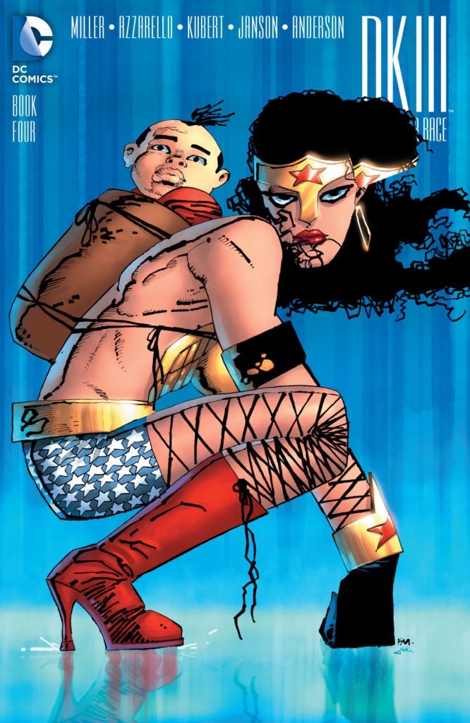
As you can see the top version is much better without the very very weird distorted headband. I wondered if this was a photo of an actual comic that somehow got perspective corrected, but the head is over different type in both, so it must have been released at some point, maybe for solicitations? Very odd.
Can anyone solve this?


I’ve always thought Miller’s real talent was for writing and layout, not for drawing human beings. Klaus Janson had a lot to do with the effectiveness of the art in Daredevil and Dark Knight Returns.
That second Wonder Woman is the exact same art. That thing with the headband is the clipping path the production designer created to pop her head over the title design. It must have gotten accidentally shifted over while working on final placement of art and logo and wasn’t caught before being output and sent out for solicit. It’s a common enough error.
Frank Miller’s art is next level.
I dig the flatter colors on his line art.
There was criticism of Miller’s drawing skills early on, as in Kim Thompson’s 1983 takedown of Ronin. As one TCJ reader commented: “That review was so harsh it actually made me feel sorry for Miller.”
http://www.tcj.com/run-of-the-miller/
Kind of odd that Fairbairn went off on Harvey for his presumption, when at least one of his own presumptions is way off base, which he’d have known if he’d seen this tweet from Sinclair on May 2:
“He (Frank Miller) doesn’t give me any direction at all. He gets to see and comment on each piece once I am done with it.”
So it doesn’t sound like Miller is exercising much control over the colors, and certainly isn’t composing the images with specific coloring effects in mind, the way he collaborated with Varley.
As for coloring approaches that work well with late-period Miller, I’d suggest (unsurprisingly) Dave Stewart’s work on the ASB&R covers: bold and graphic, eschewing gradients, but with painterly or pastel texture that adds interest and allows for variations in tone within a shape without that shiny, metallic feel..
Miller rips off Goseki Kojima’s art for ‘Ronin’, borrows heavily from Jose Munoz for ‘Sin City’, then goes on in interviews about the superiority of WASP culture. Funny that.
Comments are closed.