

This week’s main review is Black Hammer – The End #1. Plus, the Wednesday Comics Team has its usual rundown of the new #1s, finales and other notable issues from non-Big 2 publishers, all of which you can find below … enjoy!
 Black Hammer – The End #1
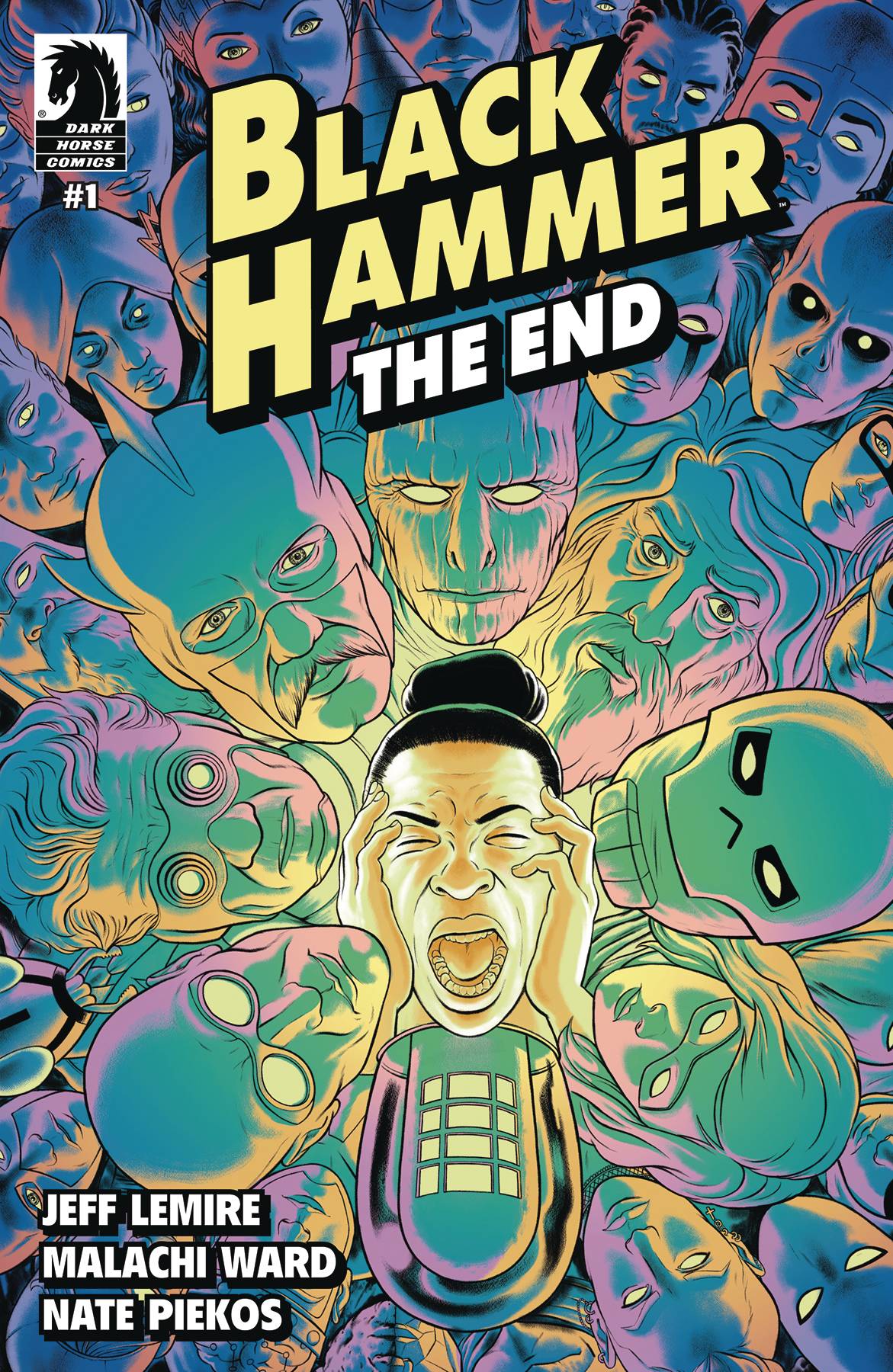
Writer: Jeff Lemire
Artist: Malachi Ward
Color Flats: Bryce Davidson
Letterer: Nate Piekos of BlambotⓇ
Cover Artist: Malachi Ward
Publisher: Dark Horse Comics
Reviewed by Joe Grunenwald
The end is here. After a hiatus of over a year, Jeff Lemire is back for the latest miniseries in his superhero homage epic Black Hammer. Lemire is joined by artist Malachi Ward, color flatter Bryce Davidson, and letterer Nate Piekos for Black Hammer: The End, a six-issue series that promises to wrap up the many ongoing storylines for the series and set up the next phase of stories for the heroes of Spiral City. This week’s first issue kicks off the series with action on multiple fronts and a return to the mysteries that have driven Black Hammer from its beginning.
It’s been a while since the last issue of the previous series, Black Hammer Reborn, released, and readers would be forgiven for not remembering all of the details of the end of that series coming into the debut of The End. Luckily Lemire has structured the first issue with all the information both new and returning readers might need in order to follow what’s happening. It’s impressive how economical the recap is without sacrificing anything in the pacing of the storytelling.
And that pace is fast. This issue drops readers into the middle of the action and barely lets up. Even the quiet scenes are tense and gripping, filled with interpersonal and familial drama. Lemire excels at conveying what each character wants in a way that’s natural and concise. Ward’s artwork brings the story to life on the page beautifully with characters who are animated and expressive, new settings that feel instantly fully-realized, and color work that treads the line between naturalistic and fantastical perfectly.
Perhaps the most impressive thing about Black Hammer: The End #1 is how fresh it feels even to a seasoned reader of superhero comics. The trappings are all wildly familiar – there’s a super-powerful force destroying worlds across a multiverse, a formerly heroic member of an intergalactic peacekeeping force who has turned evil (and even developed the graying hair to prove it), a mismatched group of heroes trying to rally to stop the end of everything, and a reluctant hero who may be the key to everything. These are all recognizable elements from other big superhero event comics, but Lemire and Ward’s character-driven approach is what separates the story from those that have come before. The stakes are huge, but the focus of the drama is small, whether it’s former enemies bickering aboard a spaceship or a husband and wife arguing in a farmhouse kitchen. It’s a refreshing take on a story superhero fans have seen many times before.
Black Hammer: The End #1 serves well as both a series kickoff and a continuation of what’s come before it. For longtime fans of the series, Lemire begins to reap some of the seeds he’s been sowing for years, and for readers just jumping on with a new #1 there’s plenty of character drama and high-stakes action – and spectacular artwork from Ward – to grab your attention.
Verdict: BUY
Wednesday Comics Reviews
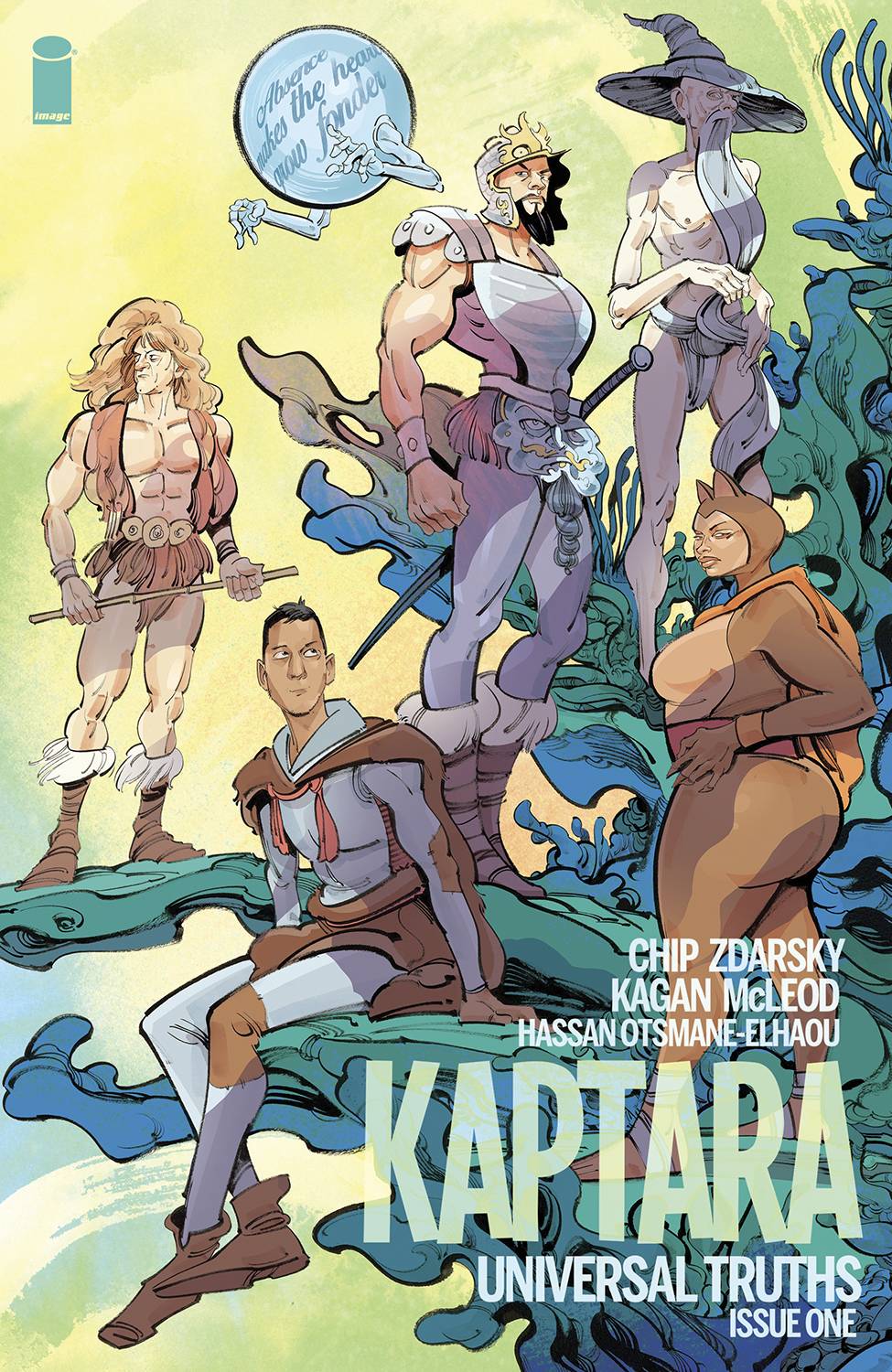
- Kaptara: Universal Truths #1 (Image Comics): “Absence makes the heart grow fonder,” the Motivational Orb displays as a reminder as well as a portent that Kaptara, your favorite disaster queer DnD campaign set to He-Man, is back where books are sold! From the outset, one would worry this return foray from writer Chip Zdarsky and artist Kagan McLeod would spend most its runtime infodumping a jumping-on point for newer (or even returning) readers, but alas, it does not handhold, and rather dumps you into the deep end. For those chum familiar with Zdarsky’s particular humor and dramatic voice, it’s all the hits, but less transparent scaffolding where this iteration of Kaptara will take us. For McLeod, there’s a dryness to his brush strokes that energizes the most tepid head and shoulders two-shot into a lively conversation. It’s an admirable strength of McLeod’s ink that excels at character expression but loses me when it comes to backgrounds and technical visualization. Adding to the innate will moving Kaptara is a saturated palette that utilizes purples where one would use greys and stark yellow with a hot pink drop shadow to blow SFX our way. Beyond non-white word balloons, one of letterer Hassan Otsmane-Elhaou’s inspired choices is to mix mixed-case lettering into its all caps lettering, so that Team Kaptara can use a full spectrum of capitalization to communicate its many asides, riffs, and sitcom-adjacent remarks. Ex. OH BOY… is not the same tone as Oh boy… So, as the Motivational Orb would say, “never judge a book by its cover.” I believe this to be true even for a sequel/return/jump-on point book. —Beau Q.
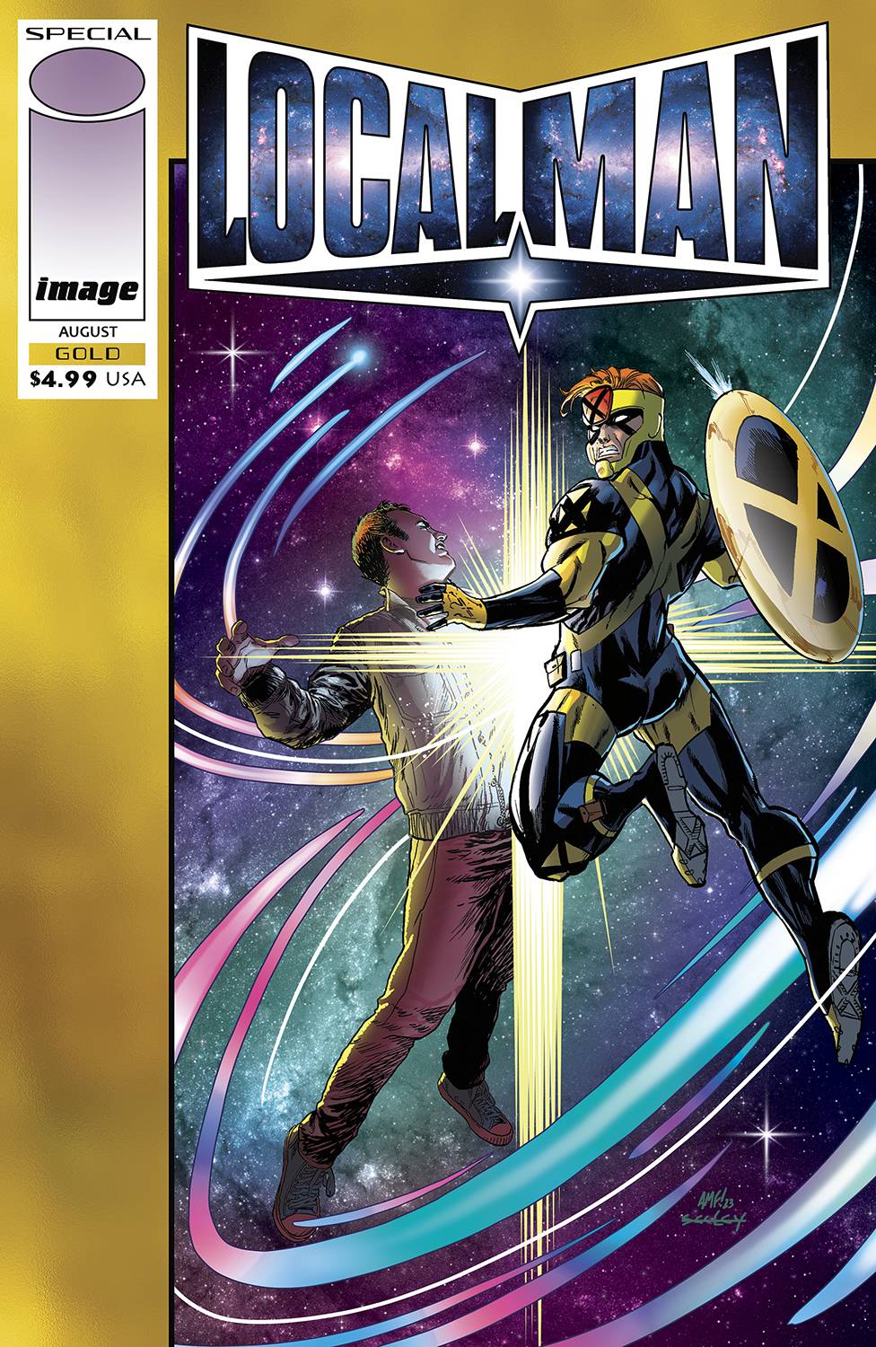
- Local Man Gold #1 (Image Comics): Time travel shenanigans are at play in what is an earnest story about growth and self reflection both on a personal level and on a meta-level. The creative team of Tony Fleecs and Tim Seely have Jack Xaver confront himself, a younger Crossjack, and it’s hard to look in the mirror and see the person he used to be. That’s where Local Man’s introspection comes in; amidst the chaos of very 90s superheroes and the allusion to the incredibly complex stories of that time, is a man who is trying to be better, who has to confront his past. The story asks readers to engage in the critique of 90s comics, and see how times have changed and how the medium has changed. This is something Local Man already did very well, but this special pushes that to another level by having the modern engage with the past in a more direct way. Something that works incredibly well here is the way the art works to convey the differences in what time period the characters are from, rendering characters based on the styles of the times. This is pushed further by the colors of Felipe Sobreiro, who plays to the stylistic conventions being used; from a grungier more “indie” aesthetic to the polish of 90s superhero stories making Local Man “Gold” a treat to look at and a treat to read. —Khalid Johnson
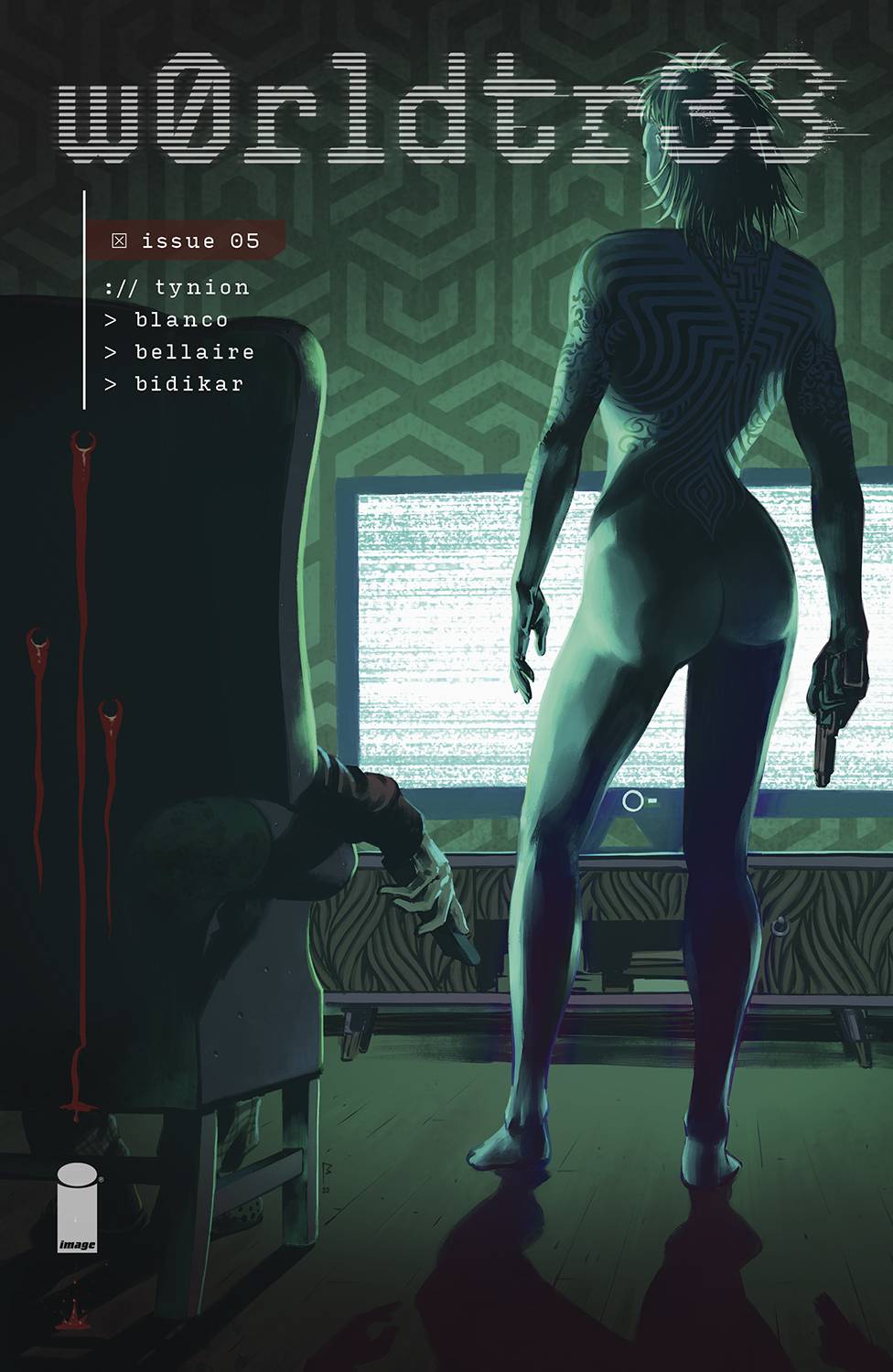
- w0rldtr33 #5 (Image Comics): At the end of the first arc of w0rldtr33, Ph43r has pushed her plan to its epoch. All around the world violence plays out like it did in the first issue. But before we get there, we get a few pages of Ellison in a dystopian, ruined future, which is perhaps a signal to where the next arc may be going. The illustrations, by Fernando Blaco, and coloring, by Jordie Bellaire continue to be wonderfully grotesque–even in moments of table setting. Rivaling the oddity of The Nice House on the Lake, w0rdtr33s accomplishes an almost unseen level of strange in its portrayal of modern, glitchy possession. The lettering, by Aditya Bidikar, doesn’t just fade into an invisible reading pattern, but keeps right up with the twisty, word-heavy narrative. This is an immensely heavy subject, yet somehow it manages to feel thoughtful and balanced, something I think only James Tynion IV could pull off at this moment. If you were waiting to start this series until the first arc was finished, now is the perfect time! Congratulations to this wonderful team, you can tell they love what they do. —Michael Kurt
Read more entries in the Wednesday Comics reviews series!


That cover of “Local Man” immediately made me think of the Valiant/Image crossover from the 90’s and the nostalgia vibes were strong. I like Seeley’s work so if I see it on the rack today I’ll flip through it and see if the feels continue.
Comments are closed.