

Welcome back to the Marvel Rundown! This week, we take a look at the debut of the capitalist tool supreme sensation himself, in Roxxon Presents: Thor #1! This review contains MILD SPOILERS, so head on down to the Rapid Rundown for spoiler-lite reviews of Giant-Size Hulk #1 and Spectacular Spider-Men #2!
What did you think of this week’s batch of fresh Marvel Comics, True Believers? The Beat wants to hear from you! Give us a shout-out, here in the comment section or over on social media @comicsbeat, and let us know what you’re thinking.
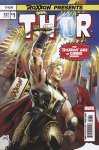
Roxxon Presents: Thor #1
Writer: Al Ewing
Artist: Greg Land
Inker: Jay Leisten
Colorist: Frank D’Armata
Letterer: VC’s Joe Sabino
Cover Artists: Greg Land & Frank D’Armata
Reviewed by Beau Q.
Always the errand for production artists and avid readers, once in a while there comes an errant chapter to a series’ run that isn’t just published under a different title, but intentionally so. Think Batman: Leviathan Strikes! with regards to Grant Morrison and Chris Burnham‘s Batman Incorporated run or all the differently titled issues that make up The Multiversity. Al Ewing and Martín Cóccolo‘s Immortal Thor run has double-booked April with issue #9 drawing Thor into an illusory world brawl and this arc’s antagonist, Dario Agger, self-publishing Roxxon Presents: Thor #1 for our thunder god to read in-canon and for us to enjoy in real life! Such a gimmick is fit for the capitalistic monopolizer Dario Agger, but it also provides ample excuse to reinforce Immortal Thor’s narrative dive into Thor’s identity and what makes the “power of Thor” such a force to be reckoned with in Marvel continuity.
From the top, Roxxon Presents: Thor is chock full of jokes aplenty at the expense of Elon Musk, Bay Area techbros, and uber rich one percenters, which makes for a relatively easy ride, and a load off of Al Ewing’s chest. By turning Roxxon Thor into a startup bootlicker and Mjolnir into a smart device, Ewing is able to continuously stream tech bro parlance into Thor’s iconography to a point where the parody feels less fictional than a reflection of a presumed Twitter user circa 2024. It’s a brilliant angle to bring Thor’s identity as an IP into the conversation without being reduced to an MCU parody we’re all too familiar with by now. But beyond the hokey jokes, there stands a fun-sized Golden Aged throwback that done-in-ones its 20 pages in a way that doesn’t end as much as unsuccessfully attempts to tie back into Immortal Thor. The result also attempts a meta-interaction a la Multiversity: Ultra Comics, but spends more of its runtime making tongue-in-cheek jokes than weaponizing idea machines and the reader’s interaction as a narrative element. What we’re left with is a comic Thor reads ignorant of our involvement as readers.

Still, Roxxon Presents: Thor feels like a best use case scenario for one of Marvel’s more infamous artists, Greg Land. Frequently diatribed for his stagnant framing, stilted character acting, and questionable rotoscoping, Land’s illustrative style is Marvel lingo for the exact ego-tripped cheapness Dario Agger would employ to produce or overproduce Thor’s periodical biography. Between the MCU style costume, the Cybertruck lookin’ Thor-Truck, and the male gazey machismo inherently tied to crypto bro culture, Land’s layouts matter less than the amount of smarm he conjures from his narrative detailing and facial expression choices. Since this is Roxxon’s portrayal of Thor life, less movement, less secondary action, and flatter compositions actually reinforce the narrative rather than harm it. This is easily the most fun I’ve had reading a Greg Land comic, which is a monumental task in itself, but thankfully longtime Land-collaborator Jay Leisten inks straight forward and to the point with cross-hatching kept to clothing and background detail. By keeping a larger outer stroke and thinner hatching strokes, Leisten maximizes silhouette readability without sacrificing the realistic clothing folds and vascular rendering Land’s style thrives on.
This would all be hollow without the flash, glitz, and glam of a famed Marvel color artist to overhype Roxxon’s Thor biopic. Enter Frank D’Armata. Heavy on airbrushed highlights and slashes of 10% gradients, D’Armata’s always brings a metallic shine to his superhero work that often blows out blonde hair and burns the LEDs in your tablet screen without 1-to-1 translating the same to print. For posterity, I am viewing this issue on a backlit screen, so Roxxon Thor’s blonde hair appears as white as the gutterspace in almost every panel. D’Armata’s approach screams “omnibus with updated coloring,” which itself feels like an attack on that style of Marvel reprinting, but adds a layer of capitalistic energy to the parody that translates obliquely to “this is what the kiddies must like.” Again, Roxxon Presents: Thor feels like a concentrated use of mainstay Marvel artists, but in a way where their faults are maximized for narrative impact rather than a detriment to the overall book. It’s amazing.
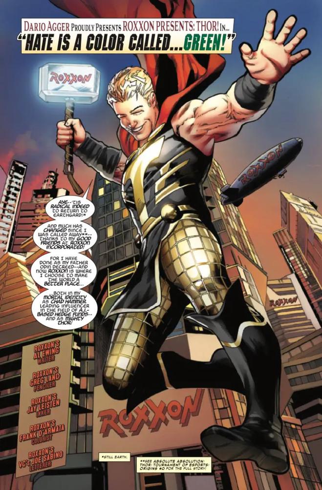
In keeping to the overarching lettering style designed by modern Thor letterers, VC’s Joe Sabino mostly plugs into the Immortal Thor style guide of Asgardian font and short balloon tails, but has most his fun with the numerous protest sign gags that may not have required different fonts, but are better off for it! Bringing back the Golden Age thought balloons to mimic the internal monologue from that era feels as cringe and immediately outdated as an Elon tweet, but absolutely smacks a large parody sticker onto every moment they’re in this book. As for sfx, Sabano keeps the onomatopoeia reduced and confined mostly to balloons rather than atop save for a couple KRA-KOOMs no Thor book can be without.
Final Verdict: BUY. Every once in a while a Big Two book nails the innate language longtime fans thrive on while rallying its entire production team into firing on all cylinders. This is, unbelievably, one such time. Please don’t miss this show of force. But also try to stop yourself from memeing Roxxon Thor into a solo series. It’s Dario Agger’s endgame, you see.

Rapid Rundown!
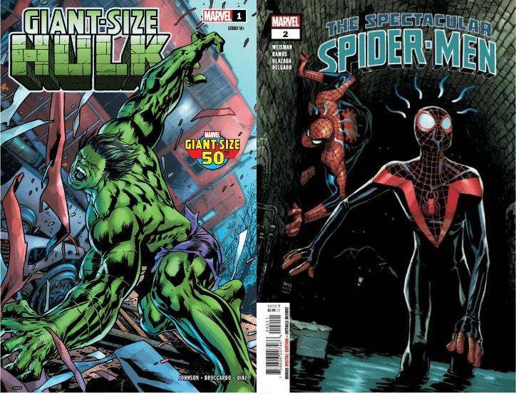
- Giant-Size Hulk #1
- Giant-Size Hulk #1 by writer Phillip Kennedy Johnson and artist Andrea Broccardo is a solid throwback to a classic Marvel style of comics storytelling. This is a great done-in-one story that gives new readers a clear picture of the writer’s take on the character while seeding small details that hint at a larger narrative. Johnson throws us right into the story through a group of young train hoppers unexpectedly pulled into Bruce Banner’s dangerous orbit. We’re then treated to an explosive (literally) battle between the Hulk and a crossroads demon. Here we get a sense of Johnson’s more monstrous take on the character. Befitting the “giant size” label, Broccardo’s art is bold and expansive. This Hulk can’t be contained by either panel or page. The combat smashes through double-page spread after double-page spread. Broccardo also gives us some gruesome imagery that has become a defining part of the contemporary Hulk. The colors from KJ Diaz are a twilit purple-red that contrasts with our antihero and gives the story a haunting glow. Cory Petit letters, and the stark white of the balloons and their thin outlines pop off the page over Diaz’s colors and Broccardo’s thick, muscular inks. The one-shot is rounded out by a classic Hulk reprint from writer Peter David and artist Dale Keown. It’s a thematically appropriate choice, with a vagabond Banner and some graphic Hulk transformations that firmly plant Johnson’s take in the larger Hulk tradition. Though I would have preferred more new material, one can hardly argue with additional royalties for older creators. —TR
- Spectacular Spider-Man #2
- Getting TV writer Greg Weisman to write a Spider-Man seems like a no brainer that should have happened ages ago. He co-created The Spectacular Spider-Man, a series generally regarded as one of the best adaptations of the character. So it’s no surprise he’s a natural writing Spider-Man comics. Even better is that he’s gets to write both Peter Parker and Miles Morales. This feels like what people want out of a Spider-Man book. There’s a supporting cast that get mixed up in superhero nonsense. Peter and Miles’ lives as superheroes conflict with their everyday things. There’s very grounded stakes and a fun mystery. Humberto Ramos at this point is a veteran Spider-Man artist. He draws a suitably weird looking Spider-Man. He’s great with funky angles and dynamic action scenes. But Ramos also makes interesting dramatic sequences. He draws a two page spread where Miles walks through a coffee shop. It’s all done in one image with panels simply tracking Miles moving through space. None of the characters in the double page spread look alike, have the same body language, or facial expressions. The pages give a sense of space and introduces characters. Ramos just draws interesting looking comics both in his action sequences and the more human drama. —DM
Next week: Daredevil #8 celebrates 60 years of the Man Without Fear!


