

Marvel is inverting a popular premise and uniting the allies of the nine realms this week with Asgardians of the Galaxy #1. Plus, writer Donny Cates returns to Thanos alongside Infinity Wars writer Gerry Duggan to fill in the gaps on where the Mad Titan was before the events of Marvel’s latest large-scale event series, while a new Silver Surfer annual examines Norrin Radd’s time as the herald of Galactus. Catch our initial impressions of this week’s titles today on The Marvel Rundown!
 Asgardians of the Galaxy #1
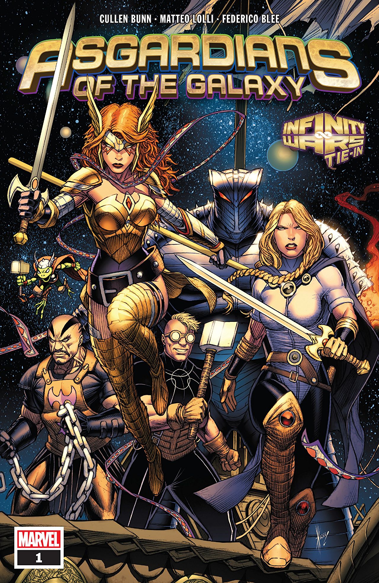
Written by Cullen Bunn
Illustrated by Matteo Lolli
Inked by Frederico Blee
Colored by VC’s Cory Petit
Alexander Jones: AJ, Marvel dove into the treasure chest to find some resident weirdos and pulled the cast of the Asgardians of the Galaxy out of the box. What did you think of the debut installment featuring the new team?
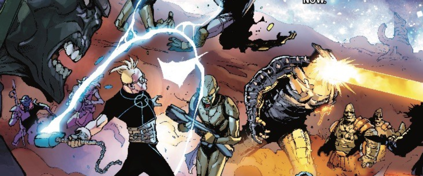
AJ Frost: Hey Alex! Great to chat with you again! Resident weirdo isn’t even the half of it. This book introduces more and more abnormality with every turn of the page. While the book does a pretty good job of setting up the stakes, there isn’t a cohesive narrative so to speak. It’s really all an expository exercise to get ready for the next part of the story. In some ways, it doesn’t feel substantive (not that that was the point), but there is an inkling of a bigger, dynamic story afoot here.
Jones: The comic has a great energy that sucked me in. I’m also a sucker for some of these oddball characters. The art really drew me into the narrative as well. I enjoyed the issue a great deal but really respect your criticisms highlighting what I may have overlooked because of my bias towards cosmic Marvel and the extended Thor heroes.
Frost: I feel that if a reader is interested in the far-out cosmic part of the Marvel universe, this is will be a really great series to get into. I’ve written in these digital pages before some of my personal hesitance around Thor’s storylines, but I will let the readers judge. Reevaluating my initial thoughts on this issue, I may have been too hard on it. It definitely plays up the kitsch factor, and there is something admirable about that. Cullen Bunn knows how to play in this sandbox and then launch the particles up in the air to see where they land. There’s a bit of a randomness to it, but also a guided trajectory.
Jones: The issue has a lot of disparate elements and while I appreciate all of them coming together in the way they did so quickly, I am dismayed at the idea of how Bunn already starts to lose sight of some of his core cast members. We get a lot more Angela than we do of the rest of the cast members. That’s an aspect of the book which really needs to be improved in future issues.
Frost: Your comment gets back to the expository element. This issue is really about setting a mood versus any big adventuring (though there are some mighty battle scenes here and there). Back to what you mentioned earlier, I think it’s more of the art being grounded enough to make even the most ridiculous parts of the story seem somewhat sane. Mateo Lolli has a great sense of scope and even though this issue is set in the backdrop of infinite space, he finds the way to hone in on the smaller, more delicate, parts of the story. Did you get that sense from the art, too?
Jones: Matteo Lolli carried the enthusiasm from Bunn’s script really nicely. This debut actually reminds of the same tone of the recentWest Coast Avengers debut, be it a little more serious and not quite as well curated. I really enjoyed getting the chance to see some of these characters depicted with his ultra-slick art. This brings me to a minor aspect of the issue I wanted to take the chance to discuss with you. The initial debut of this concept left me a little cold because of the cover, did you also get that impression?
Frost: Interesting you bring up West Coast Avengers, which I was thought was really good. What was your issue with the cover? Was there a disconnect in the tone that left you cold? Or did you feel the cover suggested a different path for the book as a whole?
Jones: The issue has a really bold, vibrant art style more akin to the bulk of what Marvel is publishing. The cover drawn by a different artist suggests something more in line with standard superhero fair that I think this issue breaks away from. The very first page of the comic does a great job grounding the story before giving way to some of the weird, heady material in the book and I feel the cover suggests otherwise.
Frost: Ah okay. The philosophy of cover art is so much different than the interiors. I see what you’re getting at and I’m about 60 percent of the way there. But the cover art itself didn’t really pull me any way in particular. It’s fine for what it is, even if the tonality of the cover art isn’t totally in line with the actual interiors of the book.
Jones: At the end of the day, this is a more minor complaint and despite everything I’ve said prior, I really did enjoy this issue. I particularly like the last page and how it builds on years and years of what the publisher has been working on with the Thor heroes. I think if you are coming into this title with a particular fondness for Thor and his supporting cast in the past few years of Marvel publishing, there is something kind of special here.
Frost: I definitely agree with your Re: the Thor stuff. Fans of the Asgardian Marvel lore, as well as fans more familiar with the antics of the Guardians will find something worthy here. Maybe not this issue particularly, but it’s only the first book and has a lot of room to grow.
Jones: What’s your final verdict on the installment?
Frost: I’m going to go with a STRONG BROWSE. There are many individuals pieces of this book that work well, but there’s just that one piece that keeps it from being a buy. Maybe future installments will change my mind, but I feel that readers who are looking for mythological/fantasy stew will find something decent in this comic.
Jones: I think a STRONG BROWSE is just right. I love the last page of this issue so much and it actually made me appreciate the title more upon going back and checking it out again. I hope Bunn expands on some of these ideas going forward and brings in more Thor players next month.
Final Verdict: Alexander and AJ say STRONG BROWSE!
 Thanos Legacy #1
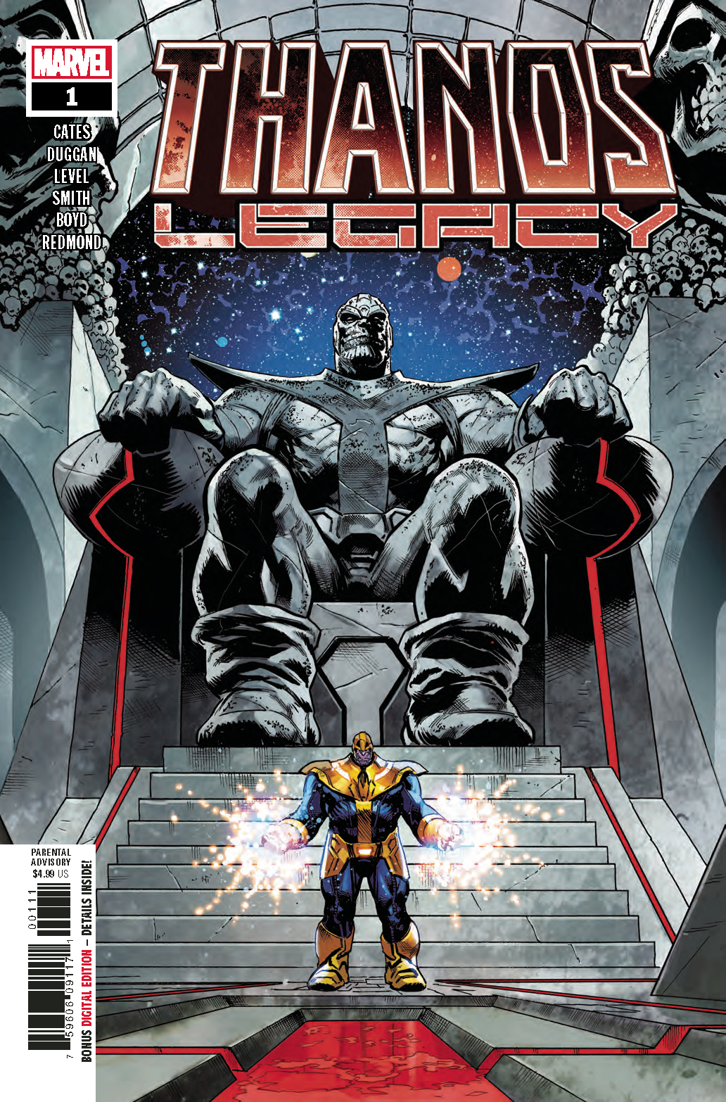
Written by Donny Cates and Gerry Duggan
Illustrated by Brian Level and Cory Smith
Inked by Frederico Blee
Colored by Jordan Boyd and Ruth Redmond
Lettered by VC’s Clayton Cowles
Reviewed by Alexander Jones
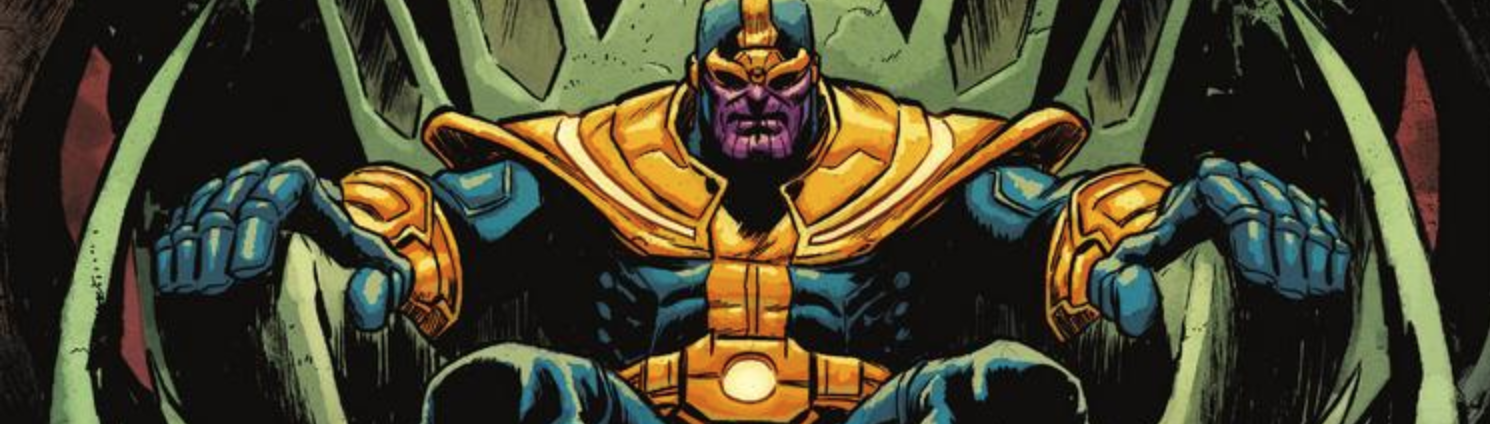
Thanos Legacy #1 is less a one-shot exploring the next chapter of Thanos’ death and more the next step in Donny Cates ongoing Thanos and Cosmic Ghost Rider saga. The narrative in the issue advances the overall Thanos plot ever-so-slightly but has an eclectic sense of humor and dark subtext, much like the actual ‘Thanos Wins’ storyline. Cates has such a strong command over the voice of Thanos and his twisted sense of humor and pride. Once you top the issue off with an appearance of Cosmic Ghost Rider and Brian Level’s subversive art, you’re in for something special. The issue starts to blossom into something particularly interesting towards the back half when more Marvel oddballs start to twist the narrative in a really interesting direction.
The final page illustrated by Level hits such an odd note that should have readers screaming for more content. The issue has a more dynamic, cartoonish look allowing for Cates to channel the humor elements of the story particularly well. This comic has a vast array of different moods, ranging from the incredibly dour opening page to the intense middle section depicting the demise of The Mad Titan. The last couple pages blend humor and violence in a really odd situation showing how Level and Cates have a particularly strong understanding of how to build an issue and a narrative with a more creative style at Marvel.
Gerry Duggan and Cory Smith’s contribution to the annual is also worthy of intense praise. The two creators craft a particularly heartbreaking story centered around the cruelty of The Mad Titan, showing just how far Thanos will go to prove a point. Smith and Duggan also do a great job collaborating in the medium of comics. Paired together the two stories barely advance any plot or say anything about Thanos readers don’t already know, but they are both extremely intriguing stories serving as strong character pieces. The final few pages also have a nice surprise for Cates fans.
Final Verdict: Thanos Legacy features a pair of interesting stories worthy of a BUY for Cates fans looking for the next chapter of the ‘Thanos Wins’ story.
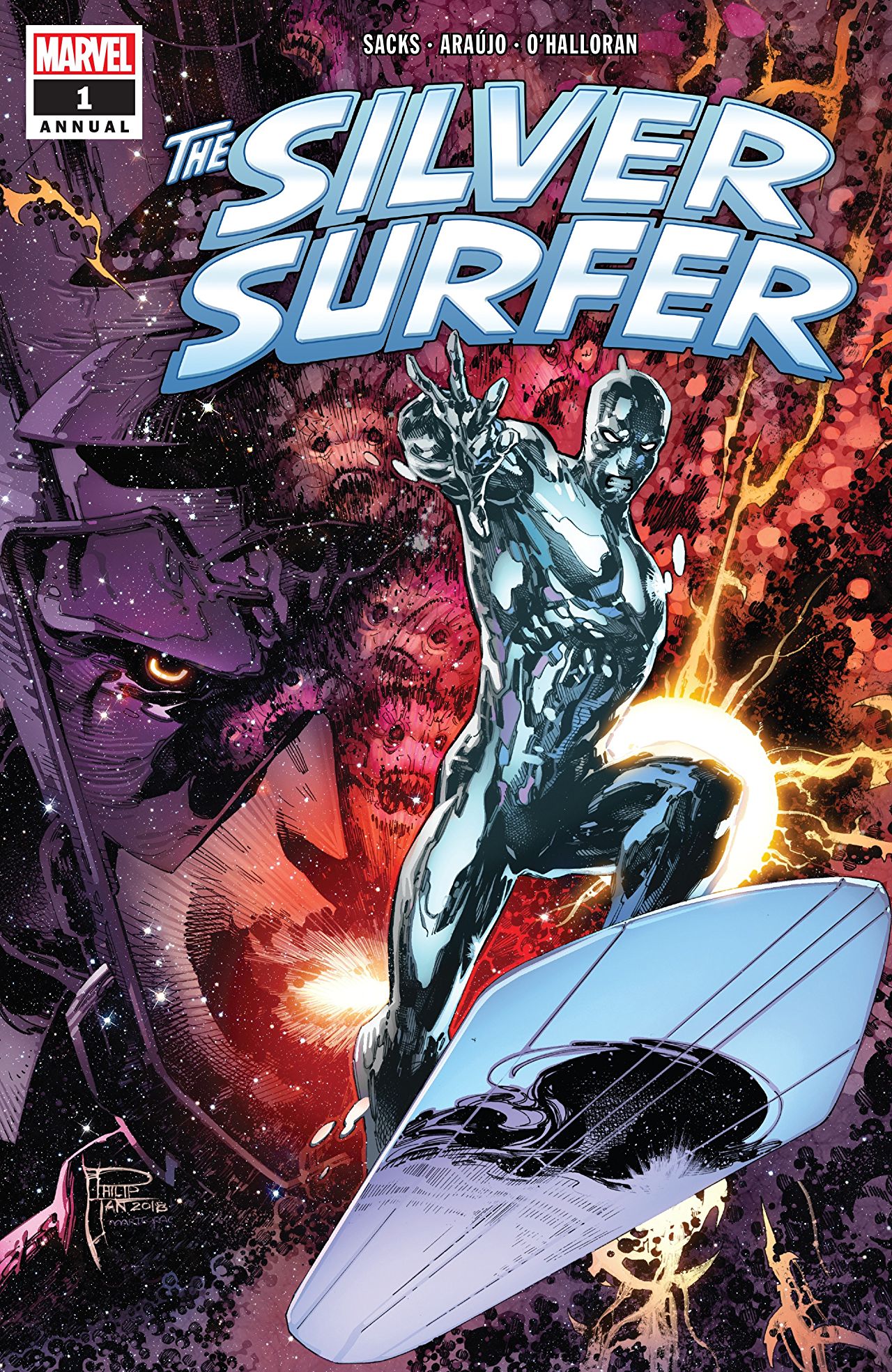
Silver Surfer Annual #1
Written by Ethan Sacks
Illustrated by André Lima Araújo
Colored by Chris O’Halloran
Lettered by VC’s Travis Lanham
Reviewed by Joe Grunenwald
The Silver Surfer doesn’t have an ongoing title right now. When last we saw the character in a solo-starring role, Dan Slott and the Allreds were wrapping up their masterful run with the Surfer and his human companion, Dawn Granger. The task of following such a definitive run is a daunting one, and this week’s Silver Surfer Annual rises to it nicely, presenting a flashback tale of Norrin Radd’s time as the herald of Galactus, and somehow making that period of the Surfer’s life even more tragic than it already was.
Ethan Sacks is a writer with only a few comics credits to his name, but whose work is worth watching if this annual is any indication. Sacks takes a story that could have felt routine – the Surfer finds a world for Galactus to devour and feels bad about it – and packages the intense pathos within a surprising amount of joy, and even some humor. The world the Surfer visits is brilliantly constructed, and feels fully developed from the moment he arrives. In the end note to the issue, Sacks writes of setting out with this story to solve a question which has bothered him about the Surfer’s past behavior; the solution Sacks devises is simple, elegant in its execution, and absolutely heartbreaking. The ‘reveal’ on the final page may be able to be seen coming from a mile away, but it’s no less entertaining for it, and casts the rest of the story in a new light.
Artist André Lima Araújo does a really nice job with the visuals for this story. His storytelling is clear, and his characters are dynamic and expressive. There are shades of Frank Quitely and Moebius visible in his work, and the artist acknowledges the Moebius influence in his portion of the aforementioned end note. The result is a universe that is endless and breathtaking, and alien worlds that feel worn and dirty. The coloring work from Chris O’Halloran adds a lot to the feel of the artwork, adding depth and, occasionally, literal shine to the Surfer himself and texture to the world he visits. It’s wonderful work to look at overall.
I will say, there’s nothing particularly groundbreaking in the story found in this annual. I mentioned before how the plot of the issue could have ended up feeling routine; thankfully the execution from all creators involved helped elevate the story above that potential pitfall. In our discussion last week of the Daredevil Annual, I mentioned the thing I look for in a flashback story is for the tale to reveal something new about the characters or the situations in which they find themselves; I feel like the Silver Surfer Annual delivered the goods in that regard. The Silver Surfer is an extremely complex character, and the period during which he was Galactus’s herald is mentioned but not often explored. Reading this story drove home hard what that period was like for Norrin Radd, and the toll the task of finding worlds for his master to destroy must have taken on him.
Final Verdict: BUY. This is a solid standalone Silver Surfer story full of clever concepts, strong character work, and interesting visuals.

Next week, cool down with Iceman #1!


AUGGHHH! That’s my Peanuts inspired interjection at there being too many good comics out for me to buy in singles. Cool reviews
Comments are closed.