
This week’s Marvel Rundown features an historic debut for a classic Spider-Man foil, and the return of some old friends from outer space. First up, Felicia Hardy is striking out on her own and headlining her very first ongoing series. Does Black Cat #1 have us purring or hissing? Then, a new Guardians Of The Galaxy Annual #1 shifts the focus away from the main team and towards characters who have been out of the limelight recently, including Adam Warlock, Nova, and Cosmo. Does the offbeat collection of tales in this annual merit the $4.99 price of admission? Don’t miss our first impressions on both books this week in The Marvel Rundown!
 Black Cat #1
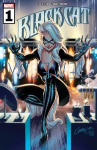 Black Cat #1
Written by Jed MacKay and Nao Fuji
Illustrated by Travel Foreman, Michael Dowling, and Nao Fuji
Colored by Brian Reber and Nao Fuji
Lettered by Ferran Delgado
Cover by J. Scott Campbell & Sabine Rich
Joe Grunenwald: Felicia Hardy is back on the prowl in the first ever Black Cat solo series! Sam, did the felonious feline’s debut steal your heart?
Samantha Puc: Yes, but I was expecting that! I’ve had big, stupid feelings about Felicia Hardy ever since I encountered her in Patsy Walker, A.K.A. Hellcat! a couple years ago. I was really stoked when I learned she was getting a solo series and this first issue did not disappoint — it had the action and intrigue that I hoped for, as well as that particular flavor of Felicia Hardy flirtation that makes her character so much fun.
Grunenwald: ‘Fun’ is the exact word I would use to describe this comic. I’m a sucker for a good heist, so this first issue was basically candy for me. I’ve never had a strong attachment to Felicia Hardy – as a reader growing up in the ’90s I found her to be so overly sexualized that I would get annoyed whenever she would show up – but Jed Mackay’s script gave the character a lot of personality and charm in the issue’s lead story. Her relationship with her henchmen is really interesting, and her banter with the museum security guard was very entertaining. The ‘cat’ narration got to be a little much for me, but otherwise I thought the first story was pretty strongly written.
Puc: It definitely helps that I was introduced to her in a female-led book written and illustrated by women, because I think she has been hyper-sexualized throughout her appearances in the Marvel universe.
I liked the introduction of her henchmen in this first issue; it’s clear that they’re loyal, even if that loyalty only really extends as far as Felicia’s skill for pulling off lucrative heists. I do wish she had at least one woman on her team, since she’s clearly in competition with Odessa Drake, which plays into some stereotypes about women that are really frustrating. I personally liked the cat narration, but that’s because I’m very much a Cat Lady. That first bonus story was perfection.
How did you feel about the art in this issue?
Grunenwald: Absolutely agree about the first bonus story. It was really cute and I was disappointed it was over so quickly. The art on that story in particular stood out to me both in terms of storytelling (which had to work or the silent narrative would fall flat) and stylistically against the other two stories. I liked that it was placed between them to break up the visual look of the issue.
As for the art on the other two stories, I thought it was good but nothing spectacular. Both Travel Foreman and Mike Dowling have styles that more or less fall in line with Marvel’s House look, though Foreman occasionally brings a little more looseness with his pencils that I appreciate. Colorist Brian Reber ties the two stories together nicely, adding vibrance to the action and visual interest to some otherwise somewhat sparse backgrounds. It’s decent work all around, if not something I would run out to buy specifically.
Puc: The one thing I really appreciated about the art in the main story was how fluid Felicia’s movements were, not just when she was fighting but throughout the story. The quick snap of her fingers to extend her claws, the way she stretched across the top of the car to flirt, the way she threw herself onto that incredibly ugly couch at the safe house — it all just felt very natural to the character and worked so beautifully with the script. Those little things made it feel special for me, especially since I was so skeptical about how this book would look based on the cover art, which really leans into that extreme sexualization you mentioned earlier.
Grunenwald: All great points about Foreman’s art. He’s a solid storyteller, and there’s a lot of personality in his characters. And I agree that there’s definitely a jarring switch between J. Scott Campbell’s cover and the interior art. It’s not the choice I would’ve gone with for a cover, and it’s definitely not representative of the look of the interiors, though an argument could be made that at least her face on the cover captures Felicia’s personality decently. That said, I know if I saw that cover on a comic out in the wild I wouldn’t be interested to pick that comic up, so I guess that adage about not judging books by their covers is true.
Puc: Without going off on too much of a tangent, I find that I have this issue with a lot of current books, especially at Marvel — the cover art isn’t reflective of the interiors at all and it sometimes turns me off of series that I would otherwise love without reservation. Anyway. My only other critical comment on this first issue is that I found the lettering for the mugshots jarring — it looked like the design editor just slapped a standard Arial font over the images rather than something that Ferran Delgado actually lettered, which took me out of the story every single time.
Grunenwald: I’ve long been a proponent of ‘the interior artist should do the cover art as well,’ so you’ll hear no argument from me on that point. And while it didn’t bother me as much as it did you, I totally see what you’re saying about the font on the mugshots. I just Googled ‘mugshot board font’ and found a match that looks way more realistic than what’s in the comic. It’s the little details.
Any other stray thoughts or observations, or are we ready to deliver our verdicts?
Puc: My final comment is that I want more silent cat comics from Nao Fuji. And my verdict on this issue is BUY, because I want it this series to stick around!
Grunenwald: Felicia’s cats and Captain Marvel’s cat should have a team-up. I definitely think this first issue is worth a look, and the series and character have a lot of potential. I’m not quite as bullish on it as you are, but I’d still give this one a STRONG BROWSE.
Final Verdict: Sam gives Black Cat #1 a BUY, while Joe calls it a STRONG BROWSE!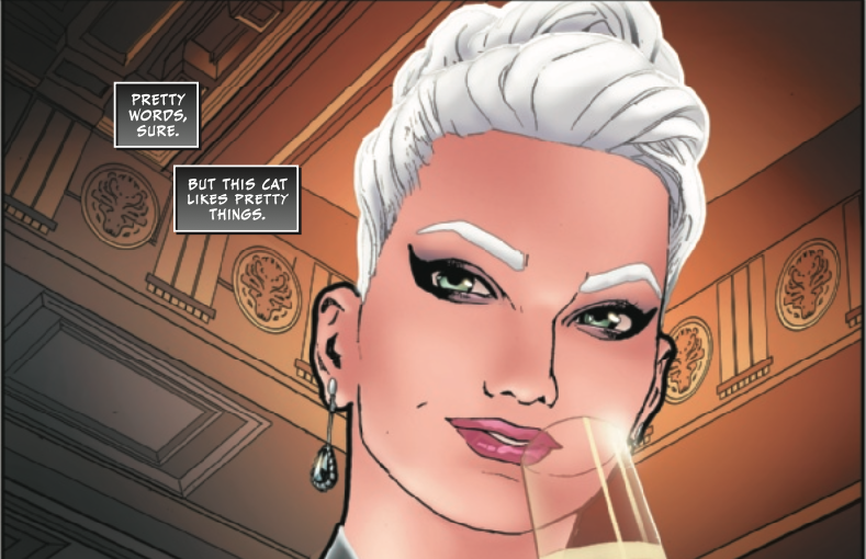
 Guardians Of The Galaxy Annual #1
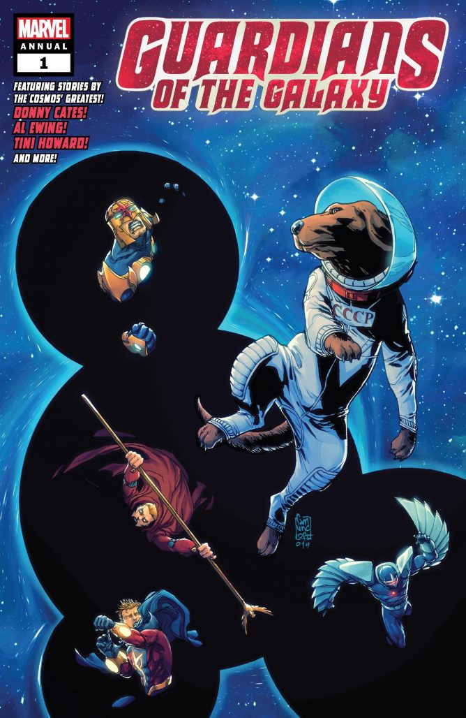 Guardians Of The Galaxy Annual #1
Written by Donny Cates, Al Ewing, Tini Howard, and Zac Thompson & Lonnie Nadler
Illustrated by John McCrea, Yildiray Cinar, Ibrahim Moustafa and Filipe Andrade
Colored by Mike Spicer, Rain Beredo, and Jay David Ramos
Lettered by VC’s Cory Petit
Cover by Giuseppe Camuncoli & Jean-François Beaulieu
Alexander Jones: Joe, some of Marvel’s obscure Guardians of the Galaxy supporting cast members are getting the spotlight in Guardians of the Galaxy Annual #1. The issue is a great example of how wide a net of characters the creative team is pulling from. What were your first impressions of the issue, and do you think the annual stayed consistent through all the different writers and artists?
Joe Grunenwald: There is certainly a wide variety of characters from Marvel’s stable of cosmic characters featured here. With four different creative teams over the course of the issue I wouldn’t call it a consistent read, but I would call it an entertaining one. What did you think?
Jones: I thought the tone was fairly consistent across all the stories in the issue. Getting to see familiar faces like Cosmo and Nova was an entertaining proposition but I also found that each story in the collection took some sort of chance. There were no particularly dull moments across the stretch of writing. I actually think the issue’s framing device could have gotten more out of being longer.
Grunenwald: I was disappointed there wasn’t more Cosmo, though given Donny Cates’s history of doing bad things to dogs he’s written, that’s probably best for our Russian space good boy. I liked the running thread of the concept of faith throughout the stories, whether it’s literal faith in a higher power or simply a belief that things are going to stay as they are or work out somehow in the end. The most interesting story on that theme, for me, was the Darkhawk story, as I felt like that tale addressed the theme less overtly than the Nova/Quasar and Adam Warlock stories did. Still, all three main stories were very well-written.
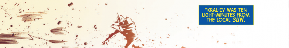
Jones: I’m surprised to see Zac Thompson and Lonnie Nadler turn in another strong script with the Darkhawk portion of the title. The more abstract line work from Felipe Andrade and Mike Spicer is also a particular artistic highlight for me. Going back over the script and looking back at what this annual is trying to accomplish, it really should be at least double the length.
Grunenwald: I agree that Andrade and Spicer’s art on that story was excellent, exaggerated and trippy in the best way. Andrade’s linework was a welcome change of pace after the relatively clean, straightforward work on the first two stories from Yildiray Cinar and Ibrahim Moustafa, respectively. Don’t get me wrong, I liked the work on those stories quite a bit, but I particularly appreciated the visual variety created by Andrade and Spicer’s work. This is a great package all-around from a visual standpoint.
Jones: There was something about that chapter of the annual that I found to be more visceral and attention-grabbing. I liked some of the rambling dialogue in “Advent Horizon” from Howard. I found the chapter to still be overwritten and slightly too simplistic. The Adam Warlock dialogue and scenario that Howard crafted was interesting. The art for this story in my opinion was confusing from the artistic switch in the middle. What were your thoughts?
Grunenwald: I actually think “Advent Horizon” might’ve been my favorite story in this annual. I enjoyed the relatively straightforward nature of Tini Howard’s script, particularly the interaction between Warlock and both the alien species he meets and the ‘deity’ he encounters in space, as well as the ethical issues raised for Warlock by the story’s end. It reminded me a lot of a Doctor Who or a Slott/Allred Silver Surfer story, with Adam Warlock landing in a new location, getting to know the locals, and ultimately helping them with a problem only he can handle. I’m a fan of Ibrahim Moustafa’s art, and I found it as strong as ever here. I think colorist Jay David Ramos deserves a lot of praise here as well, giving the scenes on the surface of the planet, the flashback scenes, and the space-set events their own visual distinction and flair.
Jones: That entry wasn’t my favorite just because I thought some of the dialogue was verbose in explanation. I also think I may carry a slight prejudice towards the story because it pains me to see Warlock depicted in that more negative light. I see him as someone who would always do the right thing similar to a character like Superman. Al Ewing’s Nova and Quasar story, “A Long Time in Politics,” also didn’t sit quite right with me. While I liked the script and direction of the story, the book has a foreboding sense of been-there done-that for me as a fan of these two characters. Nova and Quasar both return from the dead and get stuck in odd places surprisingly frequently.
Grunenwald: I don’t have as much experience with those characters, so I’ll take your word for that. I enjoyed Nova and Quasar’s familiarity with each other, and I appreciated the different perspectives that Ewing had the two characters embody. Nova’s explanation for why he’s on ‘therapeutic leave’ was heartbreaking, and his diatribe to Quasar on the final page felt unfortunately socially and politically relevant. I also really liked Yildiray Cinar and Rain Beredo’s art on this story. The pair gave “A Long Time in Politics” a clean, classic superhero feel which contrasted nicely against the darker, heavier themes Ewing presented.
Jones: I definitely agree with you that there is a level of chemistry with Nova and Quasar. I did find their relationship to be slightly derivative compared to some past works with these characters seen in Bendis’s Guardians of the Galaxy and The Thanos Imperative. I thought the framing device was amusing but a little vague up until the cliffhanger. I have faith that the plot thread at the end of the story will find an interesting resolution in the main book.
Grunenwald: I agree. It was a solid framing device that picked up on threads from the first issue of the series, facilitated the three more or less standalone tales, and set up an interesting cliffhanger to be continued later in the main title. It got the job done and it did it well. Do you have any other thoughts before we render our verdicts?
Jones: I think the issue is worthy of a BROWSE verdict. The stories kept a relatively consistent tone across the board. It was good to see some recent fallen Guardians come back for an issue.
Grunenwald: I agree. This issue doesn’t feel essential even for regular GotG readers, but the stories presented are entertaining and deal with some complicated topics relatively well. I’d give this one a BROWSE as well.
Final Verdict: Alexander and Joe both say the latest Guardians annual is worth a BROWSE!
Next week: Silver Surfer Black!


