

The Beat’s Gregory Paul Silber has been accused of having a bit of an… obsessive personality. Each week in Silber Linings, he takes a humorous look at the weirdest, funniest, and most obscure bits of comics and pop culture that he can’t get out of his head.
You may recall that for my birthday edition of Silber Linings, I wrote about five weird comics I stumbled upon in a dollar bin. That was hardly the first time I went dollar box diving for the wackiest comics I could find, but I have a bad habit of neglecting to read them once I take them home. I’m correcting that this week by staying home and digging out a few obscure comics that have already been in my apartment for years, but that I never got around to cracking open.
I even managed to accidentally stumble upon a ’90s theme. All four of the comics I’ll be reviewing this week (three are from 1993 specifically) are from that wild boom-and-bust decade that saw the industry’s highest of highs (at least in sales terms) and lowest of lows. Let’s find out which end of the spectrum these land on.
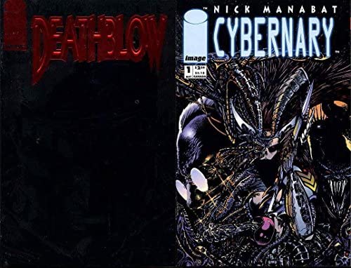
Deathblow #1 / Cybernary #1
Story/co-creators: Brandon Choi and Jim Lee
Script: Stever Gerber (Cybernary)
Art: Jim Lee (Deathblow) and Nick Manabat (Cybernary)
Colors: Joe Chiodo
Color assists: Wendy Fouts
Letters/Logo: Mike Heisler
So this was an interesting surprise. I originally picked this up for Deathblow, a character I had only vaguely heard of, mostly because I was fascinated by the black foil cover. I realize gimmicks like that were commonplace in the ’90s, especially from Image’s early ’90s superhero-heavy years, but I was born in 1991 and didn’t start going to comic book stores regularly until I was 20. The novelty of a cover (published in 1993, in this case) that’s only visible in the right light earnestly delights me.
But what surprised me even more is that Deathblow #1 turned out to also be Cybernary #1, a title I had literally never heard of until about 10 minutes ago when I read it. So we’ve got two issues in one here – or really, two ashcans in the length of a single comic book issue, because neither of these stories are full-length.
I can’t tell you much about Deathblow as a character beyond the fact that he… kills a lot of people? And that makes him sad? I guess he’s Catholic because he confesses to a priest? I know it’s ’90s comics but guys, Deathblow has killed so many people. “I’ve killed men… women… and even… children.”
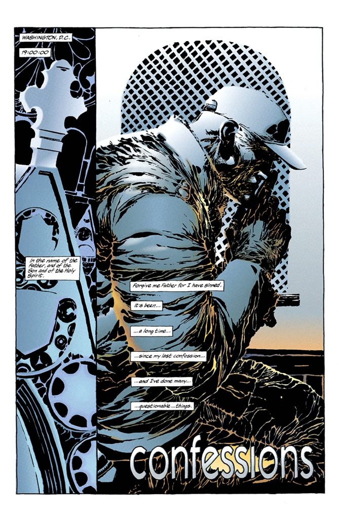
Jim Lee and Brandon Choi are clearly doing a Dark Knight Returns riff, with Deathblow’s suicidal urges echoing Bruce Wayne’s “this would be a good death” in that story. The writing lacks the polish of the ’80s comics to which it’s indebted, but Lee’s visual Frank Miller impressions are impressive. Check out his use of negative space and shadow. It’s a more-than-worthy homage, and while there’s not much story to speak of in these few pages, there’s no denying that it looks extremely cool. I’d love to see more art from Lee in this style.
Cybernary was more disappointing, especially considering that it’s written by Steve Gerber, whose surreal and subversive co-creation Howard the Duck is easily my favorite ’70s Marvel comic. Granted, Lee and Choi are the credited co-plotters, but it’s still groan-inducing to read lines like “nympho-droids seduce, not attack. Target clearly has suffered a major malfunction.”
Much like with Deathblow, I can’t tell you much about who Cybernary is or what her story is about. Sexy robo-lady in a dystopian future? Nick Manabat‘s art is pretty neat, although predictably for this era of “mature” comics made for 12-year-old boys, the visual design of his leading lady is… not great.
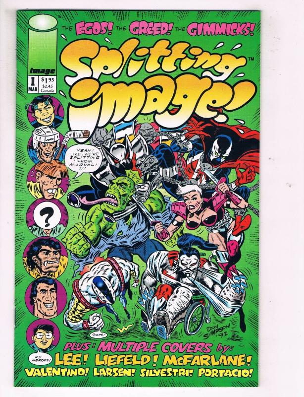
Splitting Image #1
“Based on an Idea by” Rob Liefeld and Don Simpson
Story, script, art, and lettering by Don Simpson
Color design by Brian Murray
Digital separations by Digital Chameleon
Next up is another 1993 Image comic, which might just be the most self-indulgent thing I’ve ever read. And I’m saying that as a Grant Morrison fan.
Splitting Image #1 (there was a second issue that I have little desire to read) is fourth-wall-shattering self-satire about the founding of Image Comics, much in the same style as Mad Magazine’s signature parodies… minus anything remotely funny. The jokes are lazy, gratingly self-satisfied, and often tasteless.
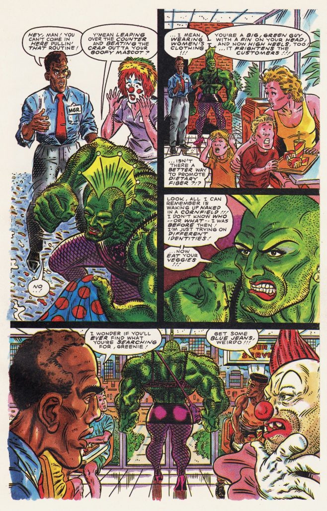
I’m not just referring to the queerphobic Savage Dragon parody “The Jolly Green Drag-Queen,” the use of yellowface for Jim Lee and Whilce Portacio on the cover (seriously, how did Don Simpson still think that was a good idea by 1992?), or the gag about an attempted rape in the ShadowHawk spoof “Tractionshock.” I mean that the jokes are delivered by someone whose comedic sensibilities don’t extend far beyond clumsy puns on familiar names. Todd McFarlane becomes “Godd McFarthing.” Instead of Marc Silvestri, we have “Sly Virility.” Was Don Simpson even trying by the time he got to Whilce Portacio as “Wilt What’z’name?”
I can respect the Image founders’ desire to poke fun at themselves in the midst of their ’90s peak, but Splitting Image reads less like a roast than a circle jerk.
Doom 2099 #1
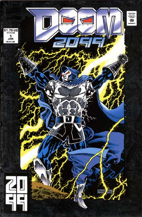
Writer: John Francis Moore
Artist: Pat Broderick
Colorist: Christie Scheele
Letterer: John Costanza
Moving away from Image but staying in 1993, Doom 2099 finds Doctor Doom – or at least, someone who thinks he’s Doctor Doom – waking up over 100 years in the future to find that he no longer rules Latveria. In fact, a young freedom fighter he meets had never even heard of Doom. That’s a bit implausible, right? I’d think anyone old enough to join an underground rebellion today would’ve heard of Woodrow Wilson.
Either way, it’s a pretty cool cyberpunk premise for Doom to find himself in, especially as he takes on more of an antihero role. In the years following Doom’s 20th century reign (and specifically the ’90s, given Marvel’s sliding timeline), the power vacuum he left allowed Latveria to be taken over by corporate rule.
That’s a clever idea, and one that’s still relevant 28 years later, but it’s not executed as well as it should be. The storytelling is a bit sloppy, and while it’s not actively bad, the pacing and sense of flow could’ve used more work. Nonetheless, I’m interested enough in the conceit that maybe I’ll track down the rest of the series sometime. I don’t know how much a 1993 Marvel comic could get away with, but the anti-corporate political musings are surprisingly bold.
NFL SuperPro #3
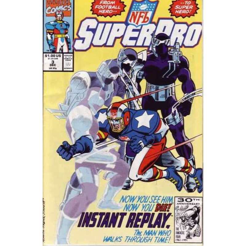
Writer: Fabian Nicieza
Penciler: Jose Delbo
Finisher: Charles Barnett
Colorist: Evelyn Stein
Letterer: Janice Chiang
I try to save what I believe will be the best for last when I do this kind of thing, and NFL SuperPro #3 proved my instincts were correct.
Much like Rom: Space Knight, NFL SuperPro is a licensed Marvel comic set in the 616 universe that’s unlikely to see reprints in our lifetime due to rights issues with the NFL. Which is a shame, because I’d love to read more adventures of this utterly preposterous football-themed superhero who appears to exclusively fight football-related crimes. It’s hilarious, and I’m like 70% sure that’s on purpose. I mean, just read this intro:
“Phil Grayfield’s career as a pro football player ended soon after it began due to injuries. Now, as a result of a fantastic accident, he has a new career – as a super-powered hero who uses his amazing abilities to fight crime and defend the sport he loves from those forces that would seek to corrupt it – for Phil has become… NFL SUPERPRO!”
This issue introduces a new villain: an assassin by the name of Instant Replay, “THE MAN WHO WALKS THROUGH TIME!” That’s a pretty fun power for a football-themed superhero to face off against, although to be honest, I’m not clear on what SuperPro’s own powers are? We’re told that the accident gave him powers, but as far as I can tell from this issue they extend mostly to tackling guys really hard.
By day, Phil works for a magazine (or maybe it’s a TV program? Or a newspaper? Were there entire daily papers dedicated to sports in the ’90s?) called Sports Inside, which is how he gets tipped off about The Eagles Gang, so called because they apparently exclusively rob fans of the Philadelphia Eagles. Why Eagles fans specifically? Other than living in Philly, it’s not for any reason I can surmise beyond the fact that if it weren’t a football-related crime, I guess Iron Man or whoever would have to go after them instead.
This is not a well-reputed comic. io9 described SuperPro as “perhaps the most derided superhero in comic book history,” and writer Fabian Nicieza claims that he mostly did it for free Jets tickets. But man, I thought this was a hoot. Sure, that’s largely because I’m reading it 30 years later through a somewhat ironic lens, but it’s the kind of silliness that I was looking for when I went digging for old, unread comics.
Okay, so it turns out I hadn’t missed out on much when I let these extremely ’90s comics collect dust in my apartment for so long. But if any big shots at the NFL are reading this: please let Marvel reprint NFL SuperPro. It’s what the fans* want.
*Me, who doesn’t follow football.


Yes, there had been a national sports newspaper in the early 90s – the National Sports Daily. It had an all-star, can’t miss lineup of some of the best sports journalists of the day. Superstars up and down the masthead. It lasted 18 months.
Doom 2099 was really good for the first couple of years. That and Spider-man 2099 were the highlights of the line (though that’s not saying much). It withered in quality around year three and spiraled down if I remember correctly.
Comments are closed.