

Via his blog, Bryann Lee O’Malley shades the wisdom of cartooning and good balloon flow:
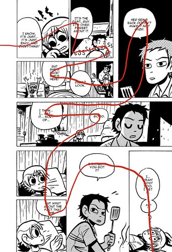
Try to avoid layouts that make as little sense as this one. Also try to avoid hiding your weak layouts with trickery, such as arbitrarily wider gutters (top right) or dropping panel borders to create the illusion of clarity (bottom middle).
A key lesson is: try to attach your balloons to the tops of the panels, especially the corners, because that makes everything a hell of a lot easier both for you and the reader.
BTW, some might argue that the rule breaking first example (from Scott Pilgrim #3) still has a lot of energy and charm in its very awkwardness.


This is sound advice and I use the same tactics in my work all the time. Even when I did a graphic novel for Image (Avigon) that had *no* word balloons I still incorporated an easy path that led the eye naturally from panel to panel.
In fact, if I can help it, I never place word balloons on the bottom of a panel that has a panel below it with a word balloon attached to the top (making both balloons appear together or cause the eye to skip around).
Like the wrong polar side of magnets I keep my word balloons away from each other. As for breaking rules in lettering that can still be done. It just requires a dedication and consistency that makes sense. Breaking one rule in a sea of otherwise solid pages doesn’t look like artistic license, it looks like an error. But who knows, if it’s intentional it could work, but the safe money is always on simplicity of use for the viewer.
However… (sorry I forgot to mention) dropping an occasional panel border (in my opinion) is damn cool when used for effect. The page above is a good example of breaking the rule *just enough* for a good effect.
It helps that some other panels (even with borders) have no background which compliments the empty space of the bottom middle panel.
Basic rule: Balloons float up.