


Nick Derington (Doom Patrol, Batman Universe) and Riley Rossmo (Future State, Harley Quinn, Martian Manhunter) joined moderator Jamie Rich in a deep dive on their contemporary visual approaches to DC classics in Sunday’s “DC: Art In Focus.” They talked shop on cover design, word balloons, page layouts, and using color, drawing examples from their own books (Jinny Hex, Harley Quinn, Detective Comics) as well as favorites like Dave Gibbons’ and Alan Moore’s Watchmen series..
Rich launched immediately into a conversation on cover design, with Derington up first to discuss his vision for Jinny Hex Special #1. The comic has a scheduled December release and features a script written by Brian Michael Bendis.
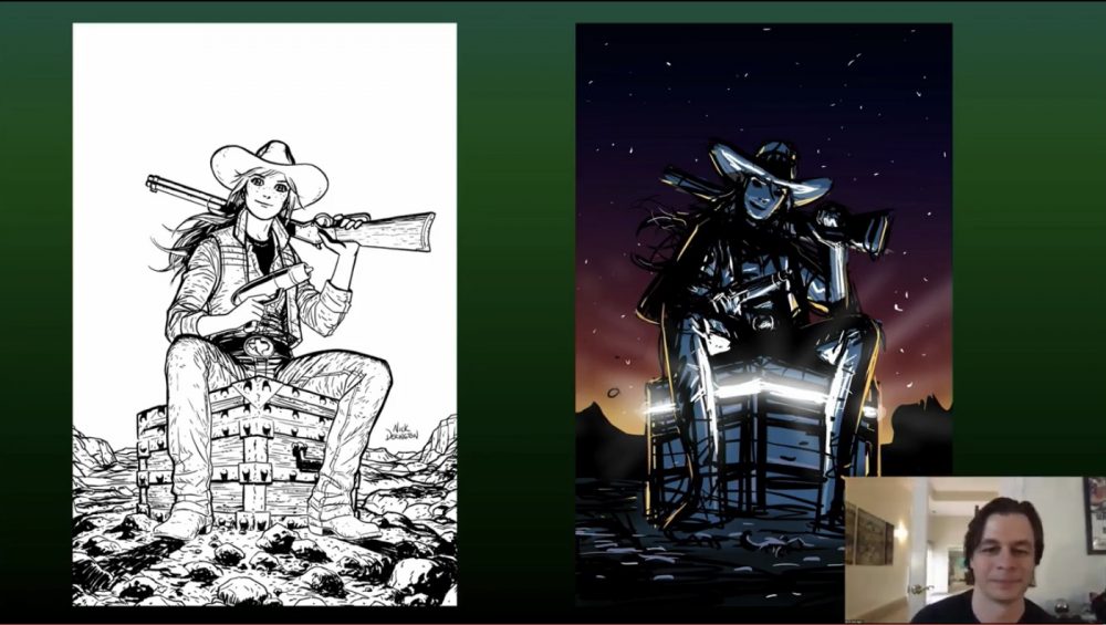
“With covers, it’s half visual, half idea. You figure something out, something that communicates the character, the story, or just an interesting concept, something that’s novel, and the different ways to get to that final goal. A lot of it is just sharing at the ceiling with a sketchbook in your lap and seeing what comes to mind as you explore the idea. Sometimes it’s just the first sketch of an initial idea, and sometimes it takes one-hundred drawings, and you rip your eyeballs out, take a shower, and come back to it. A cover has to do so many different things. It has to tell the story. It has to look cool. Sometimes there are behind-the-scenes things that it has to accomplish.”
An engaging and informative conversation ensued between Derington and Rossmo on their preferences for the different script types: loose scripts (ala Sam Humphries), collaborative scripts (Gerard Way) or dense scripts (Brian Michael Bendis). While they preferred the creative freedoms that came with loose scripts, they also spoke of the personal gratification of adapting a more challenging script.
Rossmo spoke about his experience with Sam Humphries on Harley Quinn #75. The details involved setting up the scene in which Punchline cuts Harley’s throat.
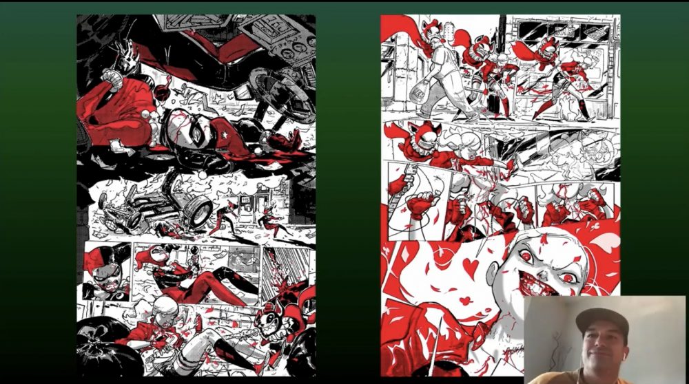
“I prefer a looser [script], I guess, more the Marvel way. With Sam, it was ‘Do you what you want to do, and we’ll figure it out. These are the story pieces that have to happen.’ I try to anchor the page with a big, detailed image that sets up where we are and what’s going on. And so with the image of Harley on that first slide, as Harley loses consciousness, she’s descending into the water that’s impossibly deep, then build out the rest of it around the page.”
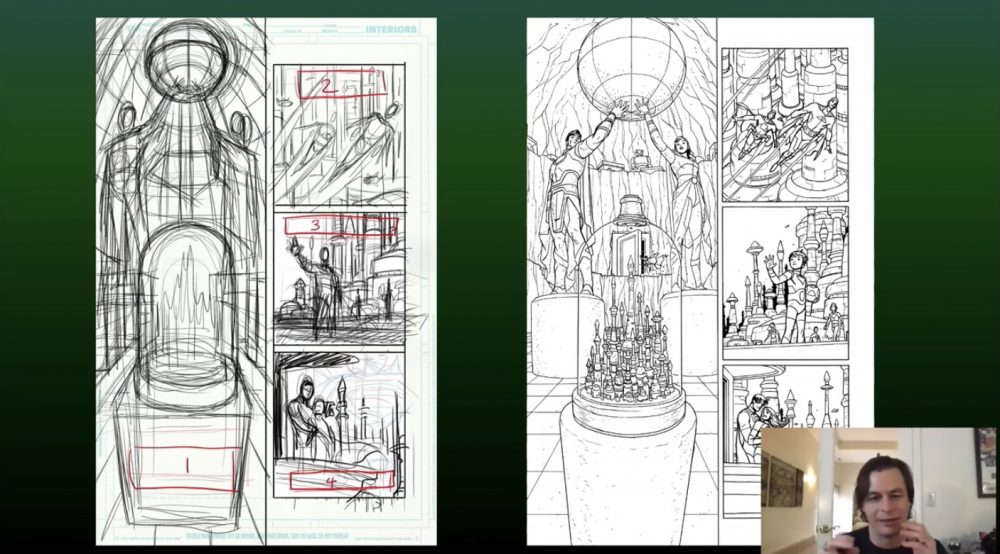
Derington and Rossmo took nearly ten minutes to discuss the importance of word balloon placement within panels. Rich commended Derington’s pre-planning on dialog placement within the pages of his Batman/Superman #7 drawings. As an editor, Rich found the direction helpful so as not to obscure important images.
According to Derington:
“It’s a personal obsession of mine, really, where it’s like you look at a comic book page. You have these square panels which are the windows to the world. But then you have these great blocks of white balloons or white rectangles. There are huge graphic elements on the page, and they’re just as important as anything else that’s happening on the page. If anything, they’re more important. If you read about how people are actually reading comics, they’re bouncing from word balloon to work balloon. About half the time, what’s happening in the drawing is kind of absorbed visually, so designing where word balloons go–that’s where the eye is going to go.”
Rossmo walked through the design elements of a double-page spread in Detective #1027, in which a red ribbon weaves throughout the page, anchoring the eye to the relevant pieces of action.
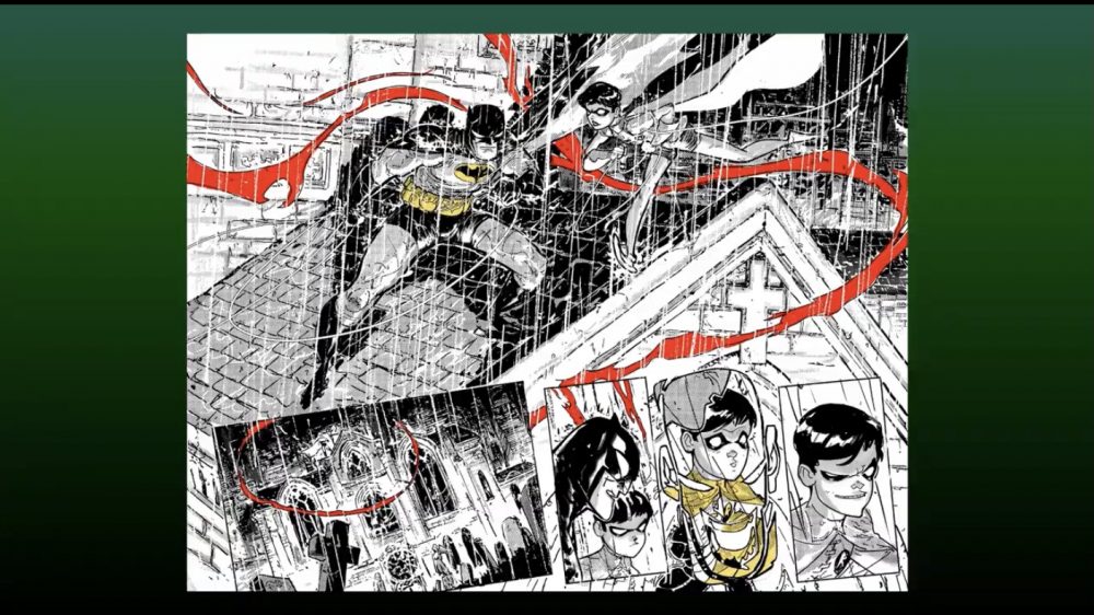
“We worked on a super, super loose script. James [Tynion] says ‘Dead man shows up, do whatever in this sequence,’ and I can do whatever I want. So dead man is a sort of awesome visual device to lead the eye through it. We start with a big huge image of Batman being Batman. I like when Robin’s kind of fun, exuberant and playful, so I try to reflect that in his body language. So that’s the big image that hits the viewers first, and the rest is, as Nick says, where really really aren’t going to pay attention.”
The last topic of the half hour “DC: Art In Focus” panel revolved around the subject of colorists. While neither man had any issues with colorists taking control of the final product, they did express a preference coloring their own covers, citing last minute decision making as a primary motivation to maintain control.
All-in-all, it was a densely packed subject, full of useful design tips and layout do’s-and-don’ts for the aspiring artist while also shedding insight behind the approaches each takes in generating fresh buzz for tried-and-true characters.
Miss any of The Beat’s NYCC ‘20 coverage? Click here!


