

by Nate Powell and Chris Ross
[Editor’s note: The release this week of March Book Two by Rep. John Lewis, Andrew Aydin and Nate Powell has already made headlines with its story of the fight for civil rights in the 60s, and the covers to both volumes have become iconic in their own right. The message of the courage to fight for equality for all in the face of violent opposition is as relevant and needed today as it was 50 years ago. But powerful images to cover powerful times don’t always spring up fully formed. Here Powell and Top Shelf designer Chris Ross with an in-depth breakdown of how they created these covers and combined imagery to capture both history and ideals.]
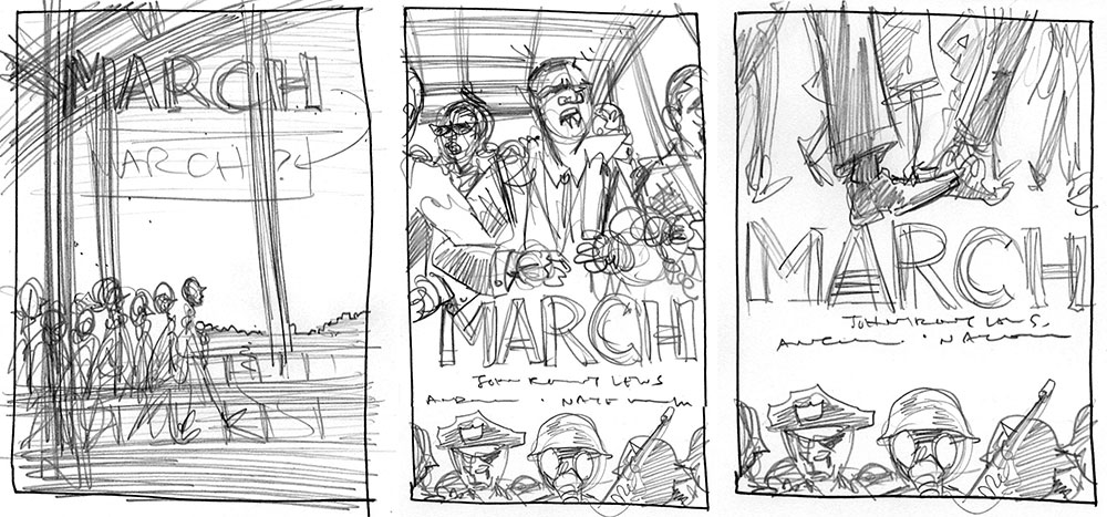
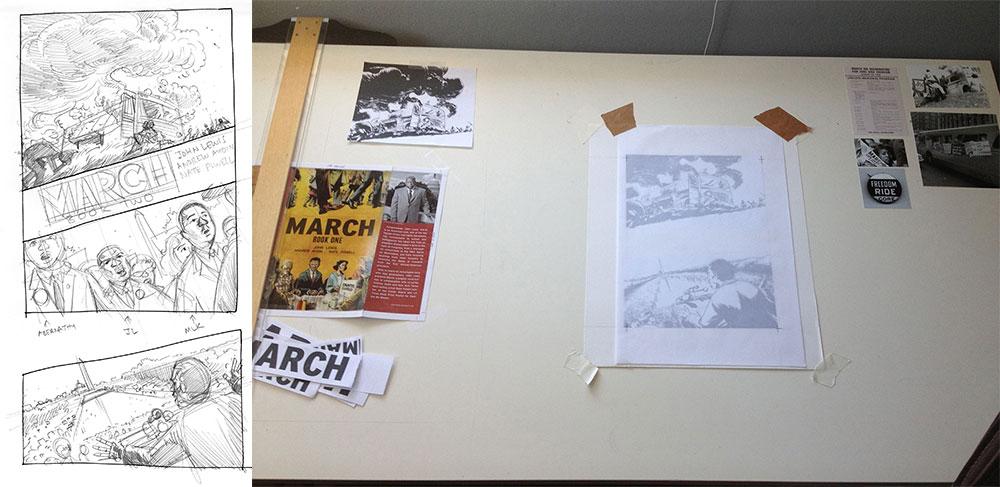
NATE: March was originally a single, massive volume, so the initial front and back covers were intended to house the entire narrative: the front introduced the basic visual theme of opposition, with two elements facing off against each other, though a contingent of riot-ready white supremacist police were prominently featured across the bottom. After some discussion with Chris Ross, Andrew Aydin, and Congressman Lewis, we all agreed that we should shift some of that focus to the folks on the front lines, and away from Jim Crow police forces. Around that time, we decided to release the saga as a trilogy, so Chris and I jumped in to further develop the oppositional themes, but playing with different angles and approaches to the cover’s division.
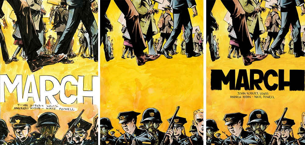
NATE: The marching feet motif, like the book’s title, are rooted in one of Congressman Lewis’ favorite Martin Luther King quotes, “There is no sound more powerful than the marching feet of a determined people.” We experimented with a lot of other design elements, but in the end kept coming back to that unshakable image.
CHRIS: I think we also had to be very conscious of being white males metaphorically designing the “skin” of a graphic novel about the civil rights movement. For example, there’s a common trope in graphic design, especially featuring marginalized people, of representing characters as body parts, “cut off” by the edges and removed from any context. Women are reduced to legs, breasts, or butts. Black men are reduced to chests and backs. Lots of folks believe that that’s not coincidental, and doing that carries a unique meaning when we represent the race and the body. So in the context of marching feet, it’s important to add depth and see whole bodies in the background, while also showing faces where we can, conveying an accurate and diverse range of these folks’ unique experiences and emotional states. It gives context to the movement and The Movement.
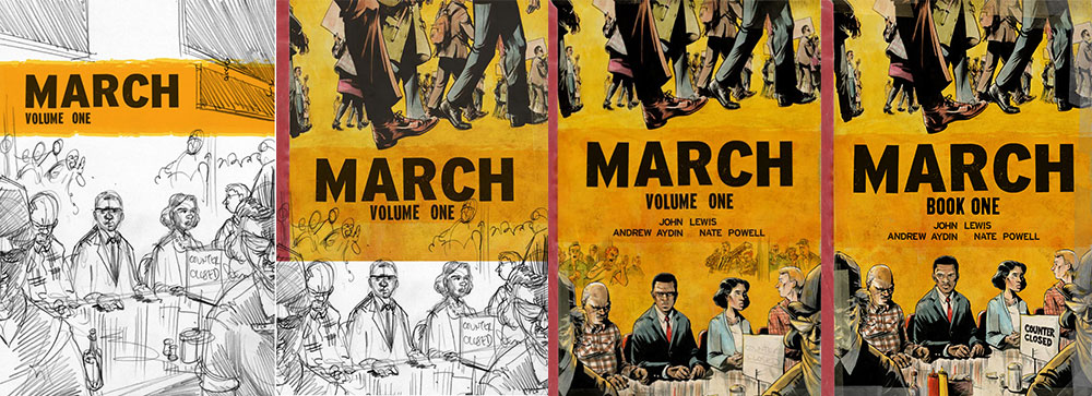 NATE: Once we settled on the lunch counter setting and I’d rendered it, a few more essential steps unfolded; importantly, there were a few re-draws of young John Lewis’ face to more perfectly capture his likeness, but several compositional changes occurred (eliminating the crowd of white heckers in the background, making the “Counter Closed” sign more legible, and adding condiment bottles to the counter, which really tied the whole room together, as The Dude might put it).
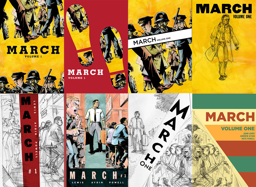
CHRIS: The type treatment began as Nate’s hand-rendered type, but the book “read” as a Nate Powell Book (alongside the fantastic Any Empire and Swallow Me Whole). This isn’t a problem because a Nate Powell Book is important and beautiful (as is Nate Powell), but March is in a different category and should have its own identity. So, we made a type treatment that was drawn from the interstate highway system, alongside some key fonts that I completely ripped off serve as homage to Eric Skillman [designer of Alec: The Years Have Pants and the Criterion Collection], whose spirit I tried to summon. Skillman is such a talented designer. So then I played with the type until it looked like the logotype March has always existed.
NATE: Chris had an incredible vision of the books as objects, as documents of that era whose contents had also survived the struggle. He brilliantly envisioned Book One as a second-hand textbook one might find in a segregated rural African-American school, like the one young John Lewis attended; the volume would bear the marks of excessive taping and binding, spine and corner wear… and the signed-and-numbered hardcover itself would include mid-century library card inserts and stamps.
CHRIS: Thanks Tualatin Elementary School librarians! But that is sort of an emerging trope—books as objects from other time periods and existing as living objects. I think it works when the designer and artist and author consider that the cover is not only going to communicate something to the reader, but that it will live a life exclusively with the reader. That’s a nice way of saying patina works in interesting ways and meanings on a cover, but it really does detract, in my opinion, when it’s an interior design choice. It makes me wonder how these books with interior patinas will affect readability in ten–twenty years. I’m guilty of thinking and designing like that myself. I think it seems like an easy tool in the toolchest, and I have to remember these books will last (and should be built to last) a long time. They live, as any teacher or librarian will tell you.
NATE: Likewise, Book Two’s cover is a survivor of that fateful bus burning along the Freedom Ride in Alabama, bearing the scorch marks and reconstructive tape necessary to keep it together as the Movement itself was threatened to be derailed.
CHRIS: The tape was originally the tape I was going to use on The Underwater Welder cover, but decided to go with a fabric texture with Welder and remembered the tape when we were noodling on March.
 NATE: We knew almost immediately what I wanted to be represented on the cover of Book Two, so it came together with very minimal sketching, but also opened up a series of conversations among the creative team. Congressman Lewis wanted to make sure that, even as a young man amidst the center of the Freedom Ride, he wasn’t exploiting the power of that burning bus’s image for the cover. Rep. Lewis had actually left the Freedom Ride for a couple of days to interview for activist work abroad, and as he was about to rejoin the Riders he discovered his bus had been attacked.
CHRIS: It’s such a dramatic rendering.
NATE: It was a powerful moment for reflection: that these experiences and their suffering were, part of a collective journey for liberation, but that can never undermine the fact that they were specific, real acts of terrorism inflicting deep trauma, injury, and death. To young John Lewis’ friends, neighbors, heroes, and to himself. It was a call to be mindful of ownership over these experiences. At the same time, he (and we) measured his own mandate to “tell the whole story,” to “make it plain.” At our consensus, I drew an alternate top for the Book Two cover depicting demonstrators at the March On Washington moving across the National Mall. After careful consideration, Congressman Lewis concluded that the original cover spoke more powerfully to the whole truth of the Movement and its struggle.
CHRIS: That alternative cover is really interesting, and it plays against the angles that we had set up, the angles of action. If we were going that way, we’d have to reconsider the dutch angle and the directions of movement above and below the title.
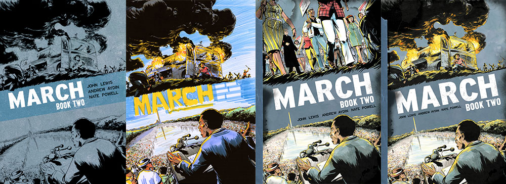 NATE: Color and angles have played an important role in reflecting both the books’ individual contents and their placement in the narrative arc: Book One is largely the yellow of caution and instruction, urging slow, careful movements before the saga intensifies. Book Two is mostly the blue-and-grey of the previous century’s American Civil War, but carrying the gold/green/red palette of the first book forward as well. I will only briefly mention that the cover of Book Three may use the color scheme of the Alabama state flag, and the previously separated opposing elements have now been pushed into the same picture plane. The volumes begin with flat, ninety-degree compositions, but shift in design and camera placement as the Movement intensifies, echoing a literal escalation of angles across the covers.
CHRIS: I remember one of the color guides we were thinking about was really blue and yellow (the second from the left above), like Boy Scout blue and yellow, and it made the cover vibrate, but not really in a way that was communicating what we wanted to communicate. 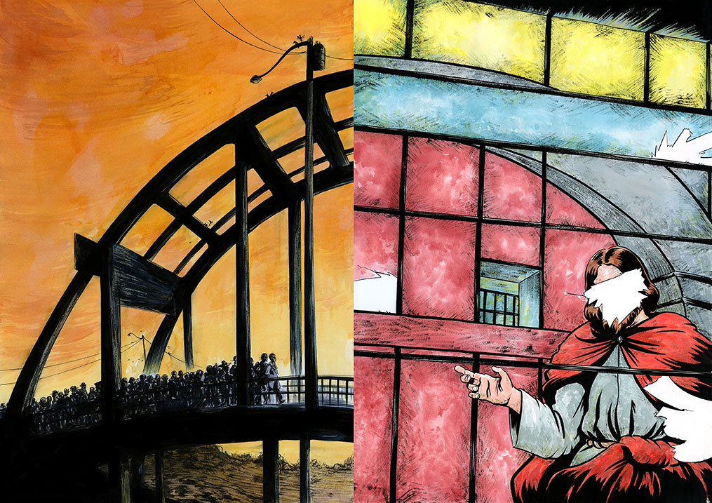
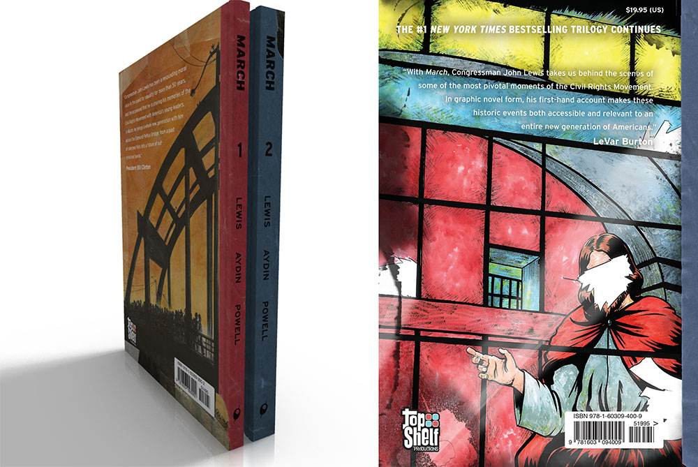
NATE: Just as we aimed for consistency and progression of theme on the front covers and total package, Chris Ross presented the idea of creating a triptych out of the saga’s back covers. One of us brought up the idea of Theodore Parker’s quote, adapted and immortalized by Dr. King, that the “arc of the moral universe is long, but it bends toward justice”, and we didn’t have to look long to find a perfect physical arc in the Edmund Pettus Bridge itself.
CHRIS: I wanted that as an art piece—a consistent narrative arc through time and this project. Standalone. Thematically linked through history that these conflicts get played out over longer time periods than humans live, and that through hard work and sacrifice, it gets incrementally better…we hope.
NATE: As I remember, I drew the Book One back cover waaaaay back in late 2011, when March was a single volume. I could see it very clearly in my mind’s eye, and just did one quick watercolor sketch before turning in the finished piece. Once we decided to make it a trilogy the next summer, we started looking ahead in content to pull out physical arcs and arches that might apply to our concept. I knew that Book Two would end with the bombing of 16th Street Baptist in Birmingham and wanted the blown-out window to be on the back cover as an eternal echo of the book itself, but it wasn’t until I started gathering more reference, much closer to the book’s end, that I realized the arch already continued in the blown-out window’s design.
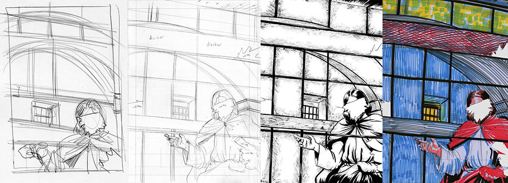 CHRIS: We also chose to crop the image on the back so that it displayed four missing panels—representing the four girls killed in the bombing. Then those missing panels become rays of sunshine.
 CHRIS: We find these coincidental things in our “discovery” of a cover, and it’s like they’re always already there. It’s also why I like designing covers FAR in advance of their release: not just for marketing reasons, but so that the creators can live with it for a long time, to become intimate with the cover, to feel like that cover has always existed. In fact, the book cover for March: Book Two was finished a few days after we finished the cover for Book One. Right now, we’re narrowing down the cover for Book Three.
NATE: On that note, I remembered the Birmingham window from my initial reading of Walking with the Wind, its Christ’s face blown out by the explosion—but I had to check in with Andrew and the Congressman halfway through drawing Book Two, in which the face of Christ is also blown out by a brick at First Baptist in Montgomery in 1961. It was eerie and disturbing to confirm both of these events, and from a writing perspective, the kind of thing you just can’t make up. So there it was. There they both were.
CHRIS: I didn’t know that—and that both these representations become something a bit more profound, a bit more representative of the movement. Kindness in the face (literally) of violent oppression.
NATE: We have elements in place to continue the overarching composition for Book Three—that’s being worked on right now (it’s sitting next to me at the desk!), but nothing to show yet. Back to the drawing table… gotta get these color sketches for the next cover done pronto!
CHRIS: That’s really the fun, terrifying, crazy, beautiful part: finding the engine of meaning and narrative in this story and doing some very Deep Thinking about what this engine looks like, how the elements that aesthetically speak to you play with Rep. Lewis’, Andrew’s, and Nate’s story. And represent them in meaningful ways. And hope that they always appear to have always existed.
March: Book One and March: Book Two are in stores now from Top Shelf Productions, an imprint of IDW Publishing.


The next time Heidi asks what we would like to see more of at The Beat, this will be one of the examples I will point to when I say “this, more of this”.
Wonderful article!
Great stuff. (The books and this process piece about them.)
What Jacob lyon goddard said. This is great – thanks!
Comments are closed.