
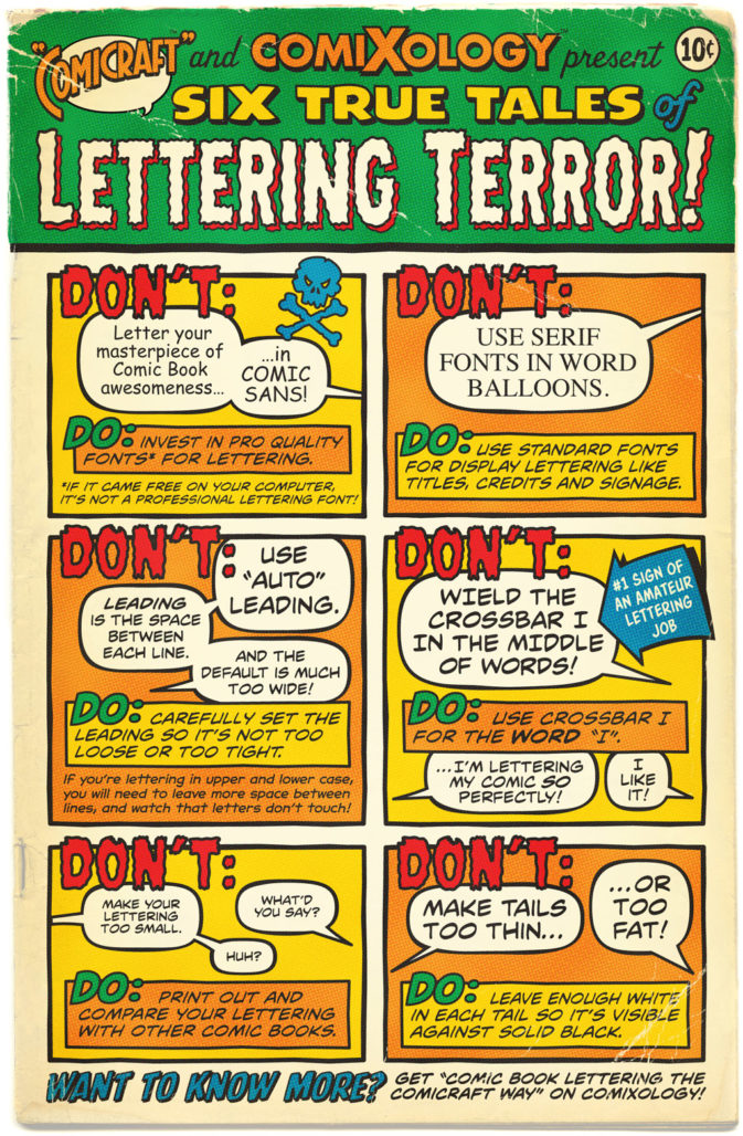
Even though the role of a letterer is often underappreciated, subpar lettering ruins the work of even comics’ best writers and artists. A common sign of a good letterer is that their work doesn’t distract the reader from the story being told. That makes for a thankless profession that’s nevertheless crucial to the reading experience of pretty much every comic.
The role of the letterer is so invisible that even their collaborators often fail to keep them in mind. The most common example is when artists forget to leave space for dialogue and captions. That makes the letterers’ job more difficult and, despite their best efforts, results in a comic that looks less professional than it should.
Creators need to be better to letterers, not just out of respect but to preserve the quality of their own hard work. Beyond that, working more closely with the letterer always leads to a better comic. The Beat put together several ways collaborators can better accommodate the letterer’s work and actively engage them in the creative process.
Proper formatting

A comic book script is far more complicated than a manuscript for a novel or a screenplay. Every page has a lot of moving parts, which can make the script difficult to follow if it’s poorly formatted. The letterer needs clear instructions to do their job well. Properly formatted scripts are crucial to conveying what the author wants from their collaborators.
As mentioned in the last Making Comics column, the easy-to-to-follow script template created by Fred Van Lente is the most popular, but several other options are also available across the internet. Writers can customize the templates but should be conscientious when doing so. If they’re not, they’ll create new formatting errors as a result of their tinkering
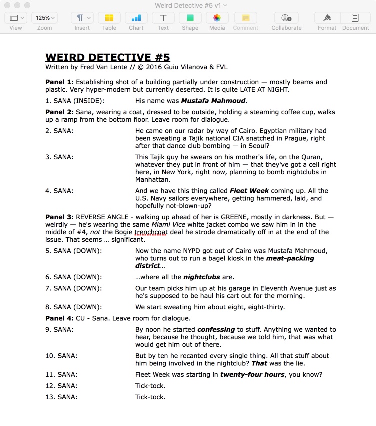
One of the simplest and most helpful things a good script format does is number each instance a letterer needs to create a word balloon, caption, etc. See the example below from a Van Lente script.
Unless instructed otherwise, comic book scripts should always be sent to letterers as Microsoft Word documents. PDFs create formatting complications the letterer shouldn’t be tasked with cleaning up.
Spatial awareness
Everyone reading this has probably come across their share of comics that leave so little space for the text that the words barely fit on the page. Usually, that happens because the writer and/or artist didn’t keep the lettering in mind. To compensate for that, the letterer has to put in a lot of extra work just to fit everything on the page. If space is too constrained, even the letterer’s best efforts won’t distract from the mistake made by their collaborators.
Comic book writers should visualize pages they’re scripting so they’re aware of exactly what they’re asking of the artist. They also need to estimate to the best their abilities how much text can fit into each panel to understand what the pages will look like after they’re lettered.
In an interview for a fanzine Zarjaz, Alan Moore relayed the lettering rules of legendary editor Mort Weisinger.
What he said was: if you’ve got six panels on a page, then the maximum number of words you should have in each panel is 35. No more. That’s the maximum. 35 words per panel.
Also, if a balloon has more than 20 or 25 words in it, it’s going to look too big. 25 words is the absolute maximum for balloon size.
Right, once you’ve taken on those two simple rules, laying out comics pages — it gives you somewhere to start — you sort of know ‘OK, so six panels, 35 words to a panel, that means about 210 words per page maximum… [so] if you’ve got two panels you’d have 105 each. If you’ve got nine panels, it’s about 23 – 24 words — that’ll be about the right balance of words and pictures.
So that is why I obsessively count all the words [in my scripts], to make sure that I’m not going to overwhelm the pictures. I’ve seen some terrible comic writing where the balloons are huge, cover the entire background…
Leaving space is also a responsibility of the artist, who serves as the last line of defense from unnecessary headaches. They need to leave empty space where the letterer’s captions, word balloons, etc. can be added. Some illustrators fill whole panels with artwork, but since it’s going to be covered up by word balloons and such anyway, they’re best off reducing their workload by leaving the letterer the room they need to add text.
Another concern is what’s referred to as “blocking” in film and television. Any panel that features a conversation between two or more characters needs to be laid out by the artist so that the word balloons can flow naturally between them. If the artist puts a character on the right-hand side of the panel when they should be on the left, the word balloons will look more unnatural on the page. Some writers describe where characters should be standing in the script, but that’s usually the responsibility of the artist. That’s why many artists will include word balloons in their layouts so they know where to leave space for the letterer.
Have reasonable expectations
Everyone has a slightly different opinion about what can be asked of a collaborator. Every time I’ve worked with a letterer on a comic we’ve agreed that it’s fair to ask for minor lettering changes here and there. Sometimes a writer needs to see their words on the page to recognize they need to be tweaked. Certain requests of a letterer, however, are tantamount to taking advantage of a collaborator.
For example, writers needs to understand that the role of the letterer is to transfer the words from the script to the page. Their job isn’t to copy edit a sloppily typed up script, and they deserve extra compensation if they’re asked to do so.
The more creators can agree on ahead of time the better. A contract is one way to go about that. Even if neither party expects it to be legally binding, writing the contract is still an opportunity for both sides to lay out what they expect of the other.
Create opportunities for the letterer
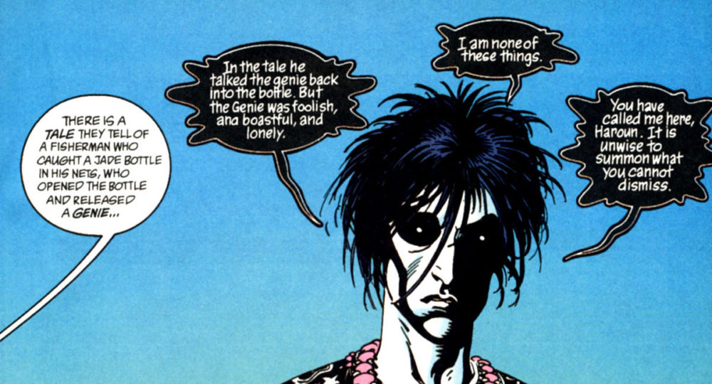
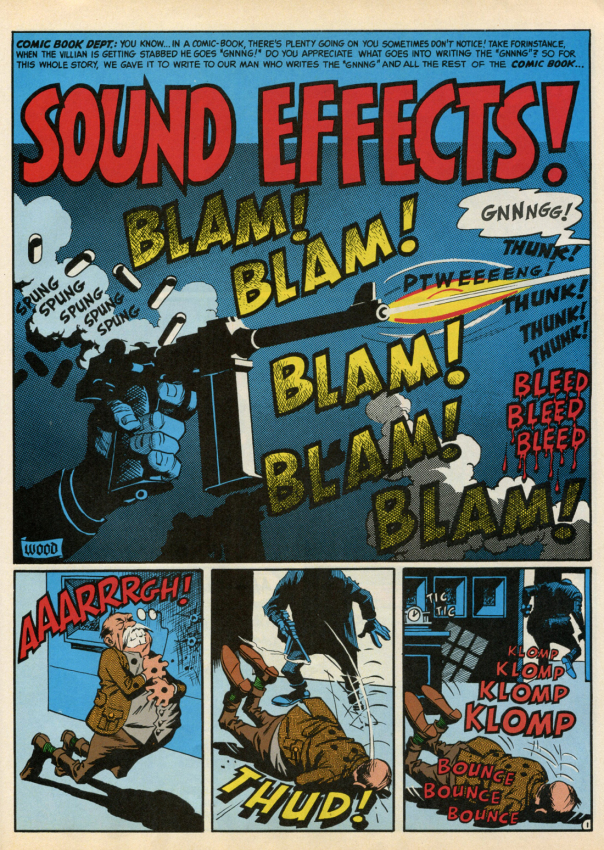
Writers and artists can develop a comic that makes the role of the letterer more creative in nature. The use of sound effects is an obvious way to do it but there are plenty of other options. Characters can be visually defined by unique word balloon designs, like Morpheus in The Sandman. The lettering can even be used to covey a specific energy or tone
Many letterers appreciate the opportunity to experiment, tired of recycling through the more standard font choices. Keep in mind, though, that more unique lettering is often more time-consuming. As a result, requesting it may or may not come at an extra cost.
Ask for the letterer’s insight
Creators should ask for letterers’ opinions on their projects. Comics are a combination of words and pictures. Letterers are the ones who best recognize how words look on the page. That makes a letterer a valuable resource for comic book creators wise enough to seek out their insight.
The role of a letterer oftentimes goes unnoticed, but comic book readers and even creators often still fail to recognize their importance. That has started to change and hopefully the trend continues. The more widely appreciated their contributions become, the more important they’ll be to the creative process, resulting in better comics and smarter readers.
Update: Edited to clarify that Mort Weisinger didn’t tell Alan Moore the lettering rules personally.


Joe Rosen’s tiny lettering for Marvel is increasingly hard to read as I age (even with glasses).
Roy Thomas must have noticed this, too. In one FF issue in the ’70s, he wrote a caption describing something as being “as tiny as Joe Rosen’s lettering.”
A very helpful guide. Thank you. One note: Alan actually got the rules from editor Julius Schwartz, not from Weisinger, who was long-dead by the time Alan started writing comics.
@Mark Thanks for the note. Based on the source I linked to, Moore was sharing Weisinger’s rules. So I’m guessing that he learned them somewhere, just not directly from Mort. Unless the source named Weisinger when it meant to name Julius Schwartz. I edited the piece so it doesn’t read that Weisinger told Moore the rules.
https://downthetubes.net/?p=6793
Comments are closed.