


Interview by Avery Kaplan and Rebecca Oliver Kaplan
We don’t know how most people’s dinner discussions go, but ours go something like this:
ROK: “Who [designed/lettered] that First Second book?”
Avery: “I don’t know. Ask?”
Well, we finally asked.
The Beat caught up with First Second Creative Director Kirk Benshoff to learn more about what goes into his work designing graphic novels. We asked about the steps in the design process, about details like the lettering process at First Second, and about how Benshoff’s experience as a photographer informs his work on comics.
ENSIGNS KAPLAN: Can you take us through the design process? E.g., what’s the first step for you? Do you talk to the cartoonist, read the manuscript, etc.?
KIRK BENSHOFF: Oh my god, I LOVE talking about this. So much so, it’s a little embarrassing. To get inside my head a little bit, I can’t be creative if there is clutter surrounding me. It’s to the point that I need to clean any workspace before I can focus on the work itself. I’ve found over the years that this headspace isn’t unique.
Many artists I interact with have a similar need for order before they can be creative. So the workflow we’ve developed at First Second is designed to allow for complete flexibility so our artists can make art however they need to, while still having structure and predictability from our side, the publisher side. Metaphorically keeping the project “space” organized so everyone can focus on the necessary parts of their project and have fun.
The first thing I do is set up calls with creators. Ideally video calls so we can meet each other face to face. We set-up a shared drive project folder and provide lots of assets to the team. On the call, I learn about the project, how the creator(s) envision the finished book, and most importantly learn how everyone plans to work on the project. I want to understand their overall work style all the way down to what software is being used.
This is a HUGE help for me and my team, because something as simple as the software to what medium will be used in a specific stage can greatly impact how we do things on our end. One of the benefits of the meeting is it allows me to help with any immediate requests, i.e., figuring out how we want to handle different languages in the book to the lettering font.
Ultimately, we break our projects into two parts: editorial and book build. The focus of the editorial half is the manuscript to pencils to inks to color with lettering in-between. We very rarely do assembly line production. More often than not, there is one artist with one stage assist if they need it: flatting, color, or lettering.
Baked into this editorial half is what we call our “Proof of Concept” stage, which is where we look at how at all the visual tools that will be used in the book: color palettes, any color palette changes, inking styles, lettering instances, layout instances, etc. This stage was modeled after “sample pages” in prose book design which is a way for everyone to see all the creative decisions for a book before implementing those creative decisions over and over in the final construction.
So our Proof of Concept stage allows for feedback to come with minimum impact to the creator. The goal is to send notes to creators BEFORE those creative decisions are repeated over and over. Once everyone involved is on a unified front with the selection of Proof of Concept pages, the creator then has a style guide for the book!
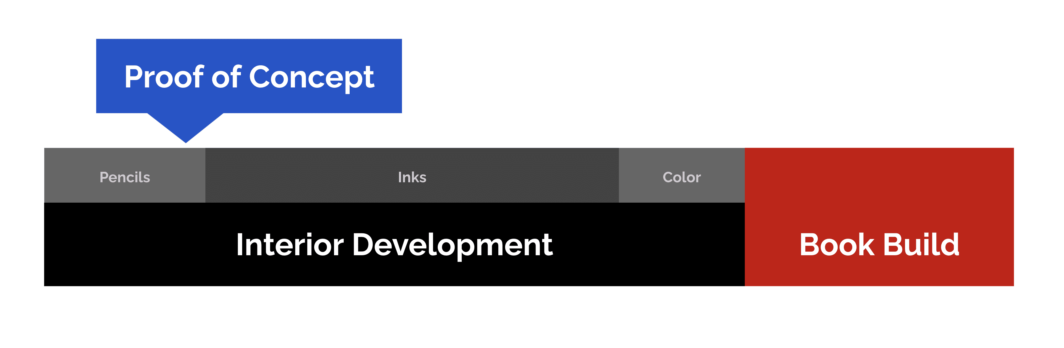
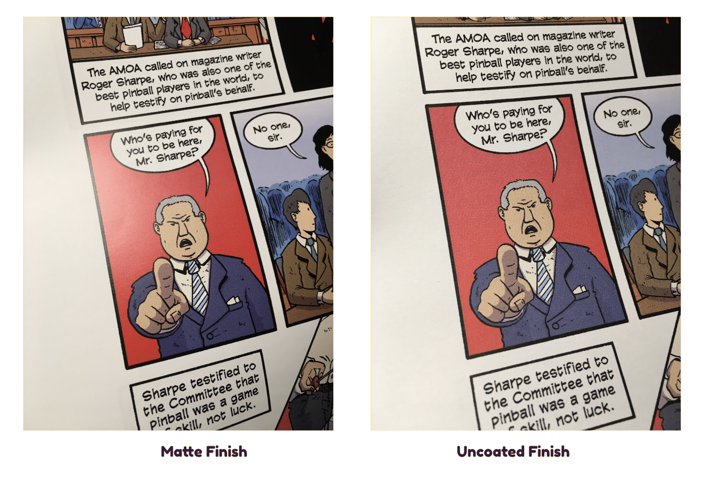
The Proof of Concept stage culminates into test proofs on our actual paper options: matte coated and uncoated paper. These test proofs are really a dress rehearsal for final art delivery. So we have our creators upload the Proof of Concept pages exactly as required for final delivery, and those are what’s sent to get proofed. This step is particularly beneficial since EVERY CREATOR MAKES THEIR COMICS DIFFERENTLY. It’s amazing how different it can be, but something small can have profound effects on the final output of the files. So if something is not looking right, these test proofs allow us to catch the fix early and address the issue early before repeating the error over and over in the final artwork.
Finally, we can check to see how the chosen colors will print on the paper stock. Uncoated has a more tactile feel that some people like, but it soaks in the ink and can flatten out the palette, whereas matte coated paper has a smooth feel and the color tends to be more vibrant since the ink sits on the surface of the paper. We usually do the Proof of Concept pages and test proofs in the pencil stage, again, allowing us to make any changes and adjustments before decisions are repeated over and over in the final art.
The final part of our workflow is the book build, which is where my design team works with our creators and takes their final interior art files and constructs the final mechanical. We do two things right away: we reset the text from where it was originally lettered into InDesign and design the other pages in the book. InDesign is awesome. We love InDesign. InDesign has many, many, MANY benefits. One of which is getting all of the dialog text into one file, which is huge.
While that is being done, my team can work with our creators on how the front and back pages of the book will look. These pages are valuable real estate, so I want people to realize that these pages can be used to frame the story in the same way that the movie industry uses opening and closing credits to frame a film. We can look at the book as a whole and really make fun decisions to pull the book together and create an experience from the moment a reader opens the front cover all the way till they flip the last page.
After many years of learning from our mistakes and being a continual work in progress, this workflow is First Second’s way to give our creators structure. Now, we know better when to make certain decisions and when to wait on others. We make ourselves available as needed, and set things up with predictable milestones in order to free up the creator’s brain for the fun and creative work, which goes so much better when you’re not putting out fires.
KAPLAN: Have any books presented a particularly satisfying design challenge?
BENSHOFF: For me, what’s interesting is navigating how each artist works. Some people start digitally then move traditional. Others that start traditional, then move their artwork into digital. Some people only use Photoshop, Clip, or Procreate. Some people will use all the programs! After doing this for as long as I have, I’m still amazed at how I still meet artists who create their comics in new innovative ways. Some artists want to take on new techniques they haven’t done before!
So the challenge for me always is, how do we take this art and make a book. Thinking two steps ahead and anticipating what the creative terrain will be like and how to move efficiently around it.
I have one title where the creator’s art style is using this insanely detailed hatching with inks. It’s so detailed, in fact, that it pushes the boundaries of what can be reproduced on press. But working with him using specific scanning and printing techniques is resulting in an absolutely beautiful book!
This is one of the many things I love about my job. Every project presents its own set of challenges. So there’s never a dull moment!
KAPLAN: What elements come under the purview of design that readers may not expect?
BENSHOFF: Design is responsible for being a resource for our artists throughout the art creation process and field any questions that might come up. We help our creators figure out how to set-up their files depending on any specific printing effects: 2-color printing, 1200 dpi bitmap inks, etc. Design will help navigate a workflow if an artist has a unique art creation process. We will also brainstorm ideas for things as they come up. Design can offer feedback on lettering, color, character designs, or even a themed approach to something in the book.
A good designer keeps an eye on a book’s interior to keep the whole package as cohesive as possible. Design takes the final art and builds a final mechanical, working with the creators on how to handle front matter (title page, copyright, dedication, etc.) and any back matter (afterwords, extra art, etc). We help with any designing the artist needs, like chapter openers or call outs. Design will send the book to Copyediting and then enter revisions as needed. Design will also clean up the interior as best as possible, getting the book ready for release to the printer. Once it’s at the printer, we also review proofs to make sure everything is looking the way it should before it goes to press.
The design department is also creating material for our sales department to sell the books to retailers. That can be a digital PDF or an early printed copy of the book called a “galley.” Design will also help create any extra material that goes in special editions: posters, collector cards, etc.
We will also work with the creators on the cover of the book, liaising between the creators and our internal teams. Taking feedback from our sales department, from marketing, publicity, school & library, and more to find the most effective way to position a book in the marketplace. Once we have a final front cover, design will layout the full cover/jacket mechanicals and ultimately release everything to the printer.
KAPLAN: How does the lettering process work at First Second? Is there an in-house team? Is there an in-house style?
BENSHOFF: Unless an artist specifically asks for lettering help, lettering is usually handled by that artist. And unless there is a letterer, we do not handle the lettering as a singular step, rather lettering is incorporated into the overall art creation process. So starting with pencils, artists are carving out the space where they anticipate the balloons will live and setting in the text as they go. This serves a couple significant purposes for us. First, our editors are able to edit the book with both the text and the art. I honestly can’t think of any other print medium besides comics where art is the other half of storytelling. So having the art and text together for the editor is vital. Second, the art on the pages can be adjusted to maximize the space around the lettering as best as possible. Especially for books that have small trim sizes, planning the space for lettering is vital for the artist’s visual compositions.
This workflow, balloons, and text are inseparable from the other comic elements. For example, balloons can be in the same inking style as the art. We try to see the book as a whole and integrate all of the comic elements (inks, color, and lettering) cohesively.
KAPLAN: What role does the art director play when designing a book cover?
BENSHOFF: When design art directs a book, the goal is to discover THE cover. I will say, without hesitation, the best covers come when we look at options. The more options discussed, the better. What’s working and what’s not. What can be pushed vs what could be dialed back. How to address any internal notes from other departments. It’s interesting, as difficult as it is, whenever there’s feedback that wasn’t expected, it always results in a better cover.
The challenge of a good cover is it must strike the balance of a book that pops out in a crowded marketplace and is also true to the author’s vision on the interior. So, we pay attention to feedback from retailers who see what works and what doesn’t out there. But really, art direction is refining a cover step by step. Drilling down from the overall concept to the final art, finessing all of the elements of color, type, and layout until, as Mark Siegel says, “…the cover sings!”
KAPLAN: Are there any covers that you’re particularly proud of?
BENSHOFF: I absolutely LOVE my design team. Not a day goes by where I don’t think how lucky I am to work with designers who are so passionate and dedicated.
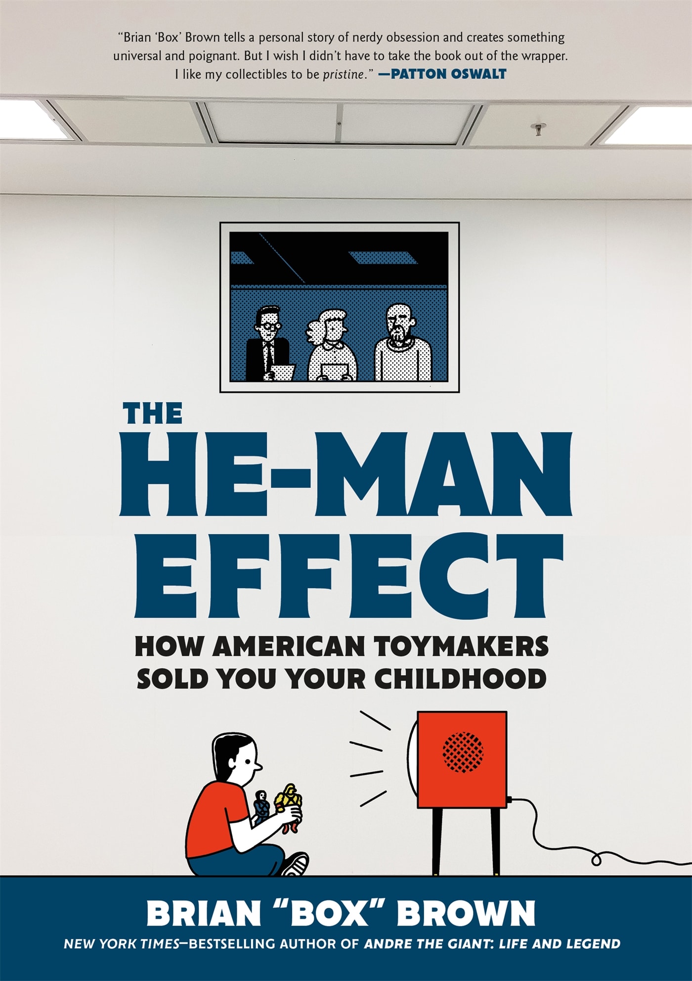
Sunny Lee did an incredible job on He-Man Effect. She was able to work with Brian Brown to get an image that immediately communicates the essence of the book. Her decisions on the case cover and interior are just amazing.
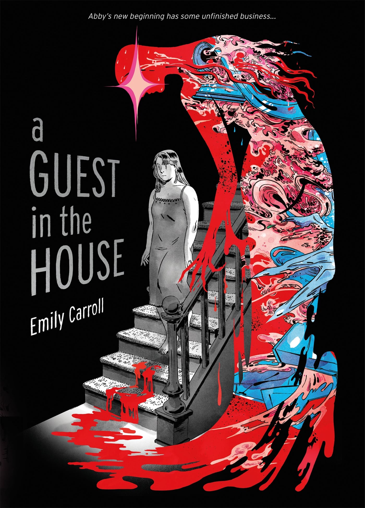
Molly Johanson‘s A Guest in the House is so beautiful. It’s such a sophisticated look, and it really screams horror and suspense. The final book is just cool and spooky.
Yan Moy had so much fun on Dog Trouble, and it shows! One look at the cover, and you get high adventure and cute doggies! Her attention to detail really pulls the book together.
Casper Manning‘s Monster Locker is a real treat for the eyes. He worked closely with Andrés Vera Martínez to nail down a cinematic concept and colors for the cover. It came together perfectly.
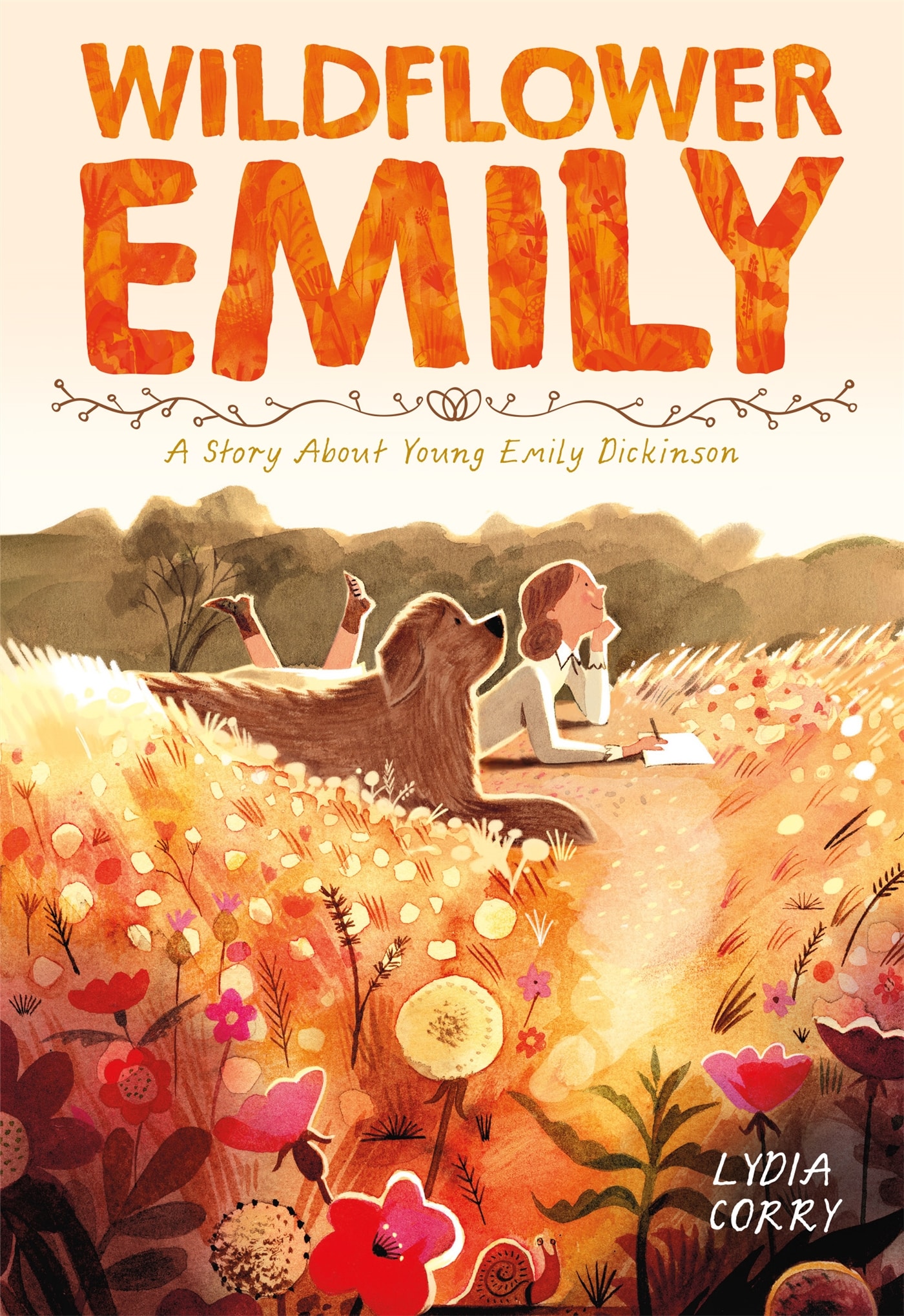
Steve Ponzo designed a beautiful title treatment and cover layout for Lydia Corry’s Wildflower Emily artwork. His keen eye created a cover that’s so atmospheric and beautiful… you can’t resist picking it up.
And this is only the covers they’ve worked on, I could go on about the incredible interiors they’ve designed too.
KAPLAN: I understand you’re also a photographer. How has that informed your work designing books?
BENSHOFF: Photography is something I’ve been doing for many years. I love going for walks around the city and looking for the pictures in the things we see everyday and take for granted. I try to look beyond what’s in front of me to see only light, shadows, and color that make something cool. Sometimes it’s about stealing a moment in time, while other times it’s about framing something beautiful.
Photography exercises muscles in my brain that I also use at work. I do find that looking beyond the elements in an artist’s sketches can help me art direct and suggest different ways to approach the overall direction. Maybe it’s a different angle or a different perspective that can make the cover stand out. How can we play with light in the art to inject drama or emotions? A concept in photography is capturing the “moment” so the photograph tells a story. What is the “moment” we are capturing in the art? How do we push that moment so a cover is communicating what we want?
KAPLAN: I understand your overall objective is to “perfect the graphic novel workflow on the trade market.” Can you elaborate on your efforts and progress toward achieving this?
BENSHOFF: This is VERY important to First Second. Many of the staff at First Second have a secondary connection to comics beyond the day job. So there is a respect and understanding of the medium. Also, First Second is one of the first imprints in the trade market to be a dedicated graphic novel imprint. So we’ve had the unique opportunity to learn from almost 20 years of experience.
Trade publishers have always fostered a very intimate relationship with creators through organizations like the SCBWI (Society of Children’s Book Writers and Illustrators) and The Highlights Foundation. Through these organizations, young and experienced creators can come together alongside very talented professionals in publishing: agents, editors, art directors, etc. As a result, how to navigate many formats like picture books, illustrated middle grade, etc are communicated in these events, creating a baseline understanding of what to expect when working in publishing and how to navigate it in trade.
Since graphic novels have blossomed in the book market in recent years, many publishers are creating their own workflow or modeling a graphic novel workflow to other formats. But in our experience, graphic novels are their own animal. They have their own rules, their own best practices, and their own metrics for success.
One of the words I use a lot is “sustainability.” Not just in the environmental sense, though we try to be very conscientious there. But rather being able to do something for the long term. BOTH on the publisher side and the creator side. Look…. Making comics is inherently difficult. It’s a very complicated medium to work in. A simple decision in the beginning can lead to a nightmarish amount of work to change later in the process.. What I hear from many creators is how tough the process can be in an already challenging medium, making it hard for some to sustain their own career.
Picture books have flourished for many years, and publishers have largely standardized how they work on these. Creators can follow certain well established patterns. Energy is then spent creatively on the books themselves, allowing for really innovative publishing in that space. What I’d love to see is a similar thing for graphic novels, where expectations are set, for both creators and publishers. Creators and publishers going into new graphic novel projects should know what is going to be involved, working efficiently to help that book get produced, and having fun doing it!
So, that defined workflow mentioned earlier is a HUGE part of how we aim to make the graphic novel medium sustainable. We earmark specific milestones in the process to provide feedback when it’s easy to make changes. We provide as much information, templates, and assets as possible upfront so our creators get as much support from the outset. My service while pages are being created is to offer practical and creative feedback, or just help with super detailed Photoshop questions.
Projects also need an appropriate time table to be completed. We map out a realistic timeframe for an artist to complete a book. Having a fairly solid timeframe and schedule allows us to strategize on how best to publish the book, and give it the best chance to succeed.
I work with an incredible team. Everyone at First Second knows that every Graphic novel has its own unique personality. The First Second team knows the comics format is inherently complex so communication and preparation are key. We learn from our mistakes and do our best out of love and respect for the creators and their incredible work.
You can learn more about First Second at their website.
And keep up on The Beat’s coverage of First Second books by clicking here.


