

Quote of the Day: Daniel Clowes on the artist’s tools
Photo by Abigail Huller, via Oakland Museum of California
Q.
Do you still work the same way you did 25 years ago, drawing by hand...
Nate Powell and Chris Ross on How They Designed ‘March’
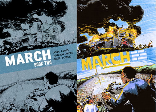
[Editor's note: The release this week of March Book Two by Rep. John Lewis, Andrew Aydin and Nate Powell has already made headlines with its story of the fight for civil rights in the 60s, and the covers to both volumes have become iconic in their own right. The message of the courage to fight for equality for all in the face of violent opposition is as relevant and needed today as it was 50 years ago. But powerful images to cover powerful times don't always spring up fully formed. Here Powell and Top Shelf designer Chris Ross with an in-depth breakdown of how they created these covers and combined imagery to capture both history and ideals.]
NATE: March was originally a single, massive volume, so the initial front and back covers were intended to house the entire narrative: the front introduced the basic visual theme of opposition, with two elements facing off against each other, though a contingent of riot-ready white supremacist police were prominently featured across the bottom. After some discussion with Chris Ross, Andrew Aydin, and Congressman Lewis, we all agreed that we should shift some of that focus to the folks on the front lines, and away from Jim Crow police forces. Around that time, we decided to release the saga as a trilogy, so Chris and I jumped in to further develop the oppositional themes, but playing with different angles and approaches to the cover’s division.

Must read: Nathan Fairbairn on coloring Pax Americana
Wow speaking of comics crafts, coloring is definitely one of the key components of today's comics golden age, yet one of the least understood,...
Must read: Todd Klein’s history of lettering
Todd Klein is the dean of comics lettering in the US, with more awards than he can carry, and a portfolio of logos and classic lettering that would be hard to touch. And he's put it all together for a seven part series on the history of comics lettering:

The Kubert School is having a open house tomorrow
The longest running stand alone school to teach cartoonist is having an open house tomorrow from 1-4. Prospective students will meet faculty and get a tour.
Open...

NYCC ’14: Frank Quitely on Visual Process and Cyclical Influence
by Zachary Clemente
On the extremely busy Saturday of this past weekend's New York Comic-Con, I had the sublime honor of interviewing Frank Quitely (pen name...
#Tweetfolio: Your Guide to the Perfect Portfolio Review
by Bon Alimagno
New York Comic-Con has arrived and hundreds of aspiring comic book artists are putting the final touches to their portfolios, eager to...
10 Steps to Make Your Creations Real
By: Nick Eskey
The thing about fandom is that on some level, we all wish we be a part of what we love: We want...
Go read: Color palette basics by Melanie Gillman
 Eisner-nomintaed As the Crow Flies cartoonist Melanie Gillman has a cute, simple intro to the basics of color theory, which will help you understand why movies are all orange and teal and European-style coloring look way more pleasing than rando pseudo CGI.
Introducing a new resource page for working in comics
At the MGA Con a few weeks ago I was on a panel on breaking into comics, and someone asked about resources for writing...
2014 Inkwell Award Nominees announced
The nominees for the Inkwell Awards, which recognize the stars of inking, have been announced and they are below. You can find out more about the awards, which will be presented at this year's Heroes Con, at their website.
Inking may be one of the more fragile vocations in the comics ecosystem, but these talenetd people deserve all the recognition they can get.
As DENVER launches, Jimmy Palmiotti talks the new era of Kickstarter
JImmy Palmiotti talks about how to run a Kickstarter and where he sees it going for comics creators, as well as his new project, Denver, a story inspired by European comics albums.