

This is the third season in a column that judges a book by its cover. Catch up on the current season, or view the complete archive.
This week’s issue of Spawn didn’t ship with just one textless “We Believe” variants, but eight, each by a different colorist. It’s a fantastic showcase of how much the choice of colorist matters to a comic, and a perfect opportunity to talk about color. Unfortunately, color is one of the hardest things for me to put words to, but I’m going to try my best.
Correction: I originally believed these were textless covers based on the information available, but it turns out the final versions did have text. Since clean digital copies of those are currently unavailable, I’m going to keep this post as it is.
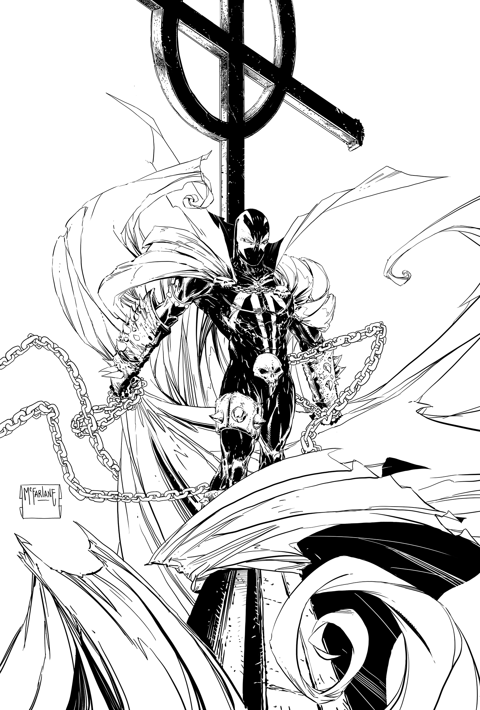 SPAWN #286 by Todd McFarlane
The base cover is by Todd McFarlane, who decided to turn his in without any color at all. Lazy!
Kidding aside, including the black and white cover is important for establishing what the colorists were working with. There are all the standard elements of a Spawn image, but the background has been left blank to give the colorists plenty of empty canvas to get creative.
It also meant less for Todd to draw. Lazy!
 SPAWN #286 by Todd McFarlane & Moreno DiNisio
DiNisio is the only colorist to hint at the city lights in the distance by including bluish light reflecting off the cape. Blue is also the complementary color of the orange sky. The sky has a nice smoky texture, and the bits of glowing debris in the foreground suggest a fire behind Spawn.
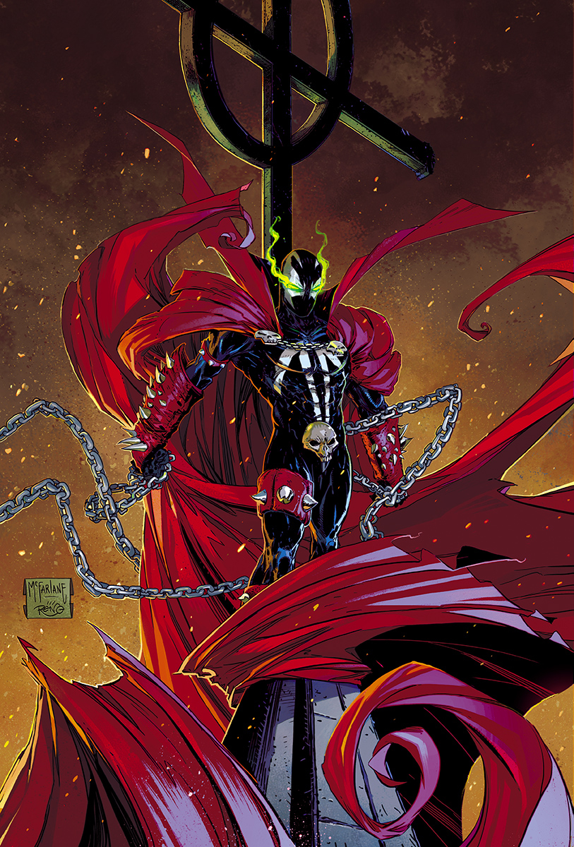
 SPAWN #286 by Todd McFarlane & Frank Martin
Martin went with a red background, which normally isn’t a great idea for a character who’s main feature is a red cape. But red is the complement to green, so it brings focus to Spawn’s green eyes. Martin has also added a green glow to his chest, so both Spawn’s head and torso are the focal point.
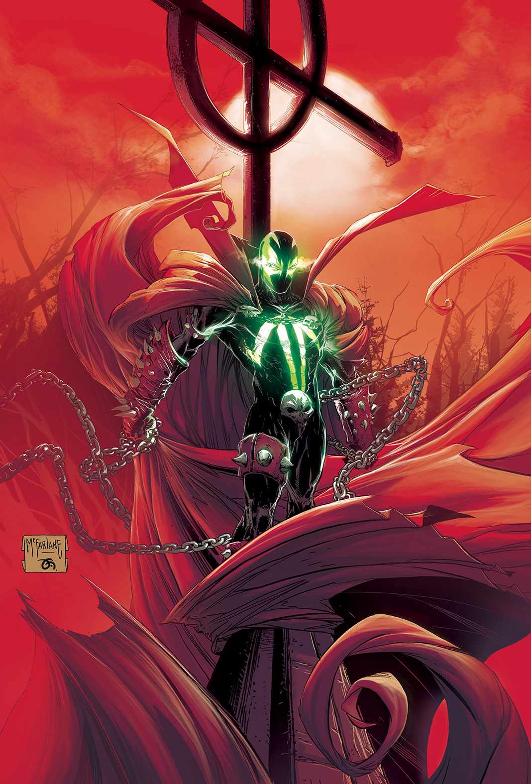
 SPAWN #286 by Todd McFarlane & Matthew Wilson
Wilson went for a triadic instead of complementary color scheme, which involves three colors equal distance away on the color wheel rather than directly across from. Spawn’s cape is more magenta than red so that the sky can be a blue-green, and then flashes of yellow-orange to complete it.
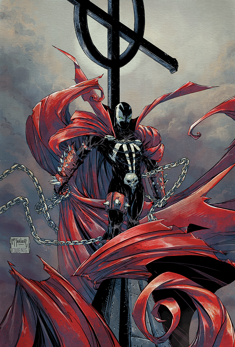 SPAWN #286 by Todd McFarlane & Owen Gieni
Gieni’s color palette is very desaturated, putting focus on the cape by leaving red as the one saturated color. Stylistically, Gieni’s coloring sticks out for the added hatching he’s done for the highlights.
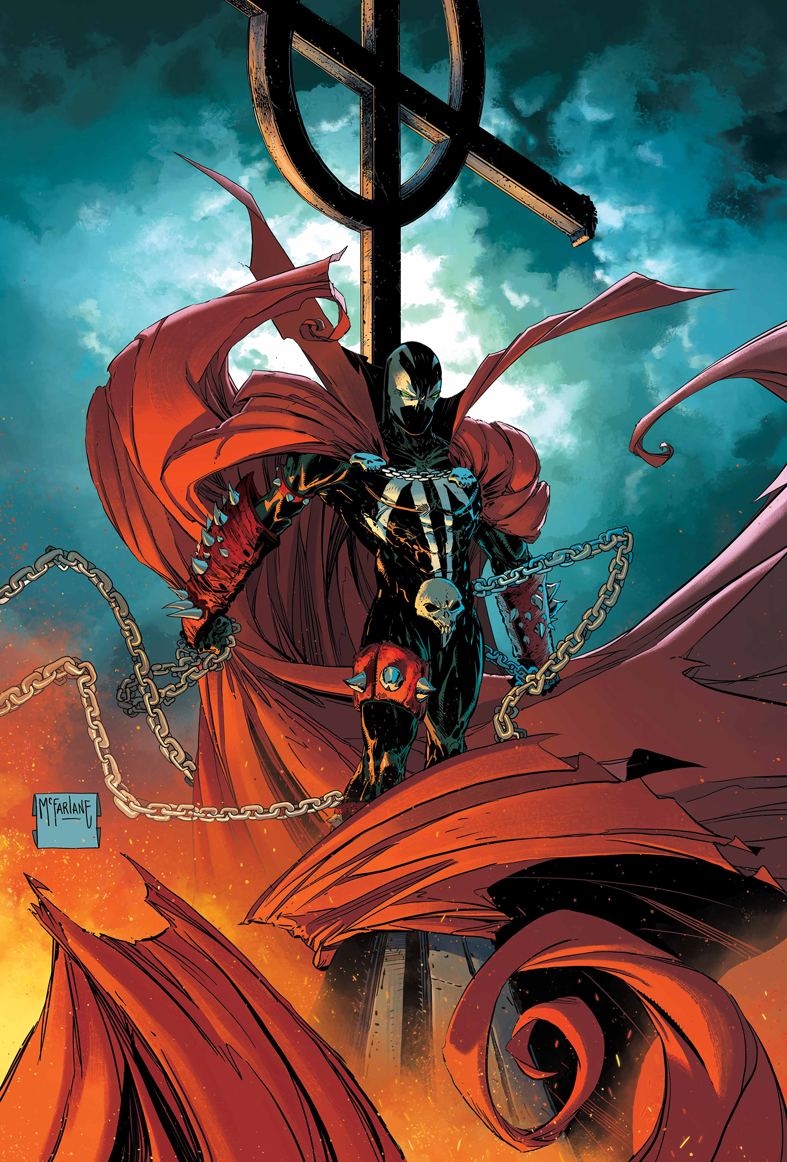 SPAWN #286 by Todd McFarlane & Annalisa Leoni
This is another complementary palette, with the two main colors being teal and orange. This color combo gets a lot of flack due to it being overused and poorly used in movie color grading, but that doesn’t stop it from being one of the most effective combos when done right. I think it looks fantastic here.
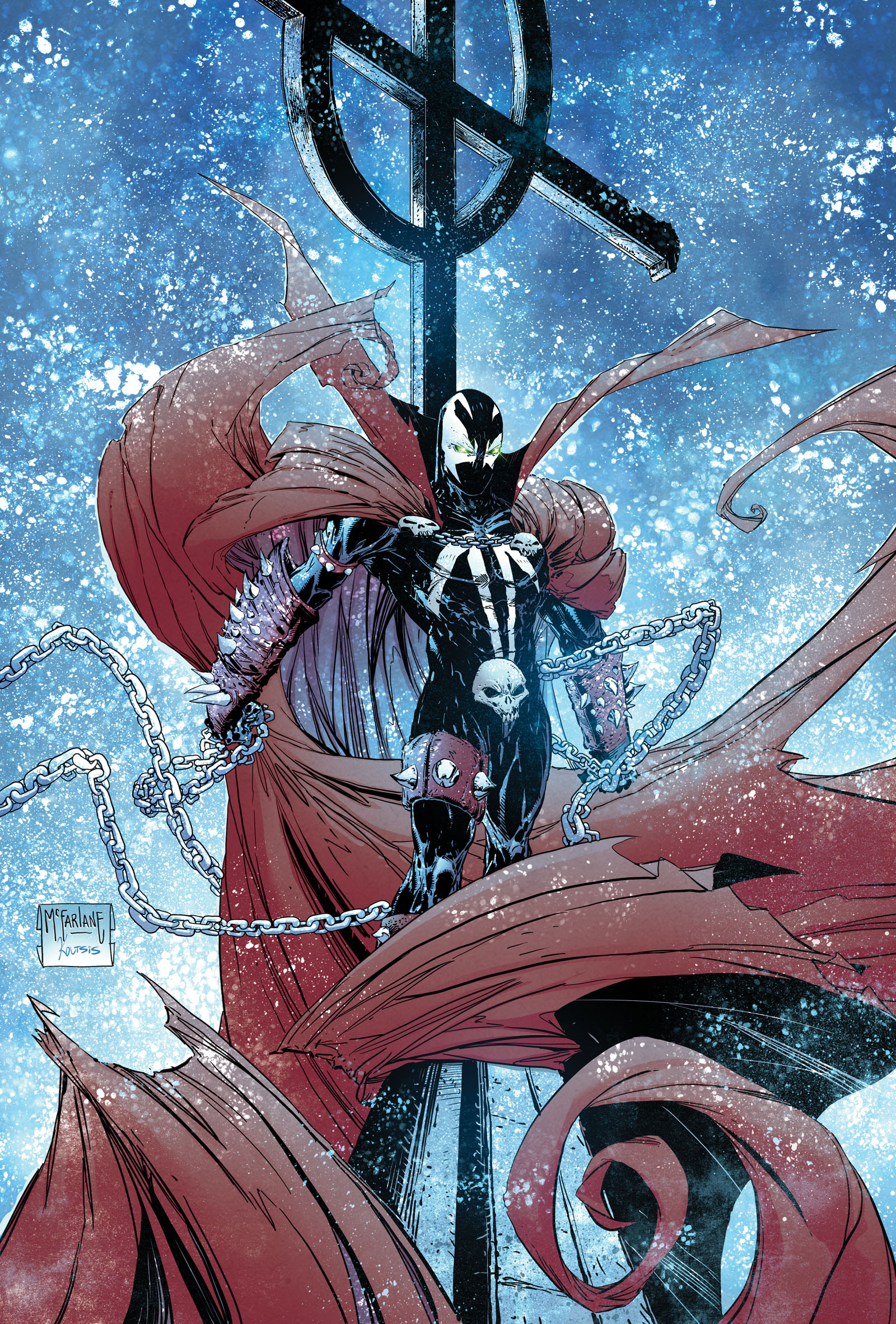 SPAWN #286 by Todd McFarlane & Nikos Koutsis
If I was coloring one of these, the first thing I’d ask myself is “what is everyone else going to do?,” and then try to do the opposite just to stick out. Naturally, people are either going to give Spawn a night sky or a hellscape sky. I know, let’s make it fucking snow! Nikos Koutsis, your bold choice is appreciated.
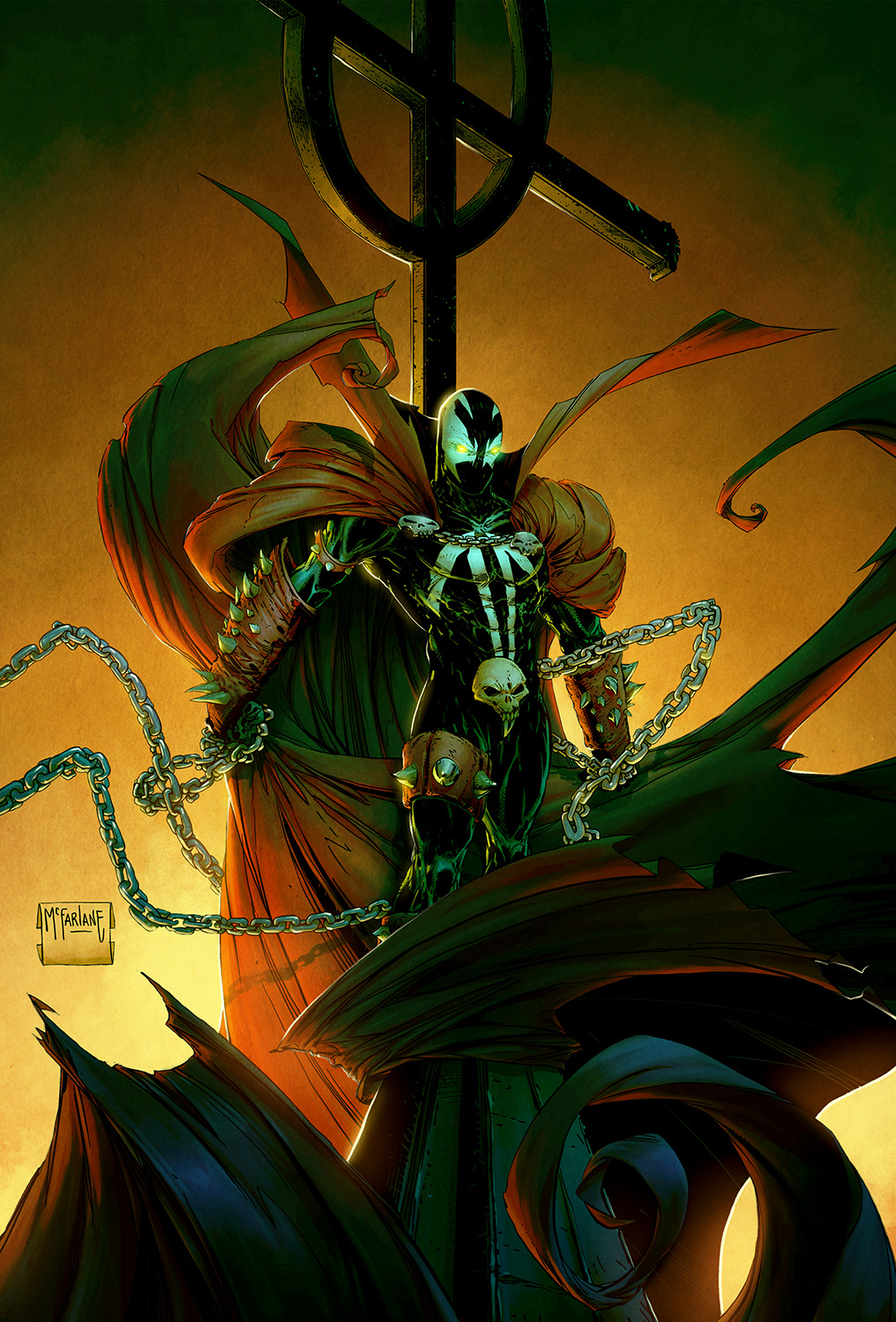 SPAWN #286 by Todd McFarlane & Jean-Francois Beaulieu
This is another bold choice, pushing the red cape right into it’s own complementary color. The green hue looks “wrong” in a way that’s disturbing and creepy, which works pretty well on a horror hero.
This Week’s Covers
Every week I pick a handful of covers that I consider particularly well-designed, not just well-illustrated. My personal criteria for a well-designed cover is that the illustration and design elements complement each other rather than fight each other, and that the resulting image stands out from the crowd.
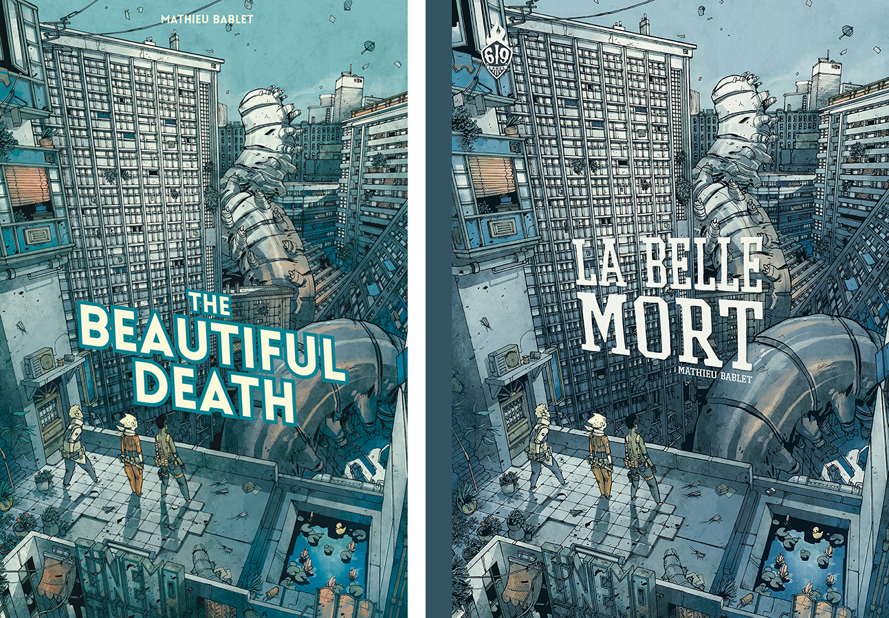
THE BEAUTIFUL DEATH by Mathieu Bablet
This is a wonderful cover, and I like what the text placement on the US cover was trying to do, but it’s not working because the text isn’t in perspective with the art. I was trying to find a textless version so I could redo the text in perspective, and discovered the original French cover on the right, where it’s done correctly. Score!
Not only is the French text in perspective, but it’s a little higher up, which feels more balanced to me. Though personally I might’ve nudged it up just a bit more even. But I love this cover, it’s great.
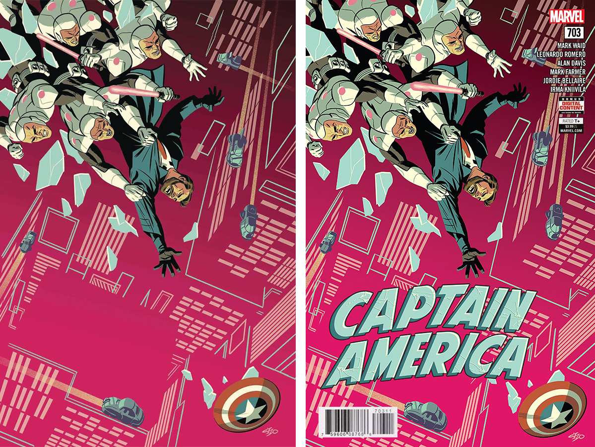
CAPTAIN AMERICA #703 by Michael Cho
Michael Cho hits it out of the park again. The foreground has a great diagonal composition, and the background is also fun to spend some time in. The headlights of the cars lead us around in a clockwise “circle,” from the shield back to the figures, or from the upper right down to the shield.
This easily could’ve worked with just a flat background color, but the details make the height look much more dangerous, while also making it clear this isn’t a normal modern-day setting.
Unfortunately, the text treatment obscures too much of the background and obliterates the composition. This treatment would’ve been fine for a flat background color, but it got me pondering ways to save the background and work with the composition instead of against it.
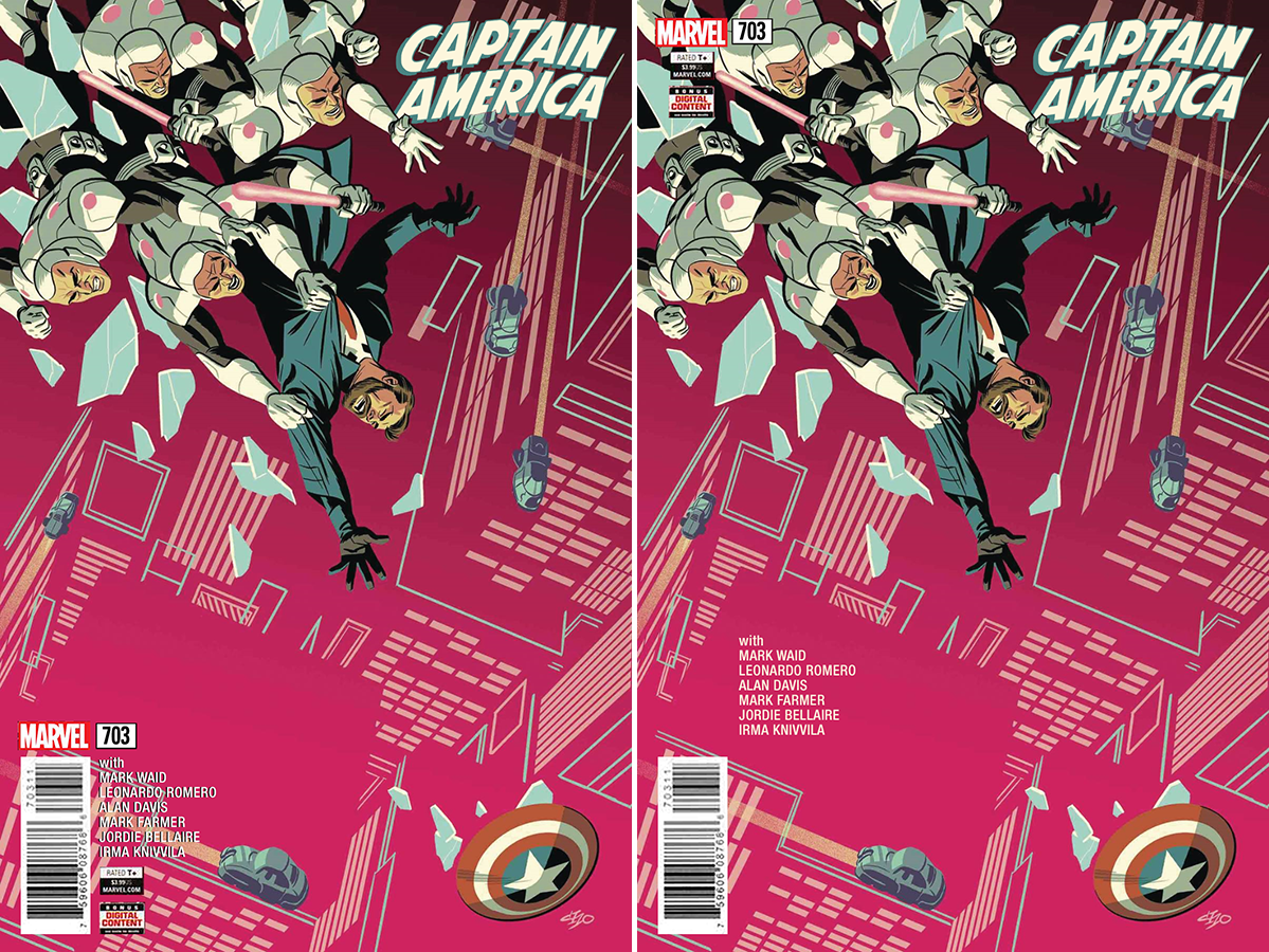
I would definitely have placed the logo smaller and in the upper right corner, to let the background breath. The question is what to do with the rest. The barcode is obvious, since we need something to “bounce” that bottom headlight so we’re not lead off the page. Side comment: on most of the cars, the stream of light looks like a trail, but for that bottom one it comes across as a headlight. Not sure if that was intentional or a weird happy accident, since only the bottom one feels like it’s leading us away from the shield back into the composition?
Anyways, the easiest thing to do with the other elements would be to contain them in a black bar along the bottom. I wanted to see if there was another way, so I played with a few options. I’m not 100% happy with either take. I kind of like the credits in the image on the right being flat text in the contained in the “box” of flat color from the roof of that building, but I kind of don’t like how it doesn’t feel anchored to anything.
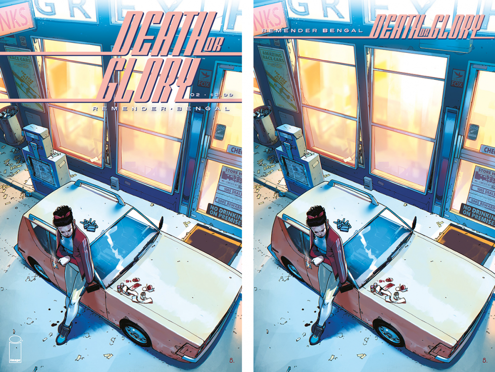
DEATH OR GLORY #2 by Bengal
I like the angle of this illustration, but I feel like that logo could be improved. A single straight line going halfway across the page looks cool and dynamic, but I feel like two lines suddenly looks static. Of course, to do the title as a single line, you’d have to make the logo text smaller. I’m okay with that because I like subtle logos (like the Cap one above), but not everyone does.
Also, this isn’t the best cover to demonstrate on, because it has text built-in that’s going to fight with any logo you attempt to place on it. This illustration is also available as a textless “We Believe” cover, and works much better that way.


Hate to be that guy, but the words you’re looking for are “complEment” and “complEmentary.”
Spelling corrections are absolutely welcome!
Comments are closed.