GI Joe maestro (and all around comics renaissance man) Larry Hama posted these on FB the other day. I stole them so we could talk about them.
These are my ten rules for drawing a comic book page, that sums up what I have learned in forty odd years in the biz. They are not universal, they are my own personal guidelines, so there is nothing to disagree about.
1. Don’t have people just standing there.
2. ANY expression is better than a blank stare.
3. Avoid tangents, and any straight line that divides the panel.
4. If you use an odd angle in the shot, there has to be a reason for it.
5. If you don’t have at least one panel on each page with a full figure, your “camera” is too close.
6. Plan out your shots in “Lawrence of Arabia” mode rather than in “General Hospital” mode.
7. Don’t think of backgrounds as “things to fill up the space after the figures are drawn.”
8. If you know what something is called, and you have an Internet connection, there is no reason to draw it inaccurately.
9. If the colorist has to ask if a scene takes place at night, you haven’t done your job.
10. If you can’t extend the drawing beyond the panel borders and still have it make visual sense, you’ve cheated on the perspective
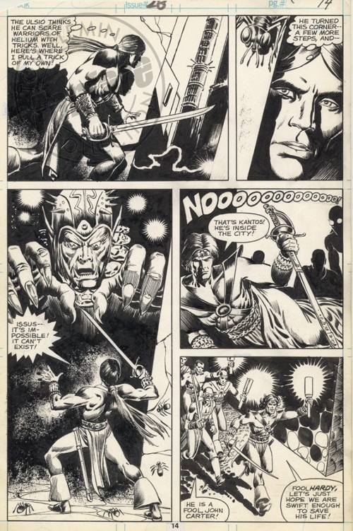
For comparison, here’s a page by Hama from John Carter, Warlord of Mars #28 (for my taste the heavy inks by Riccardo Villagren are aimed at making this look more like Gil Kane, which is weird.0
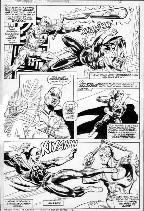
And Marvel Premiere #18, inked by Dick Giordano.


Nicely stated and sound advice. And I agree with all his comments — in general.
That said, I will admit to breaking at least half of those rules in my work. But that’s just me. The beauty of the visual comic form is that we can alter, twist and manipulate the work to our heart’s desire for a wide variety of dramatic effects.
All sound tips and reminders. Thanks!
Sorry, I don’t get the Lawrence of Arabia vs General Hospital reference. Big screen vs TV screen? Big budget vs low budget? Wide vs medium shot? Can someone explain?
First speaker on the LEFT! I want this tattooing inside the eyelids of every penciller in the industry when they’re handed their first pro assignment! You hear me? ON THE LEFT! :-)
From my limited experience watching soap operas, I’d guess the comparison covers several things: angles, distance, settings, number of people in a shot. Since a soap episode cuts from affair to affair to affair, there are frequently no more than two or three people in a shot, and the settings are as dull as someone could imagine. Emotional intensity is supposed to make up for all of those shortcomings, presumably.
SRS
The soap opera’s have 3 angles: close up shot, countershot, full shot
>> First speaker on the LEFT! I want this tattooing inside the eyelids of every penciller in the industry when they’re handed their first pro assignment! You hear me? ON THE LEFT! :-)>>
Except that rule is flawed.
First speaker can be on the right, or in the middle, or in the background, or even off-panel, just so long as the balloons can be placed and read in the proper order without the tails entangling.
The important rule to follow isn’t the placement of the speaker, but the placement of the balloons, and the speakers need to be placed to accommodate that.
Here’s a Golden Age Kirby page that twice breaks that rule without any confusion:
http://www.bpib.com/illustra2/kirby2a.jpg
Here’s another counterexample:
http://www.griph.net/bp/namor.jpg
Another:
http://3.bp.blogspot.com/-ZvMT6EVyghA/Tt6pd64KZEI/AAAAAAAAo8g/4OXQFMHttJY/s1600/jack+kirby+stan+lee.+inhumans.+p032.jpg
“First speaker on the left” is a rote way of accomplishing something that isn’t as simple as that, especially since an artist following it can put that guy on the left and still fail to draw a panel that can be lettered properly, by putting another character in between the guy on the left and the space left for balloons. Or by not leaving enough space for the balloons.
Better they understand what they’re doing — make sure you can add the text and read it well — than to follow a rule that won’t necessarily get you what you need.
kdb
I dunno … that Kirby page breaks the rule … but kind of obeys it … the main character is facing right in three panels on the left … but facing left on the three panels on the right. Like two columns … It reads well from top to bottom, so maybe that conveys something I’m not smart enough to describe going horizontally.
>> I dunno … that Kirby page breaks the rule … but kind of obeys it >>
Not if the rule is “first speaker on the left,” which is what was being said. That’s not at all about which direction the main character is facing, but where the first character to speak is positioned.
In the first two panels on the BLUE BOLT page, the first speaker is on the right, the second speaker is on the left, and it works fine, because Kirby left room to stack the balloons and have them read in the right order.
kdb
When studying graphic design we were told to learn the rules before you broke them. Basically you need to know why you were breaking the rules and ultimately it needed to work. If it doesn’t work, go back and follow the rules.
*sigh* I expect pedantry and random contrariness on the Internet but I thought you could do better, Kurt.
No, I’m not demanding that the first speaker is ALWAYS drawn on the left. I suppose I should have said “Please be aware that comics in western languages read left-to-right and top to bottom like regular books and it would be nice if artists remembered that and if editors pointed it out to them occasionally.”
However, I didn’t think that had the same rhetorical or (presumably failed) humorous effect.
I professionally lettered about 6,000 pages last year, and I can assure you that this (along with writers who seem convinced they’re writing screenplays) is the bane of many letterers’ working lives. That, and the page rate, obviously.
>> *sigh* I expect pedantry and random contrariness on the Internet but I thought you could do better, Kurt.>>
I’m sure I can raise pedantry and random contrariness to very high levels, if I really tried!
But since I meet so many people who seem to think that’s a literal, unvarying rule (along with the 180° rule, which is also flawed and often conflicts with the first), it’s worth pointing out that it just ain’t so.
kdb
1. Don’t have people just standing there.
Breaking this rule seems to be what Bendis built his whole career upon
“For comparison, here’s a page by Hama from John Carter, Warlord of Mars #28 (for my taste the heavy inks by Riccardo Villagren are aimed at making this look more like Gil Kane, which is weird.0”
Having poured over Dark Horse’s reprint of Marvel’s John Carter of Mars I presume this is on purpose since Gil (w/ Dave Cockrum) is responsible for the first 11-12 issues of art. Most of which is inked by the insanely talented Rudy Nebres!
“1. Don’t have people just standing there.
Breaking this rule seems to be what Bendis built his whole career upon”
THIS. No truer words have ever been spoken/written….
The two constants that I have found in comic books drawn written or edited by Larry Hama is that I have never had to stop and ask where the hell do I go to next. The other is that Mr. Hama gives you your money’s worth. It’s hard to say that about many comics published today.
3. Avoid tangents, and any straight line that divides the panel.
The first part of this is inarguable. But the second part means randomly tilting you backgrounds, which I hate, and which seems to contradict rule #4 “If you use an odd angle in the shot, there has to be a reason for it.” Several of these rules seem to run congruent to the theme of How to Draw Comics the Marvel Way, which is: always have the image be dynamic! Great comics can be made without constant use of dynamic figures and scenes, in fact, one in particular, Watchmen was made with a studied avoidance of dynamism.
The examples shown here do use the random tilting of backgrounds. and also, these may be handy rules for superhero comics, but they can be counterproductive for other genres.
Matthew Leske: “The first part of this is inarguable. But the second part means randomly tilting you backgrounds, which I hate, and which seems to contradict rule #4…”
I think you’re misunderstanding what he means by a straight line that divides the panel, Matthew. I believe he means a line that extends COMPLETELY across a panel, visually cutting the panel in two. Whether that line is at a 0º or 90º or 32º angle is irrelevant; it has nothing at all to do with #4. If a line extends across the entire panel, it inadvertently suggests a new panel to the reader (despite the lack of a gutter).
“3. Avoid tangents, and any straight line that divides the panel.”
… What does this mean? I get the straight line dividing an entire panel, but what does it mean to “avoid tangents”?
First speaker on the left is a pretty soft rule and should NEVER supersede the 180 rule and clear visual storytelling and framing.
If you’re thinking in terms of “angles” and “shots,” you’ve unnecessarily limited your visual vocabulary before you’ve even begun putting a page together. Modern superhero genre comics ape film–much to their creative detriment IMHO–but there are plenty of other ways to engage storytelling visually.
180 degree rule is for film, not comics, and doesn’t apply. If you understand the rule in film, you can understand why it doesn’t apply to comics. I know what Kurt’s saying, but first speaker on the left is useful to artists who aren’t used to thinking about balloon placement. Understand the rules before you break them. There are a lot of too-broad rules I hand beginners when I don’t have time to sit with them through every decision. More nuanced understanding comes over time.
Thanks man. My problem is women and girls. Can you help me?
Hama’s rules are old hat. That’s how comics were made up through the 1980s. It’s based on emphasizing visual drama and putting as much action on the page as possible. Between 1990 and 2000, this method of comic art has become passe. Comics over the last 15 years have a different way of telling the stories. DECOMPRESSION doesn’t just refer to the writing. There is a LOT of “air” in the art now. Also, writing and art seem to be vastly more interested in using tv/movie designs than traditional comic book designs. For example, many comics heavily employ “widescreen” panels–regardless of the content of those panels. Note how when Bendis has characters talking for pages on end that we don’t get 9 panel pages to speed up the delivery. We still get widescreen shots with (frustratingly) sparse backgrounds–tons of unused space. There’s just no ‘economy’ to modern comics, and Hama’s rules address the needs of economy. Look at Watchmen and Dark Knight Returns… how many major comics are done this way? None, it seems. Yet that style was essential to telling those stories.
Kudos for Busiek pointing the real underlying rule over the flawed *approximation*, which doesn’t intrinsically even guarantees that the rule itself will be followed (first character who talks on the left, and yet second speech balloon, of another characters appears on top of that).
Boos for those who booed him. BOOO!
I’ve found that following Alex Toth’s advice on balloons really helps. That is, start with balloon placement in your thumbnails, make it the primary flow of the page, and design the panels from there. That means you don’t need artificial rules like “first speaker on the left”, because you’ve already got room for all the balloons you need, placed where they need to go. Works for me, at least!
With regard to “First Speaker on the left!” Writers need to allow some visual exploration on an establishing shot. Some of the word guys have a bad habit of wanting to put LOTS of words in large establishing shots (usually with loads of characters). It puts an extreme load on the penciller and usually gums up what should be a visual establishment of scene. Make sense?
A lot of these can be, and sometimes, should be broken.
This one, i see given often in comic, is bad advice re tangents.
“3. Avoid tangents, and any straight line that divides the panel.”
Actually tangents are great, don’t avoid them, be aware of them, make them work for you, not against you. A tangent isn’t just two lines that appear to line up or a poll sticking out of someone’s head, it’s any form that seems to connect literally or suggest a connection. In the first page example, the first panel, the sword, pointing at the second panel’s figure’s eyes, is a tangent. A great one.
There is an implicit “unless you do it on purpose for a reason” on any rules of this sort.
these are some very good rules to listen to but like he said these are his opinions so you cant say its right or wrong. these rules assume you can draw which is the first hurdle i suggest studying movies and anime too. i can dry a limited amount so i do the best i can
The I’m severely regretting putting an aftermarket exhaust on a small Going to try to make it as quiet as possible soon, I feel it would be cheaper than just reverting to stock -_-
Comments are closed.