![]()
Just as it did with The New 52, DC is ushering in a new logo for its new Rebirth era. The logo, which was designed by the design team Pentagram, will debut on next week’s DC Universe: Rebirth Special #1’ by Geoff Johns but will imediately be seen on all DC websites, social media channels, DC All Access webseries, and the DC All Access app. The pr promises that the logo will “come to life” at future DC events.
“While comics continue to be the heart and soul of DC, the brand has evolved to now stand for powerful storytelling across so many different forms of media. DC is home to the greatest Super Heroes and Super-Villains, and the new logo has the character and strength to stand proudly alongside DC’s iconic symbols,” stated Amit Desai, DC Entertainment Senior Vice President of Marketing and Global Franchise Management. “The launch of the new logo is the perfect tribute to DC’s legacy, exciting future and most importantly, our fans.”
“I’m very proud that REBIRTH will be the first comic book published with the new DC logo.” stated Geoff Johns, DC Entertainment’s Chief Creative Officer. “To me, REBIRTH and the new DC logo are built on what’s come before while looking to what will come tomorrow. I can’t wait for people to see it on the cover.”
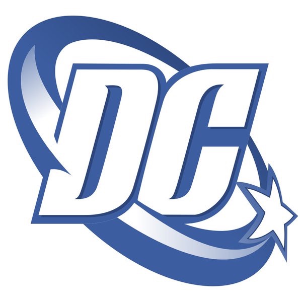
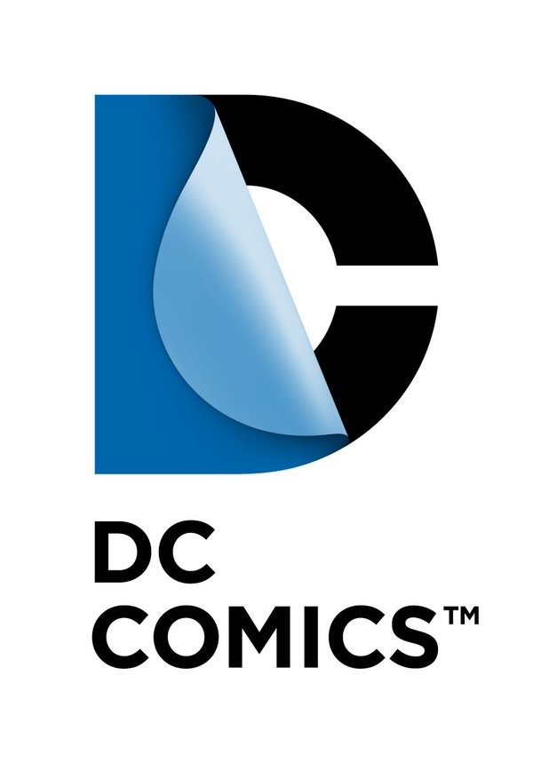
The DC bullet, designed by design immortal Milton Glaser, was a standby from 1976 on until the “swoosh” came along in 2005, followed by the “flipping pages” logo in 2011. The latter was met with some pushback, evoking layers of corporate branding. The new one has more of the Glaser feel, with something of “throwback” type treatment so trendy today. It deos seem more like a publishing company and less like a logo that comes on before a Zack Snyder movie.
All that said, Glaser’s design remains the gold standard of all of these.


Better than the last two, at least. And at least they’re timing the intro better this time. It was kind of ridiculous last time when they did the New 52 relaunch and then introduced a new logo 7 issues in.
Another new logo? Why does this feel like someone slapping a fresh coat of paint on the Titanic?
As a logo it’s fine, though I feel like it’s trying hard to tweak those Feelings Of Nostalgia that I as an Old Man feel for the DC bullet. Since DC likes to use those Feelings Of Nostalgia to get me to Open My Wallet, well, I’m naturally a bit skeptical.
I actually like the “peel” logo – I don’t even think it looks dated yet. The swoosh was dated the day before it was introduced. Of course as an old man the only one that “looks right” is the DC bullet, but that’s because I Am Old and it was the logo that was on my Personal Golden Age Of Comics so of course It’s Objectively The Best.
Also to truly invoke those Feelings Of Nostalgia it needs to be tilted counter-clockwise by 45 degrees.
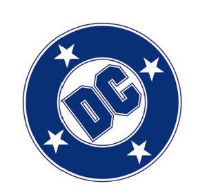
Actually, this new bullet looks more like the version DC used a few years *before* the Glaser logo. From mid-1972 through the fall of 1973, DC had a very ‘plain wrap’ logo — two large, block letters surrounded by, but not touching, a black circle. Sometimes the title of the comic would be squeezed in the small empty space above and below the DC inside the circle. Pretty ugly.
I’d say this new logo is an improvement over that — and the previous ‘page turn’, but I’d be happier if they took the trip on the nostalgia bus all the way back to the Glaser bullet — or to a variation of the DC/Superman National Comics 1960’s bullet (which is still used on some DC licensed products.)
I don’t know why DC feels the need to farm the job out to an outside design firm. They should have hired Todd Klein to design the new logo. He has created some of DC’s best logos over the past 30 years or so and knows a thing or two about good design, lettering and DC history.
“I don’t know why DC feels the need to farm the job out to an outside design firm. They should have hired Todd Klein to design the new logo. He has created some of DC’s best logos over the past 30 years or so and knows a thing or two about good design, lettering and DC history.”
Hear Hear! You can bet he’d sweat over it too!
It’s like they decided to combine all the worst elements from every previous logo other than the peel (though maybe they’ll add that later!).
Yeah, I think it’s not the bullet logo they’re calling back to, it’s this one: http://www.comics.org/brand/5/
Jonathan, I was thinking of the even blander bullet that preceded “The Line of DC Super Stars” — as featured on the cover here:
http://www.comics.org/issue/25690/cover/4/
On the new logo: the “D” is fine, but the “C” looks clunky: there is something crude and unsophisticated about it. It looks like it is from one of those ‘FREE FONT” packages. No finesse. Oh well, better than the peeling sticker logo.
That Shit is UGLY! they should have replace the Art Director 20years ago! They Should have hired TATE Design Group for the Logo Design. They are Really good!
I’d finally grown fond of the band-aid. Sigh.
Well, it’s better than the Toilet Seat logo (ANYTHING is better than that!), but it looks old right out of the gate. Not the right choice if you don’t want to look old-fashioned. And the “C” character is pretty ugly too.
The bullet still stands undefeated. They should look into modernizing it, instead of the even older logo that seems to have been the basis for this one.
New logo looks like it’s sick and in need of bedrest!!!!
You should hire TATE DESIGN GROUP to design a replacement for THIS replacement!!!
I’m a bit surprised that this came from Pentagram. It’s not bad, I kind of like the font, but as stated, it doesn’t hold a candle to Glaser’s. Today, Glaser’s may appear too dated, but there should have been an attempt to update that one.
I’d like to see the multimedia applications of this. Usually you get a better idea if it works or not by seeing it in action.
What if…
DC hired someone to redesign ALL of the major properties into a unified design?
Trade dress, logos (which would also be used in merchandise, like Glaser’s “WW” icon), maybe even icons.
Has DC ever created a successor to the 1982 Garcia Lopez Style Guide?
I just went to Pentagram’s site to see what else they’ve designed and discovered they also did Verizon’s hacky new logo that is basically the much-hated GAP logo from a few years ago with a checkmark in the corner instead of a box. Not surprised they’d do this too.
@Torsten
The Garcia Lopez style guide was a style guide for licensed product. They certainly have a current version, probably a variety of them for different properties and separate ones for film and classic properties, but licensed product style guides like that aren’t really about defining new looks for a brand. They’re about giving licensees art and logo assets they can put to use and showing them how to make their product on-brand.
I took a stab at a very untraditional DC logo redesign:
http://katewillaert.tumblr.com/post/144585648986/unsolicited-dc-comics-logo-concept-mic-drop
Did they actually pay for that design? It just screams boring…..
I like it, it’s better than the peel logo that I’ve hated since day one. Bullet is still the best but this is a good choice
OMG! WOW!!! Just saw TATEDESIGNGROUP1.com redesigned DC Comics Logo. It’s a killer Design.
Here is the Link: https://www.facebook.com/TateDesignGroup1/
Comments are closed.