

This week’s main review is Helen of Wyndhorn #1. Plus, the Wednesday Comics Team has its usual rundown of the new #1s, finales and other notable issues from non-Big 2 publishers, all of which you can find below … enjoy!
 Helen of Wyndhorn #1
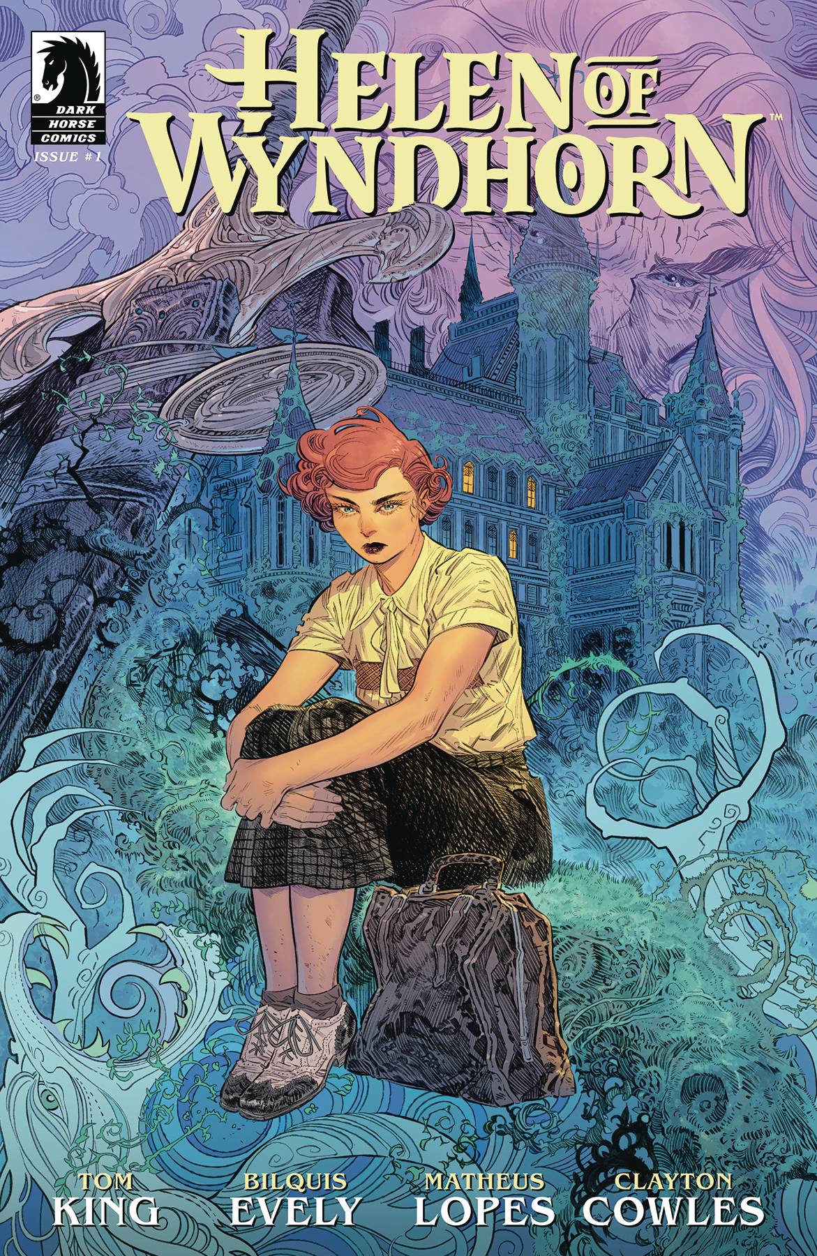
Writer: Tom King
Artist: Bilquis Evely
Colorist: Matheus Lopes
Letterer: Clayton Cowles
Publisher: Dark Horse Comics
Review by Sean Dillon
In short, you should obviously read Helen of Wyndhorn. And also rewatch Sub Rosa.
I Heart Skull-Crusher #1
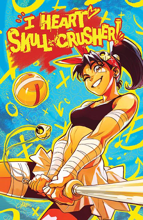
Writer: Josie Campbell
Artist: Alessio Zonno
Colorist: Angel De Santiago
Letterer: Jim Campbell
Publisher: Boom Studios
Review by Jordan Jennings
For as long as she could remember Trini Wastelander wanted to become the best Scream Pain Ball Player and join her idol—Skull-Crusher’s team. When a recruiter finally makes their way out to Trini’s home in the remote portion of the Wasteland and announces a qualifying tournament to not only join the SPB League but join Skull-Crusher’s team, Trini wastes no time in trying to form a squad and recruit a washed up SPB coach to her fulfill this dream. It isn’t easy though as Trini must overcome bullies and bandits to even hope of entering the qualifying tournament. It is Mad Max meets the Running Man in this sports manga-inspired series, I Heart Skull-Crusher.
Josie Campbell’s plot structure is like a lot of tournament centered stories in terms of efficiency and pacing. We are quickly introduced to the main character—Trini Wastelander—and immediately learn the character’s past, motivation, and dreams. This was all done in a matter of pages. Trini’s characterization feels familiar, but it is engaging. Her energy is contagious, and her personality leaps off the page in a way that I genuinely cared for her. There are some humorous bits that worked and meshes well with the more light-hearted action-oriented story being told. The comic is violent, but that violence is not oppressive as some other post-apocalyptic stories like to present.
Campbell’s world building is effective, as well. The world is post-apocalyptic, and it plays with familiar tropes, but it doesn’t waste precious page counts on explaining how the world got to that state. Instead, there are just a couple off-hand references in the opening couple pages and that’s it. In the first issue of a new comic, I find it is important to quickly get to the main event and not waste time on the background information unless it is critical to understanding the story—and frankly it isn’t. Sure, the setting may be reminiscent of Mad Max, but that is just window dressing for the actual story which is centered around Trini and her desire to play a hyper-violent sport. That efficiency and story telling decision is much appreciated and helps the issue focus on attracting and maintaining that interest.
Alessio Zonno’s art is the MVP here. Their art on this issue is SUPER kinetic in ways that is eye-catching. Whether it is character acting, the layouts, or the general sense of action, it is all full of energy. Zonno’s art style is best described as manga-influenced and that is not derogatory at all. They manage to bring the elements of Manga and Western comic techniques together to create something special.
The character designs are all top notch and visually interesting. Trini’s design is relatively simple but 1) it speaks to the character’s background as someone in complete poverty and 2) it allows for a large array of movement to the character to create a greater sense of energy. Meanwhile, the bandits aka The Twins are decked out in a cyber-punk motif that creates a visually distinct contrast and their enhancements give a sense of greater access to wealth.
The colors by Angel de Santiago compliment the tone of the art and writing. Satiago’s colors are rich and vibrant in their color palette often employing bright pops of red or green to draw the reader’s eyes across the page. One thing I appreciated was Santiago’s use of monochrome and low saturation backdrops along with bright, colorful, and saturated colors on the primary focus of the page. It helps the reader follow the action more clearly and is just aesthetically pleasing. The decision to color the cyberpunk Twins in pastels was a nice touch, as well, and really helps set them apart as a different flavor of post-apocalyptic when compared to the desert wasteland of the main cast.
I Heart Skull-Crusher #1 is a strong start for a new comic. Josie Campbell, Alessio Zonno, and Angel De Santiago do a wonderful job leaning into the manga-influences and, in turn, create an eye-catching issue. Every page has something that is absolutely visually stunning and the story is equally engaging. Overall, it is a real delight to read and I highly recommend checking this one out.
John Carpenter’s Toxic Commando: Rise of the Sludge God #1
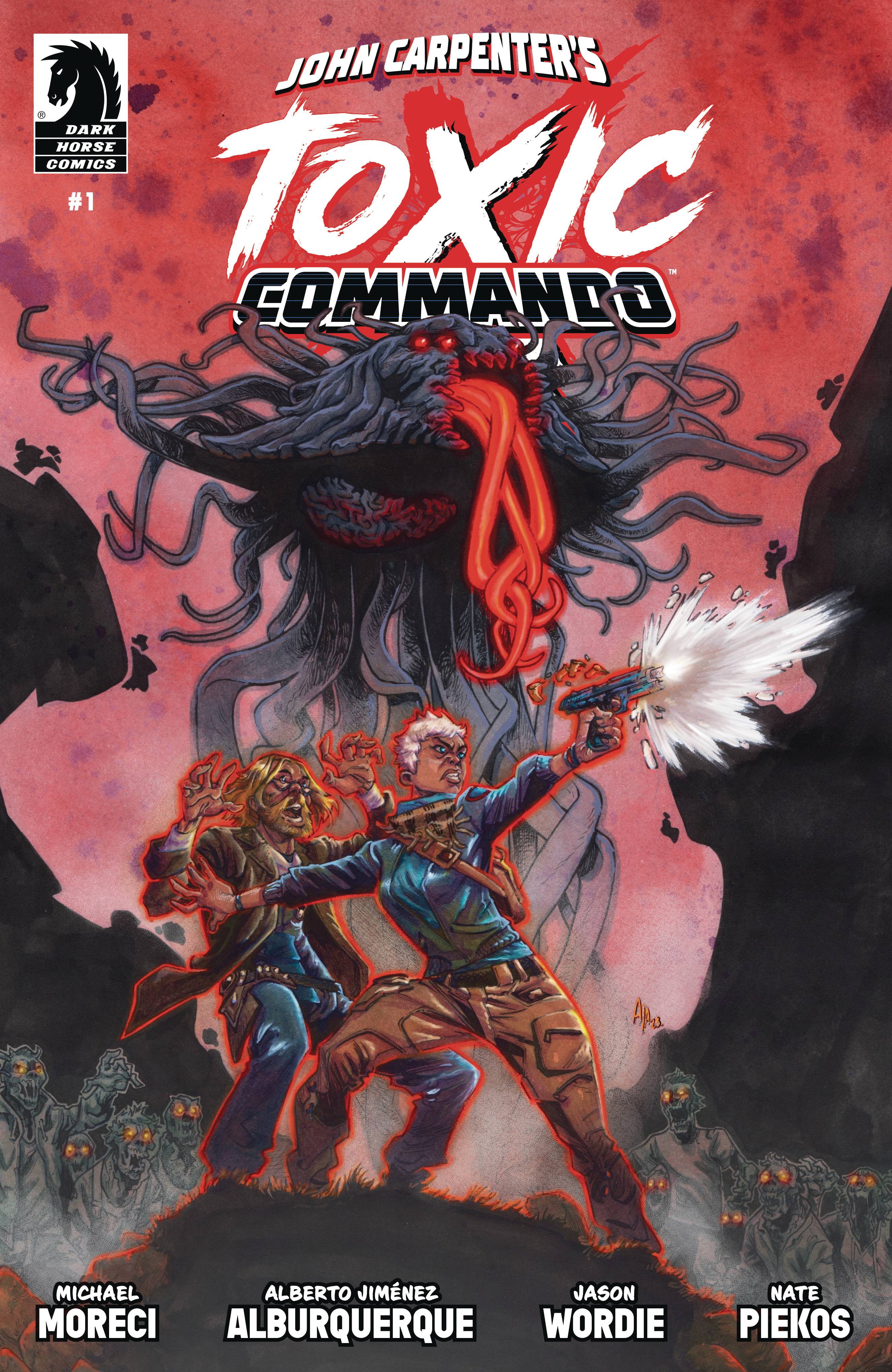
Written by Michael Moreci
Art by Alberto Jiménez Albuquerque
Colors by Jason Wordie
Letters by Nate Piekos
Publisher: Dark Horse Comics
Review by Ricardo Serrano Denis
The 1980s were a special time for ultraviolent monster movies that were unleashed on people by the actions of greedy companies and arrogant salesmen. Larry Cohen’s The Stuff (1985) comes to mind, about a delicious white substance that everyone becomes hooked on only to find it’s a parasitic alien organism that turns consumers into zombies. The substance spreads rapidly not just because of its taste, but also because it has an aggressive PR campaign pushing the product. Michael Moreci and Alberto Jiménez Albuquerque’s Toxic Commando is cut from the same cloth, gruesome monsters and badass protagonists included.
Based on the upcoming video game of the same name, based on a concept by horror master John Carpenter, Toxic Commando follows a group of military-style fixers that are called in by the Obsidian Group to contain the awakening of a sludge god due to illegal drilling. The god is a behemoth that’s part Cthulhian and part The Thing (the Carpenter version, obviously). It can turn people into zombies (which you’ll be shooting a lot of when the game releases in summer 2024) and it seems to have a craving for reshaping everything in its own image.
Moreci and Jiménez Albuquerque are quick to establish that glorious 80’s feel I mentioned earlier. No time is wasted establishing the greedy CEO whose complete disregard for rules and regulations made it possible for a god to break free and threaten existence. The team that comes to the rescue has the same swagger and bravado as the one led by Arnold Schwarzenegger in Predator (1987). Everyone’s there to stare evil in the face, tell it to suck it, and kick ass.
Moreci’s dialogue is punchy and precise throughout for this, though there’s not a lot of plot progression other than monsters have arrived and everyone’s dying. Albuquerque’s art, on the other hand, takes full advantage of the breakneck pacing with some amazing creature designs and human characters that stand out by sheer force of personality.
Much like John Carpenter characters, each one is visually distinctive and easy to separate from the crowd. Creatures aren’t generic blobs or off-the-shelf zombies, either. They all carry a menace that makes them genuinely creepy. Horror fans have a lot to chew on in this department.
Toxic Commando is great escapist storytelling that’ll scratch the itch for anyone hungry for a ‘shoot things first, ask questions later’ type of experience. Sometimes, this is all that’s needed for a good time with a comic.
Little Black Book #1
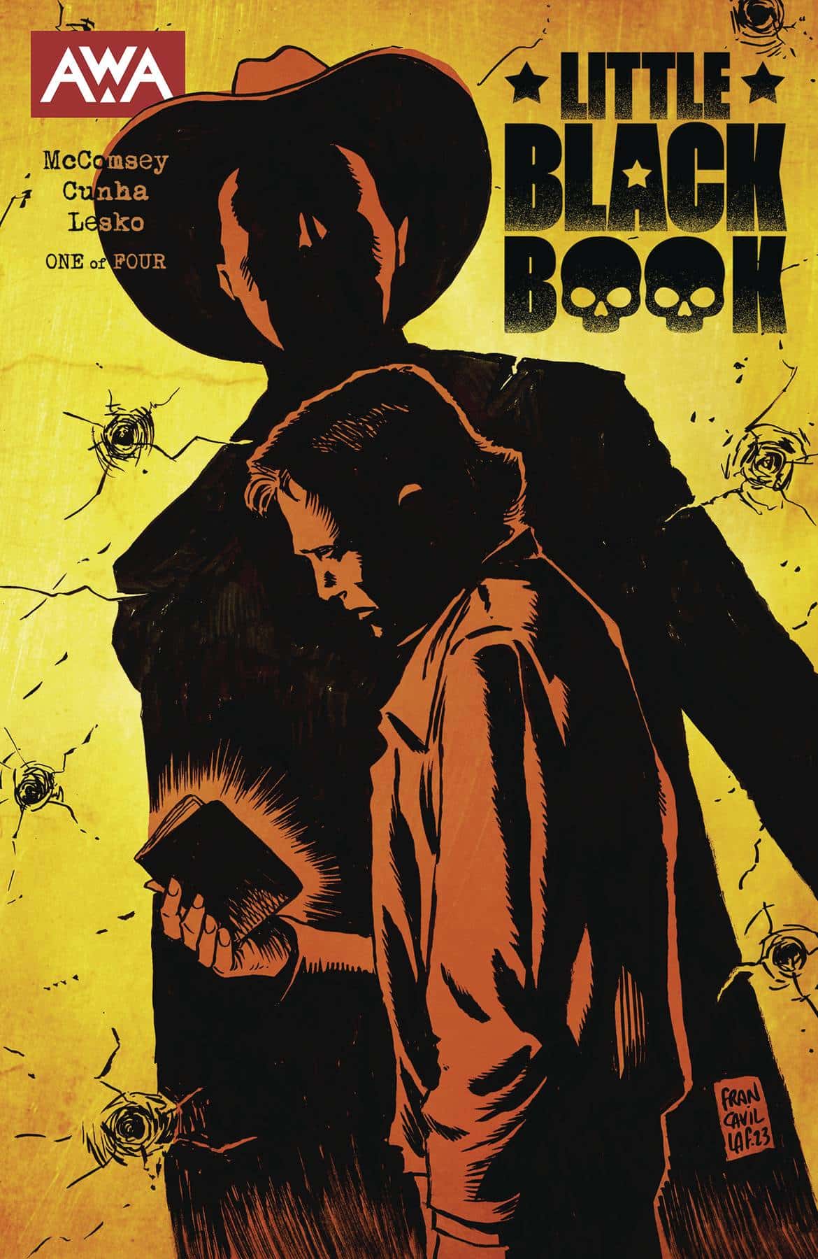
Writer: Jeff McComsey
Artist: Felipe Cunha
Colorist: Marco Lesko
Letterer: Sal Cipriano
Publisher: AWA Studios
Review by Clyde Hall
The solicitations cite this 4-issue series as a ‘hard-boiled, neo-Western thriller’. While that’s a lot to aim for, the creative forces behind this title place a tight, center-mass grouping in the target silhouette of the first issue.
Cole and Tess Moyer are young marrieds living in New London, Texas and expecting their first child. A lawyer representing the estate of Cole’s deceased and very estranged father brings news of his passing plus the deed for a two-story house Cole’s father has bequeathed to him. Cole, abandoned by his father for two decades, flatly refuses. Tess, however, insists that house living beats a trailer park for raising their kid.
Not long after moving in, Cole finds a hidden book with information regarding his father’s criminal enterprises. Enterprises which ran deep and dark as Texas oil. Soon, Cole suspects his late father’s gang has maneuvered his family into their circle of influence. Cole’s a civilian, never tainted by the sins of his father. But now it appears those sins have taken roost anyway.
The veneer writer Jeff McC0msey puts on his tale is roughhewn and real enough to give you splinters. In his hands, Cole and Tess are young protagonists, but wizened past their years by lives that have been none-to-easy. But the people we glimpse impacting their futures, entangling them in events beyond their control, show us what innocents the Moyers really are. Cole’s aware enough to be unnerved, a dread handily shared with the reader.
Artist Felipe Cunha keeps the world around these characters imperfect and lived in. His characters are rendered in fresh ‘what you see’s what you get’ styles, their lack of pretense exactly right for this sort of story. He along with colorist Marco Lesko make the deep dark of those rural night skies pop in the last quarter of the book.
The premiere issue of Little Black Book crafts a realistic world occupied by pragmatic, relatable protagonists. It then builds tension as the heroes discover their vulnerability. Vulnerability orchestrated by serious people existing in a much harsher, more dangerous reality than they’ve ever known. That realization sets deep hooks for picking up the rest of the series. Fans of similar works like No Country for Old Men and Ozark should find familiar territory here.
Wednesday Comics Reviews
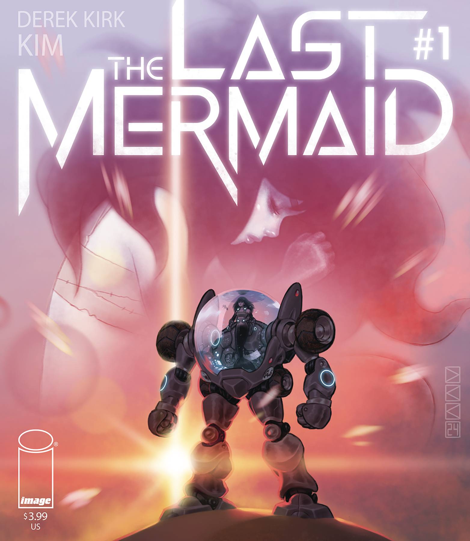
 The Last Mermaid #1 (Image Comics): Derek Kirk Kim returns to comics after ten years away, and the result is, inevitably, a beautiful looking book. Quickly establishing its arid, post-apocalyptic world, and a “ticking clock” problem for its title character to solve, the book moves elegantly across the landscape that Kim has imagined for the reader. If there’s a drawback here, it’s the first issue of a monthly comic format. Even with the slightly longer page-count, the book really only has time to tease the story to come, but hopefully the lush art and the strength of Kim’s previous work will be enough to bring readers back for issue two. —Bob Proehl
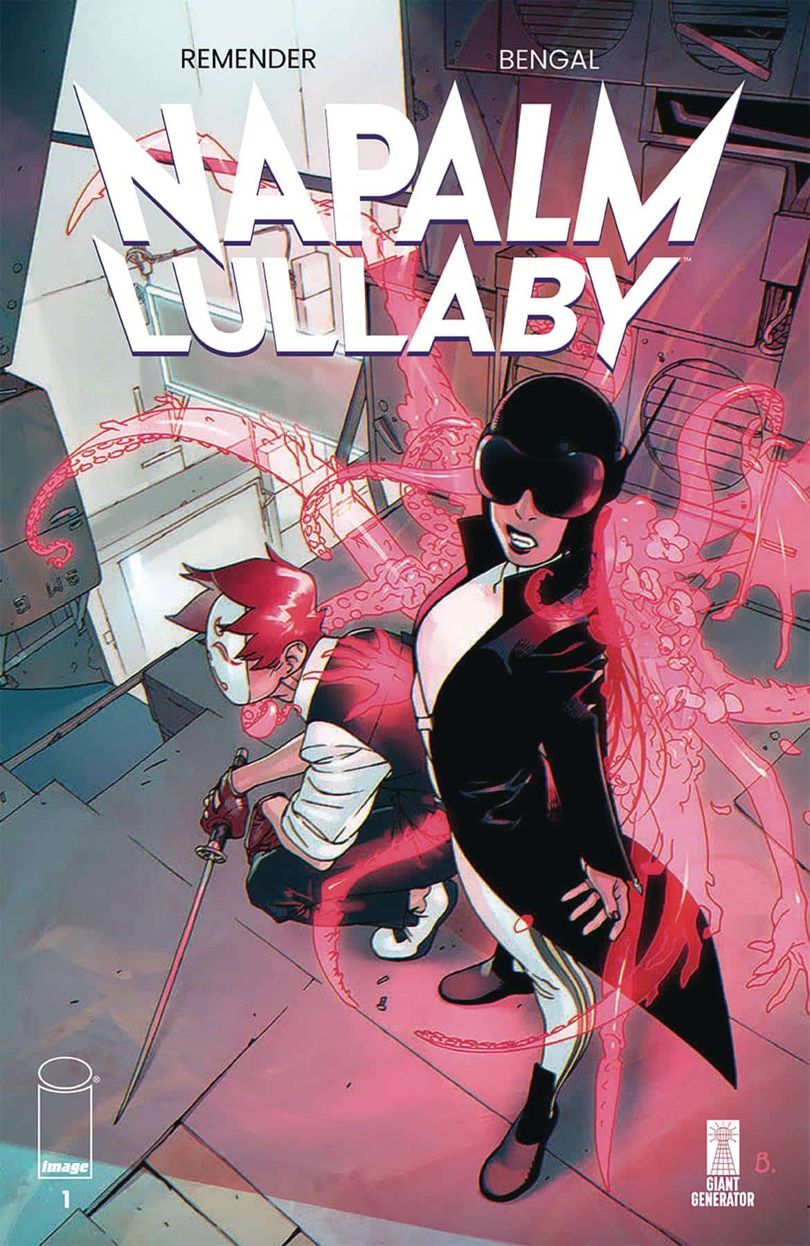
- Napalm Lullaby #1 (Image Comics): There’s always a point in Rick Remender’s first issues where I get really confused about what’s happening. Sometimes it’s warranted, like in Seven to Eternity or Low, where the world is strange and things take a while to digest. But sometimes it’s just me, like with Black Science where, in hindsight, it’s pretty clear what’s going on. I feel like Napalm Lullaby is more of a Seven to Eternity situation, in a way that is pretty exciting. Back in the saddle with artist Bengal, who worked with Remender previously on Deadly Class and Death or Glory, Napalm Lullaby looks fantastic. It has a recognizable world that is immediately pummeled by threads of weirdness. There’s mech-guy super-cops, there’s a god-baby, there’s a dude with a funny mask, there’s VR, and there’s some good old espionage. At the end of the first issue, I was overwhelmed by the amount of things that happened. But I trust the process. Tokyo Ghost, Seven to Eternity, and Low all felt this way to me and, once I read their first collected volumes, the payoffs all started to feel satisfying. Lettered by Rus Wooton, Napalm Lullaby grabs you with the “ZEREEP” of laser fire and the “GWOOM” of explosions. For anyone looking for a new big world to jump into, I think this is going to unfold into an absolutely wild story. Napalm Lullaby is out now from Image Comics. Written by Rick Remender, with art by Bengal and lettering by Rus Wooton. —Michael Kurt
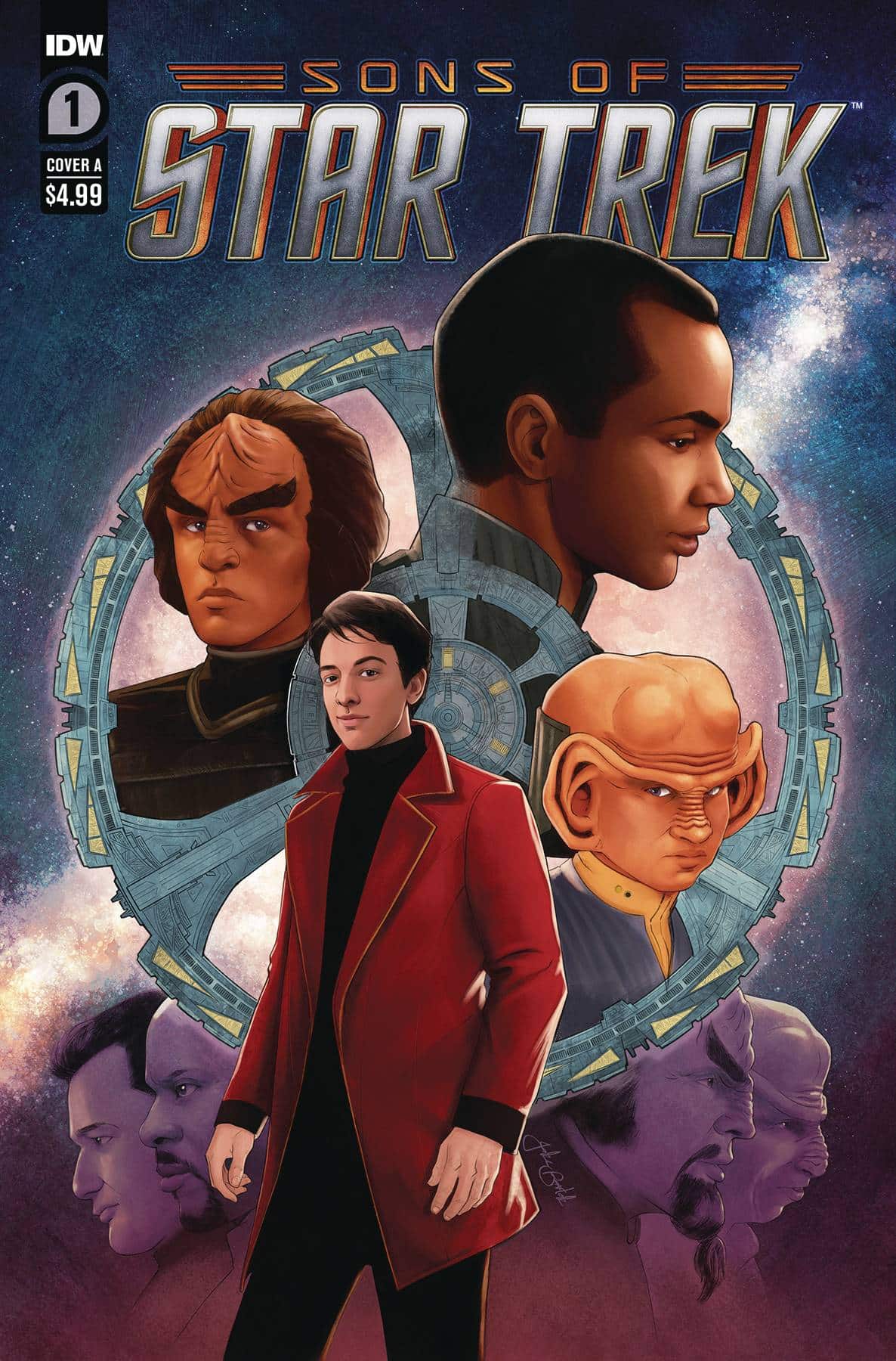
 Star Trek: Sons of Star Trek #1 (IDW Publishing): Resisting Star Trek: Sons of Star Trek #1 by writer Morgan Hampton, artist Angel Hernandez, colorist Nick Filardi and letterer Clayton Cowles is futile. This issue is a pretty straightforward “Q What If…?” Trekkies know what I’m talking about: it’s one of those stories where Q (or in this case, Q’s kid) snaps our heroes into a parallel universe where the familiar is rendered strange by some unexpected alterations. But as anyone who read Planet X by Michael Jan Friedman knows, this premise can serve as the foundation for greatness! Sons of Star Trek #1 succeeds in two important ways. First, the characters at the heart of the story – Nog and Jake Sisko – are interesting and underused protagonists who deserve more time in the narrative spotlight. And second, the nature of the parallel universe is so bonkers that its mere existence is titillating. In fact, the characters who appear together in this timeline are scintillating enough to keep Trekkies talking until issue #2 arrives next month. If you haven’t haven’t had these characters spoiled, I won’t name them here, and I suggest you try to avoid learning who they are until you get a chance to read this issue for yourself. But I will say that the lineup pulls from both 90s and modern day Trek, to great effect. Ships and characters are rendered easily recognizable by the art of Hernandez and Filardi, and the lettering by Cowles is reliable as ever. I’m looking forward to the arrival of Sons of Star Trek #2, and after reading this issue, you will be, too! —Avery Kaplan
- Transformers #6 (Image Comics/Skybound): The first arc of Daniel Warren Johnson’s Transformers wraps up as sacrifices are made and the series’ penchant for over the top bombastic action continues strong. We start in the action and the sense of scale that’s been on display the entire run is kicked up as Devastator is in the midst of the battle. There’s such a fun kinetic energy to Johnson’s work that makes it a visual feast and when he takes the time to slow the story down and sit with the emotions of the characters, it is very resonant. I wish we had a little bit longer to sit with some of that before the next amazing action sequence started but, there’s something to that in the fact that this is wartime and breathing room is hard especially when you have a genocidal force violating Geneva conventions at every turn. It’s a joy reading this story, especially Johnson’s Optimus who truly embodies everything the character should, inspiring hope while also being amazing in action, going toe-to-toe with Decepticons that dwarf him. There’s a spread here that is jaw dropping, absolutely hype stuff on the page and Johnson knows how to sell a moment, that’s a strength of the book overall and it’s amplified with Mike Spicer’s color work and Rus Wooton’s letters. Everything meshes as this dream team has assembled an action-packed and emotionally resonant first arc with more story to tell and I’m excited to follow and see where it goes from here. —Khalid Johnson
The Prog Report
- The Prog Report is taking a break to recover from last week’s fantastic finale for Judge Dredd: A Better World (which you can read about here, if you missed it), but it will be back and better than ever next week, promise!
Read more entries in the weekly Wednesday Comics reviews series!


You’ve convinced me, I’ll check out Helen of Wyndhorn, but I’ve seen every episode of TNG and Sub Rosa is nowhere near one of the best….
Comments are closed.