

This week’s main reviews is Animal Pound #1, the new series from Tom King, Peter Gross, and team. Plus, the Wednesday Comics Team has its usual rundown of the new #1s, finales and other notable issues from non-Big 2 publishers, all of which you can find below … enjoy!
 Animal Pound #1
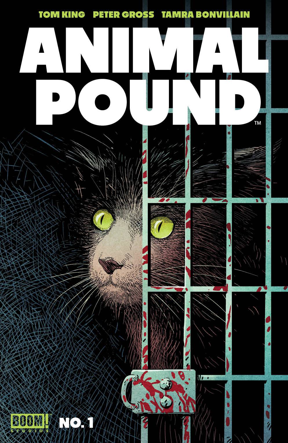
Writer: Tom King
Artist: Peter Gross
Colorist: Tamra Bonvillain
Letterer: Clayton Cowles
Publisher: BOOM! Studios
Review by Sean Dillon
 Godzilla Rivals: Jet Jaguar vs. Megalon
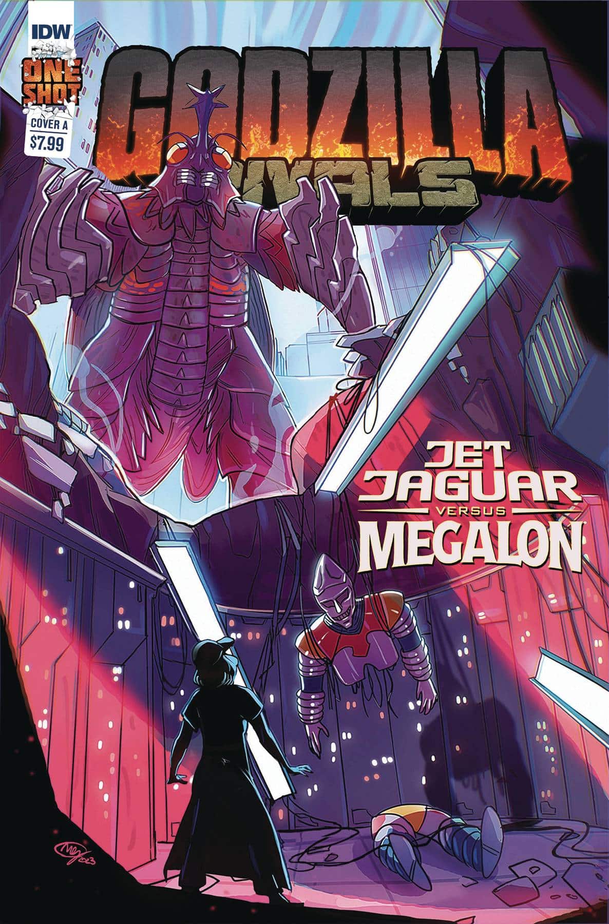
Writer: Nola Pfau
Artist: Megan Huang
Letter & Design: Nathan Widick
Publisher: IDW
Review by Jordan Jennings
Godzilla Rivals: Jet Jaguar vs Megalon is the newest entry into Godzilla Rivals—A series of stand-alone one-shots that often tell unique human stories that happen in the shadows of a giant monster brawl. This edition comes to us from writer Nola Pfau and artist Megan Huang. Together, the creative duo delivers a strong entry into the series by focusing on the human Jen and her relationship with Jet Jaguar.
I love that this story takes advantage of the format and opts to not feature Godzilla and instead shows Jet Jaguar facing off with Megalon solo. When we meet Jen in the story, she is not in a good place. She has dropped out of college, struggling to make ends meet, struggling with suicidal ideation, and takes a job at a subpar fast-food joint called Manila Burger (nice nod there, Nola). It is by interacting with Jet Jaguar and watching it take on Megalon by itself that Jen learns that you can face life even if you don’t think you can win. Pfau’s writing focuses on Jen’s struggle with mental health and suicide. Without the solo brawl between Jet Jaguar and Megalon, the message would have been lost.
Nola delivers an emotionally charged story about perseverance even in the face death. Godzilla Rivals: Jet Jaguar vs Megalon is about never giving up. People need you and will miss you. Pfau’s handling of Jen and Jet Jaguar’s relationship is beautiful. They bring along a touch of finesse and subtly to the story that I found very emotionally resonate. Admittedly, I am soft for stories about people finding the will to go on and thrive, but I got a bit misty eyed at the end of the issue.
Godzilla Rivals: Jet Jaguar vs Megalon balances the emotional human stories with the giant monster fighting quite well. Pfau and Huang are stellar in pacing of the comic. There are emotional beats that hit like a ton of bricks weaved in with Jet Jaguar literally slinging tons of bricks at Megalon. It is quite a sight and a beauty to behold. Megan Huang’s art is very dynamic and expressive which is critical for a character like Jen. It helps sell the raw state that the character is in when we meet her in the story. Yet, this is contrasted by the very static and cold Jet Jaguar. The robot doesn’t show facial expressions by design. There is a novel way for having Jet communicate with Jen via the computer in the lab, but Jet doesn’t show emotion as they don’t have them. It is a nice comparison between the two and difficult task for any artist.
The brawl between Megalon and Jet Jaguar is a great one. Huang makes excellent use of the environment in the fight and making it have weight. She also utilizes a variety of panel size, shapes, and layouts to command the pace of the action. Additionally, there is frequent use of establishing shots to help provide scale to the readers and give a sense of gravity to the brawl. This spatial mastery makes this one of the better Godzilla comics I’ve read this year, and I have read quite a few.
Lettering doesn’t always get a mention in reviews. Often only gets brought up when it goes awry, but I must commend Nathan Widick in their lettering and design choices. There was a choice made with the balloon shape and fonts used. The humans all speak in more irregular shape and organic looking word balloons. However, Jet Jaguar speaks with a more uniform rectangular text box (Jet Jaguar is technically not talking but using the computer’s sound system) that has more angular font. It gives Jet Jaguar a colder feel and contrasts to Jen. It is a simple touch but a nice one to see.
Godzilla Rivals: Jet Jaguar vs Megalon is an excellent comic. Fans of the Godzilla franchise will find something to love about this comic even if the Big G doesn’t show up. In fact, the comic is better for it. Much like all great Godzilla stories, Nola Pfau and Megan Huang deliver a story that is action-packed and carries emotional heft. Highly recommend checking this one out. One of my favorites of the year, easily.
Wednesday Comics Reviews
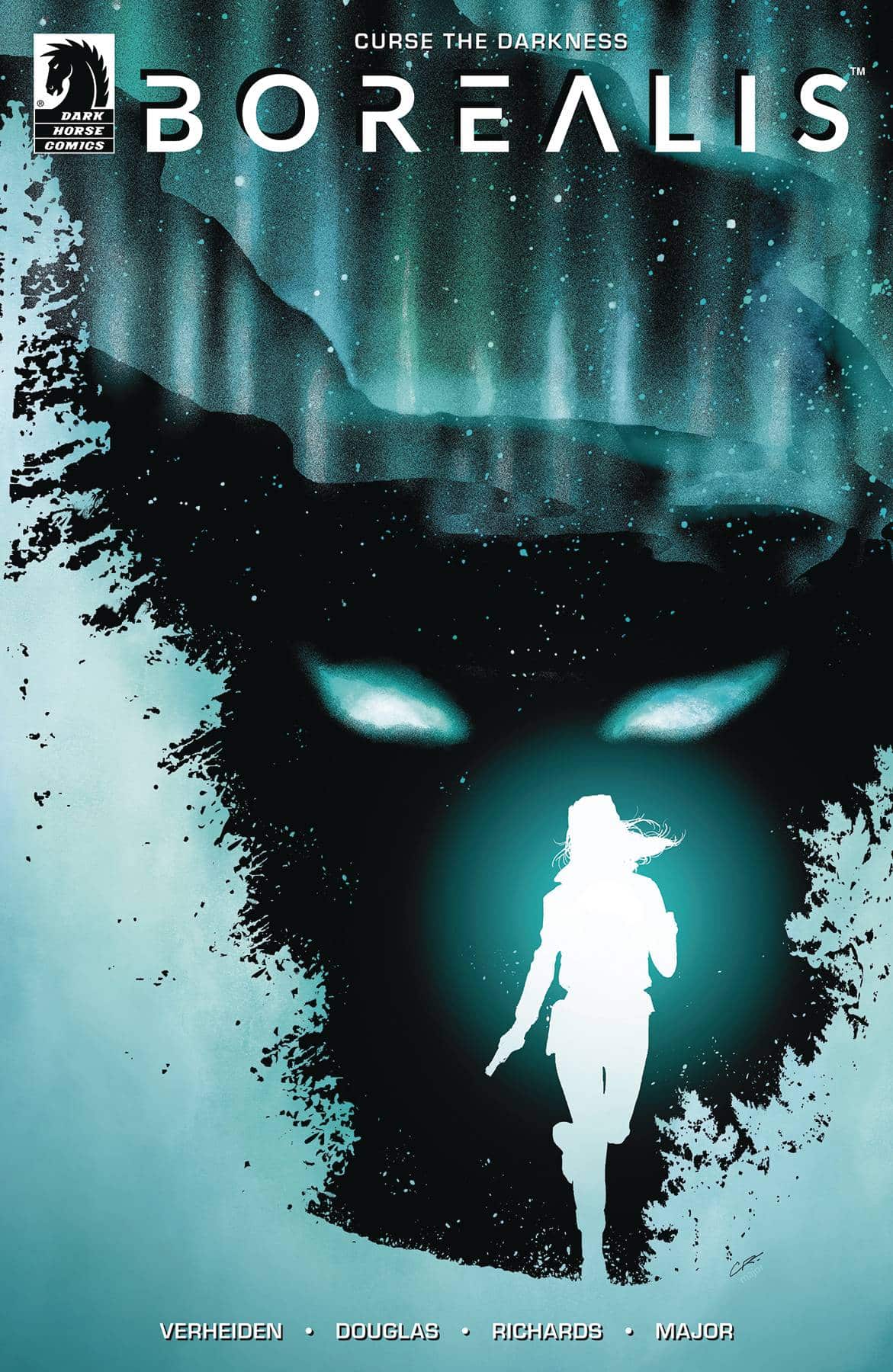
- Borealis #1 (Dark Horse Comics): Borealis #1 is a dark introduction to the three-part mini series as it sits with protagonist Silaluk, an Inuit woman with a lot of personal baggage and trauma that writers Mark Verheiden and Aaron Douglas spend time exploring while exercising their penchant for the more mature. This is certainly not a “light” read but I think they do honestly try to engage with Sila’s culture while butting her up against her past and her choices while teasing out the supernatural elements that seem to haunt her. The art of Cliff Richards works really well to complement the tone here and there’s a real strength in the visual choices from what’s shown to what’s not, amplified by the colors of Guy Major whose color choices really push the mood that much more. Lettered by Jim Campbell, everything is tied together to make a moody, gritty first entry into this series. —Khalid Johnson
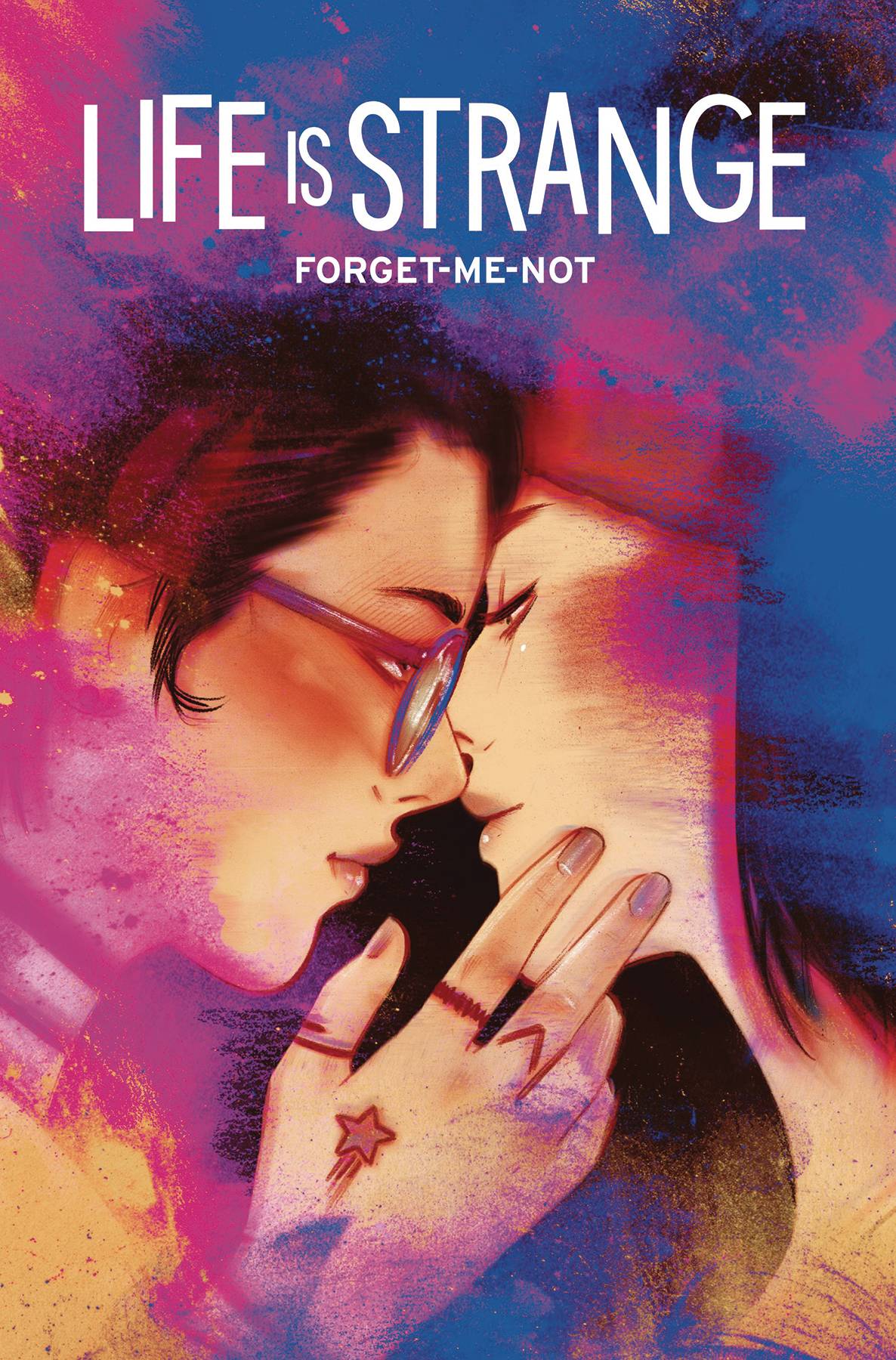
- Life is Strange: Forget-Me-Not #1 (Titan Comics): Coming off a year that saw her garner five Eisner nominations, Zoe Thorogood takes over the writing duties for LIFE IS STRANGE with the seventh volume, Forget-Me-Not. Thorogood is clearly a good fit for the property, even if this issue spends a little too much time establishing the core characters for new readers. The introduction of Lily sets up a solid mystery, and an emotional connection for Alex. Returning art team Claudia Leonardi and Andrea Izzo bring a consistent tone that links the book easily to previous series and the games it spins out of. —Bob Proehl
Read more entries in the Wednesday Comics reviews series!


