
This week’s main review is Dark Spaces – Dungeon #5. Plus, the Wednesday Comics Team has its usual rundown of the new #1s, finales and other notable issues from non-Big 2 publishers, all of which you can find below … enjoy!
 Dark Spaces – Dungeon #5
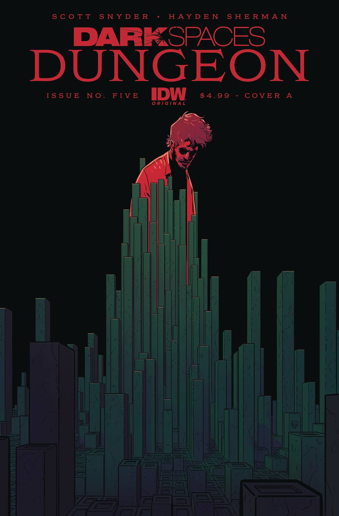
Writer: Scott Snyder
Artist: Hayden Sherman
Colorist: Patricio Delpeche
Letterer: Andworld Design
Publisher: IDW Publishing
Review by Zack Quaintance
This week marks the conclusion of the most disturbing (complimentary) comic I’ve read in years, with Dark Spaces – Dungeon #5. It’s going to be tough to talk about this one without SPOILERS, so if you haven’t read the book yet and don’t want to know a bit about the ending, turn back now.
I’ll pause for a moment…we good? Okay.
So, this comic has one of the darkest endings of any comic I’ve read in some time. It really makes good on the Dark Spaces promise of its title, and, moreover, it’s dark in a way that I didn’t see coming, not even a little bit.
The concept of this book has been disturbing from the start. It’s about an investigation into a serial torturer. It’s tempting to call the villain of this story a serial murderer, because he’s essentially ending the lives of his victims, even if he’s not killing. What he’s doing is entombing them in secret underground dungeons hidden throughout the country. His victims are kept alive in solitary confinement, in these stone grids where he can twist the bricks to make them smaller or break their bones.
If you’ve ever read anything about how even a day in solitary confinement effects the human mind, or if — like me — you are claustrophobic, what this villain is doing is a fate worse than death. The story doesn’t belabor it, but it’s established and then regularly mentioned that these victims spend years and years and years in these little boxes, unable to move and having bones broken on a whim as their captor taunts them. It’s truly horrible, and every time I think about it, a chill runs through me. It is, in other words, a perfect horror concept.
On top of that concept, this series also had a great plot. The lead investigator into these dungeons was himself a childhood survivor of the tormentor. He was, in fact, the only victim to ever get free. Now, he’s an FBI agent working to help another father who seems to have lost his little boy to the dungeons. The series built tension so well to this final issue.
And in this finale, we see some of what one might expect from this story. The agent is able to free the little boy, a battle ensues, and the evil tormentor is killed. But the book doesn’t stop there, and, really, it’s the final, incredibly dark twist that puts this among my absolute favorite comics of the year so far (right up there with Judge Dredd: A Better World).
The agent is revealed to have suffered serious trauma from his time in the dungeon. No surprise there. PTSD has become a fixture of modern horror, and with something as horrific as this, it’d be odd if the book didn’t address that. It’s so bad, that he feels as if he’s never left the dungeon, not truly, so trapped is he in his memories of what happened and his obsession with freeing everyone he can. This leads him to continue investigating the case after he’s freed the boy…and he learns that a rich man whom he knows (I won’t spoil it entirely) was the bad guy.
To me, this book ends up being one of those stories about how we’re all captive by the whims of the ultra-wealthy, that we can never truly be free of them, no matter how hard we fight. And I didn’t see that narrative coming here, not even a little bit, but it made me like the book all the more.
So, kudos to this entire creative team. This is the darkest writer Scott Snyder has gone with his work, and artist Hayden Sherman is an absolute superstar, an immense talent who makes every choice correctly in service of the story, with colors by Patricio Delpeche and AndWorld Design serving as a perfect compliment. I’m going to be buying this one for my shelf, and don’t be surprised if it lands on my Best of 2024 list.
Verdict: BUY
 Rat City #1
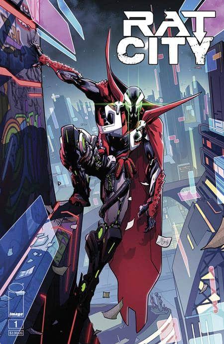
Writer: Erica Schultz
Artist: Zé Carlos
Colorists: Jay David Ramos, Fco Plascencia, Marcello Iozolli
Letterer: Erica Schultz
Publisher: Image Comics
Review by Jordan Jennings
It’s 2107. For all intents and purposes, World War 3 has broken out. The United Coalition of Nations has sent in Peter Cairn and his elite paramilitary squad to take out a high-ranking target in Azerbaijan. Unfortunately for Cairn and the team, the mission ends in disaster without the team either maimed or killed.
Cairn wakes up six months later to find himself alive and outfitted with the latest cybernetic enhancements in an apparent bargain to work as a cybernetic solider in exchange for his life. However, as years after his super solider dreams falter, a literal necroplasmic blast from the past upends his life and brings Cairn in contact with the Spawn of our time—Al Simmons.
Of all the New Universe Spawn titles to spin out of Spawn #350, I have been looking forward to Rat City more than any other. I mean, it is a Cyberpunk Spawn! I am glad to report that this series lives up to my expectations.
In what is essentially Spawn 2099, Rat City #1 provides an update to the Spawn story in the semi-distant future. Writer, Erica Schultz, presents an origin with strikingly similar story beats as Al Simmons: a skilled mercenary that carries out a mission that fails miserably, gets offered a deal to live again but at a great cost, and seemingly being thrust into the role of a Hellspawn, that they did not knowingly sign up for. Schultz makes use of a seemingly omniscient narrator, a common device in Spawn, that helps set the more grandiose nature of the story. There are changes to the story though.
This isn’t just Al Simmons 2.0. Despite having similar cannon events, Peter Cairn isn’t motivated by the same things as Simmons. The character is not driven by the mystery of his origin or regaining his lost wife. Heck, Cairn isn’t even the celebrity of sorts that Al Simmons was before his death. Instead, Cairn is a neglected veteran of sorts that is left maimed by his final mission and cast out to live in the destitute slums of Rat City.
Schultz sets a strong voice for Cairn which is welcomed as we spend the bulk of the issue seeing his origin play out. The pacing of the issue is a bit decompressed as we don’t see Cairn suit up as a Spawn, but this is perfectly fine as it gives us more time to see Cairn’s life before he becomes linked to Simmons. The ending page makes for one hell of an attention getter and should be a hook for Spawn fans to come back for more.
Schultz is also the letterer for this issue, and I want to highlight their brilliant use of Spawn speech ballons. For the unaware, Spawn has speech balloons with a gray shadow to help signify the demonic tone of voice. When the issue starts out Cairn uses speech balloons in line with the rest of the characters. Yet when Cairn begins to become influenced by the nercoplasm he switches over to the Spawn speech balloons. It is a subtle nod to the continuity but not one that gets beat over the head. I appreciate that.
The art by artist, Zé Carlos, is really enjoyable here. Carlos has a dynamic and fluid style that captures the emotion of the script quite well. There is one sequence where Cairn becomes overpowered by the necroplasmic energies that are trapped in his cybernetics which results in what can only be described as a cybernetic, supernatural body horror show. Carlos manages to bring out the fear and dread in Cairn’s eyes. It makes for one captivating read.
Carlos has a strong command of pacing with their use of layouts. Most of the issue uses straight forward grid layouts alongside more cinematic widescreen panels. This keeps the action beats moving briskly. However, at a couple moments Carlos uses a two-page spread that is eye-catching and exhalating to see unfold.
The art is held back by some degree in no small part to the fact this issue has THREE colorists. While each colorist is perfectly fine on their own and there is an effort to keep the color palettes and tones the same between them there is a noticeable difference, and it is enough to take me out of the moment. I understand the nature of comics and often the comic needs to get out of the door by any means necessary. That said, I usually expect the first issue to be more cohesive as it is the one that is often made with the most lead time. I am not privy to the creative process of this series. Something could have come up, but it is disappointing to see happen in an otherwise good comic.
Overall, Rat City #1 is a strong start to an interesting reinvention of Spawn that I am frankly shocked hasn’t been explored more over the years. It is a bit of a slow start, but it takes time to establish the main character. The colors-by-committee approach, while not ideal, it is unfortunate nature of comics sometimes. It is not enough to ruin a good comic. The tone Erica Schultz and Zé Carlos bring to Rat City #1 is very reminiscent of Spawn’s origin but through the lens of Spider-man 2099 #1. That said, while it is evocative of those stories, the issue does more than enough to be more than a series of references to 30-year-old comics. I found this issue to be highly enjoyable and well worth my personal hype.
Verdict: BUY
Uncanny Valley #1
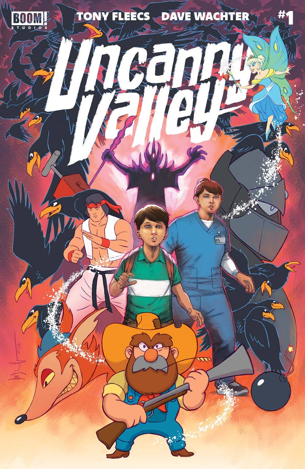
Writer: Tony Fleecs
Artist: Dave Wachter
Letterer: Pat Brosseau
Publisher: BOOM! Studios
Review by Beau Q.
Just know that by the end of this, you will know what in tarnation I mean when I say Uncanny Valley is where Saturday mornings meets Saturday night.
We start, as one does, on a weekday. Oliver is a kid in the sense that he’s too young to know jumping off a bridge is dumb but old enough to think it’ll make the cool kids his friends. With one leap of ignorant faith, Oliver brings us into the world of Uncanny Valley. From the minds of Tony Fleecs and Dave Wachter, Uncanny Valley is the comics equivalent of Who Framed Roger Rabbit? but instead of starting in Toon Town, we have the cartoon side of reality shockingly revealed to us. Uncanny Valley carries the kind of high concept that speaks a very specific language between film and animation, but when transferred to comics, is somewhat of an experiment in most hands. ‘Most’ being the operative word here.
See, splitting comic real life juxtapose cartoon comic life requires an artist who can occupy both hyperrealism and the wacky zany world of caricature without losing an ounce of storytelling ability. Dave Wachter is one such artist. While the cartoon caricature feels simple to source from Looney Tunes, Wachter’s realism exists in a crossroads between Tommy Lee Edwards’ shape language and Bob Ross’ background rendering techniques. Now, given Wachter’s previous work on Punisher, he could have just as easily reached for a Big Two house style approach to realism heavy on hatching and shadows; this we often see in noir and crime comics. But Wachter instead spoke to us with illustrating techniques we find hyperrealistic in comics: gray ink instead of black, thinner outer strokes, less cross-hatching, and overall less visual bombast from backgrounds, fashion choices, and character acting.
Wachter is using what comics knows to be real in order to wholly immerse the readers into this world…and have it crash dramatically into the cartoon world.
What could be seen as a stock standard approach by some hides an intentional dulling of the palette and comics technique to affirm its reality in realism. In Uncanny Valley’s real world, panels don’t have black grid lines locking moments off from one another. Gone are the plugin techniques of gradients and glows, single color shadows, highlights in compositionally designated areas, etc. Gone are fantastical or even heightened framing techniques– everything looks so exceedingly normal which is incredibly difficult to achieve in comics, a visual medium.
In painterly comics, sometimes the aura of high art illustration techniques can sometimes tilt the production timeline into requiring other departments as an afterthought. But thankfully for Pat Brosseau, Wachter has left a lot of thoughtful room for Brosseau to find his place in the page with multiple different placement methods possible. The one approach Brosseau reaches for here is starting the panel with the dialogue, then letting your eyes pour over the art with the conversation reeling in your mind. I’ve always loved the look of a no-stroke white balloon series where the panels are separated with flat white gutters. Combining the two lettering ideas into a practice allows for us to experience this comic narrative as realistically as possible with the sound reaching us before the visual.
This classic take on sfx means more flat color which puts the pressure on fonts and form to communicate tone, but also alleviates the reader from seeing another comic break immersion by sticking superhero lettering all over its world with its alternative fonts, multiple outer strokes, drop shadows, gradients, and transparency. These are tools of a different comic fiction. Hell, these same visual storytelling skills turn these cartoon crows that look Disney devious into new nightmare material by placing them within a specific visual context at the height of the scene’s emotional stakes.
Now, if you’ve read Stray Dogs, such an approach to turn cartoon caricatured creatures into an emotional hell is something of a specialty to writer Tony Fleecs. Without Fleecs’ slow thoughtful descent into the major points coming to light with Oliver’s cartoony abilities naturally baked into the script, Uncanny Valley could’ve come off as hokey…or worse: a high concept that doesn’t knock it out of the park.
But the intonations taken by Peggy, Oliver’s mom, and Oliver’s lamentations on school life offer a level of humanity that feels approachable to Western audiences. Within one panel, Peggy has taken her newly suspended kid to In-N-Out on the way home– the kind of treat a parent might resort to when they’re flabbergasted out of options. These are carefully curated moments of humanity on display to make the cartoonish violence feel otherworldly even in a comic medium. I say this, but it’s not too great when the sole female character gets fridged by the end of the first issue. Given the shot selection, one hopes this plays into a dramatic badass return instead of a full-on fridging or even a damsel situation that could greatly reduce the work in Uncanny Valley into power fantasy slop [now with Saturday morning powers!] that plagues so much of the comics medium as a whole.
So, with so much darkness at the heart of its plot, Uncanny Valley is something of a noir before it hits its final stages of slit-lit rooms and smoke and guns. Though, with so much heart as its purpose, Uncanny Valley is something of a weekend cartoon heavy on kids entering action adventure with special powers and magical tutors. Therefore, if you were wondering what exists at the crossroads of Saturday morning and Saturday night, then look no further.
It’s the Uncanny Valley.
Wednesday Comics Reviews
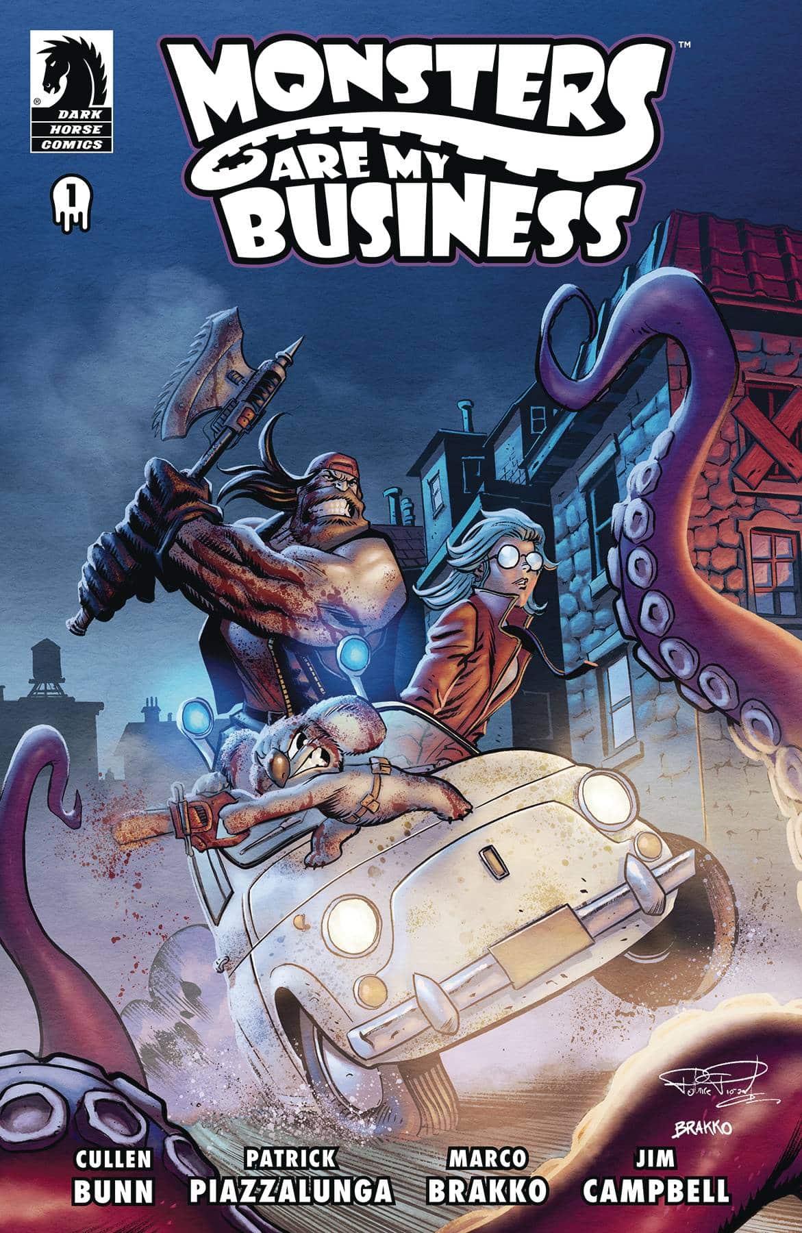
- Monsters Are My Business (And Business Is Bloody) #1 (Dark Horse Comics): A koala, a necromancer, and a former soldier turned monster killer walk into a building, they’re paid in food for their services. Content as they are to help the people, when our big strong man and monster killer, Griz, is approached about a search and rescue mission by a government employee, he’s reluctant but “chicken and dumplings don’t keep the lights on.” The story, written by Cullen Bunn, at first seems pretty straightforward with a lot of charm in the characters, their designs, and the world-building. Griz is a hulk of a man, dwarfing the people around him, especially his hyper-violent koala companion, Cuddles. On a visual level it’s a great juxtaposition. Artist Patrick Piazzalunga delivers on the violence; it’s very dynamic and blood and viscera spray everywhere, working well with the artistic style and how well it lends itself to being over the top. Colorist Marko Brakko brings a great sense of tone and mood to this destitute imagining of our world, really pushing the effect of eeriness or making the blood pop. Letterer Jim Campbell provides voice, visceral sound effects and narration, bridging the gap between exposition and the action in this bloody first issue. —Khalid Johnson
The Prog Report
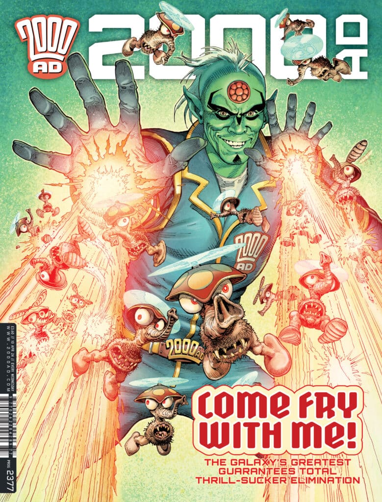
 2000AD Prog 2377 (Rebellion Publishing): In case you missed it, I recently go to talk with writer Rob Williams about the new Judge Dredd story, Rend & Tear with Tooth and Claw. That story features art by RM Guera, colors by Giulia Brusco, and letters by Annie Parkhouse. In our interview, Rob praised the way the artists bring the landscape to life, and that is especially evident in the action-heavy, burst of 6-page survival horror in this issue. What a set piece the creative team serves up. It’s so good and it moves so fast, I had to go back and immediately read it twice. Excellent stuff. As always, you can nab a digital copy of this week’s Prog here. —Zack Quaintance
Read more entries in the weekly Wednesday Comics reviews series!


