

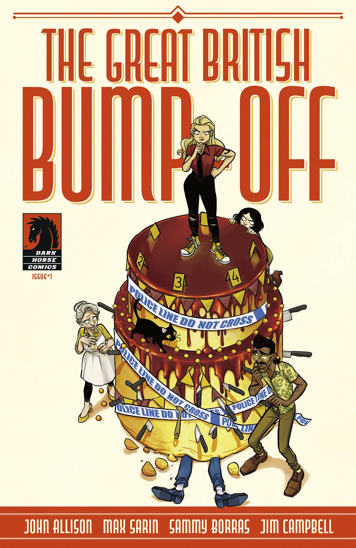
This week’s lead review for Wednesday Comics is The Great British Bump-Off #1, a parody of the popular British baking show. Plus, the Wednesday Comics Team has its usual rundown of the new #1s, finales and other notable issues from non-Big 2 publishers, all of which you can find below … enjoy!
 The Great British Bump-Off #1
Writer: John Allison
Artist: Max Sarin
Colorist: Sammy Borras
Letterer: Jim Campbell
Publisher: Dark Horse Comics
I don’t know about you, but I like my murder mysteries like I like my baking competitions – twee af. So when Dark Horse announced The Great British Bump-Off from the team that brought us Giant Days, John Allison and Max Sarin, I was like, ‘carve me out a thick slice of that. Yes, please!’ Now that I have tucked into issue one, I can honestly say that this title will fit me like a tea cozy.
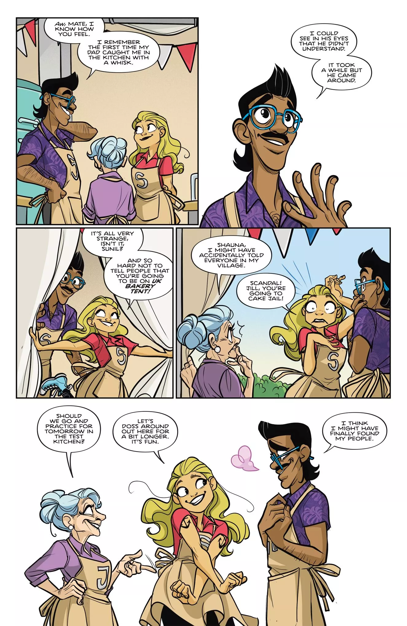
Shauna Wickle enters the UK Bakery Tent in her freshly starched apron starry-eyed and ready to live her UKBT fantasy. But when one of her fellow competitors is found poisoned, face down in his own batter, she sees her dreams deflate like an overwhipped genoise. Not wanting the bitterness of foul play to besmirch the good name of her favorite baking competition show before she can win it, Shauna promises the producers that she can solve the mystery of the meddled-with mix before the hosts can say, “On your mark, get set, bake!” Can she make it through to the second episode without getting eliminated by either the judges or the cold-blooded killer? All she wants to do is survive – getting crowned Best Baker would be icing on the cake.
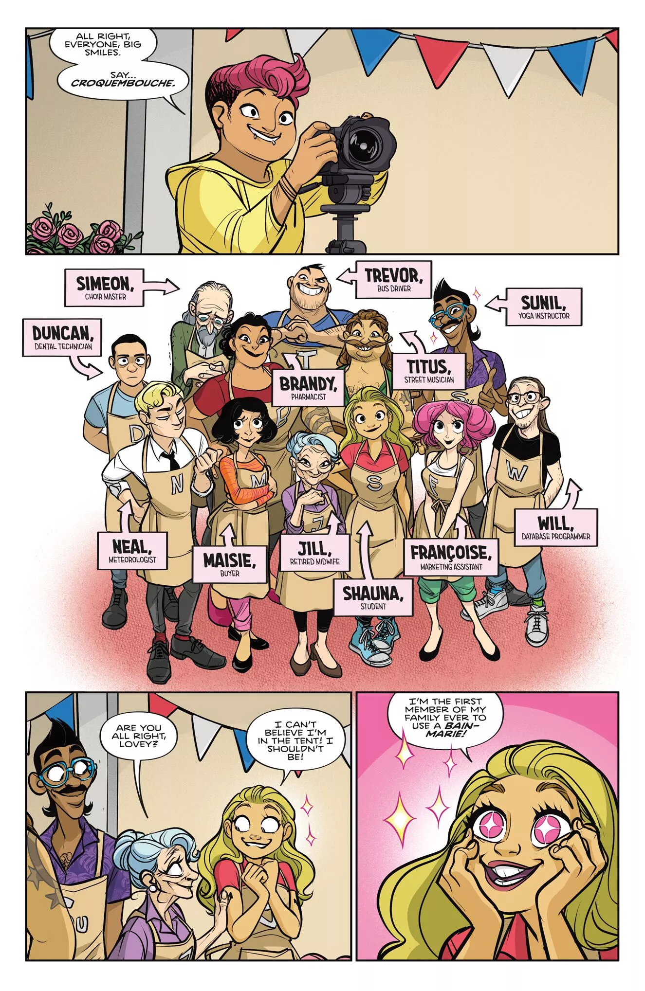
Diehard Great British Bake Off fans, like myself, will not be disappointed. Allison and Sarin have clearly cried over cake. From the layout of the tent to the kooky cast of characters, The Great British Bump-Off manages to deeply curtsy to the source material while gracefully managing to avoid stepping on any copyright toes (I’m reasonably certain. I am a home baker, after all, not a lawyer. Unlike Series 3 winner of the Bake Off, John Whaite, who is both). There are the obvious wink-nudges, like the silver beefcake judge, swervingly named “Pete Holyrood,” but it is the subtler nods that genuinely delight me. It’s hard not to draw parallels from the fictional contestants to real-life Hollywood Handshake hopefuls. I mean, Will, the database programmer, is suspiciously reminiscent of Jordan from Series 5, while street musician Titus is more of an amalgamation of Dan, Stu, and every other “massive dafty” not savvy enough through the first cut.
I am so utterly charmed by The Great British Bump-Off, #1, that my expectations are like the most epic Show-Stopper desserts — hastily crafted and perilously high. But will it be like Frances’ biscuit tower, which crumpled to a heap, or Nadiya’s soda pop cheesecake triumph? As my hero, Mary Berry, has often said, “It is in the lap of the gods.” I am brimming with faith that if anyone can kill a Bake Off/Bump-off murder mystery, it is John Allison and Max Sarin. But, if you want to find me, I’ll be perched expectantly staring into my pull-box as if it’s my convection oven during a Technical Bake.
Verdict: BUY
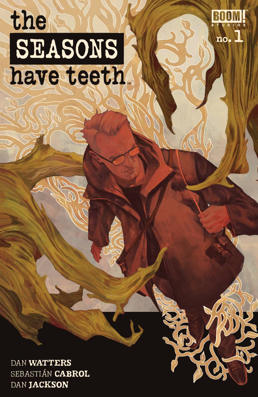
The Seasons Have Teeth #1
Writer: Dan Watters
Artist: Sebastián Cabrol
Colorist: Dan Jackson
Letterer: Nate Piekos of Blambot
Cover artist: Qisitina Khalidah
Publisher: BOOM Studios
Whenever horror and melancholy mix, the results can be uniquely haunting. It’s in the presence of deep sadness that pervades over the things we’ve come to expect to scare us. Dan Watters and Sebastián Cabrol’s The Seasons Have Teeth #1 seems to be aiming for this, and issue #1 offers a strong foundation for a haunting that has the capacity to latch on to the reader once it’s finished.
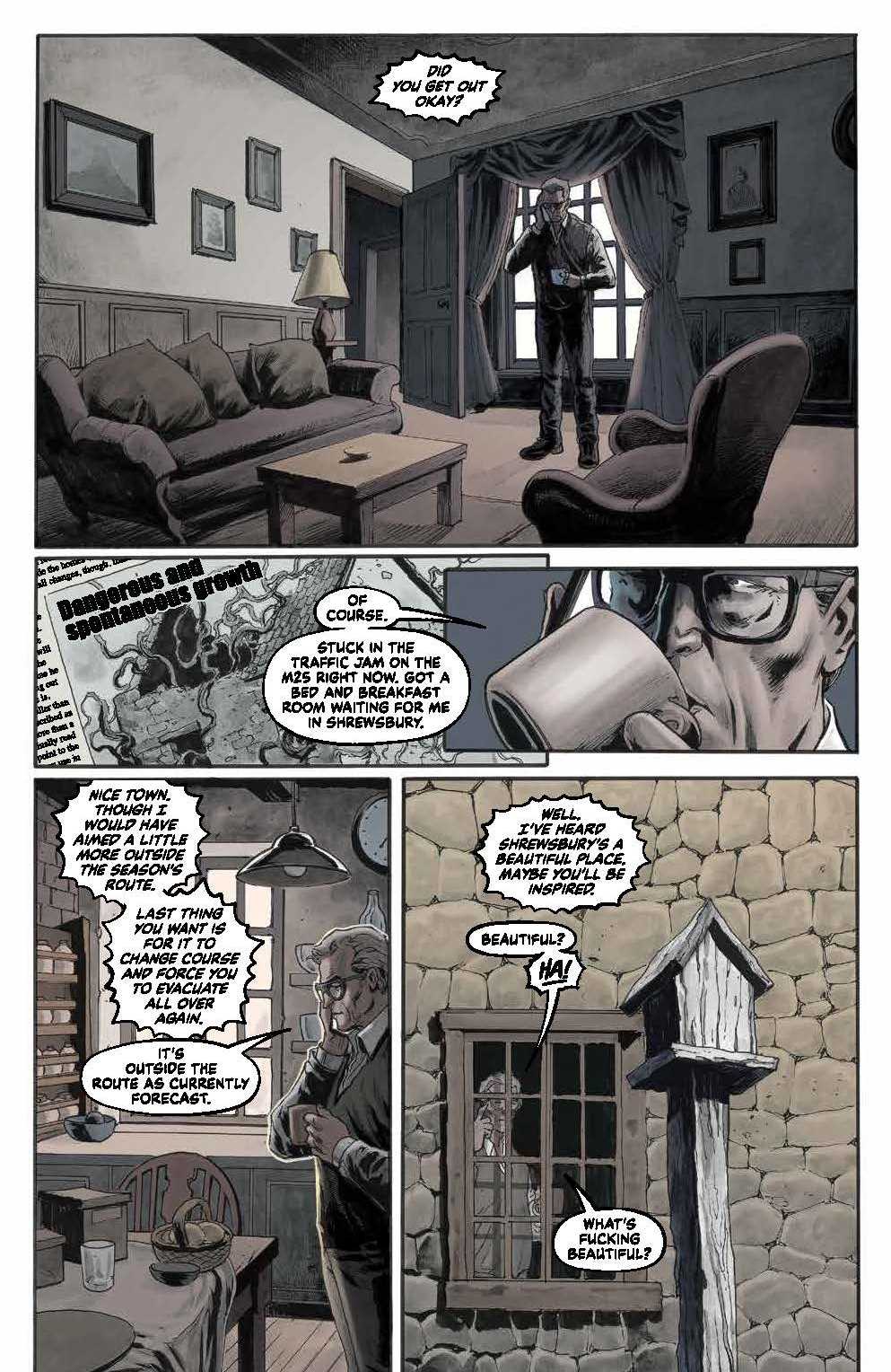
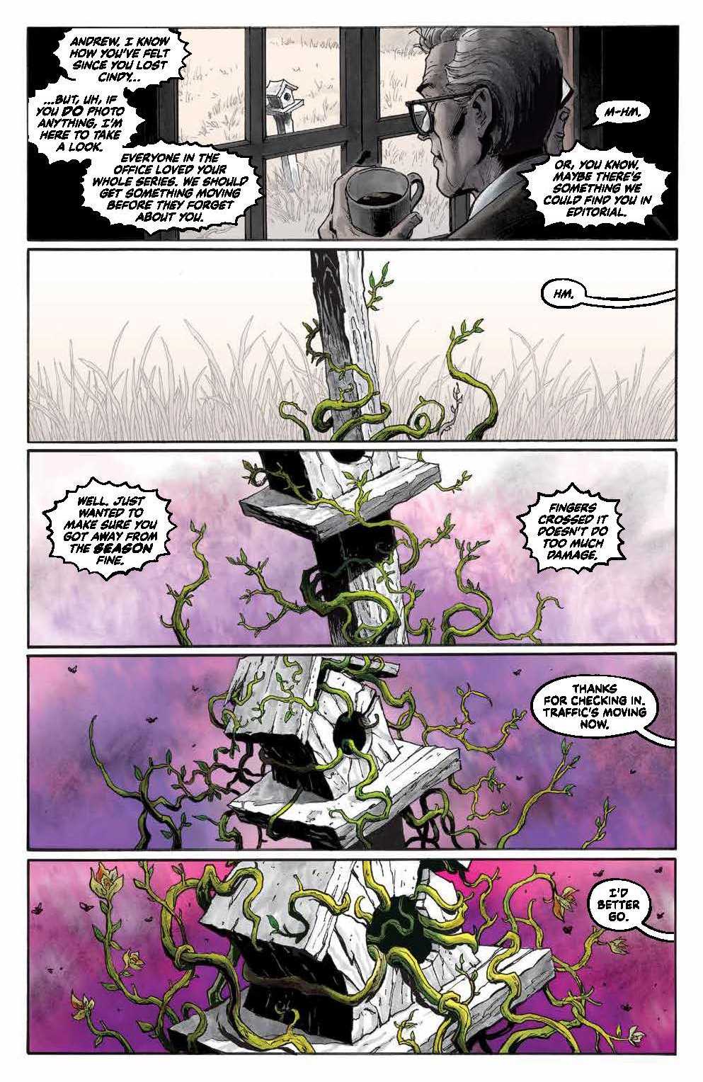
The story follows a photographer called Andrew, a man who’s made a career out of war photography, just as spring starts to round the corner. Its arrival is signaled by violent growths of green, of roots that explode out of the ground without much consideration as to what stands in their way. People evacuate, but Andrew stays. He hopes to capture one of those perfect photographs that lock an experience in a perfectly framed shot. Throughout, we learn Andrew is also overtaken by the loss of his love, something that holds him down to his home despite the evacuation order.
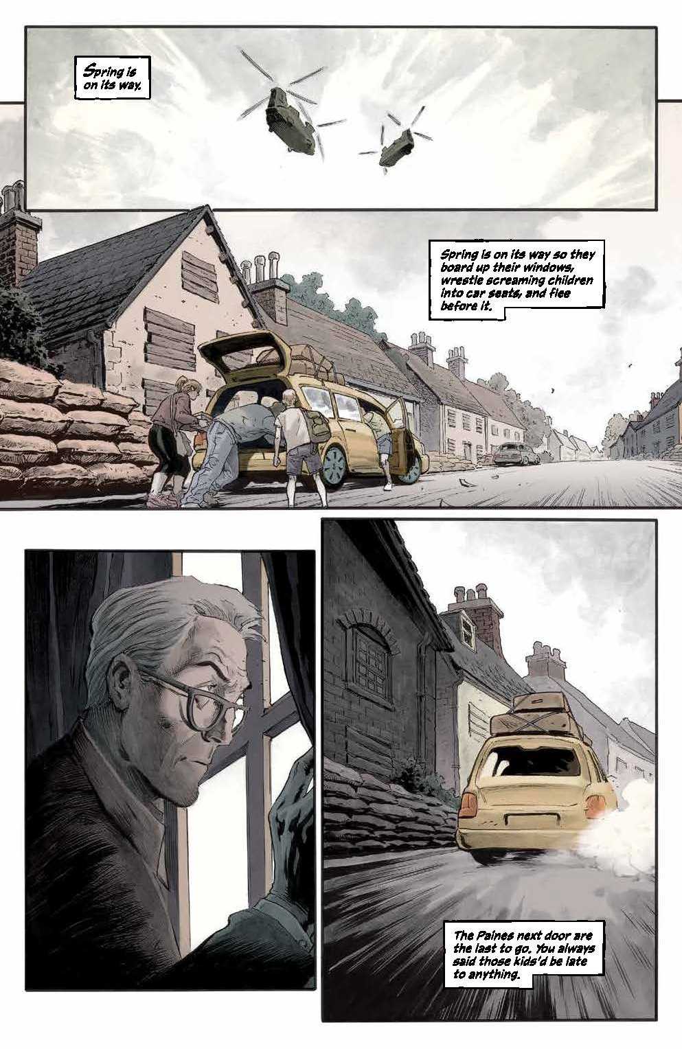
Watters’ script is wonderfully emotional, unflinching even when it comes to opening the wounds Andrew clearly hasn’t been able to heal entirely. His views and his attitudes towards the coming of this strange spring reflect his fractured self and speak to a metaphor of living in sadness without much urgency to overcome it. There’s more at play than just memories of loss and sadness, though. The entire act of taking pictures speaks to memory and how we deal with the things we see versus those that the lens can’t possibly catch.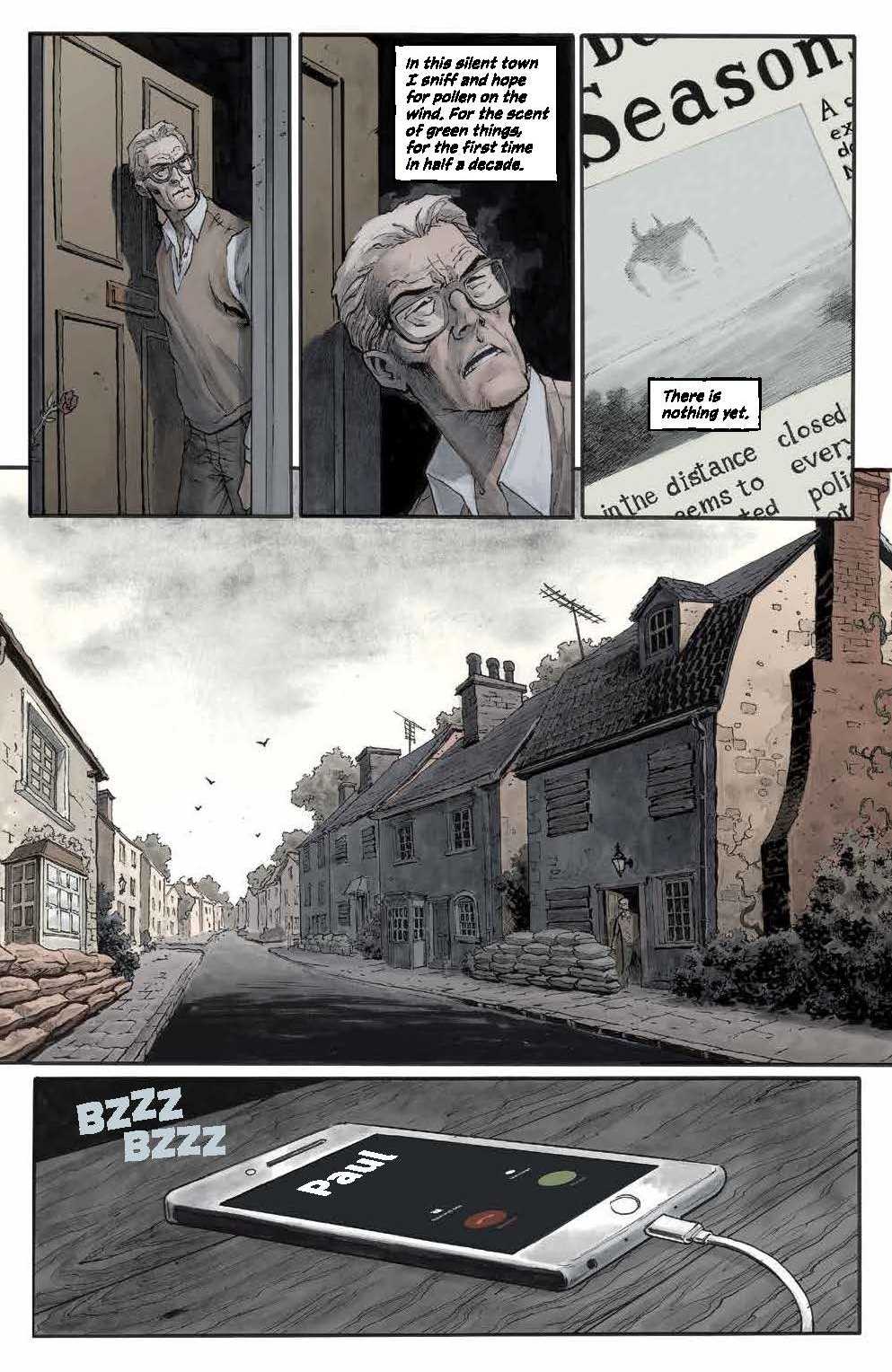 Cabrol’s art embraces the melancholic tone of the story with a force that makes its presence known in every panel. There’s a stillness to Andrew’s life that makes the reader close in on the character, painfully so in parts. Once the roots start taking over, a different kind of life forces itself in every conceivable way imaginable and the story switches to wider shots to capture the totality of spring.
Dan Jackson’s colors deserve special mention here. The first few pages of the comic are mostly in blacks, whites, and muted greys and browns. Everything is soft, non-violent. The roots bring in color and transition the story from the inside to the outside, as if the changing season’s tenacity overrides personal tragedy. You’ll see colors whether you like it or not, and they won’t always conform to your emotional status. Jackson doesn’t overdo it either. Colors move in organically and add layers to an already complex character study in the form of a war photographer.
The Seasons Have Teeth #1 is an impressive debut that considers a different type of violence. It sees change as a relentless constant that can bring just as much comfort as it can distortion. It’s emotional and confrontational, and it requires an equally emotional and confrontational read.
Verdict: BUY
Wednesday Comics Reviews
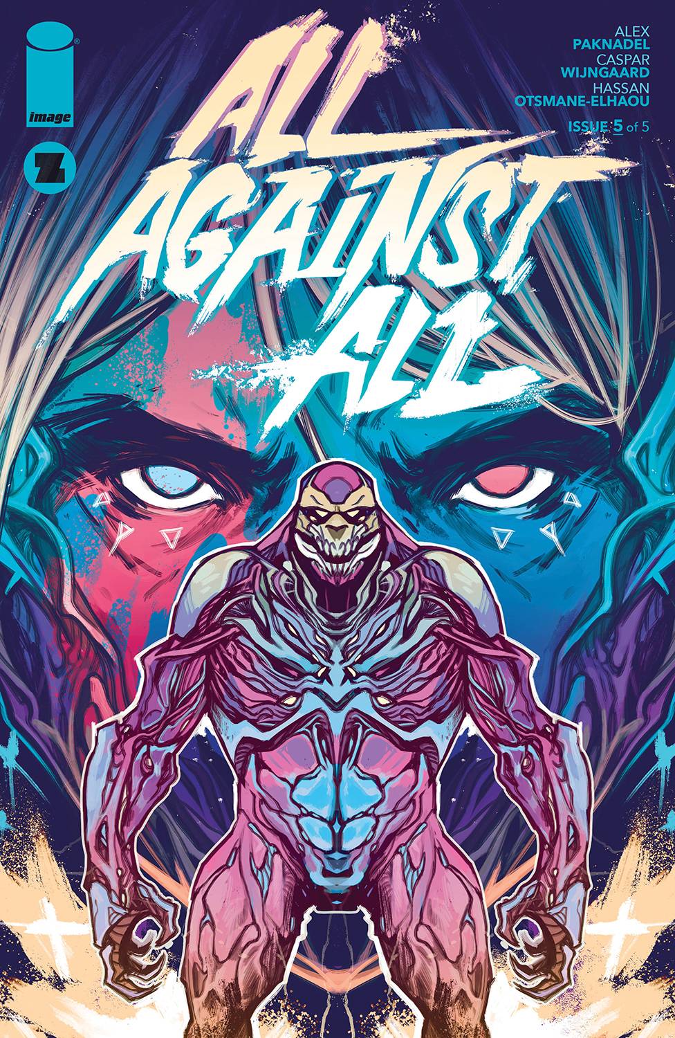
- All Against All #5 (Image Comics): Flat out: this is a jaw-droppingly gorgeous book, with an out-of-this-world story to boot. As an alien race uses The Habitat (Earth) as a test ground for their inhuman experiments, one the last remaining human strikes out for survival… and gives the aliens a serious run for their money. Caspar Wijngaard has perfect command over his linework, and dresses every single page in beautiful pastels, no matter how graphic the content of the panels may be. His ability to depict strange alien technology and creatures is breathtaking, and keeps me scrutinizing over every page just to see what little details I can find. Hassan Otsmane-Elhaou’s lettering, perfect as always, enhances Wijngaard’s art, with borderless balloons and zig-zagging tails that set a cold, ominous tone for the series. He brings a sense of physicality to sound effects, reacting to the world around them just as much as the characters are. Alex Paknadel caps everything off with a strong, solid script, merging sci-fi and horror to create a terrifying story of science run amok. Not only that, but there’s tremendous pathos to these characters, as we watch alien scientists come face-to-face with their own mortality and the fact that there are some things they just can’t experiment their way out of. This final issue is a satisfying culmination of all of these strengths, wrapping up a stellar series that begs to be reread for years and years to come —Cy Beltran
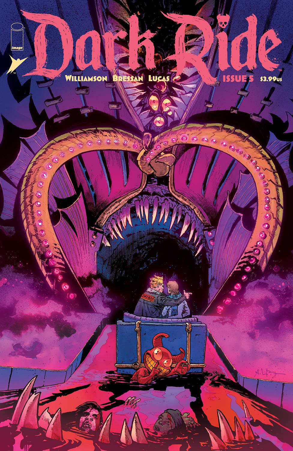
- Dark Ride #5 (Image Comics): Dark Ride #5 not only picks up where its first arc left off, it feels like it raises the stakes. This issue does this by looking back at some of the characters’ history to point readers at mysteries that have been part of this story from the start. I’m absolutely loving this book, which feels at once like a tribute to great horror stories as well as a new horror story in its own rite. With the first trade out now, I’d recommend picking the first volume up and then lining up for the rest of this ride. It’s really a can’t-miss monthly comic. Dark Ride is written by Joshua Williamson with art by Andrei Bressen, colors by Adriano Lucas, and letters by Pat Brosseau. —Zack Quaintance
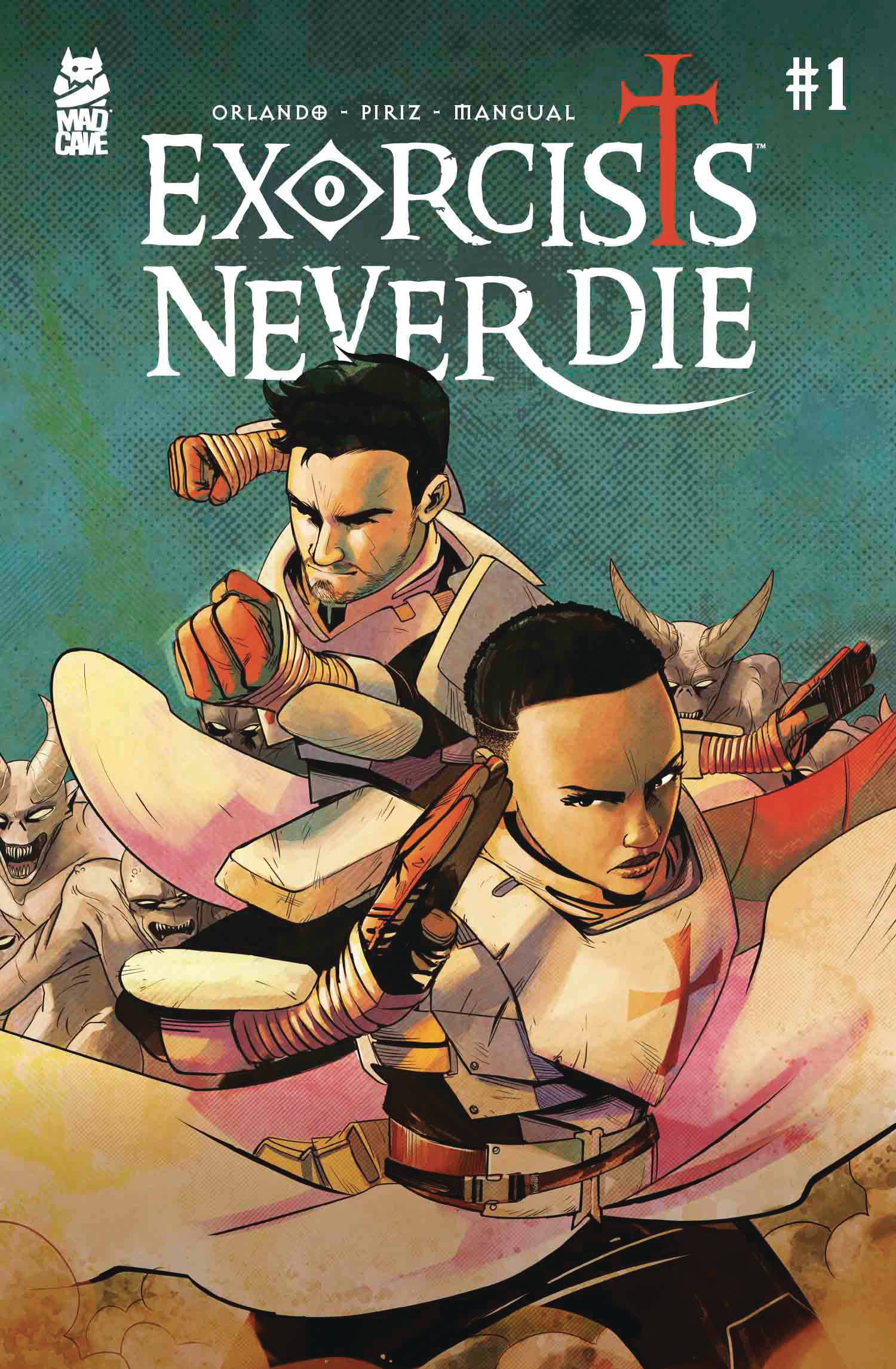
 Exorcists Never Die #1 (Mad Cave Studios): Tasked with diving floor by floor into this particular Hell’s own Dante’s Inferno-like circles, two exorcists equipped with papal kung fu flirt and irk one another en route to stop an auction. On their way, Seven Sins, each deigned to watch over a single floor like the many Bloodborne bosses that make up this Hellscraper. Beyond a helluva Dark Souls/Die Hard mashup, writer Steve Orlando chews up the space with witty banter that’s less laughs and more subtle reveals to the duo’s prior history and the mechanisms behind their fighting abilities. Artist Sebastián Píriz brings the book action that itself feels intentionally stagnant; the moment-to-moment and fight flow is less important than the symbolism and results, an action style similar to Chainsaw Man, I’ve found. Where Píriz shines is bringing a religious art historian’s eye to the symbolism and framing that often doesn’t translate to comics, but here feels like it was mixed in the water of a 90s Image/Marvel comic– heavy on panels tilted for action and big panels impacting grandeur, but not reinforcing narrative. Píriz also rides an interestingly needle fine line with the palette, teetering between aged but sleek and religious but stripped. I hope the print run is on glossy paper or the colors might run muddy on lighter paper. Letterer Carlos M. Mangual held the unenviable task of bolding several words per balloon for emphasis, which I prefer, but it can be distracting for some. Aside from some alt-colored balloons that flatten out the art in spots where it’s a level or two away in saturation, Mangual’s sfx explore a wide range over the course of the book that I don’t think finds the right tone for Píriz’s palette, so it comes off as discordant. All in all, this team, this book is an absolute deluge of creativity locked in and ready for a seven floor thrill ride– now all it needs is you to believe in it. —Beau Q.
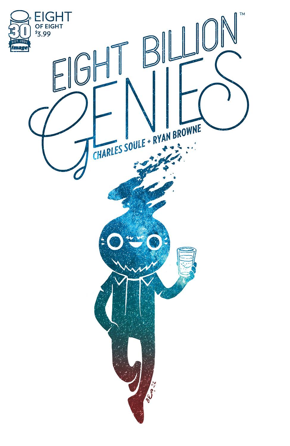
- Eight Billion Genies #8 (Image Comics): Sigh. This week I had that bittersweet feeling of a fantastic book going away while absolutely delivering a satisfying finale, and I got that feeling from Eight Billion Genies #8. This week sees the conclusion of just an utterly excellent miniseries from writer Charles Soule and artist Ryan Browne, with colors by Browne and Kevin Knipstein, and letters by Chris Crank. This last issue had a lot of work to do, unraveling some mysteries, giving us full arcs for the remaining characters, and oh just covering eight centuries of world events. But it did it all well, in ways that were in keeping with everything that came before. This book has just been so good, a rare instance of a strong high concept in comics that was actually made better by the execution. Kudos to everyone involved. —Zack Quaintance
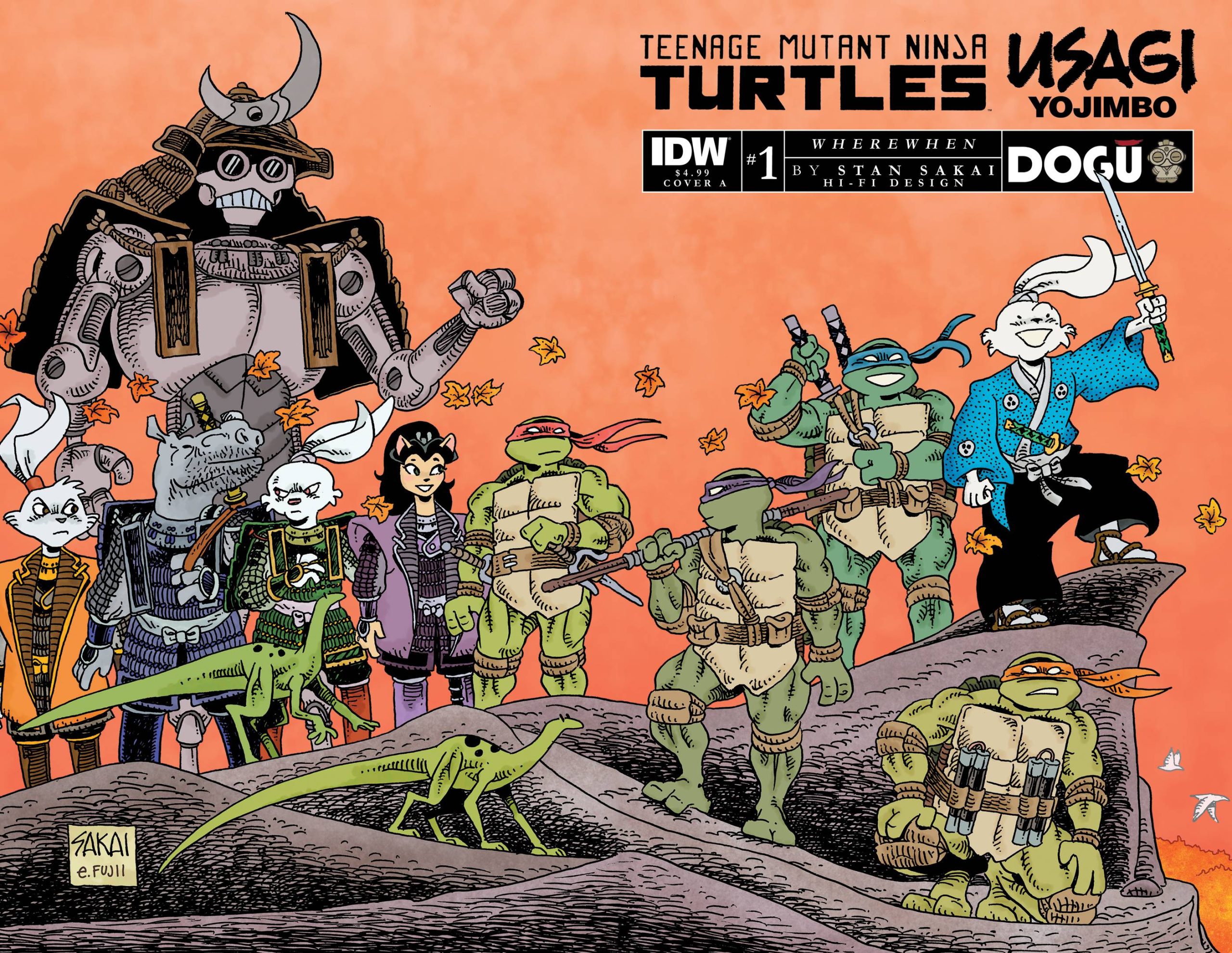
 Teenage Mutant Ninja Turtles/Usagi Yojimbo – WhereWhen #1 (IDW Publishing): Teenage Mutant Ninja Turtles / Usagi Yojimbo WhereWhen #1 by Stan Sakai and Hi-Fi Designs brings the long-running pairing back for another round of time and culture clash hijinx. While on a large campaign to confront Lord Hikiji, General Usagi is approached by some villagers who have a Kappa terrorizing them. Having defeated Kappa before, Usagi and friends get permission to help the villagers, as long as they are back before sun down. Across time, the Teenage Mutant Ninja Turtles have tracked down Dr. WhereWhen, an evil robot time traveling nemesis. But he escapes through time. Where he goes and where this will lead the TMMT… well, you can guess. WhereWhen #1 is difficult to review because both Usagi Yojimbo and TMMT have such a long tradition behind their narrative styles and, aside from the TMMT original animated series, I’m not the most well versed. But I see the appeal. Although I feel the dialogue is a bit too obvious, the action and characterizations of the style suck you in. I want to see those turtles and Usagi clash. I was compelled to research what a Kappa is in Japanese folklore, then return to the story again. WhereWhen #1 sets up for a classic story with a lot of layers, in a classic style. If you’re unfamiliar with Usagi Yojimbo, or the currently running TMMT series, this 5-issue miniseries is not a bad place to start. –Michael Kurt
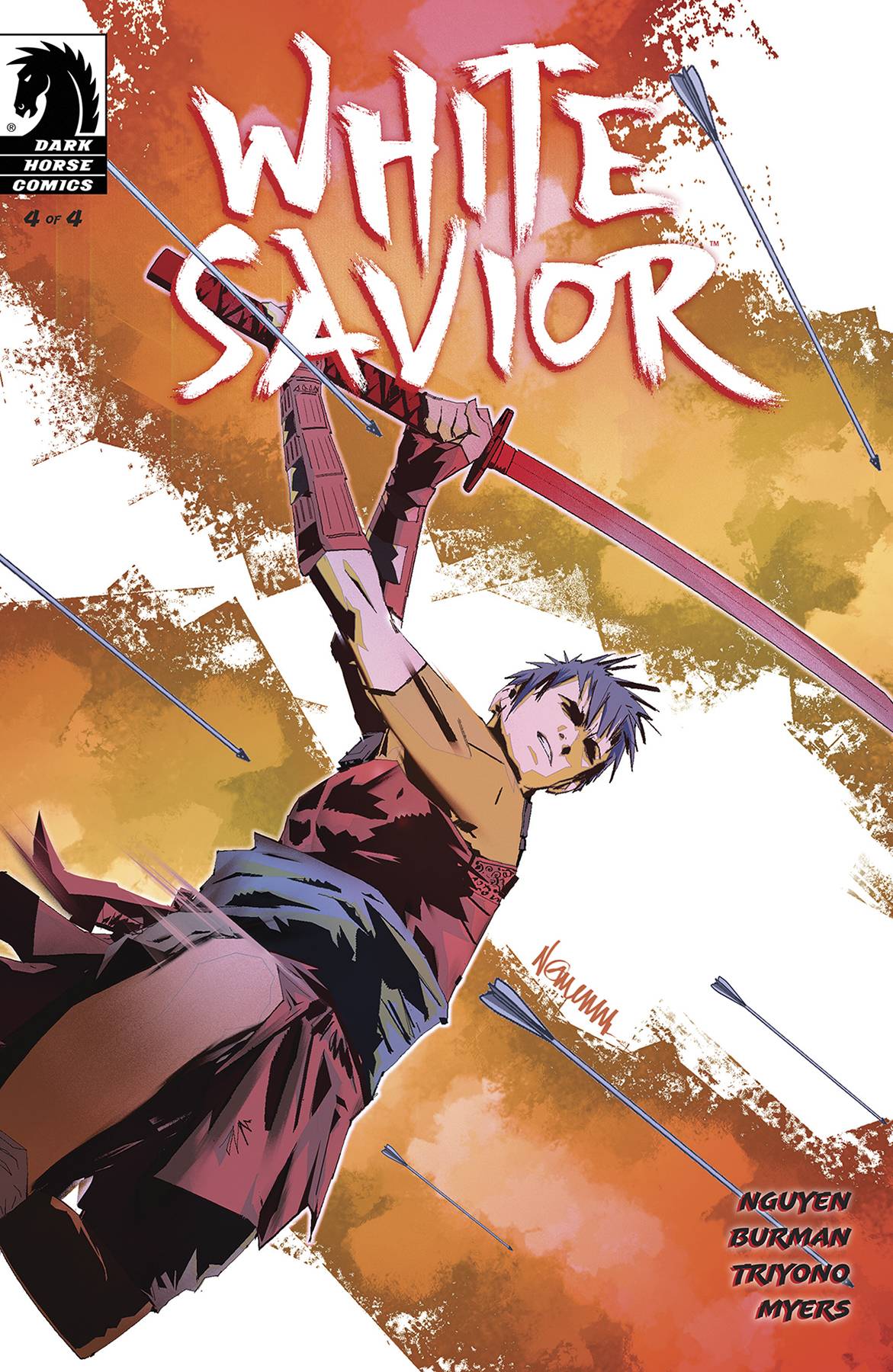
- White Savoir #4 (Dark Horse Comics): White Savior #4 sees the final confrontation between the Inoki and the Akuno, where Todd, Neal and Maggie are put in a do-or-die position after faking their leadership and prowess. Writers Eric Nguyen and Scott Burman play on the nature of identity and representation through their brand of meta-humor, but what shines through is commentary on self-determination outside of a colonial lens which works even more when the foils and antagonists are white men cosplaying white supremacist monsters. Erig Nguyen’s art is energetic and expressive as the exaggeration in the characters and their movements really work in the favor of the story and action on display along with the dynamic layouts and compositions. Nguyen’s art is elevated by the vibrant colors of Iwan Joko Triyono and the letters of Micah Myers which tie Nguyen’s layouts together and weave the reader seamlessly from one panel to the next. The result of White Savior is an Isekai with a group of minorities challenging prophecies and stories that somehow centered white people, and declaring through film references, meta-humor and commentary, and expressive art that people of color don’t need to be defined or saved by white people, they have the right to define their own destinies and write their own stories. —Khalid Johnson
Read more entries in the Wednesday Comics reviews series!
Wednesday Comics is edited by Zack Quaintance.


