
Chip Zdarsky and Adam Kubert are finally getting the keys to Spider-Man. Their new series is the second ongoing Spider-Man book featuring Peter Parker currently published as Zdarsky and Kubert are going to have to really show off why this one is a little bit different from the flagship Spidey title! Oh yeah, Marvel also has a new Thor joining the pages of my favorite ongoing Marvel series: The Mighty Thor starting…today? Time for The Marvel Rundown!
 Peter Parker: The Spectacular Spider-Man #1
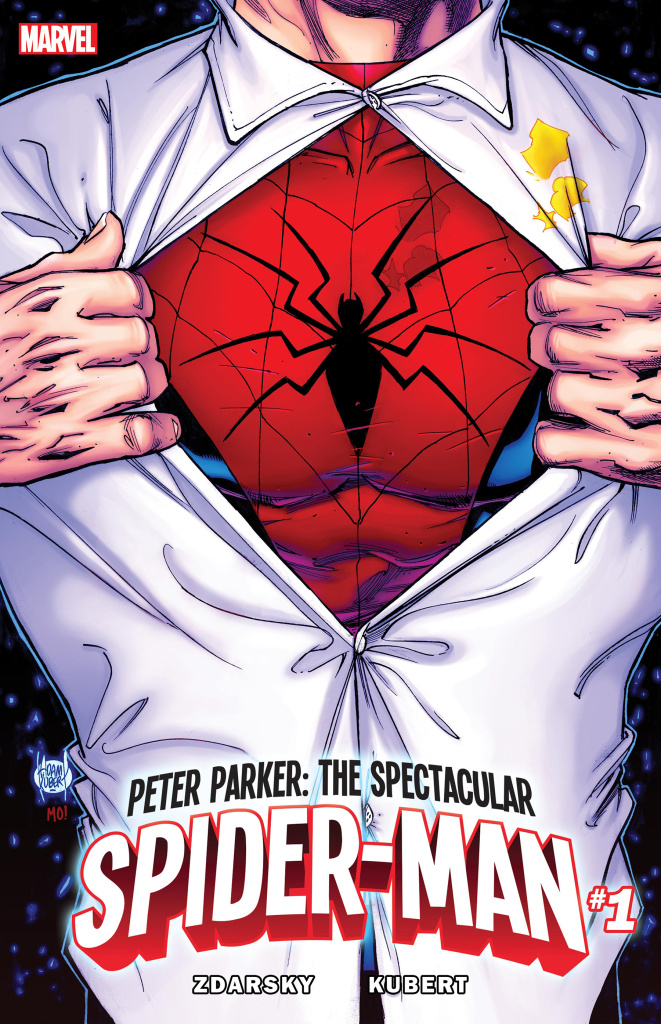 Peter Parker: The Spectacular Spider-Man #1
Writer: Chip Zdarsky
Artist: Adam Kubert and Goran Parlov
Colors: Jordie Bellaire and Nathan Fairbairn
Letters: Travis Lanham
Jones: You know I read that and still thought: UGH. Just because you are calling out a cliche doesn’t mean that you are telling a good story. I thought the art was really shaky on that opening page and not a great way to subvert Adam Kubert’s rough illustrations. I do like what Zdarsky and Kubert were going for in the sequence that has all the muted colors, but I don’t think the moment had the ambition to stylistically make me do anything other than groan. What about the rest of the issue AJ? Did you notice that this comic was loaded with dialogue?
Frost: I know that Spider-Man is known for his quips, but at some point, constant joking a coherent plot does not make. Every page was filled with hokey dialogue that was half-hearted. When it landed, it could elicit a chuckle. When it didn’t, it was like wincing at a bad stand-up comic on open mic night. Adam Kubert is Adam Kubert. He’s a good artist, but this isn’t him at his most ambitious to say the least. It’s good enough, but not great. And yeah, I’ll agree with you that this was a dialogue heavy issue. There’s even Chip providing commentary, like this is an Ultimate Squirrel Girl comic (but she’s fab, no complaints!). It was a little distracting to say the least, but I can get where he’s coming from.
Jones: I kind of liked some of the smaller gags in the editor’s note boxes. It was more the constant dialogue that drove me up the wall. Nobody was thinking or saying anything that seemed truly worthy of the amount of space that the dialogue took up on the page. I just read Howard the Duck by Zdarsky and I definitely was able to spot his voice in that series more clearly. I feel like this could almost be written with a couple different names and I would be fooled. There’s not really much of a plot here either?
Frost: Nah… well, unless you think the plot is only to lead up to the final reveal…Which… whatcha think?
Jones: We don’t even need to get into spoilers because this is just a retcon that doesn’t mean anything until the creative team explores that aspect of the plot in greater detail.
Frost: Ok. Yeah, it was jarring for me. It really was like, “Ok… what’s going on here?”
Jones: The art on this page was striking, the anatomy was a little strange but I thought Kubert cleaned up his style for that reveal, did you notice at all?
Frost: I didn’t, I thought it just kinda blended in with the rest.
Jones: That neck is pretty crazy… huh? Let’s talk about the art a little more in general. Kubert seems really loose here in general and I don’t understand why you would launch a book with him. I don’t think that he quite blends into the Spider-man Universe very well either. You mentioned earlier that you weren’t entirely satisfied with his contributions to the title, what were some of the things that could have made it better in your opinion?
Frost: It just looked like lazy composition to me: poses and panels that he’s done a million times. I’m not saying it’s outright bad or anything like that. It’s just bland and stiff; a corporate style It looked small rather than ambitious. Here we are with a new comic line… do something bold! Take readers somewhere new. Do something unexpected. It’s not like this is new IP.
Jones: That’s what I think as well. The bottom line is that I was actively looking forward to this book and my hopes are kind of dashed now. I thought the second story was kind of interesting but still not enough to earn your dollars.
Frost: Agreed. It’s serviceable.
 The Mighty Thor #20
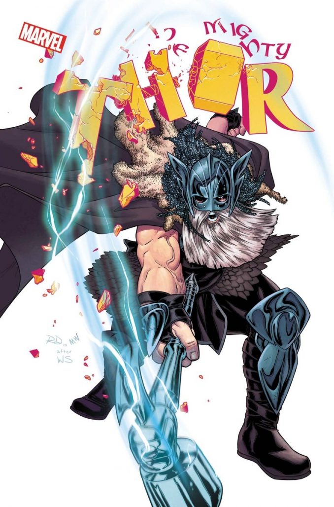 The Mighty Thor #20
Writer: Jason Aaron
Artist: Russell Dauterman and Valerio Schiti
Colors: Matthew Wilson and Veronica Gandini
Letters: VC’s Joe Sabino
Reviewed by Alexander Jones
This issue took by surprise to say the least. We’ve already seen a few different Thor’s introduced by Thor scribe Jason Aaron, but the story structure and the risks that the full creative team take in this issue is massive achievement in comics. Aaron, Russell Dauterman and Valerio Schiti have a secret in this comic in the form of the identity of the the all-new War Thor and you aren’t going to see it coming. Again, throughout his run on the character the writer has planted this seed of war throughout the different realms culminates in this huge issue.
Taking a mythology as well established over the course of several decades as Thor and inverting it such a manner is sacrilegious but thanks to the full art team, something so wrong never felt so right. Russell Dauterman deals with some emotional moments between the Odinson and Jane foster. The writer compares and contrasts the body type of the two characters to extract the right emotion from his artistic contributions. The artists’ opening pages with the map of Asgard is a dynamic approach to the opening of the comic making this book seem bold, brash and epic thanks to some strikingly beautiful prose from Aaron. When the final moments of this issue unfold and Dauterman shows the War Thor in action, the artist pays off the different threads beautifully. Valerio Schiti is given the tragedy of the issue to expand on. The artist draws some dramatic splash pages and great figure work. Schiti nails the emotion carried from each character and delivers on the dark place that Aaron relentlessly thrusts this issue into with ease.
Aaron has done a number of incredibly smart things with Thor franchise, but the writer’s commitment to Jane Foster’s current status quo over the past couple of years in the main Thor comic is pulling out some of the most dramatic beats that the series has ever touched on. This Eisner-Nominated series just delivered one of the strongest issues yet. It feels like like we’re towards the end of Aaron’s Thor run as Marvel Legacy quickly approaches showing off a more classic version of the character front and center. If that is the case I really hope that Aaron, Dauterman and company have the time and space that they need to wrap this series and keep this immense level of quality throughout the issue.
Final Verdict: THE MIGHTY THOR #20 is a bleak and fascinating new direction for the Thor franchise.
This was a stellar week of quality across the board at Marvel. All-New Guardians of the Galaxy #4 carried the same momentum as previous installments while Daredevil #22 wrapped up the incredible cliffhanger from last issue. Silver Surfer #12 threw another emotional gut punch and I’m not even through my stack of Marvel issues this week. Wow.


“Frost: Agreed. It’s serviceable.”
For the prices marvel charges a comic has to be more than ‘serviceable’.
The “weird new addition” isn’t new, she was introduced in a graphic novel several years ago.
Comments are closed.