
This week Marvel’s got a slew of brand new ongoings spanning from Black Panther to two additional X-Men titles. We’re knee deep into RessurXion but there’s an incredible amount of new series and directions thrown up against the wall at the troubled publisher. We’ve got reviews of those three additional ongoing series, but we’re not stopping there–Brian Michael Bendis is leaving Guardians of the Galaxy this week and we’ve got some things to say. Plus…I’m dying to know just what Cullen Bunn is going to do with the time-displaced X-Men years after what should have been there expiration date–I think it’s time for The Marvel Rundown!
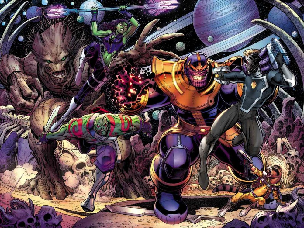 Guardians of the Galaxy #19
Writer: Brian Michael Bendis
Artist: Valerio Schiti, Phil Noto, Andrea Sorrentino, Ed McGuinness, Arthur Adams, Kevin Maguire, Mark Bagley, Sara Pichelli, Filipe Andrade
Inks: Mark Morales and Andrew Hennessey
Letters: VC’s Cory Petit
Colors: Richard Isanove
Reviewed by A.J. Frost
Ok… I didn’t know exactly what to expect with this issue. While I’ve been a general fan of the Guardians of the Galaxy comics, I haven’t exactly been following their exploits with an eye towards the minutia of their story arcs, nor have I been following the saga of reaction to Brian Michael Bendis’ interpretation of the superhero team. To be fair, I generally like his work. I tend to look at comics book issues, such as this nineteenth and final installment of Bendis’ run, with an eye towards their individual merits, strengths, and weak points. I’m not naive enough to let preconceived notions cloud my judgement of a story, but sometimes it’s good to drop any pretense and just enjoy something because its interesting or surreal. While Guardians of the Galaxy #19 is far from a perfect comic, it does offer action and closure, not only for the characters, but for the creative team. For this it deserves some praise, while undoubtedly possessing some flaws.
What will draw readers most into the issue is, indeed, its sense of finitude. (Or at least, as much finitude a comic can have.) And being a non-event double issue, there is a lot of ground to cover. We begin in the Negative Zone, where a conclave of villains consult with Thanos to destroy Earth to get rid of all the pestilential mutants, inhumans, and, yes, guardians always putting a stop to their dastardly plans. Thanos for his part doesn’t want Earth destroyed completely, just subjugated under his rule. You know, typical stuff. We are then shown vignettes of where everyone is, from a S.H.I.E.L.D helicarrier over Cleveland, to Groot still hanging around Central Park, to The Thing and Kitty Pryde bickering on the Brooklyn Bridge, before the story kicks into high gear.
And Bendis’ story is… well, you can definitely see the beats even if the level of coherence varies between scenes. There is a strict linearity to the proceedings because everything needs to be wrapped up in a nice bow at the end. The Guardians gang do their fair share to save the world, and it’s always good to see them subvert expectations and actually accomplish what they set out to do, even if a certain loquacious cybernetic procyon lotor doesn’t get a chance to fulfill his explosive potential in the way I would’ve liked to see. In fact, the most absurdly dense dialogue balloon I’ve even seen comes from Peter Quill, and its disconcerting to see just how clumsily inserted to the story it is, even if it does have a purpose.
But of there is anything to be said about this issue, is that the art is truly ambitious and fitting to fill the space of major end to a story arc. As the main artist, Valerio Schiti goes all out in this issue, drafting detailed spreads of alien invasions, bone-crunching blows, and some tender scenes (especially near the end of the issue) without any dialogue. But to augment Schiti’s work are the contributions of other artists including Ed McGuinness, Arthur Adams, Filipe Andrade, Mark Bagley, Sara Pichelli, Kevin Maguire, Phil Noto, and Andrea Sorrentino, who each add some varying art styles to the issue, doubling down on the singular purpose of this comic as the end of one era and the beginning of another.
In sum, this is a conflicting issue of Guardians of the Galaxy. While I haven’t been effusive in my take on it, I should state that I didn’t hate it either. It’s a serviceable enough piece of pop ephemera to entertain readers and that’s worthy enough. For some, though, I foresee that it’s haphazard approach to finishing the story might not hit all the right notes. Sure there’s plenty of action, but where is the payoff? Where’s the catharsis? It’s here, sort of. What should be a ringing success ends with a bit of sour note. Nonetheless, the ride is a least compelling enough to warrant a glance, especially if you’re a hardcore fan. If this is the case, then you will like the ride more than the average raccoon.
Final Verdict: At 5 dollars, this is an investment for all abut the most ardent fans. Weak BROWSE for the rest of us.
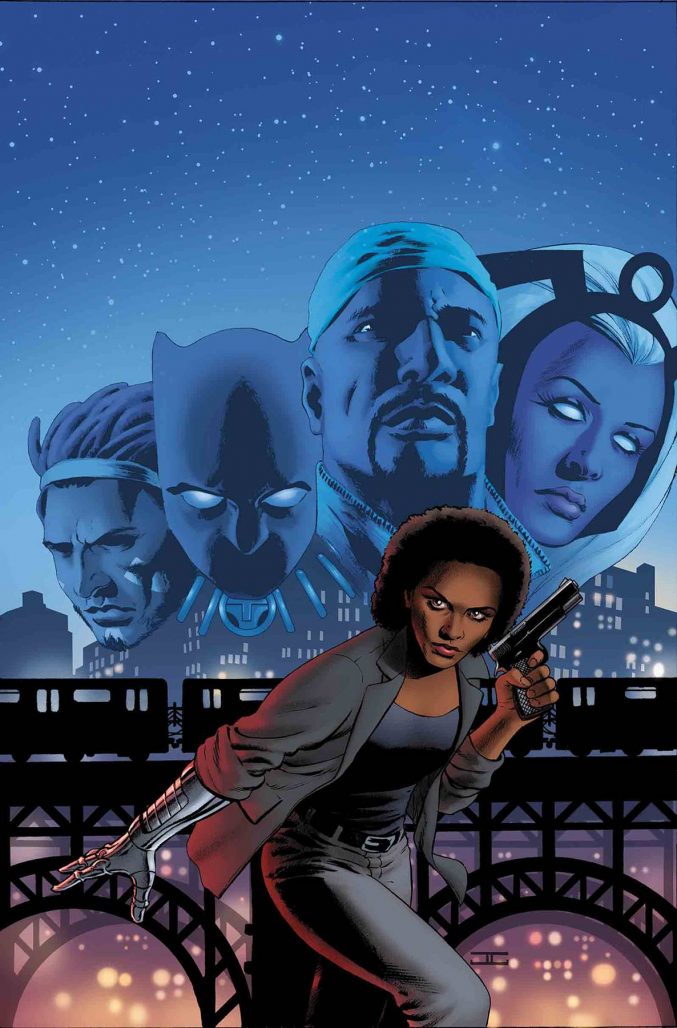 Black Panther & The Crew #1
Writer: Ta-Nehisi Coates
Artist: Butch Guice
Inker: Scott Hanna
Colors: Dan Brown
Reviewed by Alexander Jones
I couldn’t be happier that we live in a time where there can be numerous ongoing series set in the Black Panther Universe. However, Ta-Nehisi Coates’ take on the character has held readers at arm’s length with hefty narration, too much plot and strange pacing. Writing comics is an artform unto itself, and seeing the author take on a smaller, more intimate story like the one presented in this issue is some cause for celebration. Coates is learning on the job here.
Butch Guice’s noir-infused pencils are a perfect match for this issue. The author gets the look and feel of modern Harlem with the gated off fences and ancient look of a city undergoing massive change. Small touches of brick and windows in the background give the series an unmistakable New York touch. It’s incredible just how many extra touches Guice adds into the background of the series. His facial expressions and subtle acting complement the tone of this book beautifully. The pencils can be a bit understated but Guice does bring in some nice layouts and subtly is rarely a bad thing in big, bombastic cape comics that can have trouble pointing with focus.
Misty Knight is a great character but this issue doesn’t give her quite the personality or conflict to make her truly stand out. Coates plays with some truly beloved characters of the Marvel Universe, but the writer gets lost in his words, placing too much on the page, violating the show and not tell rule in a visual medium. While the narration from Misty is nice, Coates’ misses the scenes where his character might have engaged readers with humor, drama or struggle as more than anything else surrounding this book, I just don’t feel the stakes here are high enough here. Coates doesn’t establish a major reason for The Crew to assemble again and continues to make me question if the Black Panther franchise is expanding too fast without the development time put into these series.
Final Verdict: Browse. Black Panther & The Crew is an interesting look at Misty Knight and the Marvel Universe’s take on Harlem that doesn’t stand out in a crowded market.
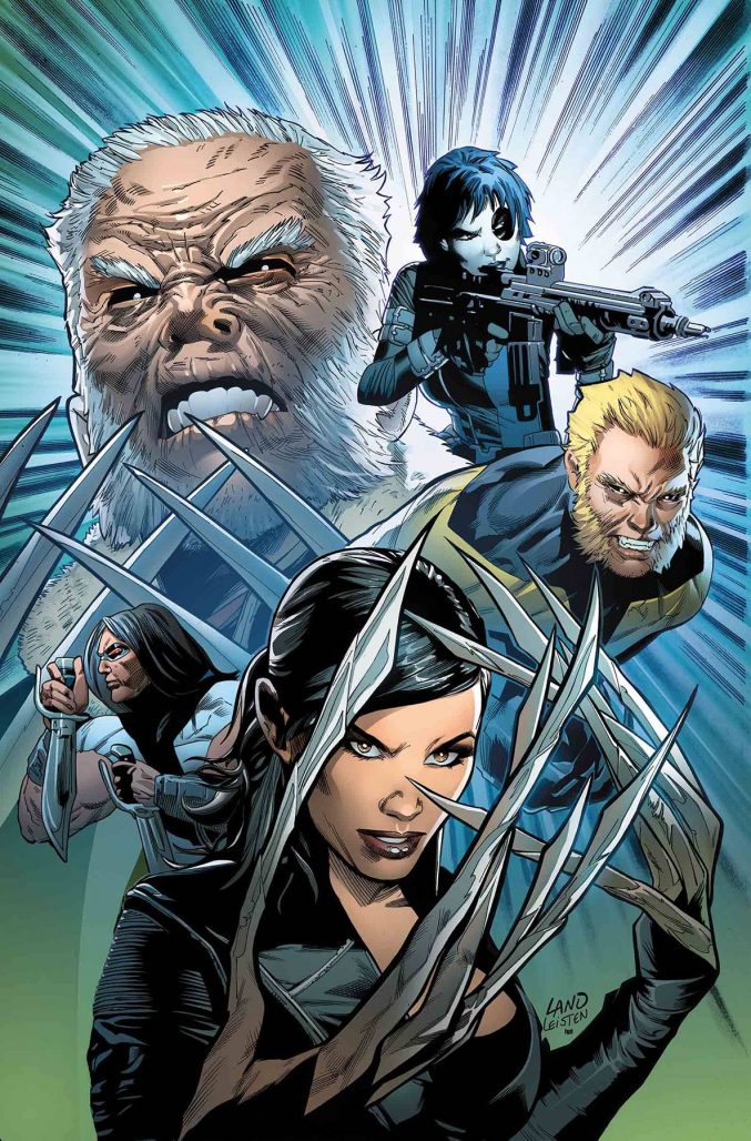 Weapon X #1
Writer: Greg Pak
Artist: Greg Land Inker: Jay Leisten
Colors: Frank D’Armata Letters: VC’s Joe Caramagna
Reviewed by Alexander Jones
Even with an older Wolverine, it’s hard to shake the feeling that we’ve been here before. RessurXion continues with a new spin on the X-Force idea with Weapon X #1. The issue is an enjoyable take on the idea, diving into Old Man Logan’s head, showing his fractured psyche. There’s even a few impressive fight scenes in the issue. However, this installment has some underwhelming, flat colors from Frank D’Armata and the standard Greg Land faces and poses. There’s more than one inappropriate scene showing more skin than what needs to be on the page.
The face that this issue is taking this brand new team nice and slow is amicable as not every member of Weapon X is established here, but Pak and Land don’t really have anything new to say about these characters. There’s not enough elements of this new X-Force style to team to differentiate the book from the past incarnations of the series. While Pak’s work is at least pleasant here, Land and D’Armata continue to turn in uninspired, dull pages.
Final Verdict: Pass. There’s nothing about this X-Force clone separating it from the pack.
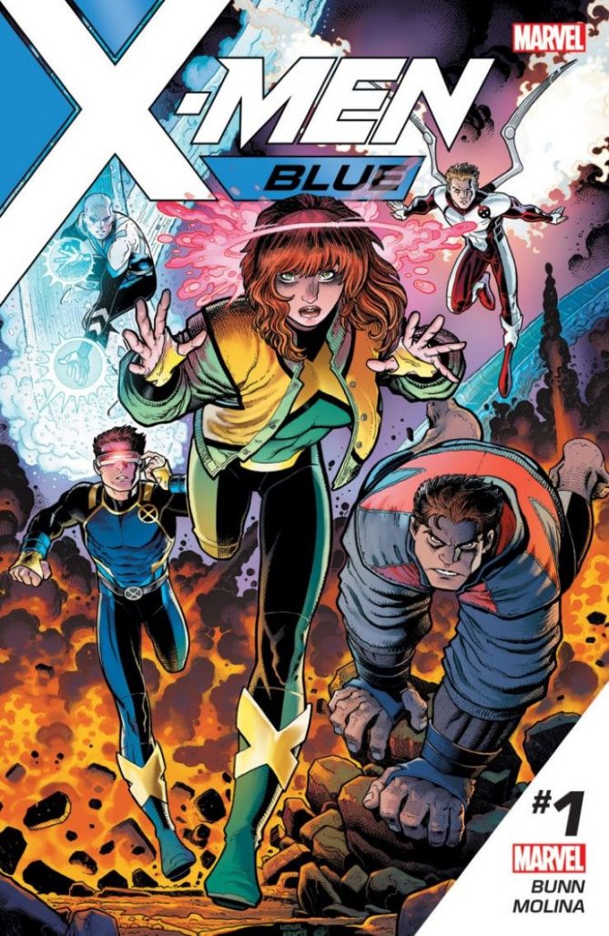 X-Men Blue #1
Writer: Cullen Bunn
Artist: Jorge Molina and Matteo Buffagni
Colors: Matt Milla Letters: VC’s Joe Caramagna
Reviewed by Alexander Jones
Over the past few years, I have grown a disdain for X-Titles that are complacent in not moving the franchise or giving readers something new. The X-Men are really struggling for a clear and concise new direction and the only way to go right now is to take these titles and introduce enough twists to shake them directly on their head. At first glance X-Men Blue #1 seems just as guilty as its predecessors, but the issue pulls the rug out from underneath readers in the final pages, teasing a true, palpable sense of ambition bubbling just beneath the surface.
This comic has a couple huge problems from a writing standpoint as Cullen Bunn has a hard time drafting dialogue for these characters that doesn’t make me grit my teeth at least once a page. Despite what these costumes and speech patterns might make you think, these teens are originally from the ’60s and it would be great for writers to examine those aspects more in-depth and set them apart from the rest of pack. Perhaps the most groan inducing dialogue is the mention of a “hipster beard” that will only serve to age this comic down the road. The funny thing about this issue is that the one time when Cyclops mentions the ’60s his entire team unceremoniously shoots him down.
After the annoying first half of the issue, Bunn introduces a really tense conflict that comes out of nowhere. The issue itself gets invigorated with a strong burst of energy matched from the issue’s artist Jorge Molina. His light pencils and subdued approach to the series makes this issue an absolute joy to stare at. Bunn also gives him some interesting material to draw in this last half, testing his metal with some intense action scenes. Molina’s faces can look a bit especially with some panels involving Jean Grey, but these small moments can be pushed aside for how much the artist gets right like the astonishing last page.
Bunn leaves the issue with your jaw on the floor with the very last couple of pages of this issue. Its remarkable just how many surprises and teases at the future of X-Men he’s peppered throughout this title. If Bunn can work on exercising some restraint with the dialogue of the core group of X-Men this could be one of the best books in all of RessurXion while Molina and Buffagni make it the best looking issue in rebooted line so far.
Final Verdict: Buy. While this issue is very, very far from perfect, X-Men fans are not going to want to miss this surprising back half of X-Men Blue #1.


” Despite what these costumes and speech patterns might make you think, these teens are originally from the ’60s ”
Given how Marvel time works, I was under the impression that they were from somewhere around the 80s rather than the 60s.
Prolly not even the 80s. Given that the original X-Men that are still alive (Iceman, Beast, Archangel) are probably not even 40 yet, the original X-Men would’ve been teens in the 90s/00’s.
Comments are closed.