
by Zachary Clemente
Script by Kelly Sue DeConnick, Art/Covers by Valentine De Landro, Colors by Cris Peter, Letters by Clayton Cowles, Cover Design by Rian Hughes, Backmatter Design by Lauren McCubbin, Edited by Lauren Sankovitch, Published by Image Comics.
A science-fiction take on the Women in Prison exploitation feature, BITCH PLANET follows five prisoners on an all-female penal planet, ready to make their escape by way of a gladiatorial exhibition against a team of visiting male prisoners. DeConnick summed BITCH PLANET up with, “there are five women, all ridiculous and real, and all very different. One shouldn’t be there. The other four are unrepentant and guilty as Hell.”
Let’s get this out of the way first – I loved the hell out of this book. It’s ridiculous while grounded, thoughtful while crazed, exploiting while humanizing; everything I knew to be excited about when DeConnick first announced the book at Image Expo this past January. What excited me most about this book was DeConnick’s personal feelings on the subject; how her love of ’60s and ’70s exploitation and of women in prison films is something that excites her as makes her uncomfortable. I’m pleased to say Bitch Planet is the best of both worlds, seamlessly integrating the unadulterated fun of pulp science fiction action with a necessary discussion on the way women can be viewed in media and society.
From the very first panel, I felt introduced to a rich, yet stifled, world where obeying is the best way to stay compliant because those who aren’t are dealt with in that deliciously camp fashion. This future, occupying whatever place in time it does, feels organically grown from a strain of our own; the opportunities to work within a society still exist, yet the systematic oppression built into constructs of our own society are still very present, just in different guises. Ads hawking products guaranteed to ease conformity to a prevailing idea of beauty are still a thing, for starters. Though, despite DeConnick’s warnings that expounding her qualms on the mixture of exploitation films and her being a feminist as “sounding like an academic paper,” Bitch Planet excels as a fantastically entertaining vehicle of discourse; it comes off as effortless.
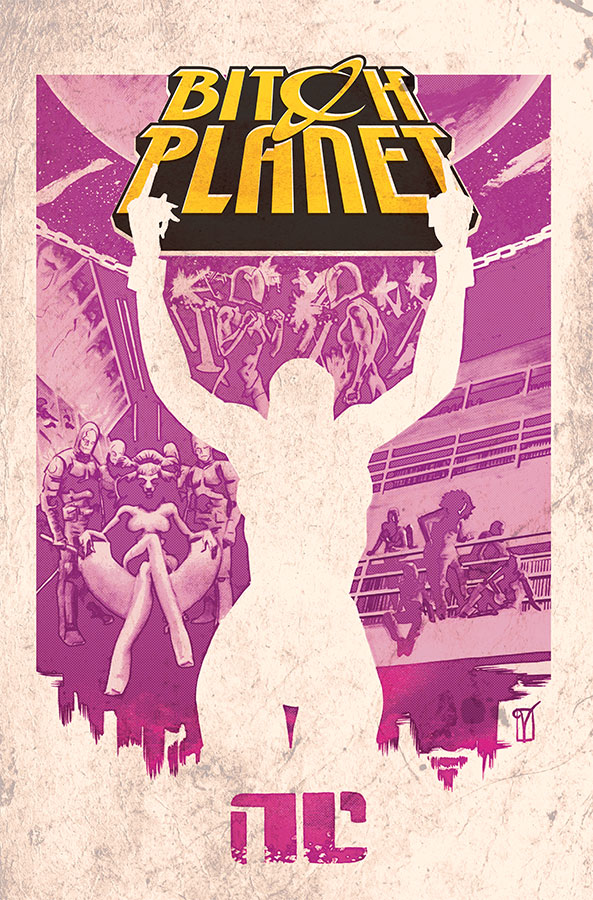
![]() Something I really want to point out is the immensely successful design of Bitch Planet. I just feels cheap – in a good way. It looks like it’ll be printed on terrible paper with horrific binding, the colors bleeding every which way and despite (or even partially because) all this, it’ll be goddamned coveted as a highly influential cult classic. While I doubt that Image will in any way skimp on the production of the actual printing, that the vibe I’m getting from the design. Fading and stained posters for underground events, hardcore fonts clashing all over place, drawing the eye…literally everywhere. I love that the aesthetic is captured so well, even slipping in a sly “IN CMYKOLOR” into the masterfully crowded image.
Something I really want to point out is the immensely successful design of Bitch Planet. I just feels cheap – in a good way. It looks like it’ll be printed on terrible paper with horrific binding, the colors bleeding every which way and despite (or even partially because) all this, it’ll be goddamned coveted as a highly influential cult classic. While I doubt that Image will in any way skimp on the production of the actual printing, that the vibe I’m getting from the design. Fading and stained posters for underground events, hardcore fonts clashing all over place, drawing the eye…literally everywhere. I love that the aesthetic is captured so well, even slipping in a sly “IN CMYKOLOR” into the masterfully crowded image.
At a cursory glance, one might write off titles such as Bitch Planet or Pretty Deadly (DeConnick’s other Image title with artist Emma Ríos, colorist Jordie Bellaire, and letter Clayton Cowles), as “risky” endeavors, citing antiquated statistics of the current breakdown of comics readership. Such an assumption would be foolish, considering the following that DeConnick has, though healthy encouragement, fostered through her works on Captain Marvel and Pretty Deadly. The readership that has grown due to DeConnick’s work is invested in new works that represent the need for different stories in comics. If Bitch Planet has anything to compliant with, being another bastion in Image’s catalog for newer or underserved readers seems appropriate.
Everything I discussed above was based off my pre-existing appreciation for what I already knew about Bitch Planet. The real standout in the book for me was DeLandro’s beautiful art combined with Peter’s smart-as-heck color choices. Pinks and purple strike with patterned greens against darker blue/black backgrounds; reminiscent of a futuristic veil cloaking today’s world. The first issue covers a lot of ground, and I don’t think it would have been as successful if not for DeLandro’s ability to cycle through drastically different page layouts, opening up with negative space for dramatic effect, pulling into a tight four-by-three headshot page for rapid-paced symmetrical dialogue, and juggling the page around to accommodate for some swift action sequences.
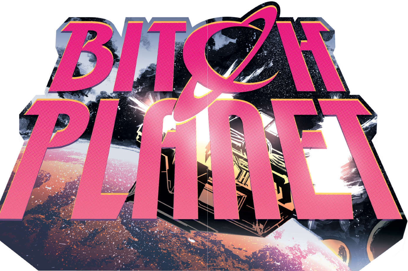
Bitch Planet is loud, proud, and rude. But behind the in-your-face pulp aesthetic is a severely passionate process that thinks through all the motions just enough to execute a book that feigns effortlessness. There’s a strong heart at the core of Bitch Planet that tempers the conflict that arises when pairing two very disparate things, making it work in such a great way. I leave you with the above double-page spread that makes me long for a physical copy of the issue, still a long, cold month away. Don’t mess with Bitch Planet, lest you wish to be deemed non-compliant. Pick it up as soon as you can.
Final Order Cut-Off is Monday 11/17, Diamond Code: ICOCT140578.
Bitch Planet #1 hits stands 12/10.


 to The DC Extended Universe")


