
This week, Matt Kindt and Tyler Jenkins create a powerful history for a fictional place while Fantagraphics enters the superhero comics space with Crime Destroyer. As always we score books here on an all or nothing system of greatness.
CRIME DESTROYER #1
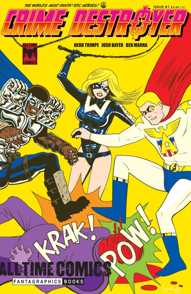
Story: Josh Bayer
Art: Herb Trimpe
Color: Alessandro Echevarria
Inks: Benjamin Marra
Letters: Rick Parker
Publisher: Fantagraphics
The debut of Fantagraphics ode to a bygone age of superheroes has arrived. Crime Destroyer #1 isn’t just the start of a new comic book series, it’s an introduction to a new universe. A weight too heavy for inexperienced creators, but the All-Time Comics imprint managed to draft a slew of creators who know this period well. Perhaps none better than the late great Herb Trimpe in his last comics project. While it isn’t a perfect book, Crime Destroyer is an interesting start, but one that needs to sort out one misstep and quick.
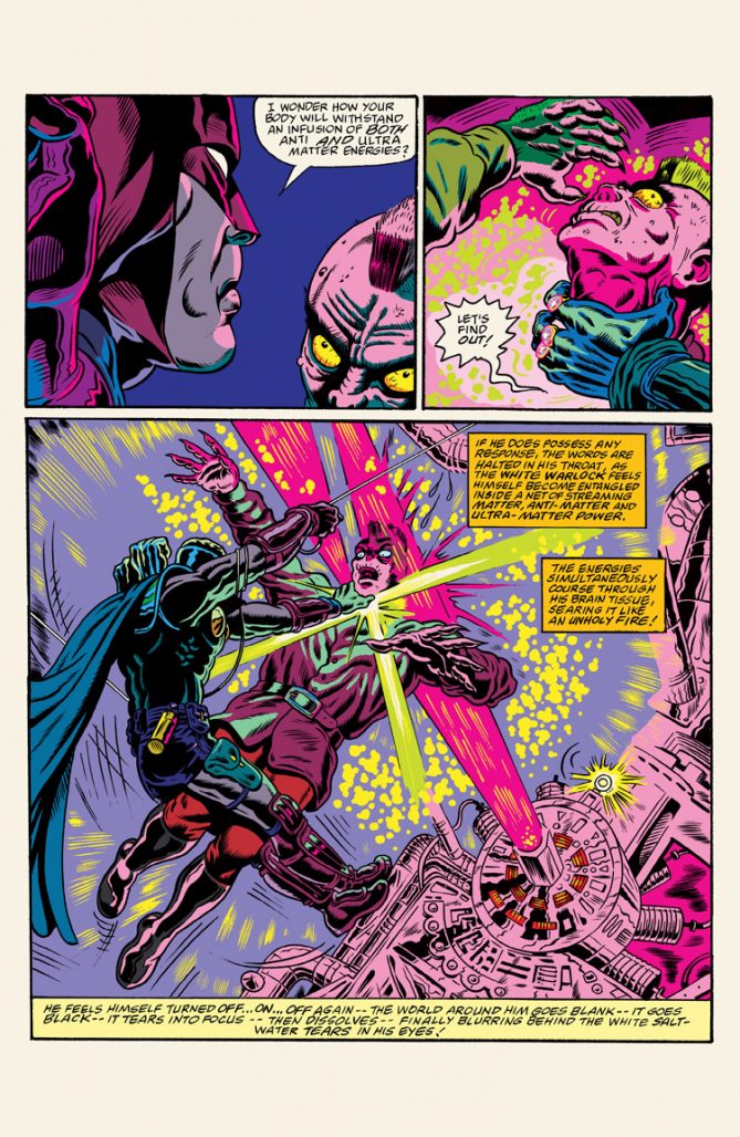
Creator of this new Fantagraphics line, Josh Bayer is best known as the man who directed Nirvana’s “Smells Like Teen Spirit” video back when music videos were still an important thing. As story goes, Josh pens an easy to digest tale. When the hero known as Crime Destroyer is asked by a friend in prison to look after his family the favor turns into more than CD bargained for. He’ll scour through monsters of the underworld in an effort to rescue his friend’s wife from a deranged cult.
It’s simple affair really. However, the book’s selling point, as well as that of the entire upcoming line, is its layers of throwback to 70’s superhero comics. For better or worse, Crime Destroyer gets much of what defined that era right. Impractical costume design is on point, stories that have a light frosting of fun over a dark cake of a story gets a check, and use of every bit of real estate; if you know that era of comics then this will all be instantly recognizable to you. While there were light goofball superhero comics in those days, All Time Comics gears itself more towards the Roy Harper heroin addict type stories of the era rather than the Superman has to cook a pie with his heat vision comics. In that regard, Josh Bayer definitely succeeds; even with a heroic dude who has two massive fists on his shoulders so cumbersome looking that you have to wonder how he turns his head without moving his entire body?
The best part of Crime Destroyer turned out to be artist Herb Trimpe’s work. For a man in his 70’s, Trimpe drew a comic book that didn’t skimp on staggering hard-to-capture imagery. Action scenes are magnificently rendered to blend all the sound and energy effects that just come off cheesy when done by modern artists. Every ‘POW” and Kirby-dot you see feels vital to the overall complete package of the comic. For his era, no one was better at knowing the exact number of panels a page needed and cheating layouts to make sure every bit of necessary visual story came through than Herb Trimpe. It’s all on full display here backed by luscious ink and coloring jobs done respectively by Ben Marra and Alessandro Echevarria.
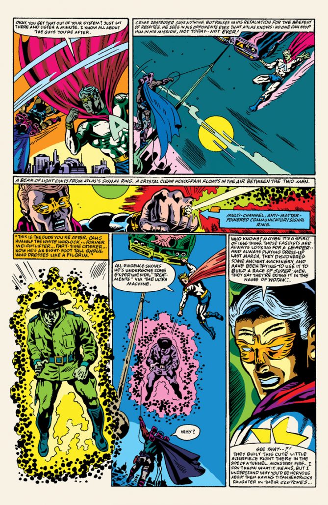
What really cheeses my onion about the book is the lettering which would have been better left in the past. I fully get that the wacky hand-drawn look of these letters is part of the appeal. But it hurts. In quite a few wordier instances, it becomes a strain on the eyes as the unevenness compiled with nonexistent spacing of the letters starts to make everything wave. I read the digital version of the book and unless it’s printed on old style newsprint there’s just no justifying the use of old lettering technique here even in the name of era accuracy.
If lettering issues are minor to you then Crime Destroyer is a decent start to this line of comics. It doesn’t worry about blending modern sensibility as a means of pandering to young audiences. The book simply says this is what was great about comics and this is what will be great about comics.
[WON]- Crime Destroyer #1 cautiously lands in the win column. While its strength lies mostly with the art of Herb Trimpe, it does have enough to make you give it a shot. However, if it doesn’t fix some of the technical problems there’s a chance of dropping it before the rest of the line has a chance to finish launching.
GRASS KINGS #1
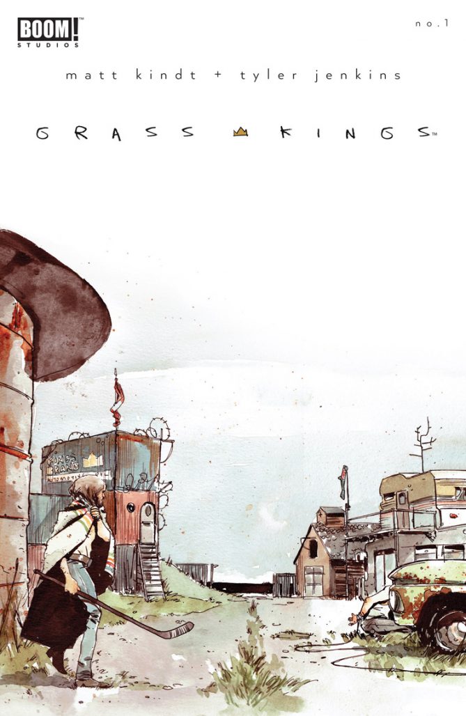
Story: Matt Kindt, Tyler Jenkins
Art: Tyler Jenkins
Letters: Jim Campbell
Publisher: Boom! Studios
Matt Kindt is a creator who really should be allowed to do whatever he wants. Fortunately most of the time it’s not in the realm of DC/Marvel where creators work through tons of moving parts. Stories such as Grass Kings debut issue demonstrate what can happen when creators are allowed time to tell a story that builds to something incredible.
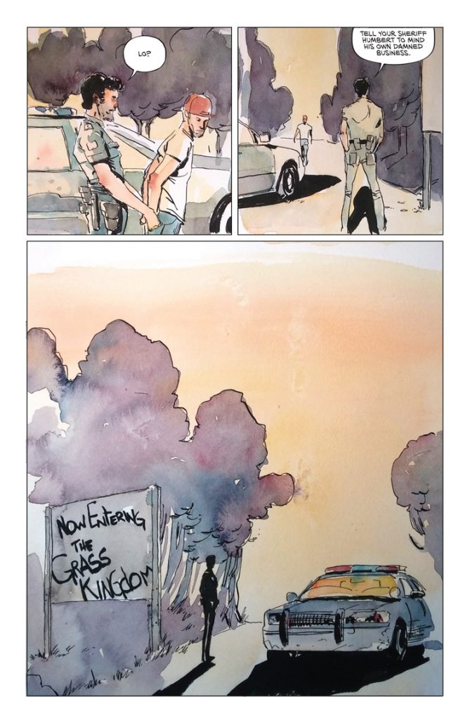
Written by Kindt, Grass Kings lets readers know from the brutality of the opening pages that this is something dangerous. It’s a story about a sovereign land forged over a century to war and anti manifest destiny into a place where the law is made, enfoced, and executed by its inhabitants. Particularly by the self-proclaimed king of the land, Robert, and his older brother/sherrif Bruce. The opening takes an approach used most often in a video game. As the sheriff nabs a trespasser from the neighboring land of Cargill, the mini-tour he receives serves as our introduction to this world and sets up some burning questions.
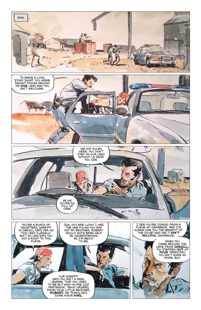
Grass Kings could certainly be compared to Jeff Lemire’s Royal City from last week, but Kindt’s comic looks to lean more towards crime mystery rather than supernatural Twin Peaks feel. The layers Grass Kings has stem from piling interestingly flawed characters like the shotgun toting Shelly or the afro-haired Pinball (best name of 2017) on top of the living feel of the Grass Kingdom. Each seemingly holding a varying piece of the overall riddle. These threads will no doubt be fun for readers and Kindt to line through in order to uncover answers of the many questions issue one posed.
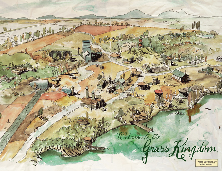
Grass King’s art is so quiet that the intended jarring of the darkness these main characters have hits you that much harder. It’s beautiful in its own subjective way. Tyler Jenkins art shares much of the surreal liveliness Kindt would incorporate himself if he were illustrating. It shows how in sync this creative pairing is on the book. Note, that map spread of the land early on is gorgeous and something any township would be proud to have as part of its history. Supported by a fundamentally sound design in lettering and overall packaging elevates this book like a child putting a chair near the fridge to reach cookies. It reaches that must have jar.
Grass Kings probably isn’t for everyone and that could very well be its only flaw. This isn’t a book for the capes and tights audience, but for anyone who likes their comics to have an out of the norm resonance.
Dept.H was a tense story about murder underwater, Ether was a fantasy filled mystery about murder, Grass Kings is an emotional drama about a possible murderer. Someone should go check on everyone Matt Kindt knows! But yeah still definitely check this book out.
[WON]- Grass Kings #1 is what you shut people up with when they say comic books are only for children. Better than most television and film.
Here’s checklist of this week’s #1 comics:
- HELLBOY AND BPRD 1954 GHOST MOON #1 (DARK HORSE COMICS)
- TRANSFORMERS ANNUAL 2017 #1 (IDW)
- MAN-THING #1 (MARVEL)
- ASSASSINS CREED REFLECTIONS #1 (TITAN PUBLISHING)
- CHARMED #1 (DYNAMITE)
- IT SECRET WORLD OF MODERN BANKING #1 (BLACK BOX COMICS)
- NANCY DREW HARDY BOYS #1 (DYNAMITE)
- STREET TIGER #1 (AMIGO COMICS)
- ZOMBIE CAMP #1 (SPACE GOAT PUBLISHING)


Tyler Jenkins’ art is really fantastic. It’s the number one selling point for this book in my opinion. It really reaches its perfection when his watercolor painting is added in. See Snow Blind by Ollie Masters and Tyler Jenkins for more.
Real upsetting beginning to Grass Kings killed sales dead at my shop. Or rather, I was going to hand sell it to folks, but decided against it. Basically, had it began w/o the extremely regressive and ultimately unneeded opening featuring Stereotyped Unresearched Indigenous Violence, I’d feel a billion times more comfortable singing it’s praises.
Comments are closed.