Talk about informed — could you have a better guide to the history of comics logos than the lettering master himself, Todd Klein? His research into the history of comics is as extensive as it is informed:
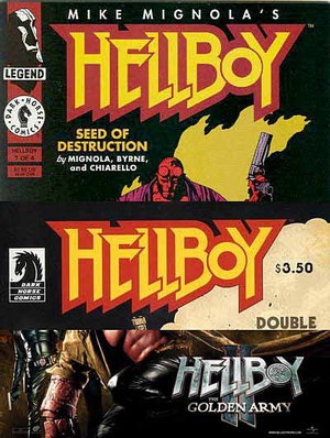
Jonah Weiland suggested this character and logo, and though he first appeared in 1994, top image above, I think Hellboy qualifies on all counts thanks to two fairly successful movies. The logo was designed by Kevin Nowlan for creator Mike Mignola. Nowlan is better known for his art, and has only designed a few logos, but this one is definitely distinctive, remains unchanged today, as seen in the second image above, and was even adapted for the films, as seen in the bottom image. For one thing, it’s very readable, with a massive outline that sets it apart from the crowd, and for another, it plays against the expected approach of hellish fire. The small O gives it that slightly off-beat look that echoes Mignola’s approach, too.


Thanks, Heidi!
I’ve taken notice that Marvel seems to be giving up “comic book style” title designs now, instead going for a reading book typography feel. Just take a look at the new Fear Itself logo, or the upcoming Thor series relaunch (unless this particular logo they’re showing is due to the movie connection?) Civil War had more of a type treatment, even the Spiderwoman relaunch logo was a yawn. Font treatment that had been “smashed”.
Does there seem to be a trend going in this direction? I wonder if it’s to bring in more of the book reading crowd. But I’m not sure it’s a change for the better.
It’s a trend, but not a new one. I think the first example is probably WATCHMEN. There were always some logos that were essentially standard fonts, but since that one they’ve become increasingly popular. And the ability to mess them up easily in Photoshop means messy type logos are quite common.
Nowlan’s responsible for the logo?! Huh, you learn something new everyday!
Do you have any favourite recently-created comic book titles yourself Todd?
There are some I like, but I hesitate to name a few, in case I leave some out, and I don’t have time to look through all the current ones.
I’d rather hear about your favorites!
I love Todd’s site, once every other month or so I will drop by and read his posts, especially those that critique logos over the years
Of the comic logos I have within reach (Hellboy being one of them, actually!) I think that Batman and Robin has my favorite. I also like the ones for the Knight and Squire miniseries, Green Lantern (regular Green Lantern, that is. Corps has a pretty cool logo, but for some reason I think the one for Emerald Warriors falls short, for some reason), and Batman INC (even though there have only been 2 issues so far. Both covers have been really cool). Todd, how did you like DC’s January covers theme with symbols rather than regular titles?
That was interesting, though some of the symbols were a stretch, and not obviously identifiable.
This was a facinating read, especially because of Todd’s experience and impeccable eye.
I would suggest GHOST WORLD as a candidate for this list–one of the few logos designed by the (only) author of the comic book which was exported intact to the Oscar nominated feature film.
Interesting suggestions, R.J. I haven’t seen the film or the comic, unfortunately.