
How would you like to sit in while Anthony Bourdain critiques food or Albert Pujols talks hitting or Herman Cain talks how to look credible in a big sinister fedora? That’s the kind of master class Dave Johnson has been delivering on cover design via Twitter and now…a blog.
That would be the Dave Johnson who created some of the most iconic covers of the last decade or so. While he may not be making a lot of friends, he’s calling ’em as he sees ’em. Here’s a sampling:
Like I said, team books are the worst. To many focus points, too much competing color. It really is the enemy of good design.
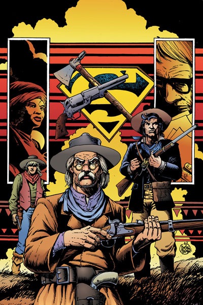
Not that it’s impossible. The old timers did it well. Kirby, Buscema, Romita and Kane were masters of it.First off is this one. The layout is kind all over the place. The color isn’t helping either. And not sure why the gun and the tomahawk aren’t centered over the Supes shield. Seems kinda obvious.
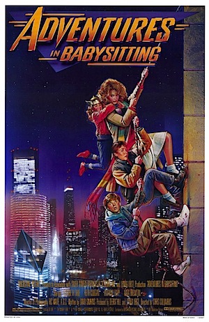
Ok, I get that you’re doing a movie poster parody and you love Adam Hughes city BG’s but the problem here is cropping. The characters are the focus, not the BG. Leaves me cold.
Speaking of cropping, this cover is cropped TOO close. It took me a while to figure out what was going on. My first thought was the artist was trying to do a Mucha decorative vibe. But wait, it’s a fence. All in all, it lacks tension.
Johnson even takes on RED HOOD & THE OUTLAWS #3, critiquing it for the size of Starfire’s boobs on the design:
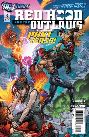
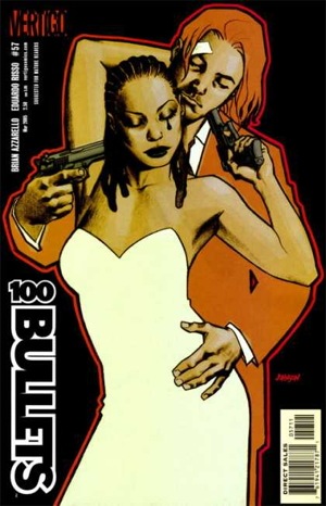
This is why I stay away from team book covers. It’s usually a lose-lose. The problem with this one is depth of character. Everybody is on a middle plane. Pushing two characters forward would have helped. Keeping them dark also.
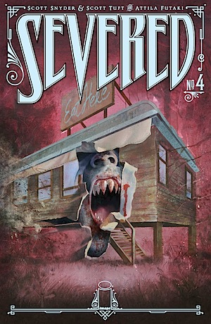
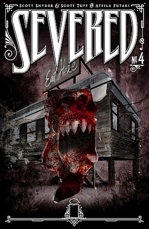
However, the cover to SEVERED also comes in for frank talk:
So much is wrong with this cover. Not sure how many parts it’ll take. First, let me say that the logo treatment is solid. But after that it all goes down hill. Let’s start with the design. So much boring deadspace. The diner looks wrong. Should have used better ref. Maybe it’s a story point but shouldn’t there be a parking lot in front? But we get grass instead. Now let’s move to the rip. It’s hard to tell if the rip is through the illustration or the diner itself. Confusing. Also having both elements the same tone and hue is a big no-no. Every part blends together when the opposite should be happening. I would have made the diner normal looking with normal coloring, and had the face coming out covered in deep red blood for shock value. Instead it looks like Koolaid
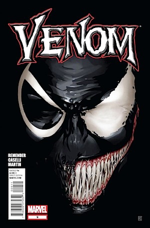
Last one for now. Uggg. Seriously? Can we retire this idea? It’s been done into the ground. You’re better than this.
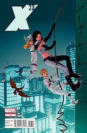
While it’s easy for Johnson to sit in his giant mansion smoking his pipe and critique others’ covers, nothing is secret on Twitter. Kalman Andrasofszky, artist on the X-23 cover above, responded:
Johnson: Hope you take it in the spirit in which it’s intended. Trying not to hate on artists, just trying to make them better.
Andrasofsky: Totally Dude, no worries! I stuck to the bizarre layout of the source when I could(should?)have tweaked it t.co/2mTqDazX
At his new blog spot, Johnson offers some slightly tweaked versions of the above covers. For instance, here’s another take on SEVERED with more focus:
Johnson promises looking at his own failures in future Twitter columns, as well as GOOD cover design. He also looks at submitted covers by nine publisher artists and offers fair critiques. Great stuff.
Need more Dave Johnson? See next post.


maybe should have waited a month or so to run this. not a lot on the blog right now but looks promising.