
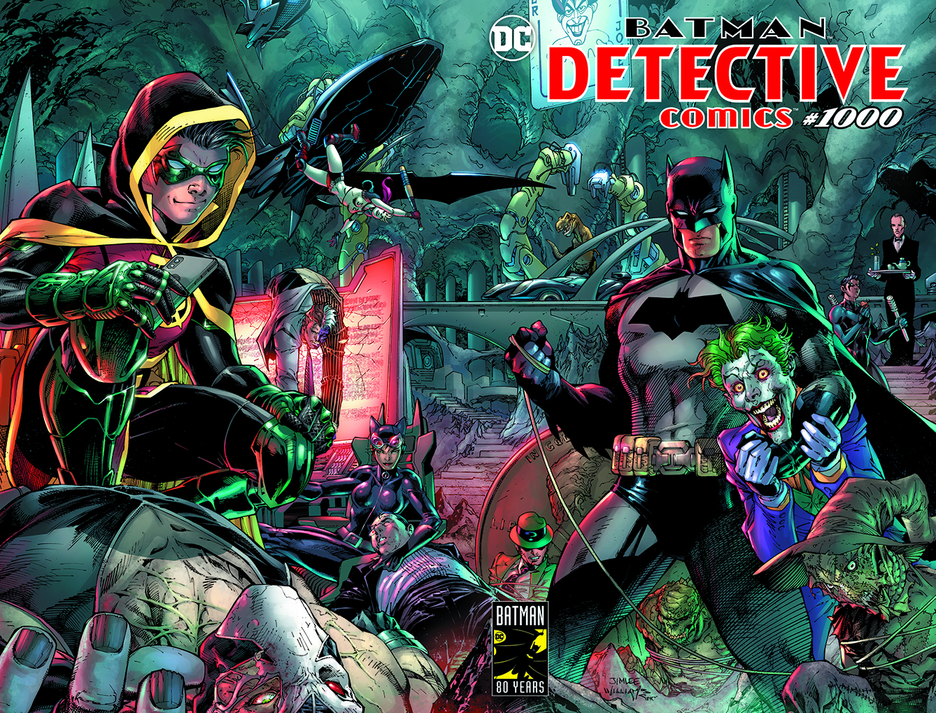
Earlier this week, DC celebrated a huge milestone for Batman with the release of Detective Comics #1000. Today, the festivities continued at WonderCon as DC Comics hosted a “DC Celebrates 80 Years of Batman” panel. There, the publisher announced that the long-running series would be receiving a sleek new logo treatment.
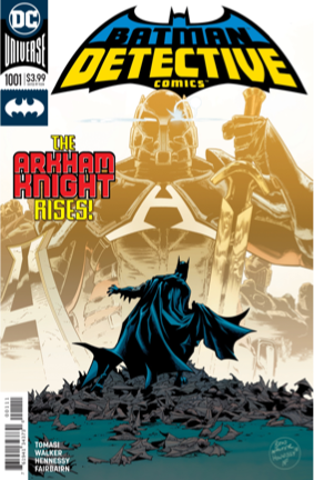
Detective Comics’ new logo will debut with the launch of a new story featuring the Arkham Knight, who originally hails from the popular Batman video game series produced by Rocksteady Studios. The character was recently introduced to the comics continuity in a Detective Comics #1000 story written by Peter J. Tomasi. Tomasi, alongside Brad Walker, Andrew Hennessey, Nathan Fairbairn, and Rob Leigh will continue to explore this version of the Arkham Knight beginning in Detective #1001, which hits stores on April 10th.
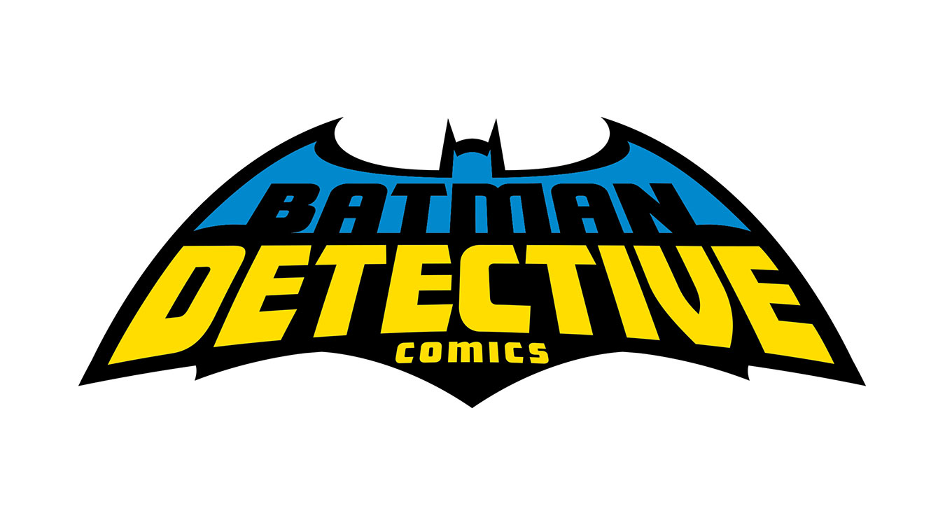
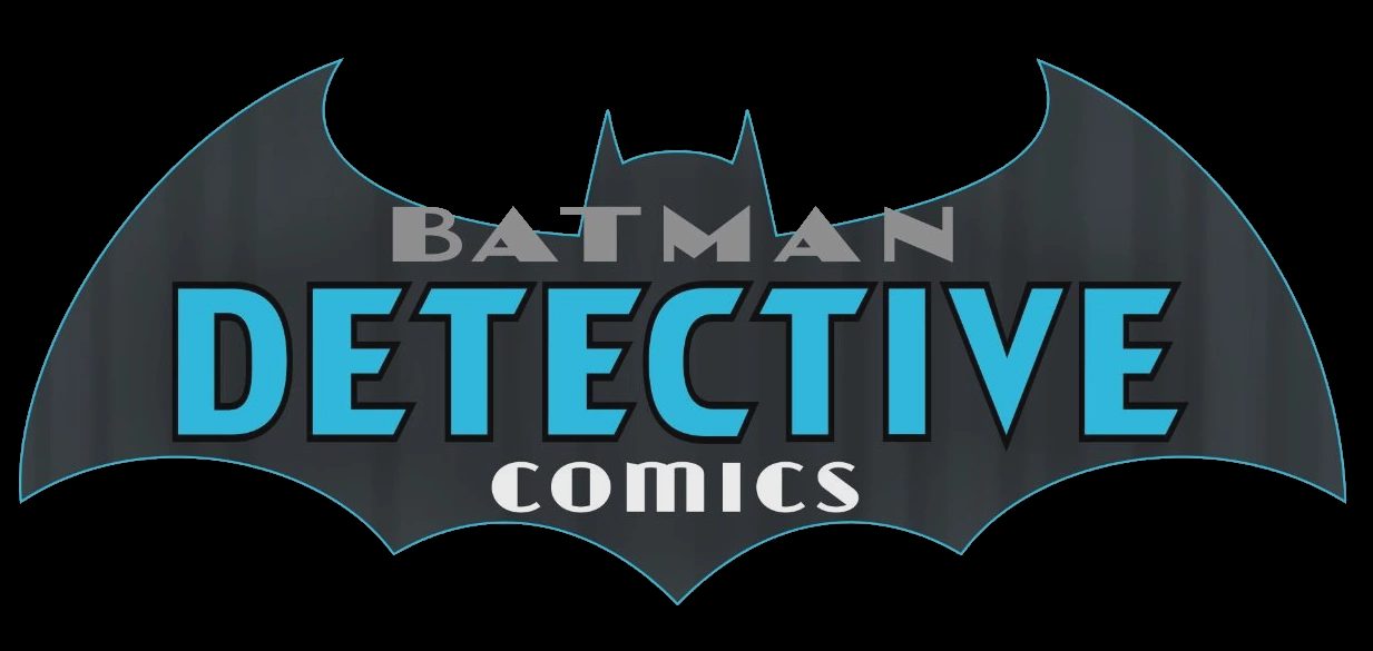
The color choice for this new logo is inspired. The top half incorporates a shade of blue over the cowl that hearkens back to an older, classical visual incarnation of the Dark Knight while drawing a hard line between that past look and the present day black and yellow that is most commonly associated with Batman now. The font choice is youthful thanks to its gentle curves and the way it extends toward the reader, dispensing with the harsher, more “gothic” looking font choices used by Detective Comics logos in the past.
This version of the Detective Comics logo is a departure from the relatively pure typeface-based logo the series has been employing since the start of the Rebirth era, up through this week’s Detective Comics #1000.
Instead, this logo resembles a mixture of a 1980s Detective Comics logo that incorporates “Batman” into the caped crusader’s signature symbol and this variant on the post-Rebirth logo that overlays the comic’s full title over the bat-symbol.
What do you think of this new take on this classic property’s logo?


Don’t like it. Looks like a “Batman Adventures” logo rather than Detective.
Second that emotion…
love it. any info on the designer?
Somewhere, Ira Schnapp is spinning in his grave. Hideous.
Why does the logo look like it’s going to buckle under its own weight?
This looks like it’s for a toy line.
Sharp! Who designed it?
Looks good.
Good thing comics are not selling based on the readability or attractiveness of their cover these days.
Comments are closed.