
What makes a great first issue?
The answer to that question is, naturally, subjective. If it was one size fits all and easily quantifiable, every story would likely adhere to that formula and everything would be great. I know that kind of seems like a non-answer. Which is why I think it’s better to look at the question from the other side; what elements are present in specific first issues that are often considered great?
To that end, I’ll be focusing on the works of Brian K. Vaughan and his collaborators.
“All of the men are dead.”
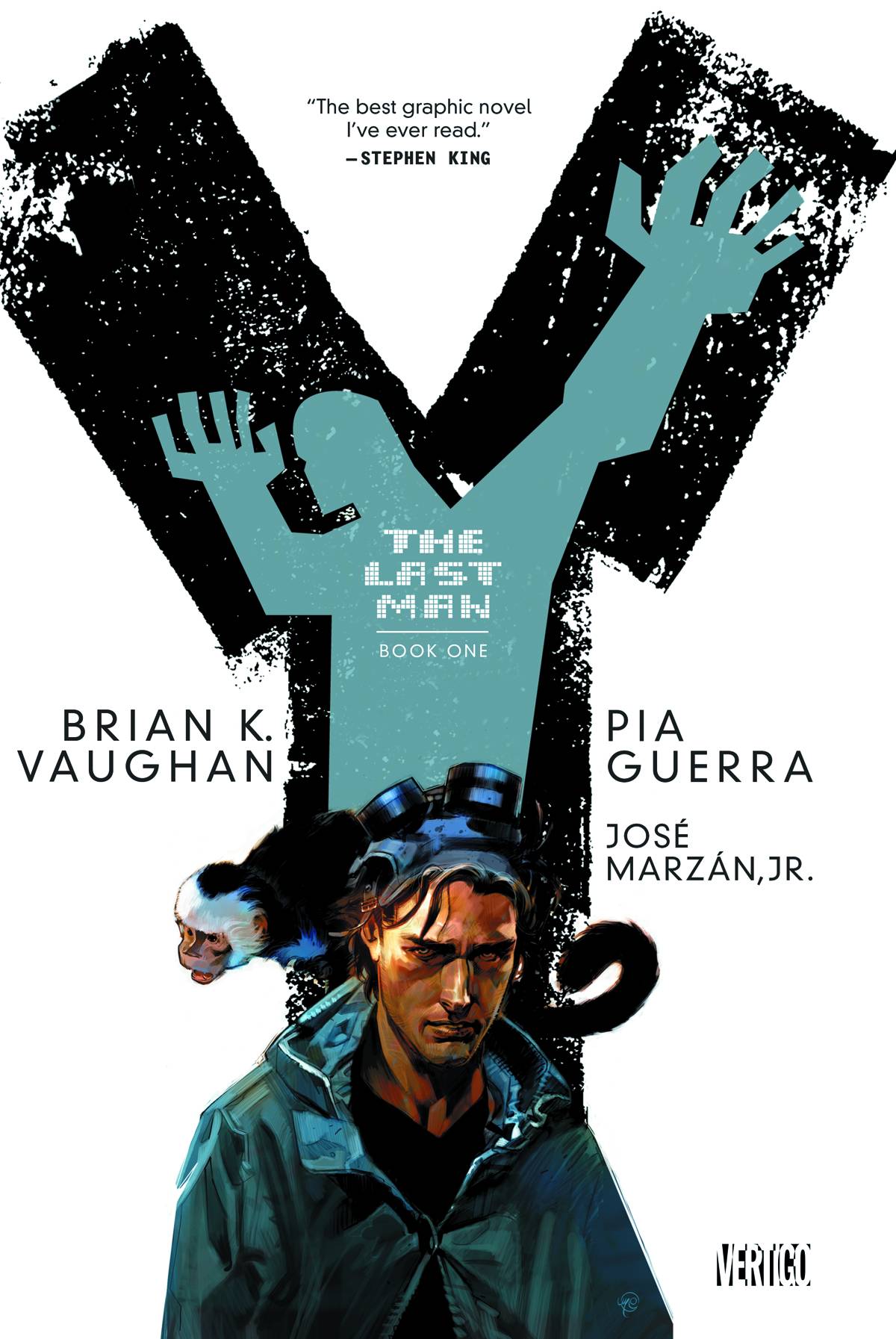
Y: The Last Man #1 from Vaughan, Pia Guerra, José Marzán Jr., Pam Rambo, and Clem Robins was arguably Vaughan’s first major breakout hit (though The Hood could also be in contention) and the next big thing for Vertigo. It introduced the world to Yorick Brown, his monkey Ampersand, and an Earth where soon the female of the species would be the only ones left.
The premise of a series and the characters can somewhat be considered an intangible, an element of a story that’s often an unknown quantity for audiences. Especially with a new creator-owned project. So what are the more mechanical elements present here?
1. Dialogue
Like Brian Michael Bendis, one of the hallmarks for Brian K. Vaughan’s work is his dialogue. But where Bendis’ dialogue is a kind of rapid-fire Mamet-inspired staccato, Vaughan’s characters tend to ramble. They’re long-winded, often referencing popular culture and music. Going off on tangents that better inform the characters. In a way, it’s kind of like Kevin Smith or Quentin Tarantino. It’s probably one of the reasons why Vaughan has also seen success writing for television. And why many of his works get adapted to other media.
Here we get a diversion into Elvis, some still topical political discussion of abortion and gun control, and a bit of the nature of masculinity in the face of an efficient, highly capable military woman. I will say that, at least in the early Aughts, Vaughan used ableist slurs regularly. And use of it is present in this issue too. I do consider it a problem, and will discuss it more when I cover Runaways. Whether or not you consider it exclusionary for his works is up to you. I can certainly understand and respect anyone who does.
2. Pacing
Pacing has numerous different parts and is a whole creative team affair. How the story is structured plays a big part, how the pages are lain out, how the word balloons appear, and many other elements. Y: The Last Man #1 starts in media res, essentially giving us what will be the cliffhanger ending first. This gives us the premise of the series and a mystery right off the bat, having the audience chew on that while then going through flashbacks for the rest of the issue.
The rhythm and flow of the layouts from Pia Guerra give the overall storytelling its structure. She uses many wide panel tiers broken up occasionally by rows, all adhering within a set frame size for each page. There are a couple splashes and one page with a grid, each focusing on Yorick. It gives a somewhat comfortable feel to the art with an imposed structure. The use of title cards for location and time also reinforces that framework. In a way, it gives an illusion of safety through form and allows for the action and end result of every man dying all the more impact.
For the most part, we get longer scenes from each of who will potentially be our major characters. Working in little mysteries and additional plot threads. When this breaks down, we essentially get rapid beats shifting from location to location, giving us the feel of society breaking down quickly at this mass extinction of the males of the species. It helps whip us into that cliffhanger with us wanting more.
There’s also an interesting bit to the rhythm of the dialogue, with Clem Robins depicting a number of interruptions through overlapping word balloons. It’s quite a nice technique. One that would really only ever work in comics.
“It’s too late. It’s like this everywhere.”
Of course, there’s more to it than just those two categories. And I feel remiss not mentioning the astonishing artwork from Pia Guerra, José Marzán Jr., and Pam Rambo more. Because the comic would be nothing without it. From the clean-lined, naturalistic character designs through to the action sequences to the shift from rather bright tones in most scenes to blues and darker shading when we meet Agent 355, the visual storytelling is also one of the major reasons why this first issue works.
Y: The Last Man #1 from Vaughan, Guerra, Marzán, Rambo, and Robins utilizes dialogue and pacing to produce an enthralling, propulsive comic that sets up compelling characters and an enthralling mystery. It may not be the absolute perfect comic, but it’s one hell of a damn good first issue.
Classic Comic Compendium: Y – THE LAST MAN
Y: The Last Man #1 – “Unmanned”
Writer: Brian K. Vaughan
Penciller: Pia Guerra
Inker: José Marzán Jr.
Colourist: Pam Rambo
Letterer: Clem Robins
Publisher: DC Comics / Vertigo
Release Date: July 17 2002
Available collected in Y: The Last Man – Volume 1: Unmanned, Y: The Last Man – Book One, Y: The Last Man – Compendium One, and Y: The Last Man Omnibus
Read past entries in the Classic Comic Compendium!


