
The column that judges a book by its cover, focusing on the month’s best-designed comic covers. For the month’s best-illustrated comic covers, see Best Comic Covers Ever (This Month).
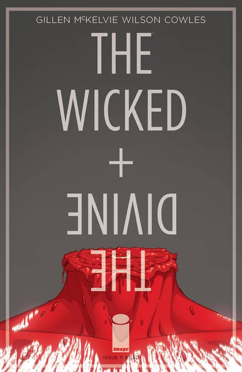
The Wicked + The Divine #11 by Jamie McKelvie & Matt Wilson
I’ve gottta honest with you: I got bored pretty quickly of the “head” covers for each issue of this series. The first issue it was kind of cool, even if it made me go “oh, it’s The Social Network poster again,” because I hadn’t seen it done on a comic. But then they kept doing it, and I regularly found myself wondering “did I see this cover already or is this a new one?”
This cover makes all of those worth it. The moment I saw this, I laughed. I mean– um, that doesn’t make me look good, does it? I have a dark sense of humor, alright?! Don’t look at me like that.
Anyways, this was an amazing climax to the head covers. Just…stop doing them now, please?
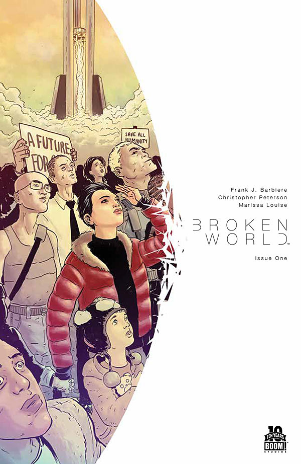
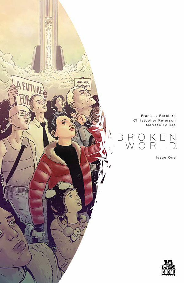
Broken World #1 by Christopher Peterson (above) & Christian Ward (below)
I like the energy of the shattering border, and the way it puts focus on the understated and clean text. My one complaint is that the shattering border would be that much better if the illustration always included something that was causing the shattering, so that the illustration looked like it was interacting with the border, kind of like the LP artwork for Pink Floyd’s Wish You Were Here where a man on fire leaves a burn mark on the border).
The problem with the illustration above is that it’s accidentally creating a strange interaction between the illustration and the border. It almost looks like the central figure’s elbow is causing it to shatter, except her arm is so static that it’s clear it’s accidental in its awkwardness.
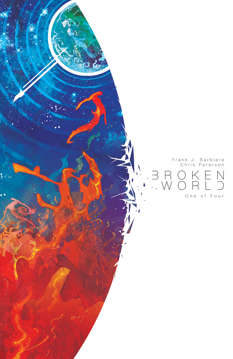
Ward’s cover works much better in my opinion, partly because I can imagine the energy from the image causing the break in the border, and the area where the break occurs is a nice dark color so that I can see it more clearly. It doesn’t hurt that the painting is also much more vibrant, and has much more depth to it. Unfortunately, this is the one they decided to release without text, so instead of the nice design above, the right side of the image looks strangely empty.
Speaking of depth, the regular cover would have much more if the foreground was colored darker (instead of lighter) and the background was colored much lighter. See my extremely quick and sloppy example.
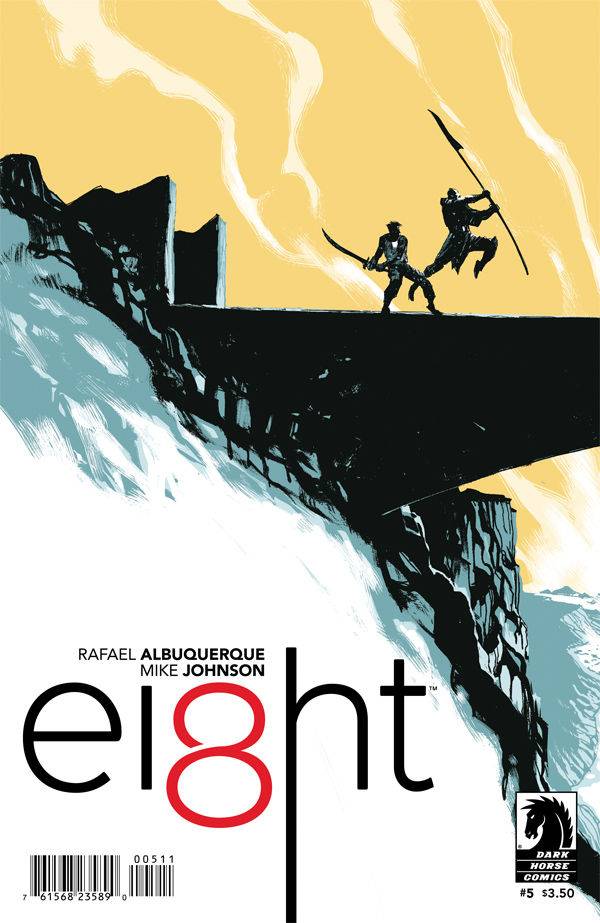
Ei8ht #5 by Rafael Albuquerque
I wish they’d try out more color schemes rather than constantly going back to the yellow, but this composition is a nice way to change things up while still keeping the logo in that same corner. The shadows frame the logo very nicely.
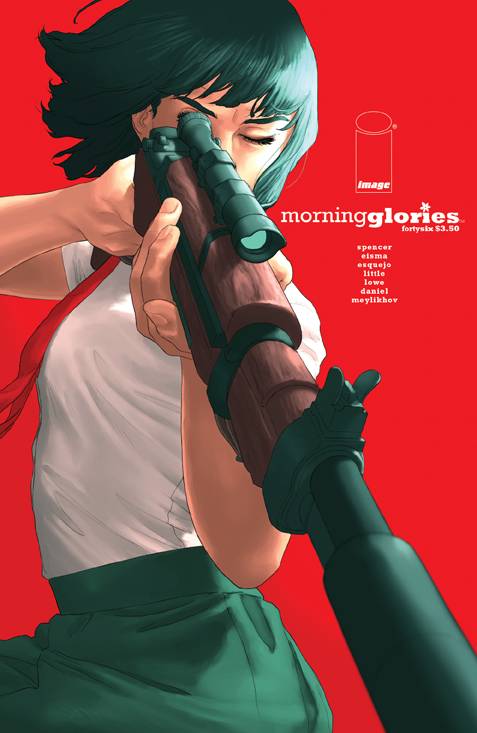
Morning Glories #46 by Rodin Esquejo
I can’t decide if the field of red is as bit much, or is part of what caught my attention. The strong diagonal of the gun makes this image feel dynamic even though it’s just a person standing in place. And like Broken World, I enjoy the understated text, but that’s a personal preference of mine.
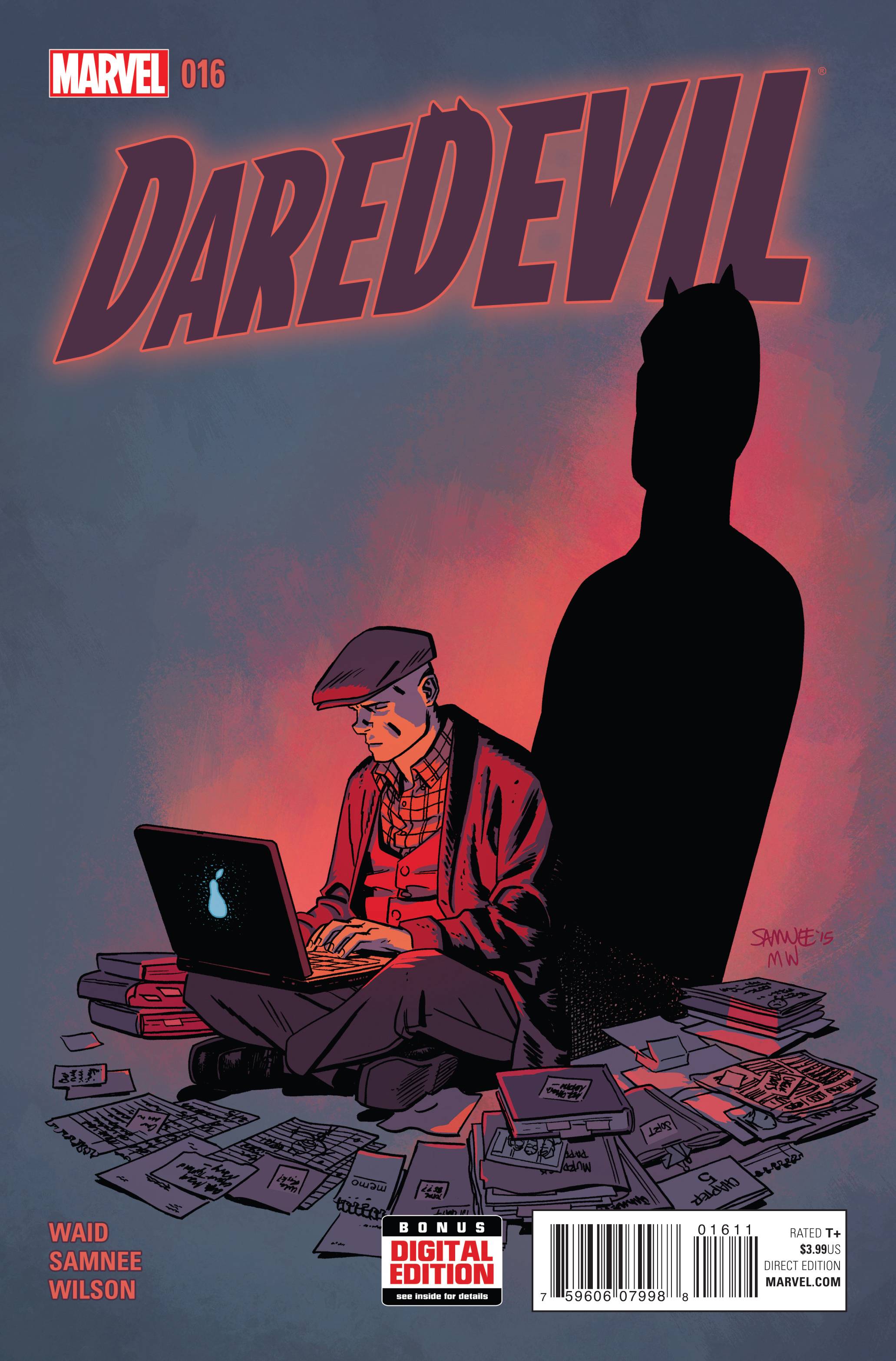
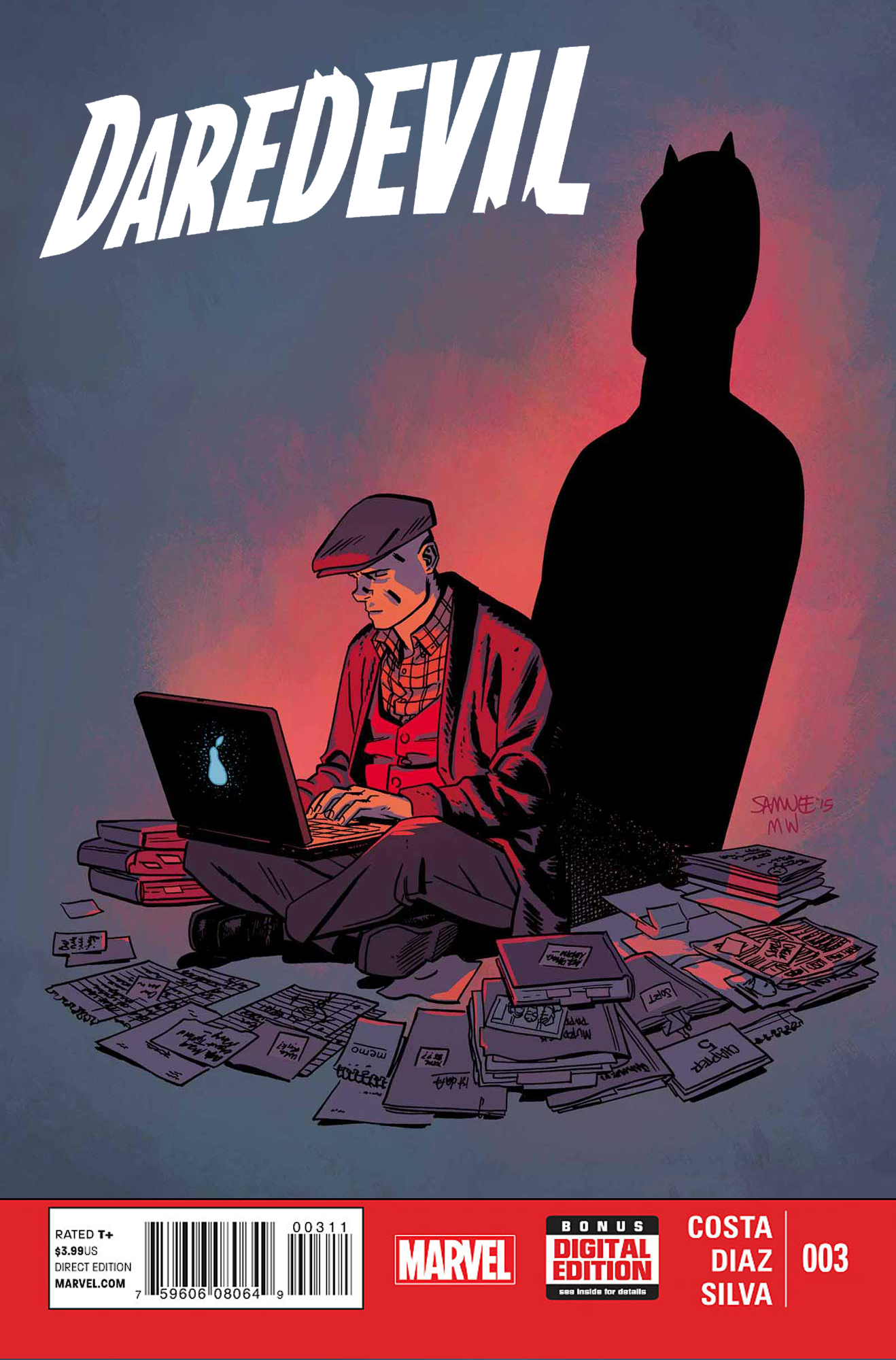
Daredevil #16 by Chris Samnee
I like this illustration, but the text design really isn’t doing it justice. The way the logo is positioned would be fine if the shadow appeared behind it, but appearing in front of it breaks the perspective of the wall behind the character. The only way having the shadow in front of the logo would work is if the logo looked like it was in the same perspective, and not glowing. You can’t have a shadow falling on an object that’s glowing.
Personally, I would’ve just put all the text elements in a standard Marvel red box dumping ground, in order to move the artwork up a little, and put the logo (in white) in the supper left corner. Quick and sloppy example.
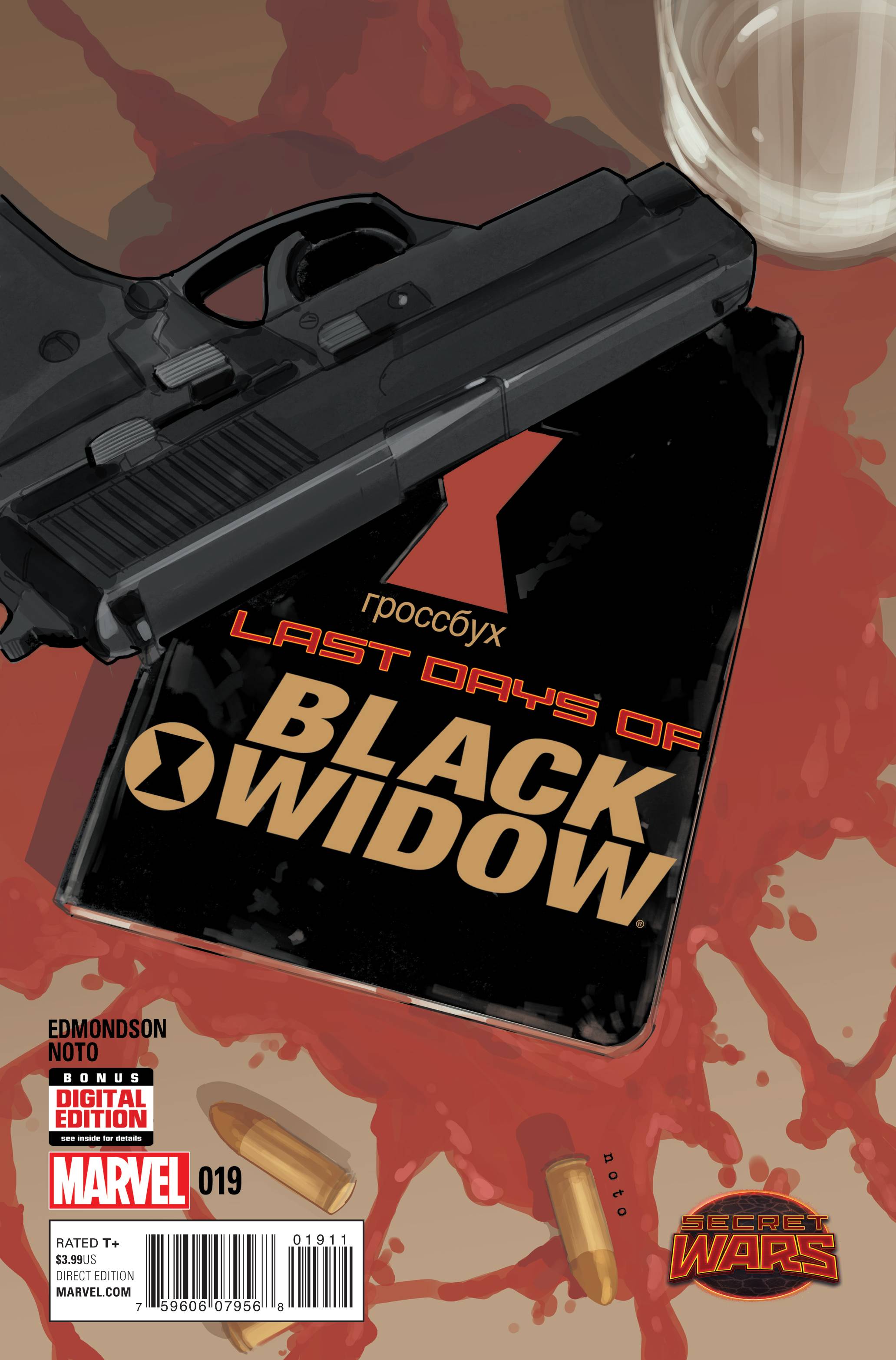
Black Widow #19 by Phil Noto
It’s a quiet moment, and yet it’s also violent. I particularly like that the logo text has been made a part of the image. The only thing I don’t like (aside from the awkwardly stacked text elements at the lower left) is that the logo text is way too close to the edges of the book.
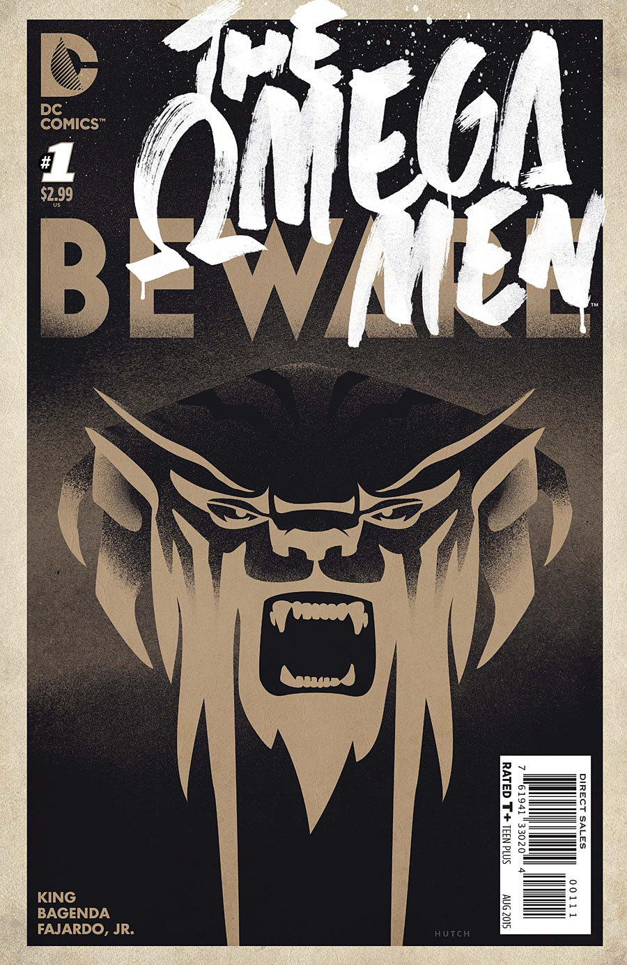
The Omega Men #1 by Trevor Hutchison
This one made me do a double-take when I saw the DC logo. This looks nothing like a typical DC cover, and maybe that’s why I included it in my picks. The overlapping text at top is kind of awkward — it had me questioning for a moment what meaning of the word “Bewmen.” But other than that it’s a nice departure from the usual DC house look.
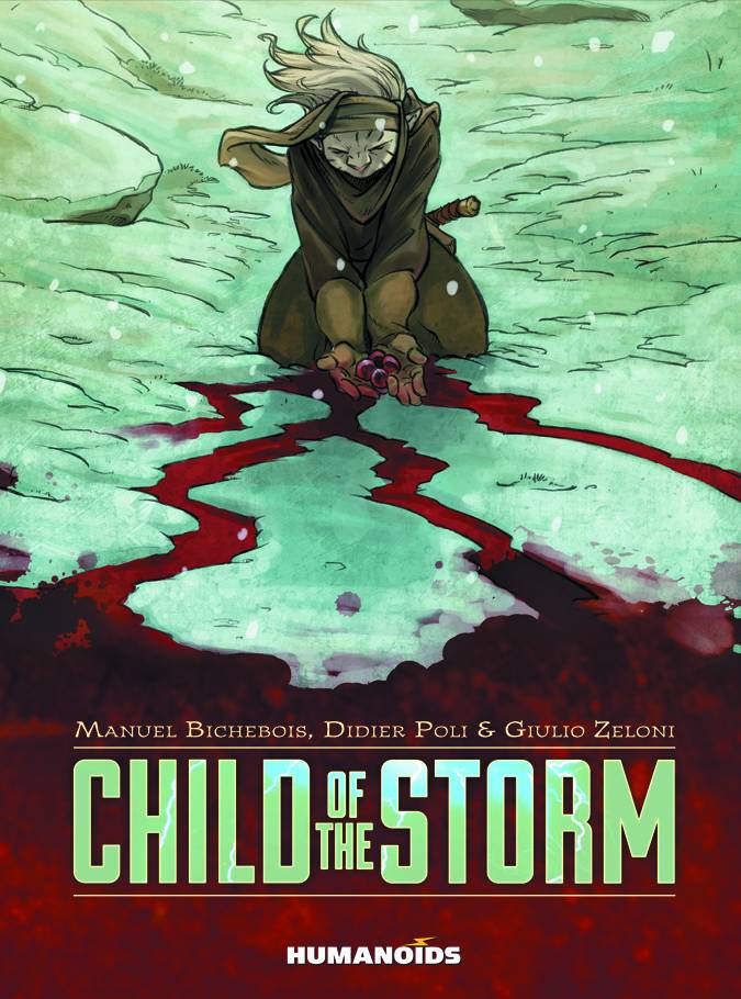
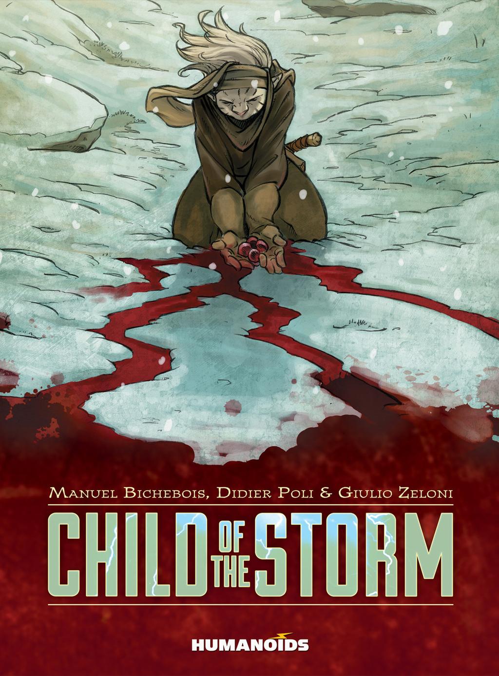
Child Of The Storm by Didier Poli
This is a great composition. The figure’s emotional pose points down to the streams of red liquid (blood?), which leads down to the logo. It’s both effective and dramatic. The only thing I question is the strange green hue of the snow, which looks to me like “did something get screwed up in the digital file?” Maybe there’s a story-related reason for the green, but I’d rather have seen it a white-ish blue or white-ish yellow.
Update: Humanoids contacted me to mention that my hunch about the file’s colors having been screwed up was actually true. The correct colors are below.
Kate Willaert is a graphic designer for Shirts.com. You can find her her art on Tumblr and her thoughts @KateWillaert. Notice any spelling errors? Leave a comment below.


On the Morning Glories cover, does the red fight with the green? In traditional printing, those two colors would create an outline where they would clash and vibrate. Perhaps it “pops” better this way?
Not a fan of that Daredevil logo at all. The whole cover of that issue just looks off and cluttered. The logo with the two horns on the second D looks amateurish too. Then the name is falling backwards and it’s done in a neon sign kind of way. Ugh.
Update: Humanoids contacted me to mention that my hunch about the file’s colors having been screwed up was actually true. The correct version has been added to the post.
Comments are closed.