
In June 2016, DC Comics kicked off the start of its Rebirth initiative. After a wave of criticism surrounding the way they have treated their characters’ rich histories since 2011’s New 52 relaunch, DC has decided to rebrand. They hope that by restoring their characters’ pasts, they will restore readers’ faith in them as well. Do they succeed? That’s what the Comics Beat managing editor Alex Lu and entertainment editor Kyle Pinion are here to discuss. Book by book. Panel by panel.
Note: the reviews below contain **spoilers**. If you want a quick, spoiler-free buy/pass recommendation on the comics in question, check out the bottom of the article for our final verdict.
 Mister Miracle #2
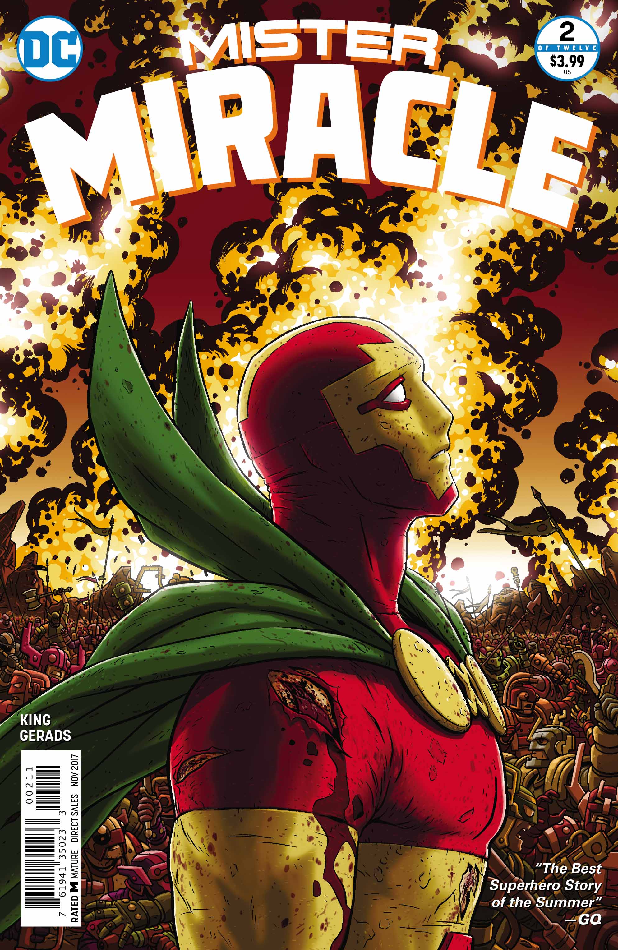
Writer: Tom King
Artist: Mitch Gerads
Letterer: Clayton Cowles
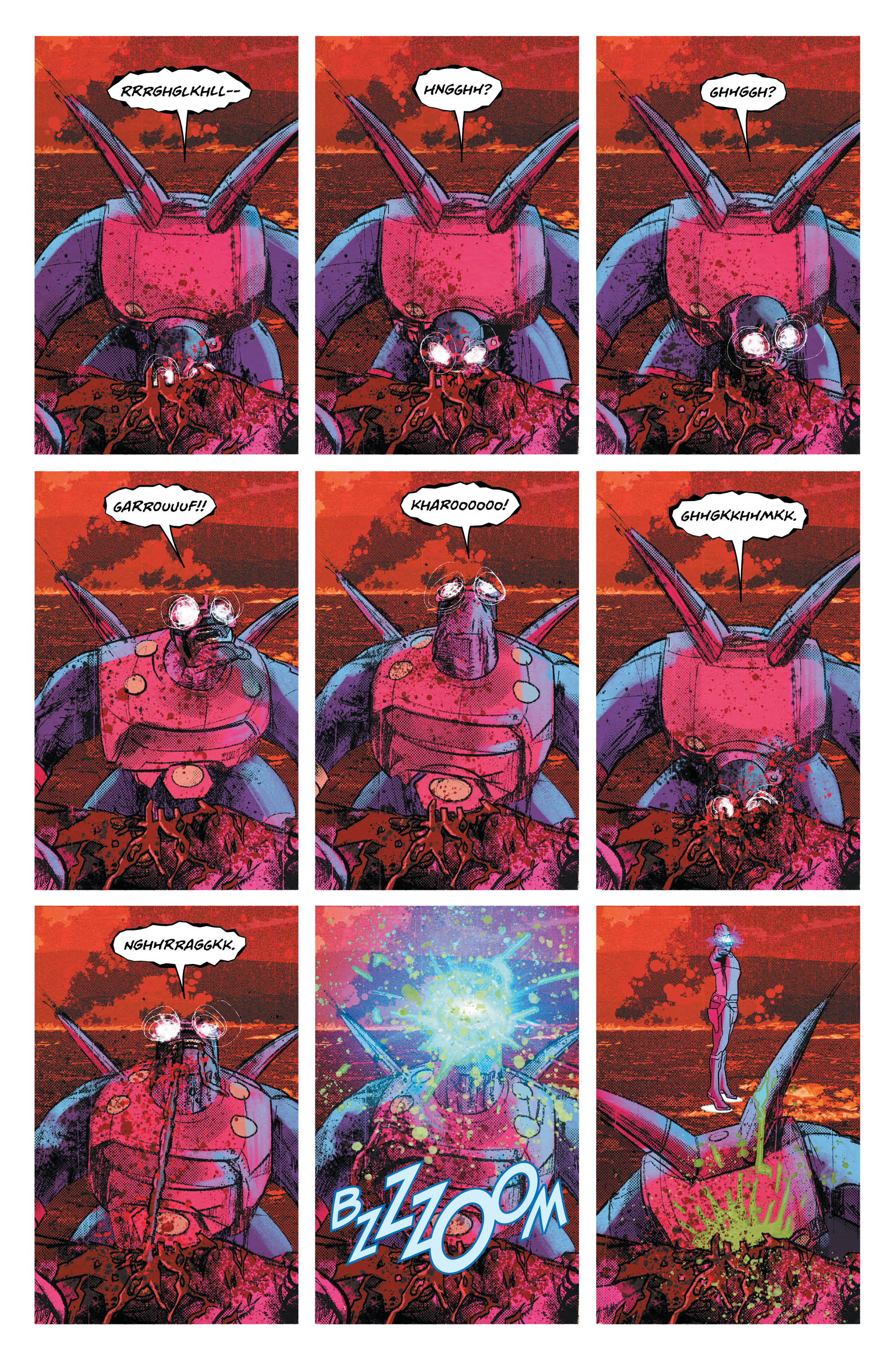
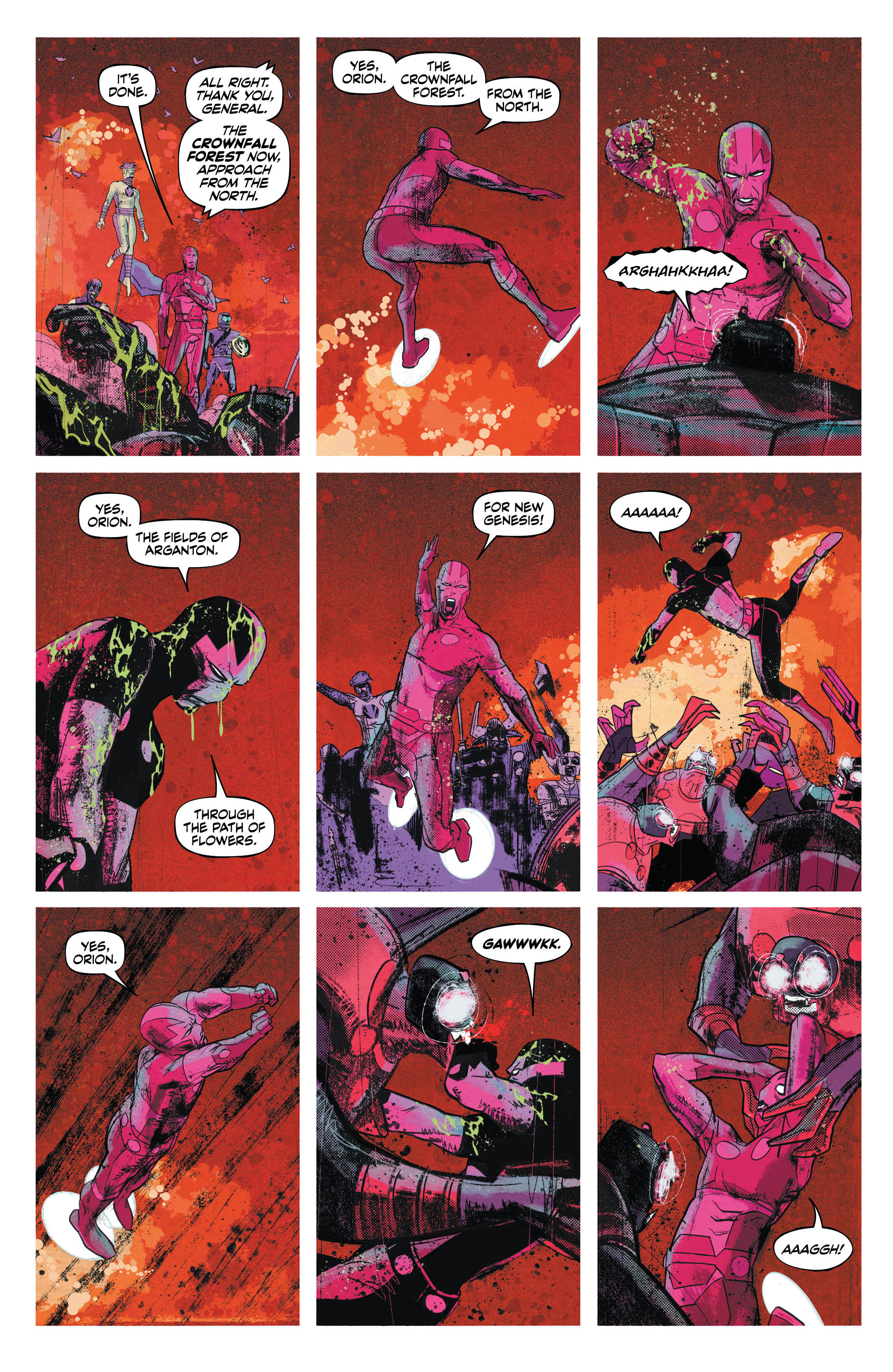
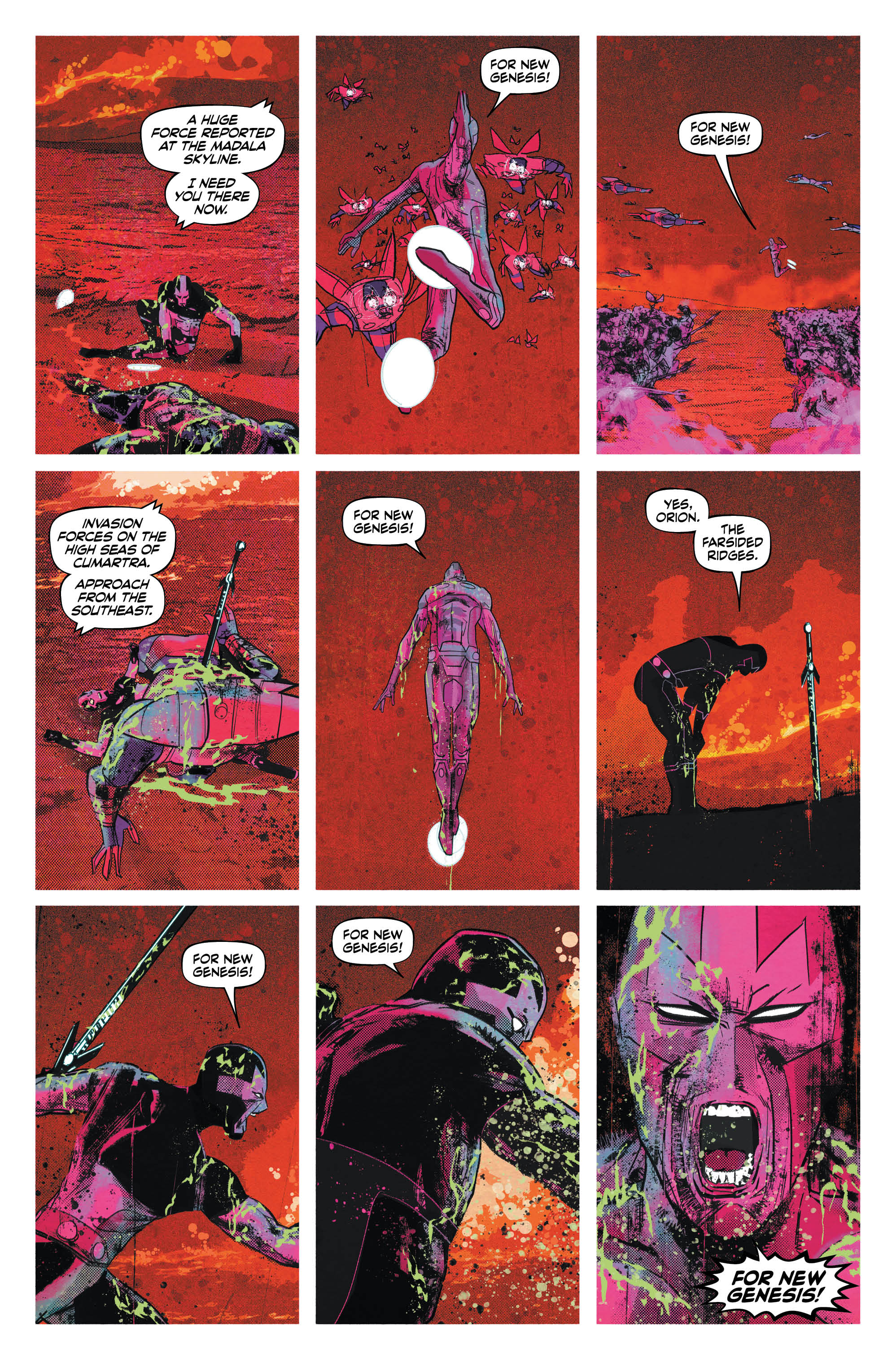
When you begin reading Mister Miracle #2, if you listen closely, you can hear a rhythm in the distance. As the chapter opens, the first thing you see is one of the monstrous insectoid soldiers of Apokolips, feasting on the entrails of what likely was a citizen of New Genesis. You’re forced to sit with the image as artist Mitch Gerads keeps the focus of panel after panel on the beast. As it dives its head into the chest of its meal. As it begins to lift a chunk of meat from the empty vessel. As it tilts glowing head and rips upward, swallowing and bellowing into the blood-soaked sky. As it dives back down and begins to process again. Only when you’re left wholly disconcerted does a bolt of blue engulf the monster’s head. Our eponymous hero finally arrives to put you out of your misery.
But the misery has only begun. If you listen closely, you can hear the rhythm turn into a beat as drums, the pounding hearts of battle, encroach. As Mister Miracle is immediately assaulted by another beast of Apokolips, his fresh kill still slumped over in the foreground of the scene. As Mister Miracle finally clears one battlefield, only to be summoned to the next. And the next. And the next. Can you hear the drums? Can you hear the chants and bellows and screams as they crescendo with a crash of symbols and death-rattling sighs?
And then it stops. A shower. A night with the one person in the world whom you trust. But you know it isn’t over. Not yet.
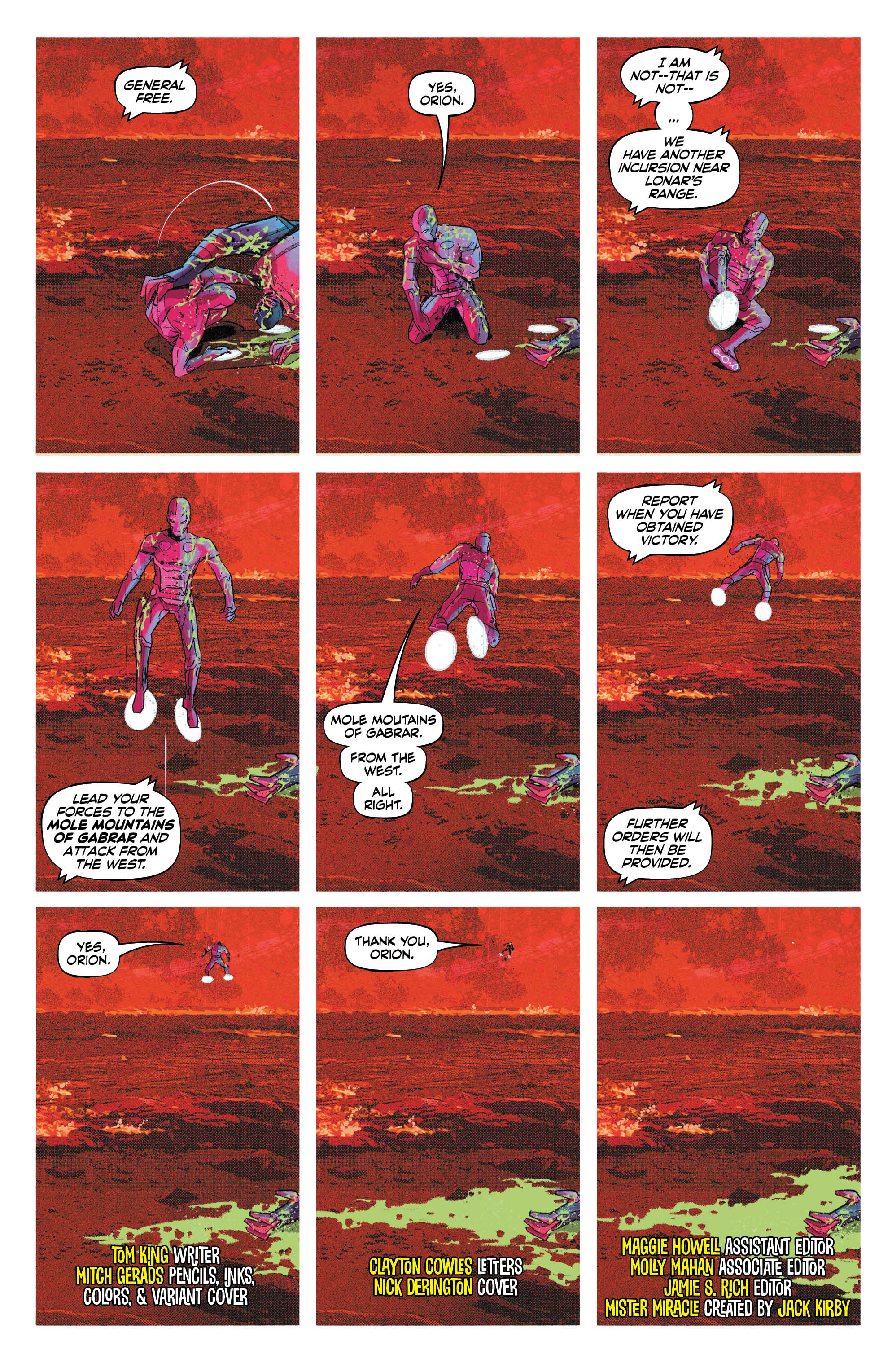
The reason why I love Tom King’s writing is because at his best, his comics read like symphonies. He has an ear for dialogue that few can match. We see it in Batman’s calls and Catwoman’s responses in the recent “Rooftops” arc of Batman. We see it again after Mister Miracle is forced to kneel before the new Highfather, Orion, as Lightray tells Mister Miracle he can stand now, echoing the fight between Scott and Orion in the previous chapter. These refrains give his stories structure. They offer connections between verses like the choruses of a pop song. They wiggle their way like earworms into your mind, revealing the most important theme in the scene.
In Mister Miracle, this sense of lyrical rhythm is furthered by Mitch Gerads’ heavily structured artwork. His consistent usage of the 9-panel grid continues here, stretching out small moments like Mister Miracle’s opening confrontation with an Apokolips soldier into what Granny Goodness calls “long days.” Conversely, when we see Mister Miracle shout “For New Genesis!” as he charges into each new battle in the war between his home and the home of Darkseid, we find the nine panel grid used to compress time. Every time a new battle starts, it’s marked by Mister Miracle’s battlecry, and we find the number of panels between each new shout decreasing until we end up with an entire panel row of rallying cries. “Long days. Short years.” All of this distortion of time has the net effect of making us, the readers, feel unsettled and unmoored. We’re drifting through the cataclysmic events of this story just like Scott is, all of us just searching for an anchor. For security.
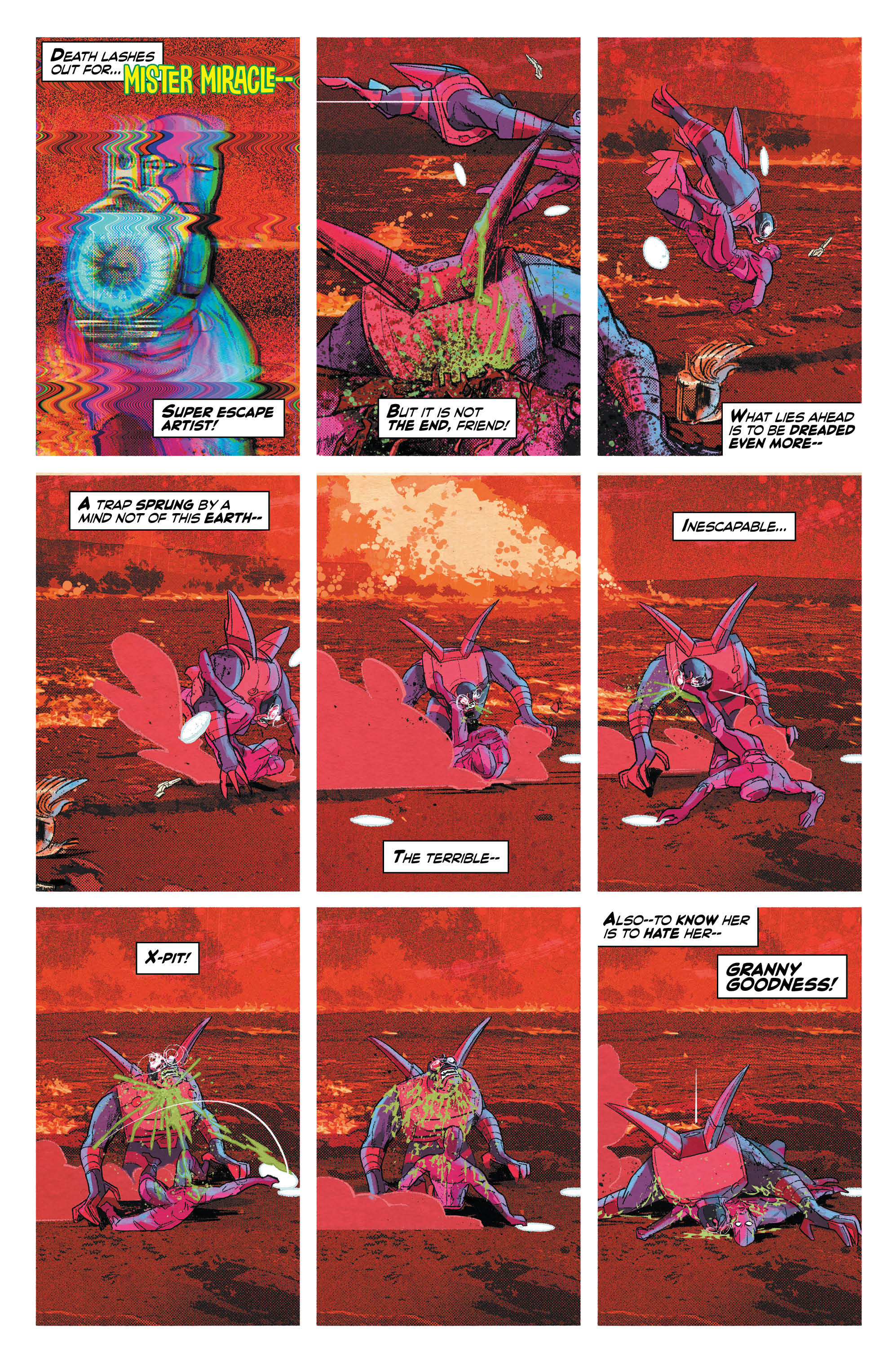
Indeed, Mister Miracle #2 finds Scott looking for security through a series of interactions with his family. We see pure affection between him and his lover, Big Barda, as they figure out how showers on New Genesis work (guess they never heard of the three seashells). We see pure disdain between him and his brother of sorts, Orion. And somewhere in the middle we have Granny Goodness, the monstrous matron of Apokolips who raised Big Barda and Mister Miracle before they escaped to New Genesis and Earth. Granny gleefully abused the both of them as children, yet Scott finds himself, in his victimized state, unsure about whether a small mercy she once showed him amounted to kindness. That skewed vantage point, where a pattern of abuse leads one to see the withholding of punishment as a reward, is one that many who have suffered through abusive relationships and unstable family lives can identify with. It is only further complicated by what Granny reveals when Mister Miracle and Big Barda go hunting for her.
With its second issue, Mister Miracle #2 continues its journey towards becoming one of my favorite comics this year. Its formal ambition is awe-inspiring and its themes of depression and the subjectivity of truth, if executed upon correctly, are timely ones to explore. I can hear the rhythm this book is building and I think I’m falling in love.
Verdict: Buy
Dark Nights: Metal #2
Writer: Scott Snyder
Penciller: Greg Capullo
Inker: Jonathan Glapion
Colorist: FCO Plascencia
Letterer: Steve Wands
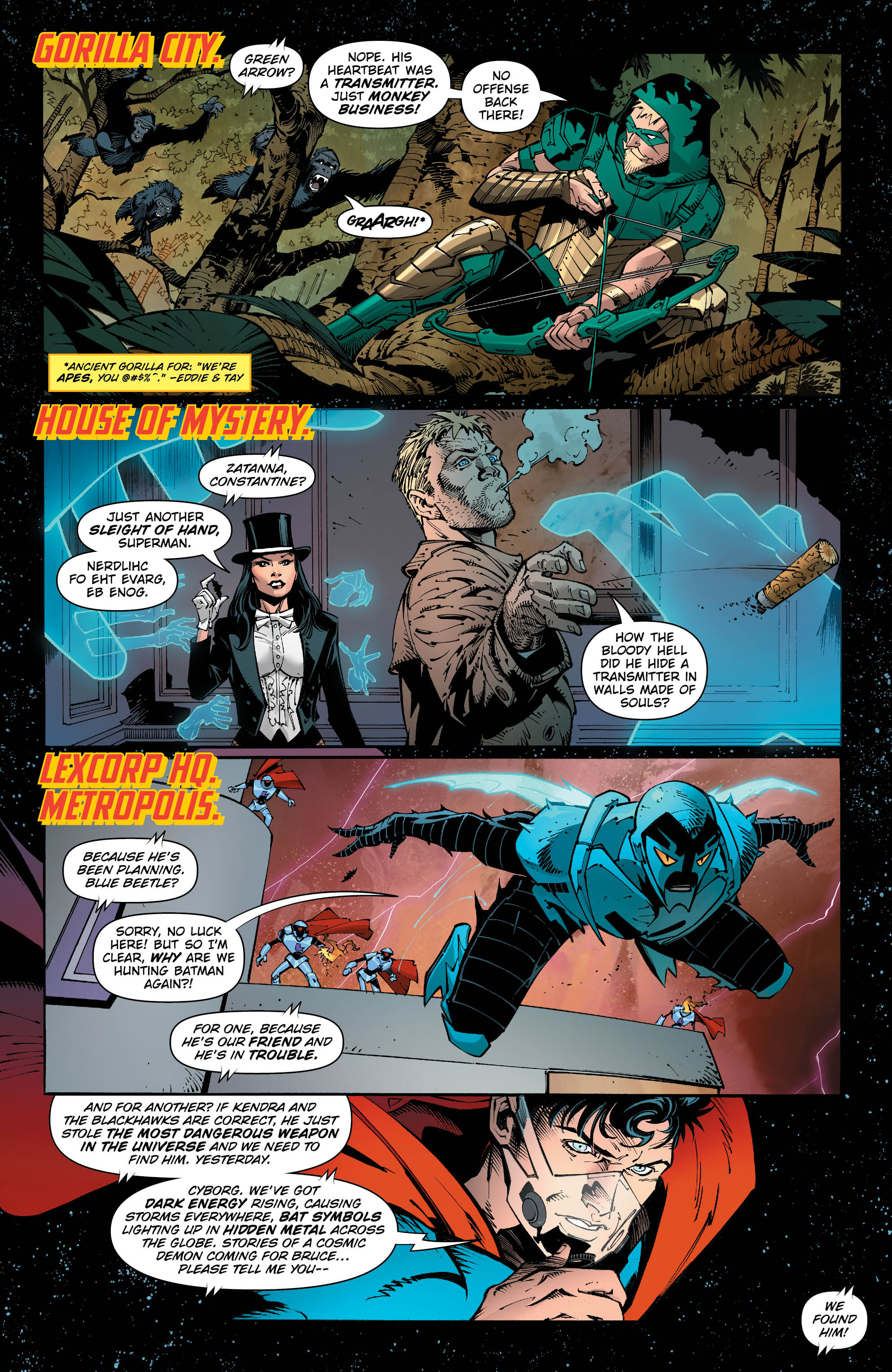
When it comes to dissecting Dark Nights: Metal #2, there are a lot of different elements we could examine. We could look at the innumerable nods to continuity or the zany themes of the story, both of which I explored in my review of the first issue. We could the way Snyder composes dialogue and narration or the way Capullo crafts the visual structure of each page. We could even explore the masterful ways that FCO Plascencia gets to play with color in this issue in order to add dramatic weight to the proceedings. But instead of all that, I want to talk about an element in comics that rarely gets its due yet is perhaps the most outstanding element of this issue of Metal: the lettering.
I won’t pretend that I know much about the technical terms or theory behind editing, but I want to elevate and acknowledge letterers as the invisible hands that make comics sing. We don’t think about it very much, but letterers are the bridge between writers and artists. Without them, all you have are scripts, likely messy and typed in an unappealing font like Times New Roman or Courier; and wordless art placed to match the words. The letterer is the one who lends the symbolic art of language with the power of visual appeal and marries the words to the page. A good letterer will use fonts, balloons, and other tools to help the reader visualize sound in an unobtrusive and immersive way. A bad letterer can create immersion-breaking dissonance between a script and art that otherwise work in harmony.
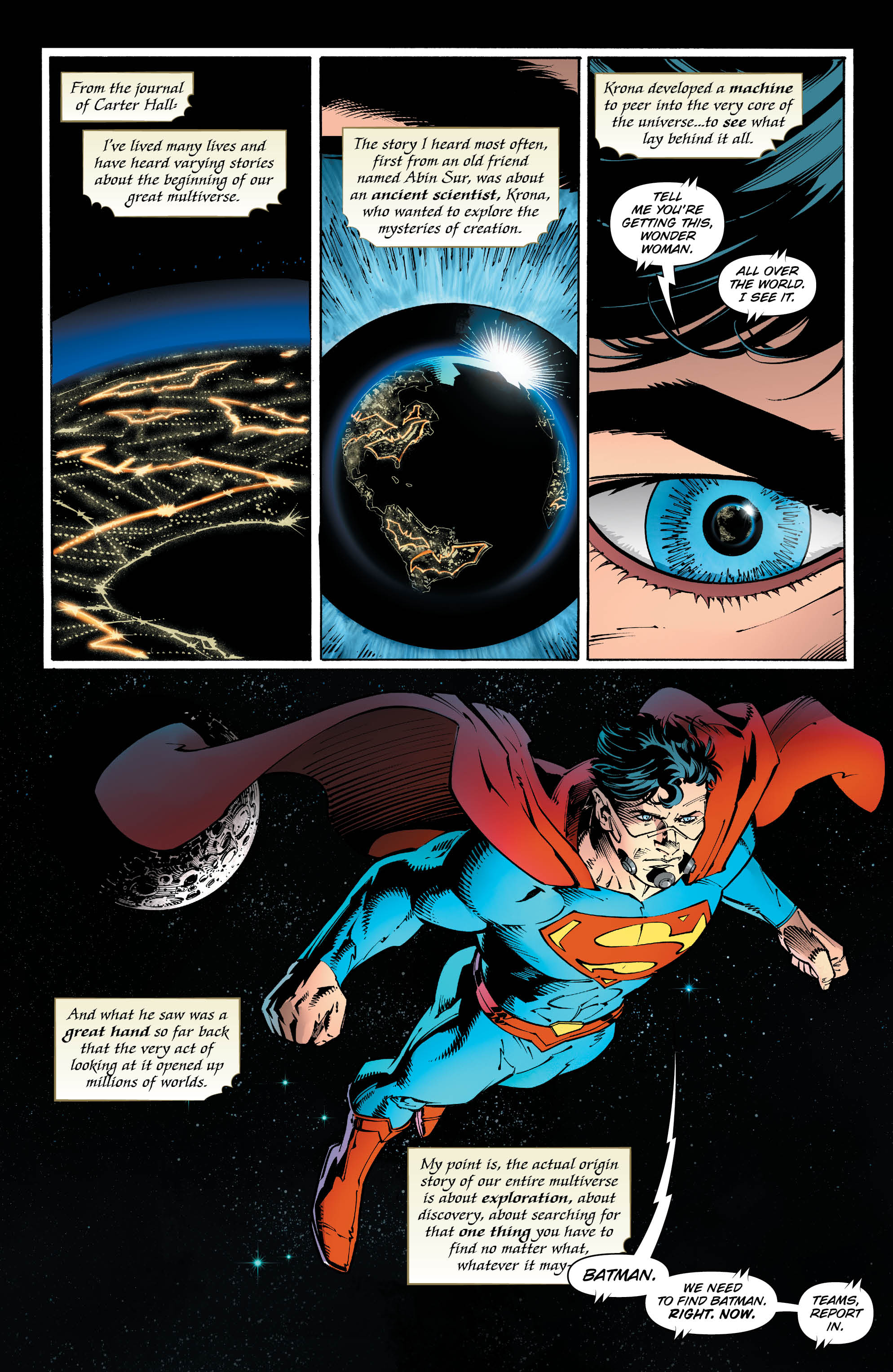
The reason why I say all of this is because Metal #2 features some of the coolest and most fun lettering that I’ve seen in a long time. We see letterer Steve Wands hard at work right off the bat, drawing contrast between the wide variety of elements that appear on the first few pages. Carter Hall’s journal is rendered with a script-like serif font a light gradient that evokes the color of weathered book pages, giving his words the weight of history. Bold reds and yellows dominate the boxy fonts that showcase the various locales the members of the Justice League, desperately searching for a rogue Batman, are scattered around. Their size, weight, and bright colors pop out against the darker hues of the art, calling out to us and making sure we stay grounded where the story needs us to be in spite of the rapid location changes. For a book as narratively and textually dense as Metal, it’s important to strike the right visual tone for each and every word balloon and Wands does an impressive job of it here.
That said, later on, we do see Wands struggle a bit in regards to Dream’s lettering. There’s nothing inherently wrong with Wand’s slightly medieval font choice, but it unfortunately comes off as a little sterile for a character who trades in the ethereal and unreal. The word balloons here are clearly produced digitally in spite of their cloud like appearance, meant to evoke the style of Dream’s balloons during the original The Sandman series, but they look a little too measured. A little too perfect. I can’t help but long for the hand-lettering that The Sandman letterer Todd Klein employed on the original series, which gave every word balloon an incredibly naturalistic feel perfect for this character.
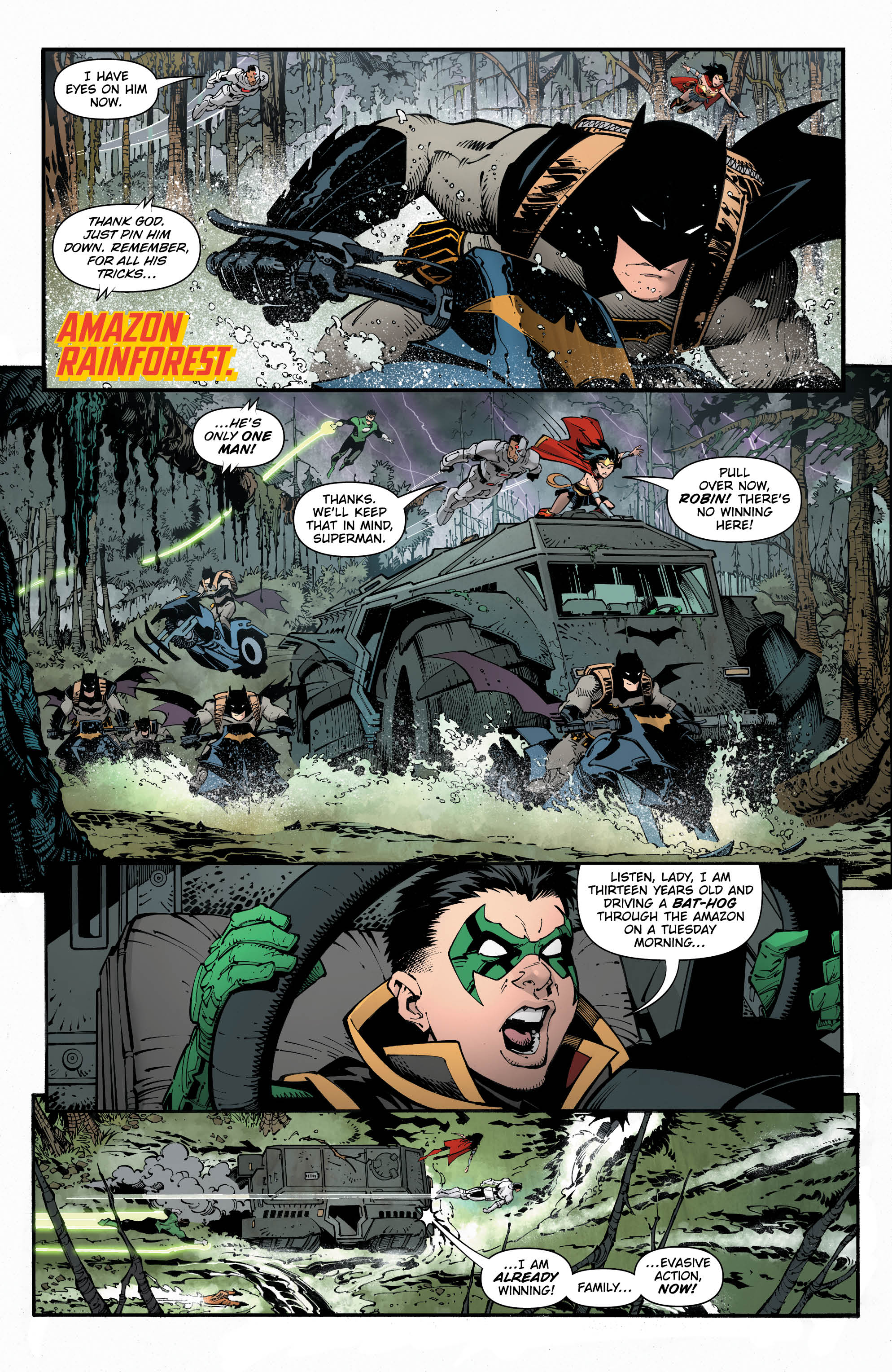
That said, a small misstep does not ruin a book. In fact, Wands’ lettering shines through strongest in the back third of Metal #2. After Superman and Wonder Woman finally figure out that Batman is in the Tomb of Prince Khufu and confront him, it is revealed that they aren’t where they think they are. Wands subverts the visual language he previously established for locations here, tilting “The Tomb of Prince Khufu” slightly off its axis and running a crack through it that resembles a crack in the earth. Overlaid upon it is the truth: this is the Tomb of Hath Set, ancient enemy of Hawkgirl Kendra Saunders and Hawkman Carter Hall. Then, things go completely haywire as Batman is entrapped by the Court of Owls, who begin chanting an eldritch rite of summons to open the door to the ancient beast Barbatos. Their chant is rendered in an ooze-like font that evokes the liquid “Batmanium” metal Batman is infused with as part of the rite and is colored in a similar fashion to the colors used to establish settings throughout Metal, emphasizing the chant’s goal of opening the dark door to a new place.
And finally, the door opens. The Dark Knights, evil Batmen from the Dark Multiverse, spill through. They’re heralded by an absurdly bold gothic font that takes visual influence from the lightning that surrounds the Dark Knights as they emerge from their portal, the letters offset in an inconsistent manner that reflects the speaker’s anger and the discordant, unsettling feelings the words are meant to evoke in the reader. All the Batmen have unique speech balloons and fonts that reflect their powers and personalities, showcasing just how varied these new threats are to the heroes of our world.
Verdict: Buy
Round-Up
 While DC’s heaviest hitters are sucking all the air out of the room this week, we got a major reveal in this week’s Action Comics #987. I think Kyle might have called this a few months ago, but yes, Dr. Oz is not Ozymandias as we were led to believe. He is, in fact, Jor-El, Superman’s biological father. The reveal was deftly handled by this issue, establishing a scenario that puts Dr. Oz in direct conflict with his son as well as revealing one of Dr. Oz’s core motivations for manipulating Superman for the past year– he wants Superman to see that humanity doesn’t deserve him. That explains a certain amount of Dr. Oz’s behavior, but there are still a lot of questions to be answered. For one thing, why that name? Why does he use Ozymandias’ Nostalgia symbol? Why, exactly, did he start an inter-dimensional jail?
Miss any of our earlier reviews? Check out our full archive!


