


This week’s lead review is Fishflies #1, the newest creator-owned book from Jeff Lemire. Plus, the Wednesday Comics Team has its usual rundown of the new #1s, finales and other notable issues from non-Big 2 publishers, all of which you can find below … enjoy!
 Fishflies #1
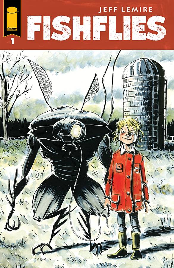
Writer/Artist: Jeff Lemire
Letterer: Steve Wands
Publisher: Image Comics
Fishflies #1 sees Jeff Lemire functioning as writer, artist and colorist with letters and designs by Steve Wands. From the first page, Lemire paints (literally) a clear mood utilizing what looks like watercolor over his inks. There’s something interesting about his use of an almost sickly yellow in the gutters of the pages that adds a sort of gross feel to things and that’s a compliment with the tone of the story and what happens in the pages.
From trekking barefoot across a sea of fishflies, to a hulking fly mutant, Lemire achieves a sense of the uncanny that rivals Cronenberg’s own fly narrative. The first characters we are introduced to are a group of kids, a little crass, as they are on the way to get ice cream. Perfectly mundane, until they discover the ground and their local mini-mart covered in fishflies and are unsettled.
Lemire really dials up this sequence by utilizing a spread to capture the sheer quantity of these things that lay before the boys. With a dare, one of the boys takes his shoes off and walks barefoot across the flies on their path and then, black. Fishflies does a really neat thing as the story transitions settings or time where Lemire will place a fully black page and then another, only with the word “crunch!” It caught me off guard initially but as a device it works incredibly well to move from one sequence to the next. It’s a device not overused and even in the pages, after establishing the different scenes, Lemire allows time to compress a bit. This lets the reader see the mini-mart as a flashback of sorts, or to the man that robbed the mini-mart, a nightmare.
Lemire then introduces a third color into the palette, red, as blood is seen on the man and then even more red on Franny, a young girl in poverty, living on a farm. Franny’s stark contrast against the more color washed usage of blue and yellow really lets her stand out in her red jacket and her characterization lets her stand out from the other children around her, which is punctuated by her being bullied.
Despite this, Franny’s curiosity works to set up the dynamic between her and this strange man as she tries to see him taken care of while not being particularly well taken care of herself. Lemire takes his time to build up the gross factor while also building intrigue around the characters here and it’s a first issue well worth reading.
Verdict: BUY
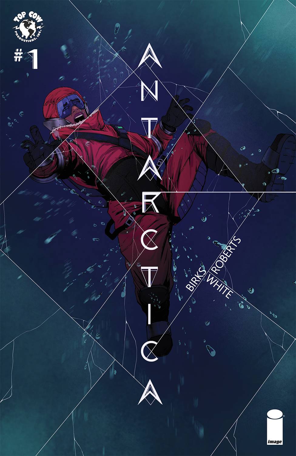 Antarctica #1
Writer: Simon Birks
Artist: Willi Roberts
Letterer: Lyndon White
Publisher: Image Comics – Top Cow
Antarctica #1: Finding something, or someone, who’s been lost is a challenge. But narrowing one of their last locations to literally the bottom of the globe at least makes the search more manageable. That’s the reasoning of Hannah Curtis when her father, a troubleshooter she recalls from childhood as tough and secretive, goes missing. Some of his trips, he’d mentioned, involved working at an Antarctic research station.
The orphaned Hannah, underage and anchorless without him, drifts into homelessness until a kind shopkeeper helps her with room, board, and an incentive to earn a degree. With her engineering credentials, Hannah takes a position at the same research facility her father once spoke of. Her intent is not only serving the base, but finding out what befell her father there. In the final act, an unexpected source offers information regarding his fate. Yet, it’s a source she’s known her entire life and that leads to a, “What?!?” moment rivalling David Tennant’s finest.
Simon Birks has scripted an introduction large on feelings and spartan on details. The how and whys are overshadowed by protagonist Hannah’s headstrong determination and assertiveness, covering as they do a vulnerable heart fractured by loss. Artist Willi Roberts makes it a compellingly vibrant character study. His panels deftly cut across street life, gravesides, and eventually drop us into a remote outpost sitting on The Ice, all alone. Well, perhaps not.
Antarctica makes solid empathic connection between reader and protagonist without tipping its hand unduly regarding reasons for Hannah’s circumstances. The final panel leaves us with a mystery worth exploring.
 The Hunger and The Dusk
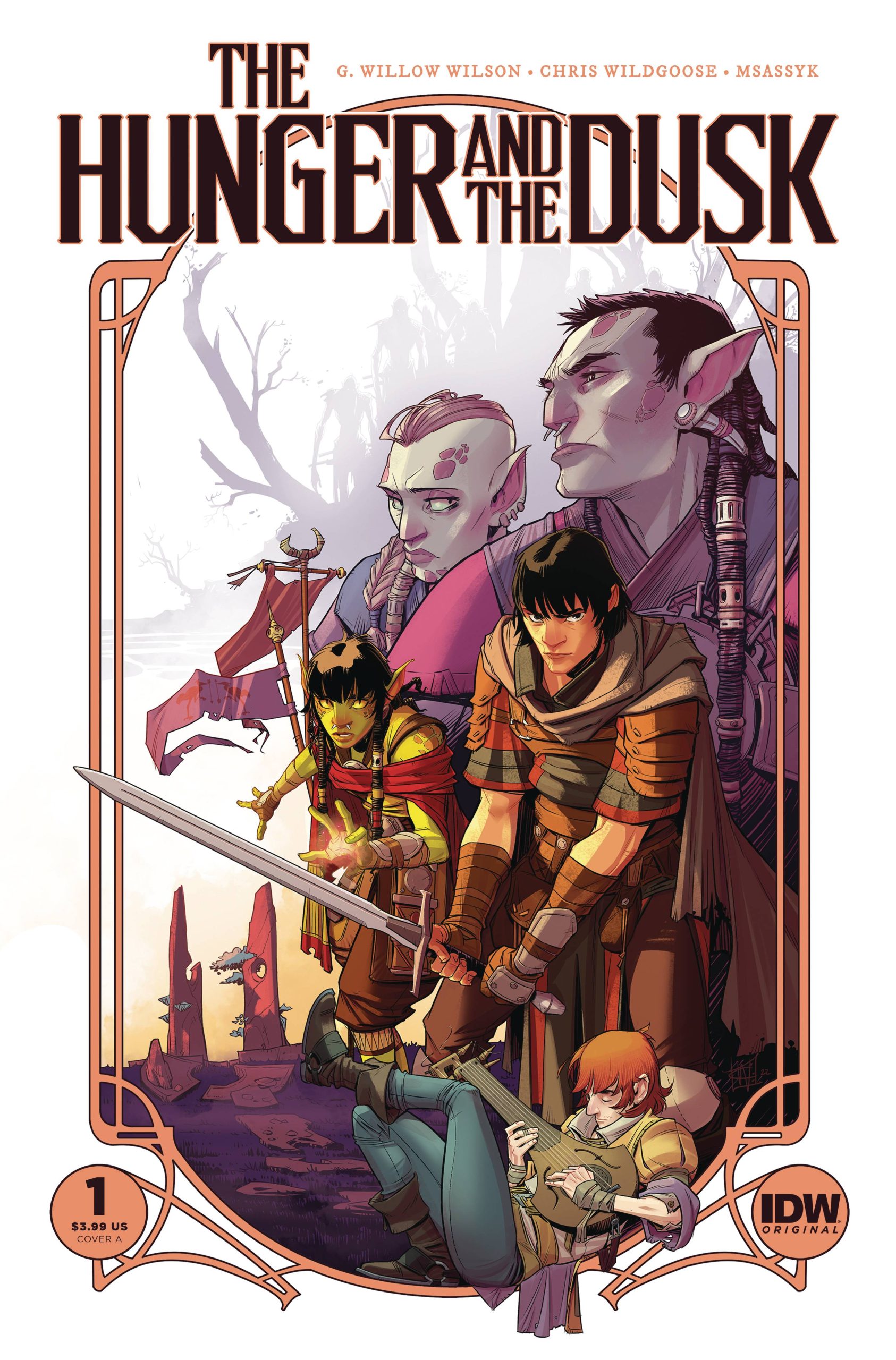
Writer: G. Willow Wilson
Artist: Christian Wildgoose
Colorist: MsassyK
Letterer: Simon Bowland
Publisher: IDW Publishing
Like many reading this right now, I have quite the fondness for G. Willow Wilson – specifically her ground-breaking work at Marvel with 2014’s Ms. Marvel [2014?! Seems like yesterday] and recent fantasy novel The Bird King. Surprisingly enough, what ultimately drew me to The Hunger and The Dusk #1 was Christian Wildgoose and his energetic cover/interiors. Regrettably, I wasn’t familiar with Wildgoose before this reading this first issue, but his talent is undeniable here and tailor-made for a high fantasy tale like this.
The Hunger and The Dusk opens with two local farm boys discovering that a band of orcs are headed directly toward their village. What immediately becomes clear is that while one side definitely fears the other far more, neither are willing to make nice until a common threat forces an unlikely alliance. Craziness ensues, leaving both sides reliant on one another as they travel into the unknown.
Folks, this one feels special – and IDW agrees, seeing how this is already being solicited as an ongoing series. Wilson’s script and world-building are both uncomplicated and tight, but easily accomplishes exactly what it sets out to do: make you care for both the humans and orcs equally. It’s worth reiterating once more that Wildgoose is a star in the making in the medium. Calling my shot now: look for this one to be on many “Best Comics of 2023” lists at the end of the year. Easy recommend.
Verdict: BUY
—Chris Hacker (of The Oblivion Bar podcast)
Wednesday Comics Reviews
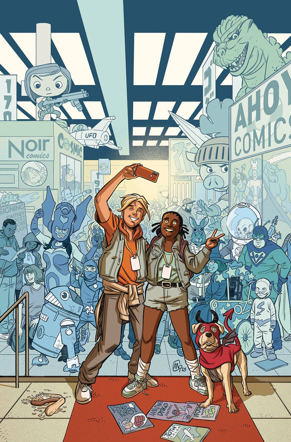
- Con & On #1 (Ahoy Comics): Putting out a comic convention single right before San Diego Comic-Con is a year-round tradition that rarely amazes. Con & On #1 continues this tradition we as an industry have lapsed into. Between the thinly veiled jabs at cancelled creators and glib nostalgia (but for folks who were there in the 80s-90s), writer Paul Cornell slops together what on paper looks like a strong story. Eddie is a cis-het white male comic writer failing upwards while his friend, Deja, is a black woman who attends portfolios only to be gatekept by more white male creators. The series looks to portray this dichotomy our industry suffers from, but without so much as a person of color on the creative team, so much of the narrative punches down or revels in, again, white comic dudes failing upwards. It certainly is a telling decision for artist Marika Cresta to not show Deja’s comic art to reinforce that this is her medium; to further underdog her underdog story. Deja’s only point of validation is only when a black actor tells her to hustle harder. Nothing sucks the air out of SDCC season like a book that wants to portray the industry’s gender dynamics from an allied side, but flagrantly has more fun being mean-spirited about it all. Have fun with that, y’all. —Beau Q.
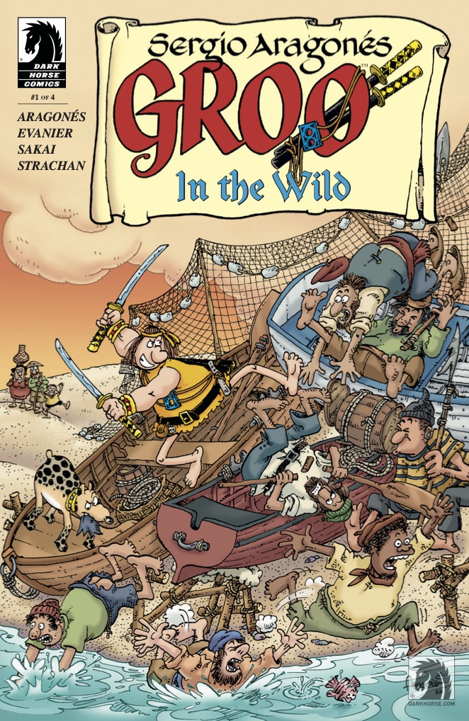
- Groo In The Wild #1 (Dark Horse Comics): It probably won’t surprise you that the first issue of Groo in the Wild is (as expected) a really fun and accessible read. Written by Sergio Aragonés and Mark Evanier, illustrated by Aragonés, lettered by Stan Sakai and colored by Carrie Strachan, this is a fun and breezy overture for the latest volume in the reliably entertaining Groo series. Much of the comedy in this issue is derived from Groo’s considerable reputation preceding him, with Groo’s name striking fear into any heart attached to an ear that hears it (his name, I mean). While the omnipresent background detail of Aragonés is naturally present here, it is used more for world-building than sight gags. Look, I feel like I’m over-explaining it. Groo and Rufferto do some funny stuff, and the latter appears in a one-page backup comic after the amusing letters page. What’s not to love? – Avery Kaplan
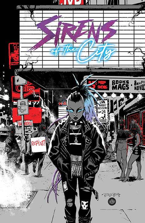
- Sirens of the City #1 (BOOM! Studios): Written by Joanne Starer with art from Khary Randolph, Sirens of the City introduces readers to a world where the supernatural and human live side by side, often making it hard to tell just who belongs where. As more is revealed throughout the first issue, it’s made obvious the book’s protagonist is a lot more than what she seems, her powers seen as valuable to those who wish to control her as she simply wishes to find out more about who she is. Letters from Andworld Design shine in the book as some of the only source of color we see apart from eyes. The reds and blues as they appear pop off the page and drive the intrigue of what’s going on in this story. What’s so special about how these special words are spoken that can cause so much chaos is this hellish version of NYC? Careful reading, as you may find yourself captivated like those in this comic to pick up the next issue to find out more. –-Bryan Reheil
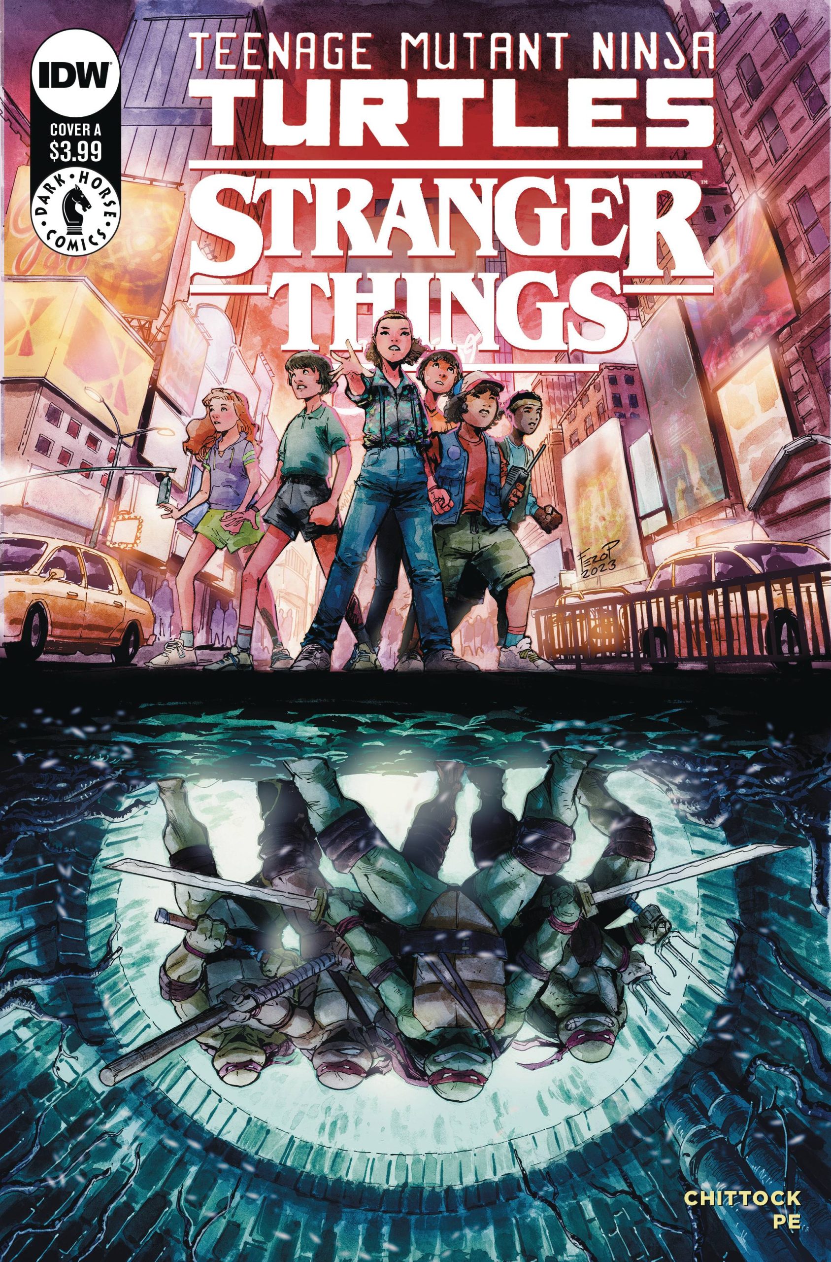
- Teenage Mutant Ninja Turtles X Stranger Things #1 (IDW Publishing): In Teenage Mutant Ninja Turtles x Stranger Things #1, the Hawkins gang are off to New York for a field trip, but they quickly get separated from their school group and end up on the subway platform hearing strange noises. Little did they know their cursed, upside down world has followed them to The Big Apple. Luckily, for El and the gang, the TMNT are eager to help. Written by Cameron Chittock, with art by Fero Pe, colors by Sofie Dodgson, and letters by Rus Wooton, the first issue gets us right up to the first confrontation with the big bad guy. I do feel some crossover fatigue with the way two IPs are forced to not only introduce themselves to unfamiliar readers, but also try to tell a cohesive story. But the team really pulled out the stops: the pace is snappy, the art hits that classic 80s spot, and the colors have a sort of grainy film quality that works well for the feel of this first issue. If you like these properties, it’s a quick and pretty fun read. —Michael Kurt
Read more entries in the Wednesday Comics reviews series!


