
This week’s main reviews are Masterpiece #1, Beyond Real #1, and Underheist #1. Plus, the Wednesday Comics Team has its usual rundown of the new #1s, finales and other notable issues from non-Big 2 publishers, all of which you can find below … enjoy!
 Masterpiece #1
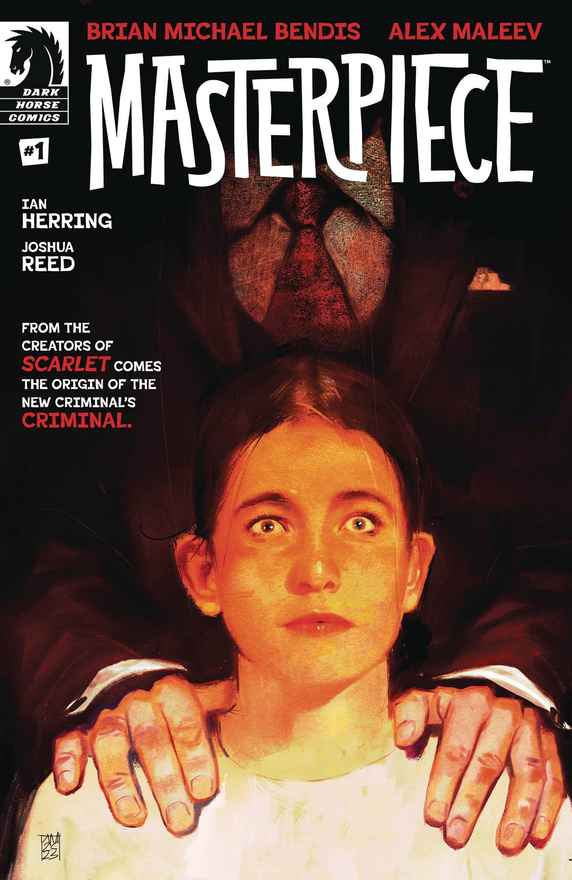
Writer: Brian Michael Bendis
Artist: Alex Maleev
Colorist: Ian Herring
Letterer: Joshua Reed
Publisher: Dark Horse Comics
Review by Beau Q.
You know Emma. Emma is a student…until she’s not. Emma is a normal anxious teen until she’s confronted with kidnappers, then she’s cool as ice. Emma is the protagonist in a high concept blackmailed to do a heist plot. If you don’t know Emma, then you may know an Emma. But truth of the matter is we don’t know the Emma of Brian Michael Bendis and Alex Maleev’s Masterpiece.
We think we know Emma. From the outset, the story is framed with introductions and twists in mind. Emma presents herself as ‘Emma’ at school, but the FBI agents know her as ‘Masterpiece.’ Hell, we think they’re FBI agents until they’re kidnapping her for a billionaire. Here’s where someone who knows Emma (and a lot about her) steps into the foray. We know him, Zero Preston. Zero Preston is a billionaire. Imagine one. That’s him. He knows Emma more than we do. He knows her provenance and wants her to do one heist. The twisty-turvy heist doesn’t stop there, but with that Bendis and Maleev have set our expectations up for failure and our minds at unease.
We think we know Emma, at least in this moment, because traditional comic thinking would tell you “this is this moment in this character’s life”– Emma is a whip-smart today teen capable of seeing through the bullshit. But the more we read, the less we know about Emma than our initial perception, and it changes the pace of the back half of this pilot issue. Just as Emma is thrown into the deep-end to survive this blackmail scheme, so too are we expected to pick it up as the hits keep coming. We the reader are having to parse out our protagonist and plot in simultaneous progression, which can help obfuscate Masterpiece’s high concept that teeters on its own tropes by adding twists before the stage is set; you think this would layer subversion, but instead it disrupts the plot’s aim.
We think we know Emma and her world, what, with its clearly defined foreground, middle ground, background planes, and their realistically expressive faces, but how could we with Maleev obscuring so many characters (incidental or not) with stark black shadow? Well, sensing how adept readers are to twisting thief fiction, Maleev uses his trademark hyperrealism to manipulate our expectations further. We are asked to question why he chooses not to render faces in moments of high dramatic turn. We are asked to reexamine power dynamics when the layouts are staged in a way that keeps Emma’s playing field level with Preston and his goons. We are being pressed to question the validity of Preston’s statements when Maleev uses a beautifully mid-century modern spread that feels artificial to Emma’s hyperreal world. Really, the only moment that doesn’t feel like Maleev pulling another one over us with his layout design is how different Emma’s webcomic looks compared to today’s webcomics– their black and white nature sell more 90s web strip than the ones we have bookmarked on our phone.
We think we know Emma’s world with its realistic grime, because colorist Ian Herring deems it so. With a sandy chipboard texture, Herring tries to complement Maleev’s inks with a natural yet pulpy palette, but the saturation is turned up enough the noise grain can feel louder than normal on backlit screens. Emma is cast in a cool blue shade when put upon in interrogation. Her world fills with sickly chartreuse when Preston brings unease and opulent terror to her day. But nothing stands out in this palette quite like Herring’s orange red; a caution. From a glass of wine, a flash drive, the sunset, some Daredevil glasses, or even a word balloon’s outline, orange red is a warning to Emma and the reader.
We think we know how Emma’s world sounds thanks to longtime Bendis/Maleev collaborator Joshua Reed booking the dialogue. Bendis is a wordy sort with a heavy emphasis on dialogue moving plot and capturing the emotions in those moments. Reed packs these multiple line segments into balloon stacks that use verticality and size to convey tone. Most wouldn’t notice a hamburger stacked balloon from a diamond stacked one, but Reed draws attention to particular lines by using an uniformed through-line to his balloon stacks, so that when one slips out, it warrants attention, or at least, a change in tone. However, if you’re not a fan of dialogue hanging on an ellipsis to connect scenes through a page turn, avert your eyes! That particular application doesn’t feel as fresh as hardcutting scenes between spreads.
With this, you might think you know Masterpiece, know Emma, and maybe even know where this book is going, but I assure you, you do not. There’s no way to know from where I am in time if you have or haven’t read Masterpiece, and therefore have gotten to meet Emma. But even then, we still do not know her. The only way for us to know Emma and how she’ll get out of this heist is for us to keep reading. Maybe then. If ya want.
 Beyond Real #1
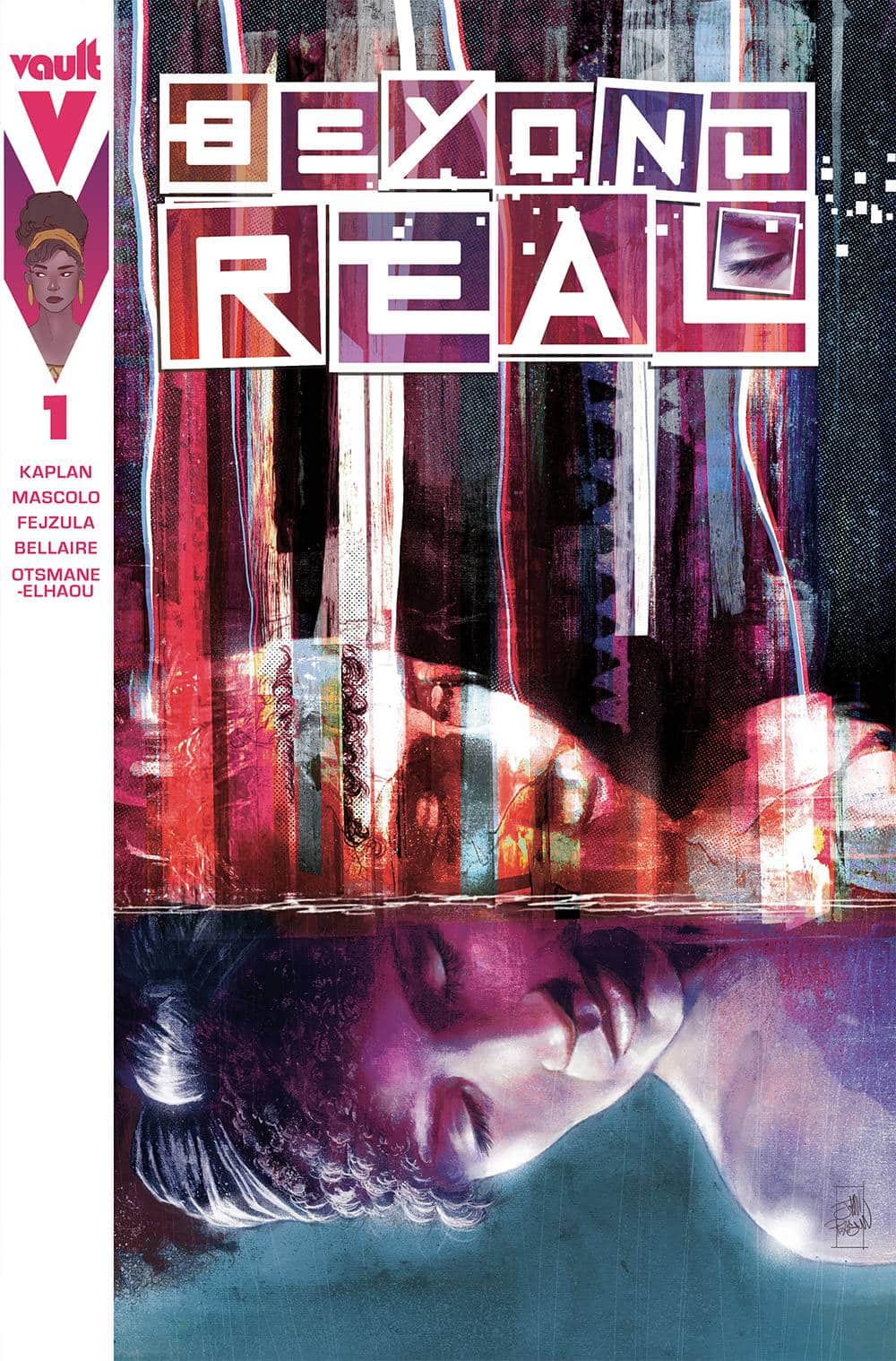
Writer: Zack Kaplan
Artist: Fabiano Mascolo and Toni Fejzula
Colorist: Jordie Bellaire and Toni Fejzula
Letterer: Hassan Otsmane-Elhaou
Publisher: Vault Comics
Review by Tim Rooney
Beyond Real by writer Zack Kaplan and artists Fabiana Mascolo and Toni Fejzula is a book focused on what it means to be alive. As questions arise around the ethics of Artificial Intelligence and predictive algorithms, Kaplan, Mascolo and Fejzula asks questions about the nature of our own sentience and purpose.
The book follows June, a young woman, in the days after a tragic car accident that has left her boyfriend comatose. She finds herself experiencing strange glitches in reality and is unsure what is real and what might be hallucination. Already skeptical about the ideas of fate and purpose in life before reality begins to bend around her, June is quickly thrown into an existential panic. The book plays with simulation theory and ideas of destiny and our human perceptions of choice and self-determination. These ideas in themselves are not new but they are newly urgent as our economic structures work overtime to remove the human from art and creative endeavors.
The artists, Mascolo and Fejzula, whose work blends seamlessly one into the other, leverage the comics page to make dynamic and disorienting imagery that undermines June’s fabric of reality. There is a clear delineation in style between the moments before the accident and everything that follows. Those early pages are rendered in straight forward, rigid panels with standard and realistic, nearly flat colors. They are well crafted but unremarkable in visual. After the accident, the world is set off-kilter, with Fejzula and Jordie Bellaire’s colors creating rainbow ripples in color and space. Images are offset with chromatic aberration as if June’s vision is constantly riddled with stars. Figures appear and dissolve across panels and static backgrounds, the skyline is reduced to a 3d wireframe simulacrum and the very structure of life breaks into their component parts.
By the issue’s end the reader’s sense of the real is thrown into question altogether as June’s reality is completely obliterated. Hassan Otsmane-Elhaou brings his usual excellent lettering skills, providing a structure to the dreamlike haze of the art. The visual feast is undergirded by the emotional heart of Kaplan’s story of love and grief. It’s part Matrix, part The Notebook and the effect is a dazzling work of comics storytelling. Art this good earns a BUY on its own, but paired with a compelling emotional story, this is a debut issue you won’t want to miss.
Underheist #1
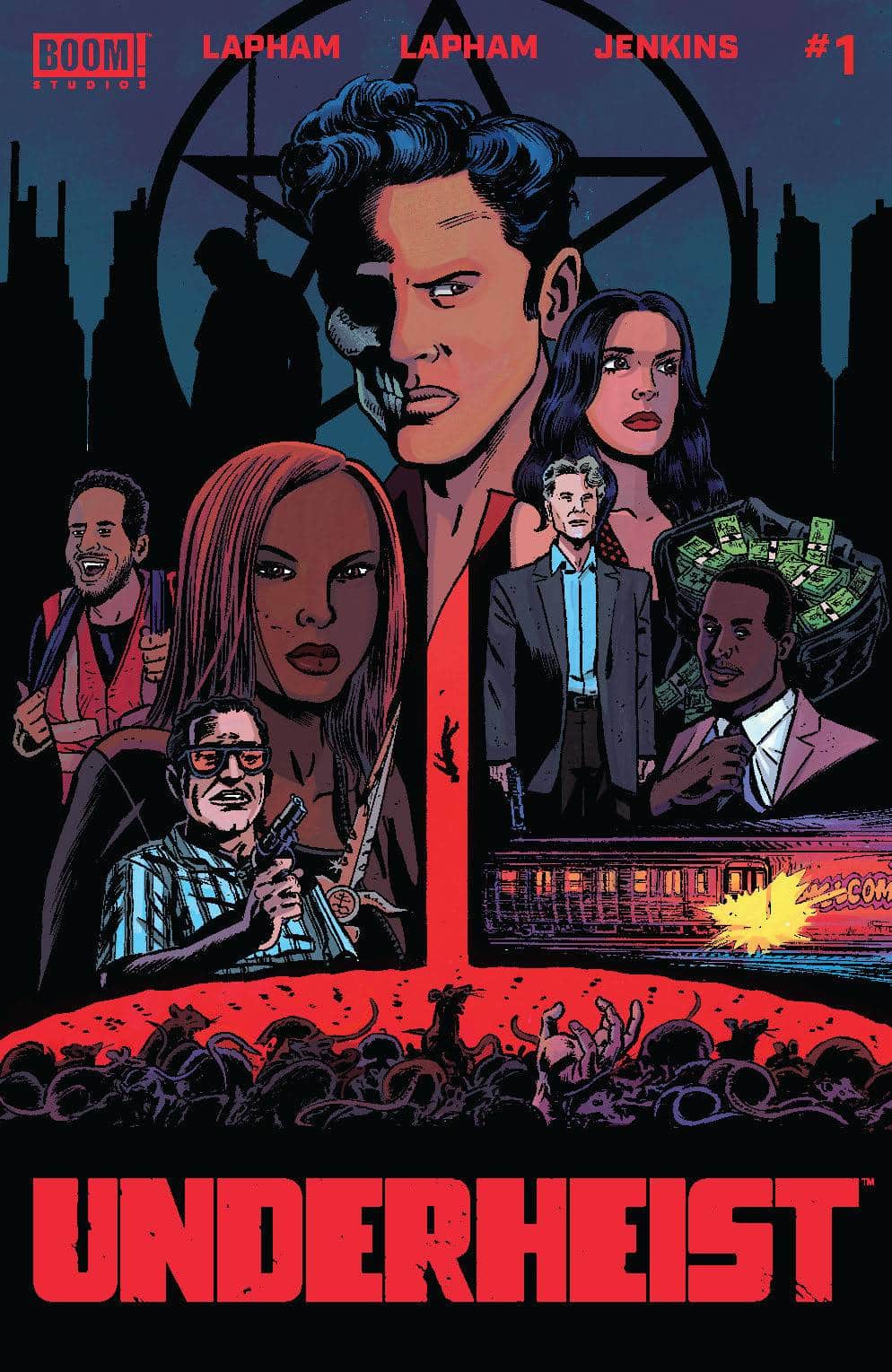
Writers: Maria and David Lapham
Artist: David Lapham
Colorist: Hillary Jenkins
Letter: David Lapham
Publisher: BOOM! Studios
Review by Jordan Jennings
Underheist #1 is the newest crime-noir comic from Maria and David Lapham. The story focuses on David a man who struggles with gambling addiction have cost him everything. In deep debt with a bookie and staring down a dead-end life, David seeks to turn his life around. With a tip about an impending bank heist, David gets together a crew to rob the robbers and break out of this vicious cycle of pain and debt. However they quickly learn that a simple task is never that simple.
Noir comics are familiar territory for the Laphams and it shows here in Underheist. There are familiar elements to the story of people in a bind as they look for quick way to make a buck. That is the quintessential American experience in a lot of ways. Yet there is more at play than just a heist. There is an underlying supernatural theme present in this story. In a flashback we see David getting punished by the bookie with a rather ornate dagger which leaves a mysterious scar. Throughout the story David is constantly scratching at the scar as it becomes more defined and takes the shape of something sinister.
This hook gives the story something beyond just a well-executed crime story and makes it unique. The slow burning reveal leaves me wanting more in a good way. Just to be clear, while the supernatural aspect is a low burn the actual comic is anything but. The overall pacing is brisk and wastes no time to get to the heist. The way the story just jumped in gives this comic a lived-in feel that made me think the comic was a sequel. This doesn’t make the comic impenetrable. Everything that needs to be explained is clearly explained as it comes up. It is just impressive that the chemistry between the characters feel like it has been going for some time.
David Lapham’s art is stylized and fitting of this kind of noir story. The people are all distinct and ugly in the best of ways. It gives the world a bit of texture and grit. He utilizes a traditional 8-panel grid throughout the comic to control the pace. Lapham spices it up by cutting between different scenes on the same page which results in a sense of synchronicity between events. Hillary Jenkins compliments Lapham’s art with a naturalistic color palette.
Underheist #1 is a strong start to the series. I am curious at what the future holds for this series, though. The overall success of this depends on how the supernatural turn plays out. As for now, I am enjoying it and I look forward to the next issue.
Wednesday Comics Reviews
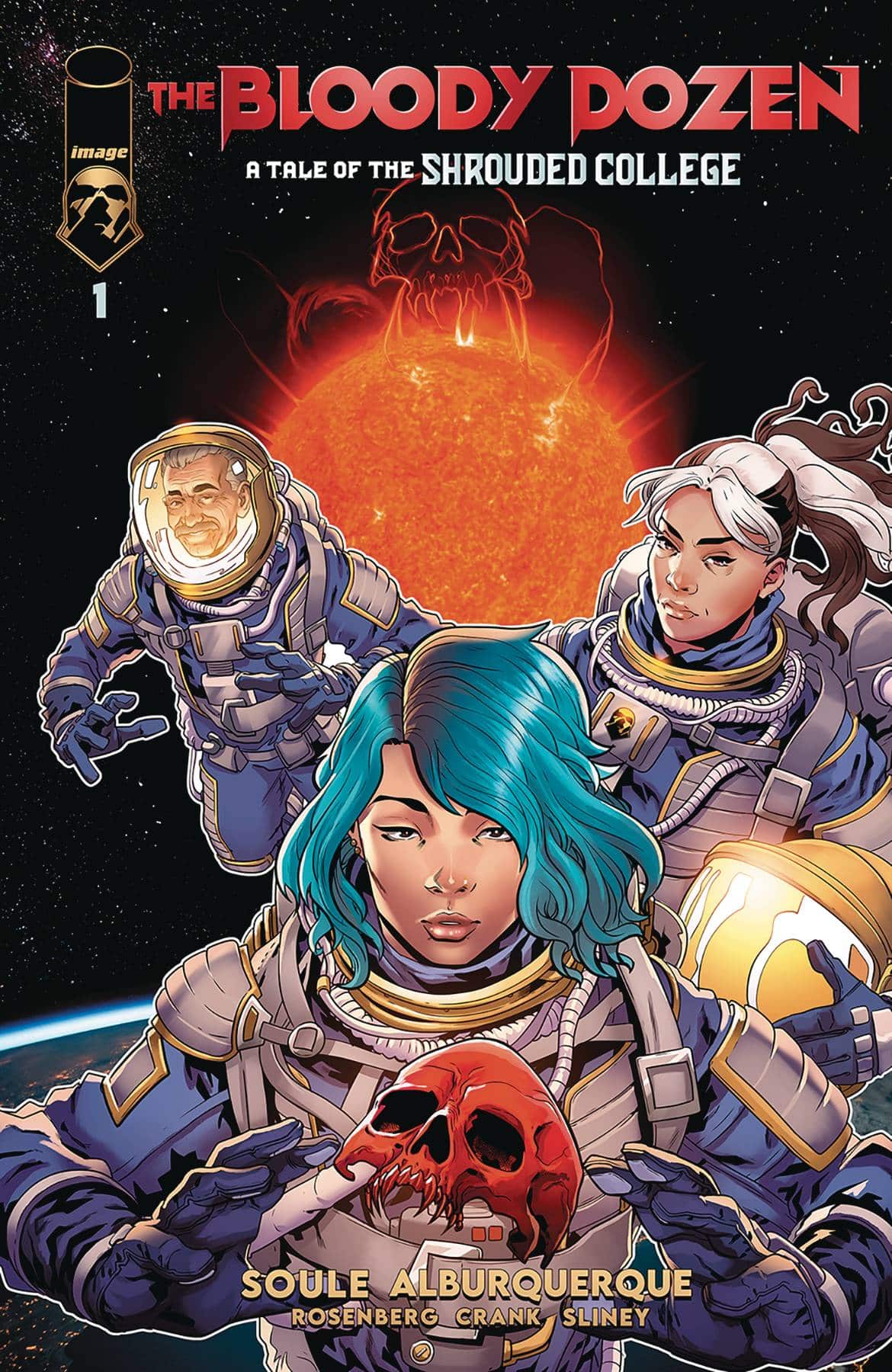
- The Bloody Dozen – A Tale of the Shrouded College #1 (Image Comics): This is my first toe-dip into Charles Soule’s Shrouded College books, and it’s going to send me right back in to pick up more. If you’re a sucker for the “classic film but make it horror” vibe, this book is for you, with Soule doing a deft set-up and adding that one more thing that makes the book crackle. A classic horror heist would be enough to get readers on the book, but Soule throws it all into space—readers of Letter 44 know how well Soule and artist Alberto Alburquerque can handle NASA-adjacent weirdness—and gives the concept one final twist for a compelling first issue. —Bob Proehl
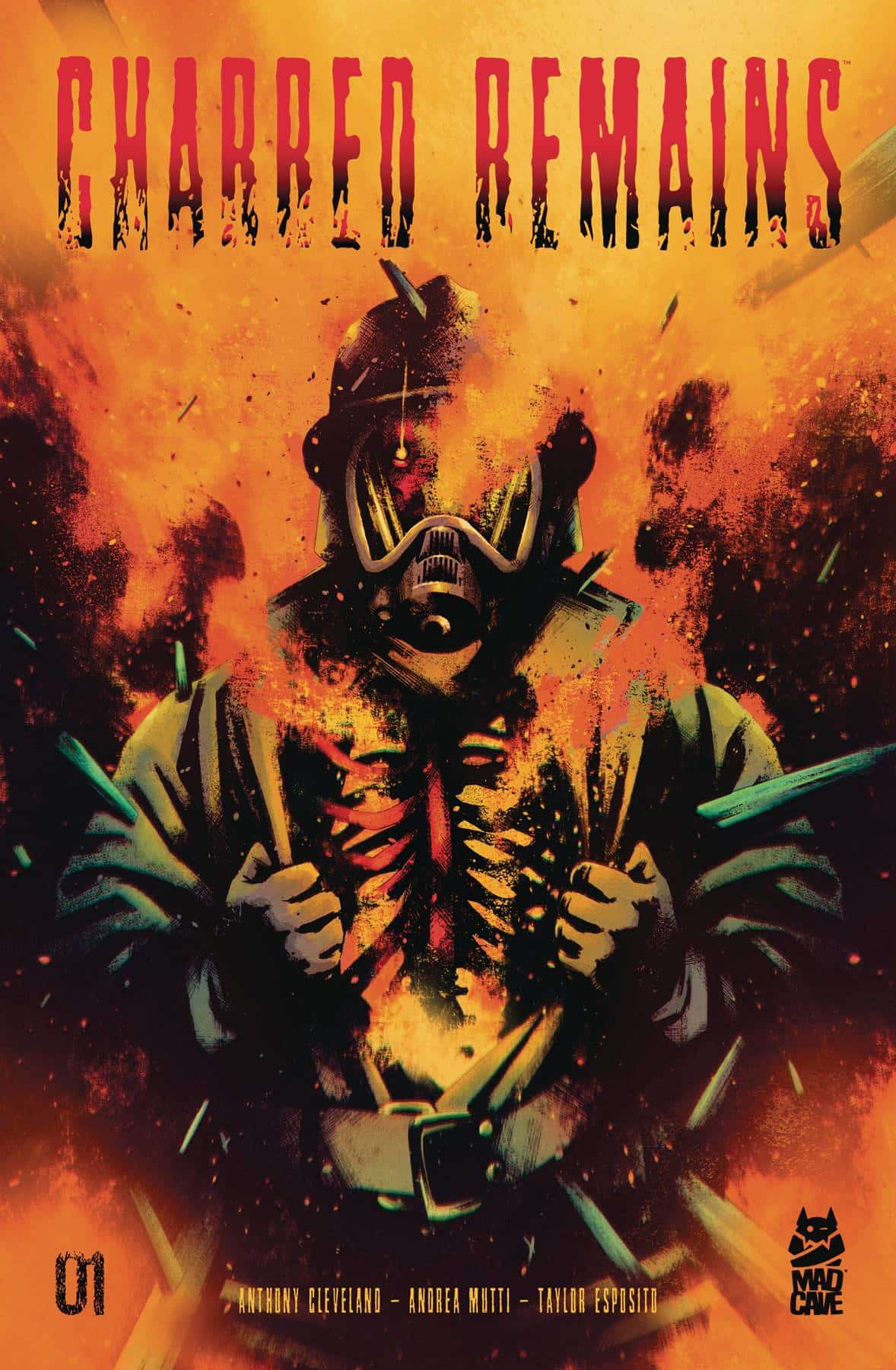
 Charred Remains #1 (Mad Cave Studios): The intrigue and horror within the pages of Charred Remains spread as quick and easy as the flames and the mysterious Fire Man behind them. Writer Anthony Cleveland takes one of mankind’s biggest natural fears and manages to make it that much more terrifying by introducing some monstrous personification of fire itself that seems to have just as long a list of victims as the element he serves. The painted style of Andrea Mutti not only captures the wild and unpredictable nature of fire as it burns without thought, but the fear of those caught in the blaze. From the bright reds and oranges used to burn a house down, to the bodies unrecognizably burned black by their touch, Mutti’s colors add that much more to the already horrifying premise and concept of being caught in a fire. For letterer Taylor Esposito, it’s even more eerie to see these victims scream their final breaths as the fire closes in around them. The way the SFX also work in conjunction with Mutti’s art, they possess this 3D quality that does nothing but serve and enhance the story, sparking interest to return for issue two. —Bryan Reheil
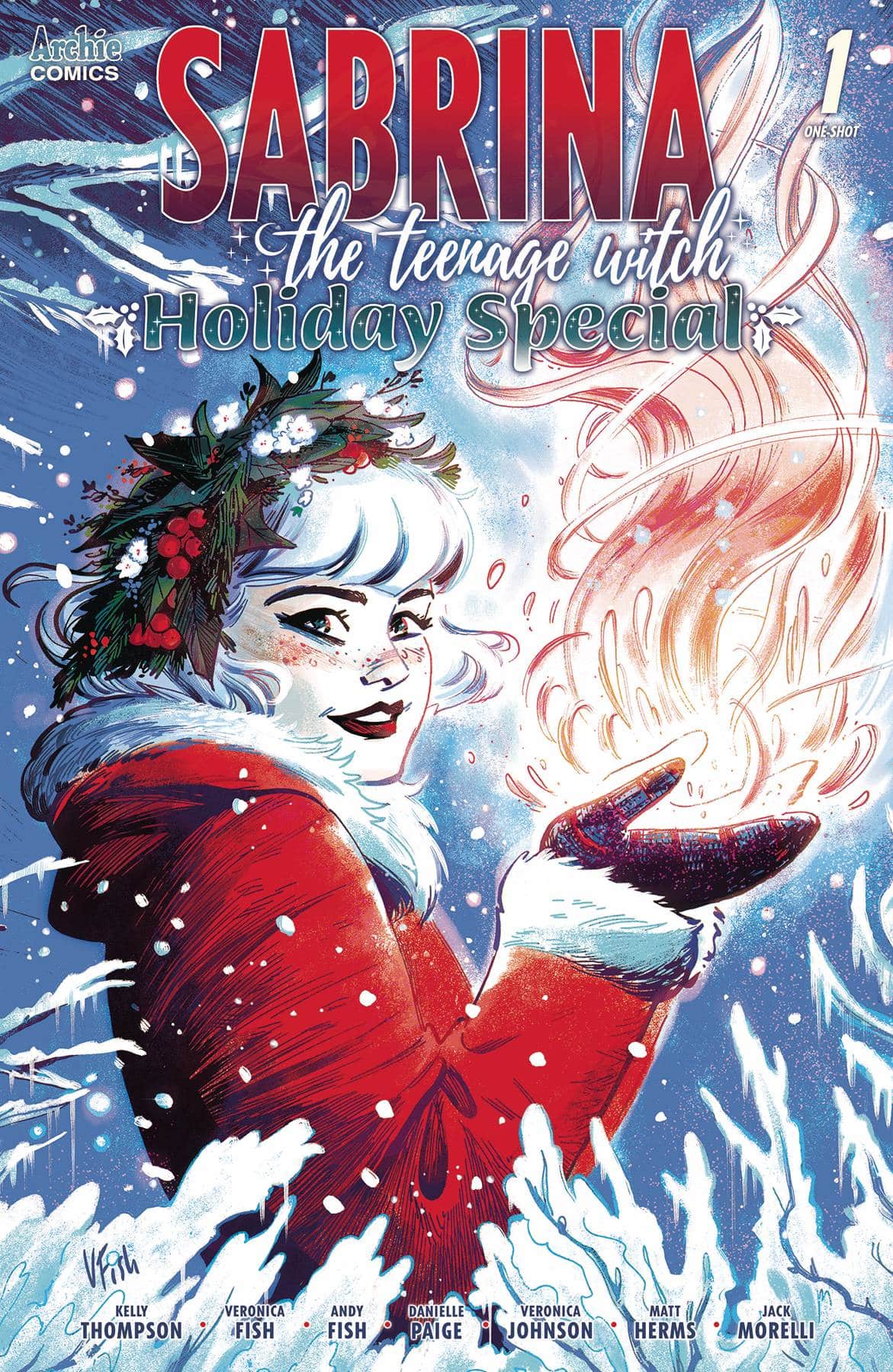
- Sabrina The Teenage Witch – Holiday Special #1 (Archie Comics): This one-shot holiday special celebrates the 2023 winter solstice (which takes place December 21st) with two stories. In the first, “The Longest Night,” Kelly Thompson reunites with Veronica Fish for a return to their incarnation of the teenage witch. This welcome resumption addresses the idea of enduring a prolonged darkness through a demonic kidnapping and rescue. The second story, “A Very Spellman Solstice,” is written by Danielle Paige, with line art by Veronica Johnson and colors by Matt Herms. This story opens a window to Hilda and Zelda’s teenage years. Both stories are perfectly lettered by Jack Morelli. However, they each have a very different aesthetic and tone. Together, they make for a beefy and enjoyable issue. Let’s hope the Sabrina winter solstice special becomes an annual tradition at Archie Comics! —Avery Kaplan
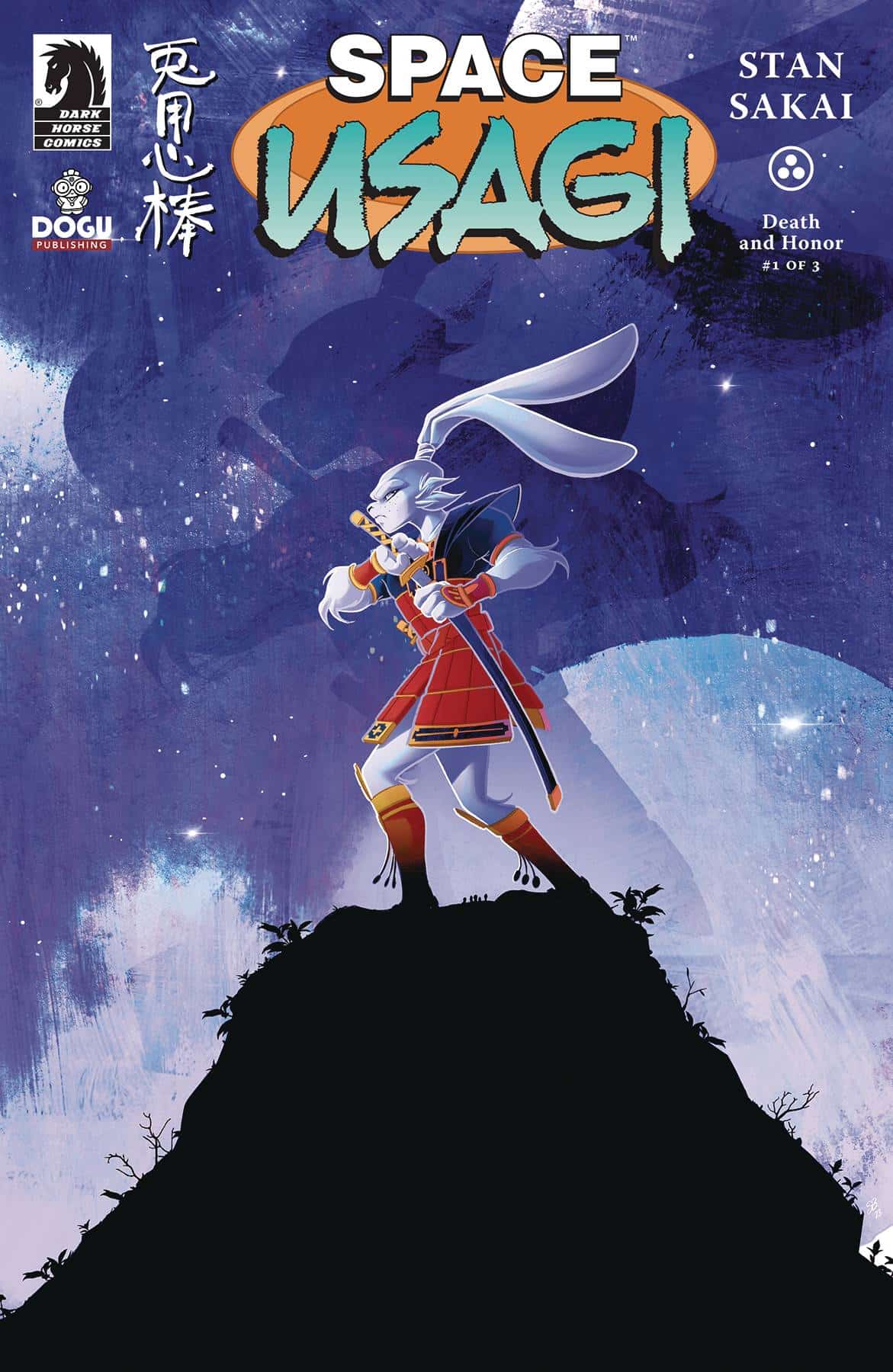
- Space Usagi #1 (Dark Horse Comics): Award-winning writer, artist and letterer Stan Sakai creates a change in environment for Usagi, and from the first page we’re thrown into a battle of spaceships and it’s no shock that it just works in this environment. It feels akin to Star Wars in a sense, especially with how both pull and play on the Edo period, though Usagi sits more directly in that bit of Japanese history. With this, Space Usagi still feels like Usagi at its core while remixing the culture within it. The art shines here as it translates into space with ease and it’s always great to see traditional art and lettering. From every line and dot, to the way the letters sit within the speech bubbles; on a technical level, Sakai’s work is a treat, elevated by the colors of Emi Fujii who pushes and pulls Sakai’s work with textures and saturated colors, really making everything sing. There is so much expressiveness in the characters and the flow of the balloons and the sound effects as the story moves from fast-paced action to more quiet reflective moments, getting us familiar with the new context that Usagi exists in within this series. It’s easy to pick up and understand while being a fun start to this three part story of honor, betrayal, and adventure. —Khalid Johnson
The Prog Report
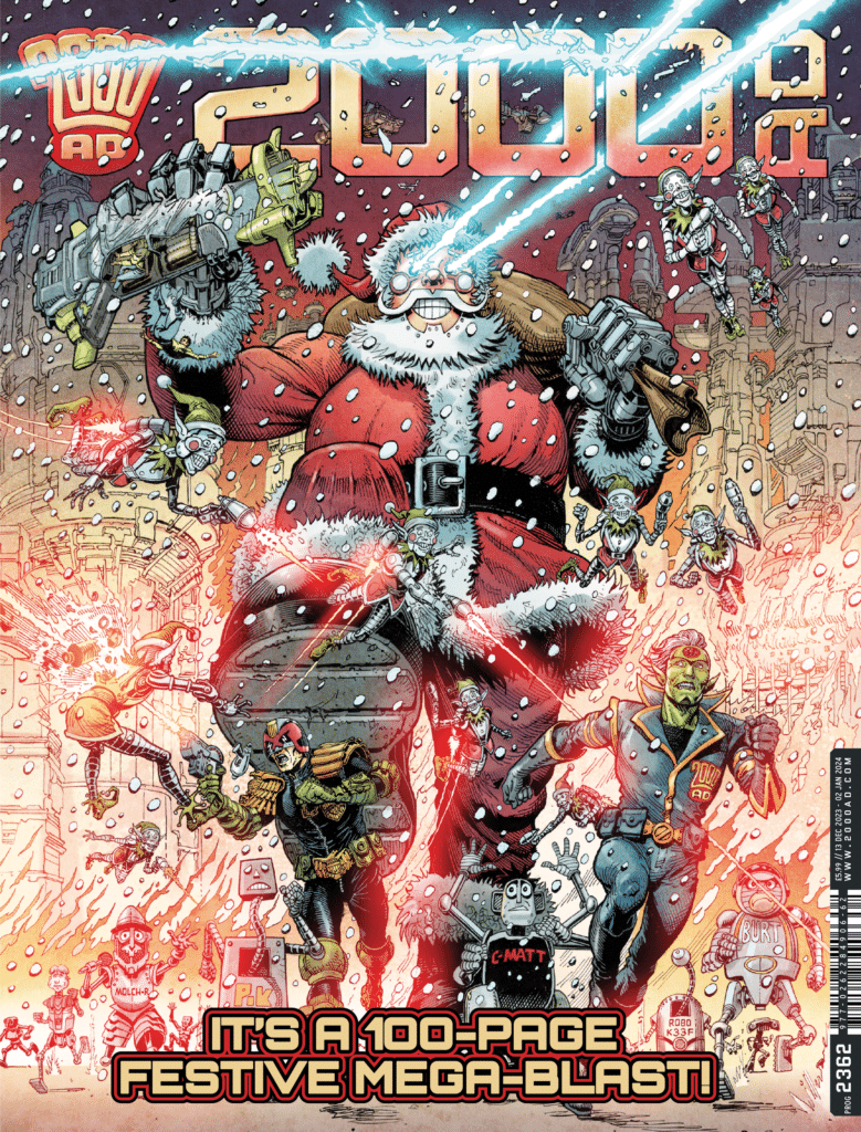
 2000AD Prog 2362 (Rebellion Publishing): This week’s Prog is the year-end 100-page magazine, one that serves up continuing stories alongside some standalones with holiday or seasonal connections. If you’re reading the ongoings, this is just a great read start to finish, feeling like the usual stuff plus some really fun bonus material. I do wonder if it might have been friendlier to make everything in here new-reader friendly, but hey, maybe some folks will also go back and get caught up on the nice variety of current ongoings. All in all, though, I had an absolute blast with this oversized Prog, and I’m excited to continue this brief weekly dispatches in the New Year. As always, you can nab a copy of this week’s Prog here. —Zack Quaintance
Read more entries in the Wednesday Comics reviews series!


