
This week’s lead review is Weird Work #1, which despite having work in the title is a ton of fun. Plus, the Wednesday Comics Team has its usual rundown of the new #1s, finales and other notable issues from non-Big 2 publishers, all of which you can find below … enjoy!
 Weird Work #1
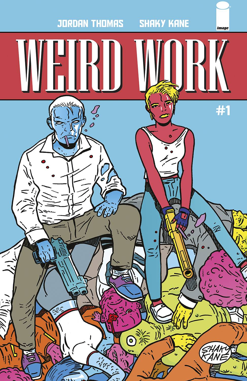
Writer: Jordan Thomas
Art: Shaky Kane
Letters: Letter Squids
Publisher: Image Comics
One thing I really like is when a comic really truly feels like a comic. You can say that’s a silly thought, that any comic inherently feels like a comic, etc., but there’s just something intangible that some books have, a sense that everyone involved loves making comics and is leaning into the joy of the medium, using it to get their story across and try something new. Friends? Weird Work #1 is that type of book.
What will likely grab you first is the pristine linework of Shaky Kane, who also colors himself. Kane’s artwork in this comic is packed and idiosyncratic, perhaps the type of work one might more reliably find coming out from a publisher like Fantagraphics. It uses the titular conceit of the book — this one is weird — to great effect, giving us in the opening pages a giant anthropomorphic peanut mascot that oversees a highway, a cigar-chomping pig politician and blue-skinned characters — all of which cohere nicely.
And Kane’s art maintains this creative momentum well past the opening salvo. Weird Work #1 just delivers design after design achievement, without ever feeling gratuitous or distracting from the story. Speaking of which, the other flare in this comic that really stood out to me was the voice deployed by writer Jordan Thomas. This book really makes great use of voice and caption, something I always enjoy in a comic, and it does it by being direct and assertive with the reader. When everything around it is so weird, there is a calming authorial voice guiding the audience through it. It’s a great creative choice, one I hope continues throughout this five-issue miniseries.
Letter Squids also does great work in this book, deliving a number of specific fonts and bubble colorations to fit or match the weirdness of the characters who are speaking. Overall, I enjoyed Weird Work #1 quite a bit. It’s the type of book that makes fearless use of familiar elements to spin something cool and fun and eclectic. I can’t wait to see what the rest of this series holds.
Verdict: BUY
Wednesday Comics Reviews
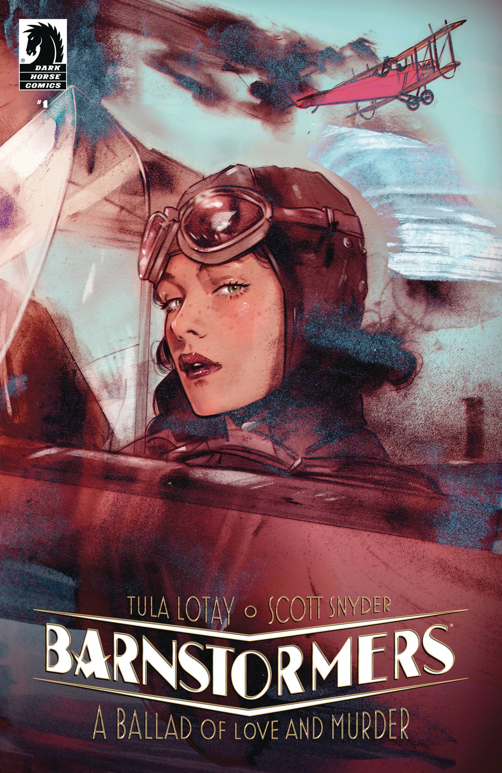
- Barnstormers #1 (Dark Horse Comics): Barnstormers is the type of comic that feels entirely built around the very specific interests of its creative team, and it’s all the better for it. From the setting to the strife to the way the characters are designed — this is a thoughtful comic. It’s about an early aviation-era showman/conman with a fake name (one of my favorite plot devices in any kind of story), who gets tangled up in the affairs of the uber wealthy during the gilded age. There are high-flying heroics, heists, shadowy authorities working for the priveleged, and a sort of cyborg that may or may not be the result of a mental break with reality. In other words, this comic is very good. This first issue is also double-sized and a serves up a massive chunk of engrossing story. I read it all in one very entertaining sitting and found myself wondering when we’d get more. Kudos to the creative team, which is writer Scott Snyder, artist Tula Lotay, colorist Dee Cunniffe, and letterer Richard Starkings. —Zack Quaintance
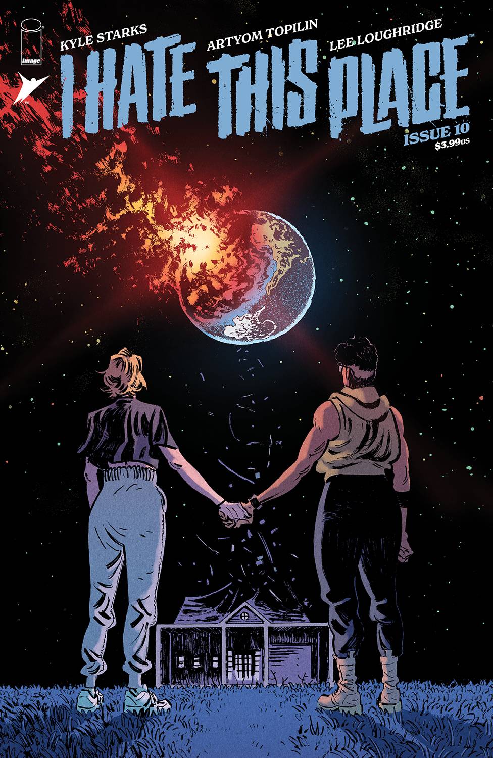
- I Hate This Place #10 (Image Comics): Here at the end of their hell home invasion, our intrepid ranch owners, Trudy and Gabby, kill dad, free some ghosts, and decide this sweet home isn’t as bad as the variant title, Fuck This Place, implies. End. What we miss out on upon I Hate This Place’s finale is a continued readable world unearthed by writer Kyle Starks and brought to life by artist Artyom Topilin! The perfect combination of Starks’ salty snap-wit liners and Topilin’s fatty flowy inks helped keep the Rutherford Ranch consistently engaging, even after all the shit it’s been through. Topilin poses each player with a playful mix of straight strokes and curves, maximizing the directional focus in each gesture — the result is a wealth of body language communicated to the reader in every panel possible. Atop that, Starks tends to write every IHTP page with the final page panel always changing the scene with a twist; no matter how small. This panel layover trick is nothing new, but of great reward is Topilin’s ability to normalize that last panel’s content and composition to disappear until it absolutely needs to reappear. Not to be outdone, colorist Lee Loughridge rinses the Ranch in a multitude of contrasting duos filled with a noise layer to help further complicate the visually divisive palette in a way that highlights and/or subdues with purpose and intent in every scene. You’re thinking this place ain’t so bad, and you’d be right with letterer Pat Brosseau lulling us into a sense of warmth among long-winded sentences in balloons that take up less space than you’d think! There are so many reasons one can say they hate this book, but with an ending so sweet, I think I’m starting to like it here! —Beau Q.
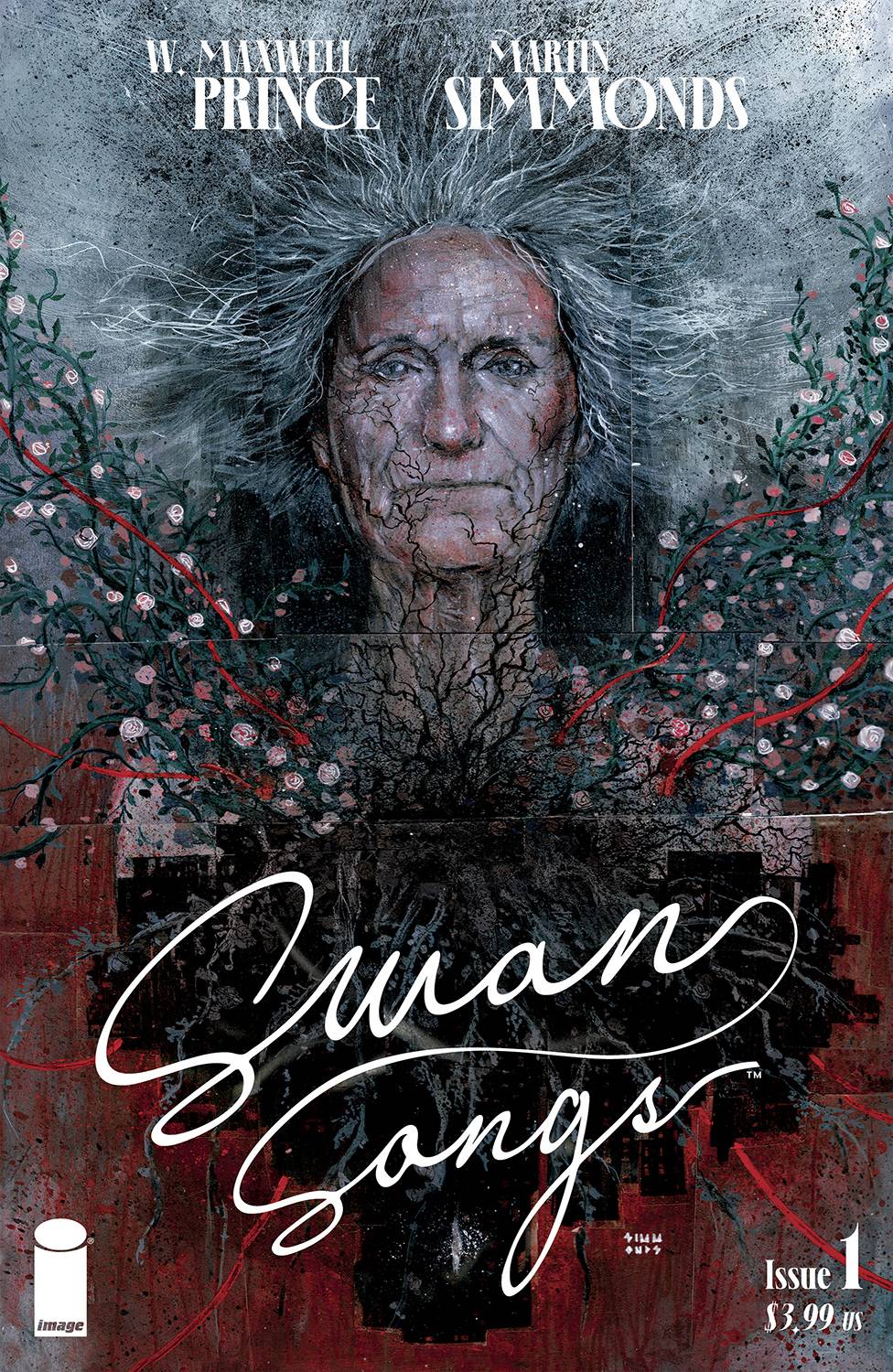
- Swan Songs #1 (Image Comics): This opening exploration into the way things end comes with an immediate twist from W. Maxwell Prince, in the form of a two-for-one ending. While the story is set during an apocalyptic future (in a society not too different from our own), the true heart of this revolves around a young man hunting down the last issue of a magazine for his Mom while she lives out the rest of her days in a hospital room. The story feels more sweet than anything. There’s this fantastic narration throughout as he reckons with his own mental state, indifferent to the dying world around him, far more concerned with his therapeutic progress he made before the world started to end. Letters are by Good Old Neon, who makes each balloon feel as though it moves across the page, varying size and shape in a way that feels like we’re adjusting the volume throughout the issue. We’re treated to this horrific hellscape with gorgeous artwork by Martin Simmonds, who coats panels in this grimey sense of decay, along with these eye-popping surreal landscapes. Though, the way he plays with lighting and colors, especially toward the back half, feels far less terrifying than may be expected from the end of the world. The whole series is set to pair Prince with a number of different artists for every issue, and it’s going to be very hard to top this opener, which has such a satisfying conclusion. I never thought I’d be sentimental about nuclear armageddon, but this issue made me more sappy than scared. Definitely looking forward to the rest of this series. —Cy Beltran
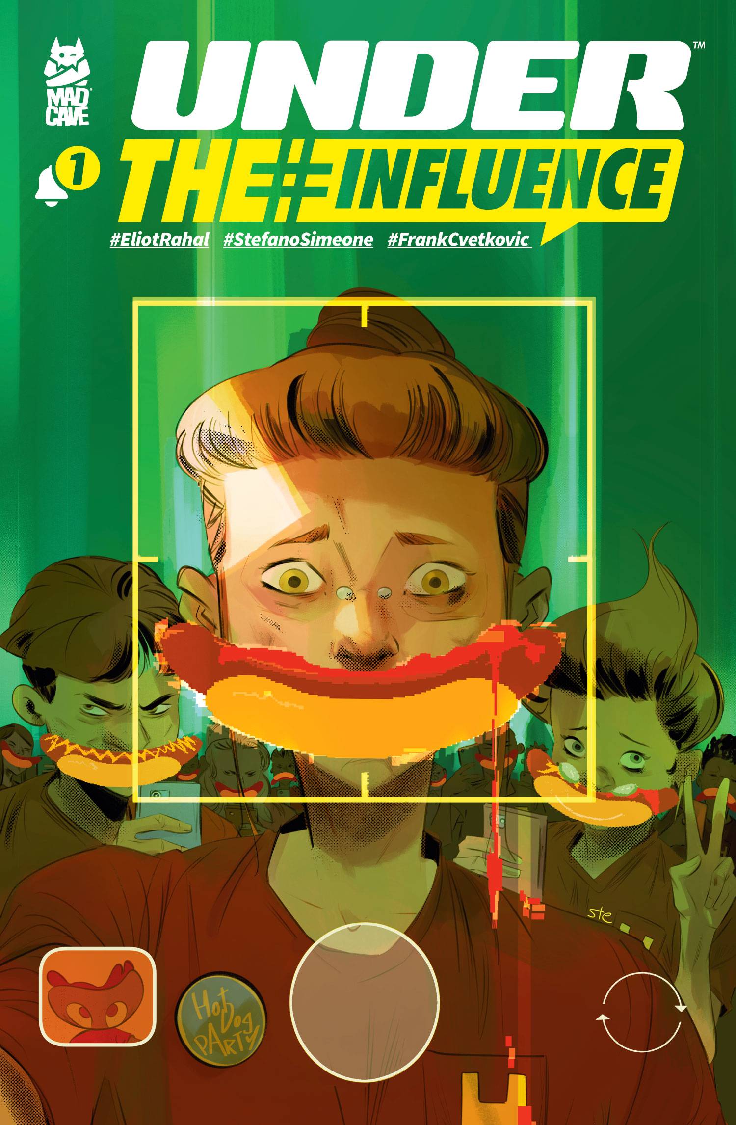
 Under The Influence #1 (Mad Cave Studios): Under the Influence #1 introduces Cara Cole, an F.B.I. agent and informant, however, writer Eliot Rahal brings a critical eye to the way he approaches Cara’s story; with references to Hoover and cointelpro there is a clear understanding that these institutions facilitate harm and operate unethically. This is called into question when Cara is assigned a mission to monitor a cult leader and the story calls to question what constitutes a cult in a time of influencers and internet celebrities. It’s thought provoking stuff, heightened by the art of Stefano Simeone whose work here lends itself to the drama of it all with incredibly expressive characters from the first scene to the last page, really selling the emotions of these characters. Simeone also brings an excellent eye for color that lends itself to really defining the moods and lighting of each page and letting the emotions that are so excellently conveyed, shine. The letters of Frank Cvetkovic tie everything together, allowing everything to work to great effect in this thought provoking first issue. –Khalid Johnson
Read more entries in the Wednesday Comics reviews series!


