This week’s main review is Universal Monsters – Frankenstein #1. Plus, the Wednesday Comics Team has its usual rundown of the new #1s, finales and other notable issues from non-Big 2 publishers, all of which you can find below … enjoy!
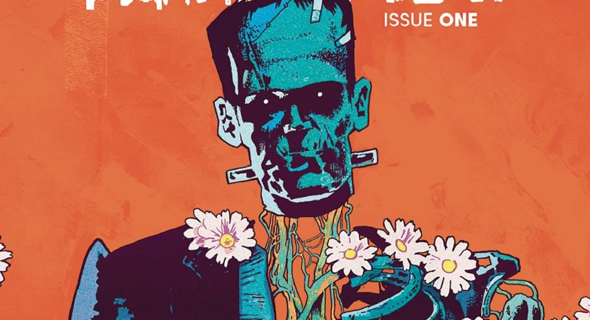
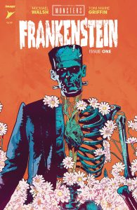
 Universal Monsters: Frankenstein #1
Writer/Artist: Michael Walsh
Colorist: Toni Marie Griffin
Publisher: Image Comics
Price: $4.99
Review by Ricardo Serrano Denis
One of the qualities that set Frankenstein’s Monster apart from the classic line of Universal Monsters is his emotional range. Dracula can carry tragedy and heartbreak; the Mummy can embody loneliness and the cruelties of being forgotten; the Wolf Man can personify rage and the isolation it forces upon the subject; and the Creature from the Black Lagoon can display the quiet suffering of living in a world that is not made for you.
Frankenstein’s Monster is all of them. He can take on each of the things the other monsters represent simultaneously or in combination and make them unique to him by virtue of his relationship with life and death.
Michael Walsh’s take on the character in Universal Monsters: Frankenstein #1 is perfectly attuned to this, and it sets up a story that broadens that emotional range even further by leaning on nuance rather than big swings on formula and tradition. He does so by focusing on the one element of the character that has received the least amount of attention in previous iterations: the origin of his body parts.
Frankenstein #1 opens with a small boy visiting his father’s grave in a cemetery. None other than Doctor Frankenstein and his assistant Fritz follow close behind, looking for a fresh body to dig up for his experiment. The boy’s father fits the bill. Upon inspection they find the corpse inadequate, except for his hands. They take them, prompting the boy to follow the Doctor to his castle and into a new nightmare of science and resurrection.
Walsh decides to put the weight of the story on the boy, on the injustice the theft of the hands represents. In turn, he adds another layer of tragedy to The Monster by making the reader think about the other grieving people Doctor Frankenstein has wronged for the sake of playing God with dead tissue. It’s a genius concept that could turn each one of The Monster’s limbs into stories of their own. Once the experiment succeeds and we get the requisite “It’s alive” moment, there’s very little to dwell on that hits with the force of the boy’s horror once he realizes his father’s hands belong to something else.
The signature sadnesses that envelops The Monsters opens up here and becomes shared. A third participant is thrust into the existential struggle that’s almost always been reserved for two, The Doctor and his creation. This allows Walsh to produce a series of panels that grab hold of the heart and squeeze. One example sees the boy hold his father’s hand after it has been attached to the body on the slab, trying to keep what’s left of him close. Dialogue is kept to a minimum. It’s just a moment that conveys how much the boy misses his father. Very few panels in comics manage to capture emotion quite as well as this.
What’s also impressive is that this new angle to the story falls in line with the original story’s mood and tone. Walsh nails the cinematic look of the 1931 film, doing a bit of a resurrection act of his own by bringing back that same gothic sense of place as the source’s. And yet, he makes space within the familiar for new ideas that enrich the narrative rather than dismiss it for something that could’ve been too far detached from what came before. It’s easy to imagine the boy’s story as part of the movie had the original filmmakers gone that route. That is a colossal feat.
Toni Marie Griffin’s colors do an excellent job of helping maintain the familiar well in place. The color palette impresses by not overpowering the near black and white stylings of the characters and the larger parts of the scenery. Blues, greens, and purples abound, but they’re muted. They are there to accentuate the characters and their reactions. Emotion is king in this comic, and Griffin makes sure it shines.
Michael Walsh achieves something few others can lay claim to: adding a new storytelling component to The Monster. To find a different means to elicit emotion from readers with a character that has been interpreted countless times before deserves attention. It’s not easy to build upon an icon. And still, that’s exactly what has happened in Universal Monsters: Frankenstein #1.
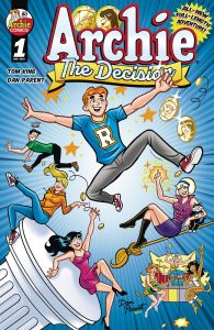
 Archie – The Decision #1
Writer: Tom King
Pencils: Dan Parent
Inks: Bob Smith
Colors: Rosario “Tito” Pena
Letters: Jack Morelli
Publisher: Archie Comics
Review by Sean Dillon
It’s fine. It’s not that anyone here is phoning it in. You can feel the passion for the Archie comics and there are some truly delightful gags (my favorite are the Reggie sequence that almost makes you feel sorry for the jerk and the Sabrina page). King’s writing has a degree of wit and charm to it. I especially liked Archie expressing what he finds appealing in both Betty and Veronica that highlights the whole situation as a difficult decision rather than one with a clear and right answer. And Parent’s art works just well enough to pull off the material. Sure, he lacks the raw violence at the heart of DeCarlo’s characters, but Parent nevertheless has his own charm and wit that often works well with the characters. There are some truly delightful facial expressions and background gags (I particularly like the smile that remains on Archie’s face as he realizes that he has no idea how he’s going to choose between Betty and Veronica).
And yet, one never loses the sense that this feels like a six page gag comic stretched out to twenty-four pages. Sure, the size and scope of the comic wherein everyone in Riverdale is chasing after Archie, Jughead, and a coin—leading to the exact punchline you’re thinking of—is part of the joke. But it doesn’t feel like it goes far enough. The telling sequences are the two pages dedicated to various people in town reacting to the sheer stupidity of the premise of “Archie decides to flip a coin to decide who he’s going to choose.” Now, the idea of the sequence is sound, and could work twice. The problem is that the joke really lands if every panel in said sequence features a different character reacting, highlighting how big the stakes are of this moment as well as highlighting the diverse and interesting population of Riverdale. Instead, the comic opts to have only six characters react on each of the two pages. Sure, there are several pages of “Spot the obscure character” (though sadly not the always delightful Mr. Inferno or, to highlight my era of Archie fandom, Lucinda, Dr. Beaumont, and Supreme Girl) and those six characters personalities are highlighted in their appearances in those two pages. But it nevertheless feels small. Not bad, just smaller than one would expect such a book to be.
So then, why does this comic exist? Well, the editor of the book gives an answer at the end of the book: they thought it’d be fun. Sure, there’s the cynical answer of “Hot shot comics writer gets involved with an old horse comic that’s been going for 80+ years,” but that feels disingenuous. Indeed, for all that it’s not a complete cavalcade of cameos, King and Parent show a love and appreciation for the characters.
And, in spite of my grousing, I had fun with it. It was a small, fun little comic farce about everyone chasing after a coin rolling down a hill. Sure, I have issues and I can’t help but imagine the Doc Shaner version of this comic (though, in fairness, I often imagine the Doc Shaner version of comics and wish it was reality), but I did ultimately like the comic. It’s fine. Not everything has to be a world shattering epic that redefines comics forever, that rocks the very core of Eternity itself. Sometimes, you just want to wander its streets and see all the people that linger throughout. Personally, I wouldn’t want to live there for my whole life. But I will admit to a fondness for it, if only for my childhood in supermarkets and pharmacies flipping through pages alongside the other books and comics that once lay on those shelves.
Check out Sean’s deep dive into all things Archie – The Decision here!
 Convert #1
Writer: John Arcudi
Art: Savannah Finley
Colors: Miguel Co
Letters: Michael Heisler
Publisher: Image Comics
Review by Clyde Hall
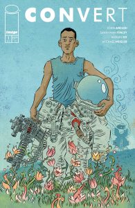
John Arcudi has carved a respectable writing rep with supernatural titles like B.P.R.D. and he’s stated that his intent behind Convert is presenting a science fiction/fantasy adventure. While I was expecting something akin to John Carter of Mars, this 4-issue miniseries begins heavy on the science with more fantastical elements coming in subsequent installments.
That’s by no means a downside, because Arcudi does the science well. When an exploratory landing craft on a mission to a habitable planet suffers a terrible accident, only one member of the four person crew survives. Orrin Kutela is an evolutionary biologist as well as an artist, and his drive to record the flora and fauna of this new world leads to his survival. He’s not with the other three astronauts when a catastrophic equipment failure results in the explosion of their craft.
With the command orbiter unable to make contact with the crew after hearing their final transmission cut short by the explosion, and without another lander, any rescue will not be timely. Or may not even be attempted. But this isn’t The Martian. This planet has plants, animal life, and breathable atmosphere.
There are, however, issues of psychological trauma and survival guilt to work through. Worse, Orrin finds a deficiency in available, essential minerals necessary for human health. Perhaps worse still are toxins woven into the alien ecology and differences in atmosphere making harvesting of animals for food extremely difficult.
All these factors lead our lone survivor down an increasingly dark path, but one opening into a literal alien landscape of possibilities as the premiere concludes. The storyline is compelling enough that I’ll be picking up this series to find out if either of my two theories regarding this world and this mission are accurate, or far afield from what the creative team has planned.
Artist Savannah Finley manages the alien world setting well. A mission to this planet makes sense given the similar-yet-different elements Orrin finds in his environ. Spacefaring tech shown in the artwork feels restrained, built upon existing proven methods of space exploration. Think expanded Apollo mission designs rather than fanciful flights regarding next gen interstellar travel. Such practicality, combined with its inherent peril, works for the overall grounded theme of the narrative.
For readers who like harder science fiction over pure space opera, Convert should hold appeal. Also attractive for those who enjoy human-versus-elements and castaway adventures. Given the first issue’s emphasis on science, I’m curious how or if that focus continues when the more fantastic elements emerge in the next installments. This book launches with many hooks across many interests, and the passion of the creative team provides its rocket fuel.
 Flash Gordon Quarterly #1
Writers: Dennis Culver, Louis Southard, Jordan Thomas
Artist: Pasquale Qualano, Nuno Plati, Russell Olson
Colorists: Mark Englert, João Lemos
Letterers: Charles Pritchett, Buddy Beaudoin, Lucas Gattoni
Publisher: Mad Cave
Review by Jordan Jennings
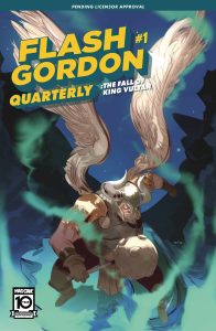
Flash Gordon has been experiencing one heck of a renaissance this past year. Along with the relaunch of the syndicated newspaper strip, Mad Cave has began publishing multiple comic series featuring the All-American, Pulp Science Fiction Superstar. Flash Gordon Quarterly #1 is the latest comic series from this initiative and presents a different style of comic we just haven’t seen too much in the west in recent years—an anthology. Not just an anthology, but one that focuses on building the world of Flash Gordon and features two back-up stories titled Flash Fiction, an alternative genre focus takes on the Flash Gordon characters. With Flash Gordon Quarterly #1 being, well, quarterly, we will only see this series four times a year. This makes it even more important to start out of the gate strong and I think the team behind this issue nail it. For the purpose of the review, I will be breaking the issue into each feature for a review.
The Fall of King Vultan
This is the main feature of the book and it is a strong one shot story showing a father son moment between the Hawkmen— Vultan and Talon— as they find themselves surrounded by Ming’s men. Dennis Culver delivers a solid emotionally driven story about a son trying to not only live up to his father’s legacy but get his father to see him as more than just a kid. While the interactions between Vultan and his son do feel familiar, I am a sucker for this kind of story. I don’t have to be a Hawkman from the planet Mongo to connect with both Talon and Vultan. Pasquale Qualano art is very expressive with a flair for the dramatic. Talon strikes a pose straight out of JoJo’s Bizarre Adventure at one point. There is a command of action and comedic timing that makes the story hard to put down. Thrilling adventure overall that has a resonate story at its core.
Flash Fiction: The Battle of Little Mingo
Louis Southard and Nuno Plati reimagines Flash Gordon as an Old-West lawman in this tale. Flash and Dale (his love interest/adventure partner) are the only ones left in the ghost town of Little Mingo as they attempt to defend it from the corrupt Governor Ming. Southard’s writing here is very genre influenced, and I loved it. There are some Western tropes put on to Sheriff Flash Gordon here such as the moral sense of obligation to the town and always playing by a moral sense of right and wrong. Plati delivers a unique art style to these characters. The world design of the western town of Little Mingo. The characters are still very alien in their design and there is a sci-fi flavor throughout, but it is still notably a Western. This was a fun little Sci-fi Western tale that would be worth exploring more.
Flash Fiction: Flash Detective Services
What if Flash Gordon became a 1930’s PI is the basis of this story. This Neo-noir-tinged story is definitely more of a soft-boiled detective tale than hard-boiled but still exhilarating. Created by Jordan Thomas and Russell Mark Olson, Flash Detective Services has Flash searching for the kidnapped Barin Prince at the behest of Aura. Prince is an upstart politician whose anti-corruption campaign has run afoul of the criminal underworld and political establishment alike. The case has Flash running through the underbelly of the city before being placed in a death trap. Thomas gives some serious Dick Tracy vibes to the story with the use of special gadgets and over the top characters. Olson’s art is in this moody style that, while cartoony at times, really sets the tone for this kind of neo-noir story. I found this story to be my favorite of the bunch, but I am a sucker for Neo-noir tropes.
Overall, I found Flash Gordon Quarterly #1 to be a good start to the newest Flash Gordon universe title. It allows for exploration of side-characters that you cannot get in a main-series book and allows for some fun genre swapping Elseworld type stories. The release schedule of the title also makes the book feel like something special. While the genre’s may be divergent at first glance, the pulp-action nature of the genres serve as the glue. I had a lot of fun and I think most fans of pulp genres will as well.
 Prairie Gods: Race the Devil #1
Writer and Artist: Shane Connery Volk
Letterer: Becca Carey
Publisher: Mad Cave Studios
Review by Jared Bird
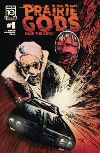
Created by writer / artist Shane Connery Volk, Prairie Gods is an anthology series mixing dark supernatural elements and noir influences. Each issue will be a standalone story by itself, with the first focusing on champion race car driver Freddy Davis, who finds himself returning home to Broadacres. He buys an abandoned speedway, finding himself in a race with the devil.
If that insane premise isn’t enough to hook you, the art is absolutely incredible. Known for his previous series Nottingham, also with Mad Cave Studios, Volk is a force of nature in this issue, tearing through the page with electric energy and compelling visual storytelling. The art absolutely pops off the page, and it finds that steady balance between highly detailed, intricate linework whilst also being easy to read and flowing well. I read through the issue twice over in quick succession just to feast on the art a little more.
Volk’s writing is also top notch, mixing genres tastefully and making them feel fresh. There’s a heavy classic film influence here, with a very cinematic style. The narration is dense but never feels overly heavy, and Volk seems to have a solid grasp on the art of writing just as much as he does visual storytelling. He balances them well, knowing when to give dialogue and when to just let the art speak for itself. You don’t get many pages with Freddy Davis, but you understand who he is and what he wants out of life, no easy task for a 30-odd page issue to do.
Overall, if you’re a fan of classic western, crime or thriller films, get any sort of pleasure from motorcars or racing, or want a damn good single issue comic story, this is the comic for you. Mad Cave’s output in the last few years continues to be absolutely stellar, and they’re prioritizing new and exciting work from their creatives in a way that brings me pure unadulterated joy. Shane Connery Volk is a creator to keep an eye on.
More Wednesday Comics Reviews
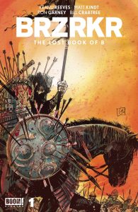
BRZRKR: The Lost Book of B #1 (BOOM! Studios): Here we are again, another BRZRKR one-shot, another Keanu Reeves billing, another uber-violent tale of immortality and retribution told along historical backgrounds. But wait! This isn’t just any one-shot! The Lost Book of B brings back the original series’ production team to give you a glimpse at B’s time in Genghis Khan’s Mongol Empire. So behind the pen of Matt Kindt, we get the BRZRKR world’s revisionist history of What Really Happened to Genghis Khan, and while that’s fun for some, redundant for others, I find it, mixed with the violence, inherently racist to a degree that is detrimental to Mongolians and other steppe-based Asian cultures. Creators only come to Eurasian history for the Conqueror Khan tales, but never anything else. Please stop doing this and go read A Bride’s Story! Aside from placing the berserker in a conqueror’s time, we get another tale of shadowy figures manipulating his violence for political gain. Ron Garney, back in the saddle, rushes the inks on some of the more nuanced moments, but his strokes have a loose and magnetic quality to them that the story’s flow is rarely interrupted from under-rendering. If anything, the veteran’s errant hatching feeds into the gnarled, terrible looks the many characters of BRZRKR find amongst their faces. Colorist Bill Crabtree aims to match the rough qualities of Garney’s inks with patchy paints and a paper texture that helps instinctually age the pages. Looks like Crabtree’s reference material for the Asian steppe was set on sunset and dawn, but Lost Book of B is all the better for such a breathtaking palette! While I’m not a fan of the cleanly cut journal page caption boxes by Clem Robins, I actually really enjoyed the swap from serifed font to sans-serif that helps signify the changing of the guard taking place behind the scenes. Look, if you’re the type to think about the Silk Road or Genghis Khan, but in a morbid way, you’ll probably like this! But when I think of the Silk Road, I think of textiles and A Bride’s Story by Kaoru Mori, so imma go read that! —Beau Q.
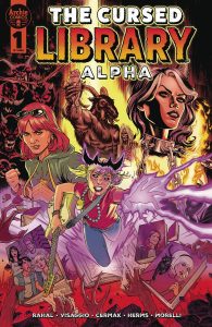
The Cursed Library – Alpha #1 (Archie Comics): Culminating the last few years of Archie Comics horror one-shots, The Cursed Library sees Jinx Holliday doing her best to survive the apocalypse and out maneuver her father, Lucifer, aka: The Devil. With story by Eliot Rahal and Magdalene Visaggio, readers are further entrenched in the ruins of the Riverdale they’ve come to love over the years as it faces the fires of doomsday. The relationship between Jinx, Danni, and Lucifer as it plays out on the page is humorous, with the dialogue being one of the most enjoyable bits! Line art by Craig Cermak, with colors by Matt Herms, brings the apocalypse to life with both the warm fires of the end times, and the cool chill of Lucifer’s immense palace. Letters by Jack Morelli compliment the art, giving each non-human or monster character a unique and recognizable voice on the page. —Bryan Reheil
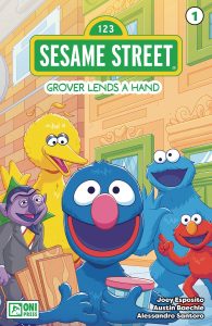
Sesame Street #1 (Oni Press): I wanted to read something light that would make me smile and where better to look than to Sesame Street? It’s perfect for kids as Grover visits familiar faces trying to help them enjoy the day as he does. It’s endearing and earnest as we’ve come to expect from Sesame Street and writer Joey Esposito understands that about these characters that we’ve come to love. The art of Austin Baechle with colors by Alessandro Santoro translates Sesame Street into comics form in a way that feels natural and just as colorful. Lettered by Shawn Lee, this was a nice and light story that did exactly what I was hoping it would do and I’d recommend it for the kids or if you just need a little Sesame Street in your life. —Khalid Johnson
The Prog Report
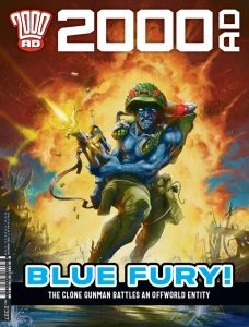
2000AD Prog 2397 (Rebellion Publishing): I haven’t yet mentioned Herne & Shuck: Suffer the Children in this space, but there has perhaps never been a better week to do so. That story is written by David Barnett, illustrated by Lee Milmore, colored by Quinton Winter, and lettered by Annie Parkhouse, and it’s now on its sixth part. The reason this is the a good week to write about it, is the slow burn of this story is now a full on blaze, with demons erupting everywhere. It was a solid enough build, but what I enjoyed most in this chapter was the excellent monster artwork, delivering scary designs that work in bucolic broad daylight setting for high consequences and scares. It’s fun that this story seems headed for its horror-laden climax just as Halloween season comes into sight. Great planning there. As always, you can nab a digital copy of this week’s Prog here. —Zack Quaintance
Read more entries in the weekly Wednesday Comics reviews series!
