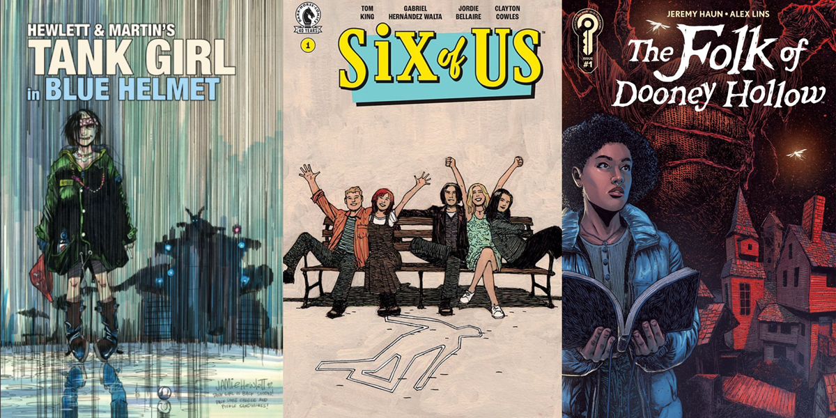

This week’s Wednesday Comics Reviews starts with a dream-like venture into The Karman Blade #1, pivots with a creepy trip to The Folk of Dooney Hollow, dives into The Forever Home, and more! Plus, The Prog Report!
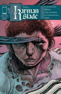 The Karman Blade #1
Writer: Darcy Van Poelgeest
Artist: Ian Bertram
Colorist: Matt Hollingsworth
Letterer: Hassan Otsmane-Elhaou
Publisher: Image Comics
Review by Tim Rooney
It is something of a cliche to refer to an artists’ work as “dreamlike,” but in the case of Ian Bertram’s art in the new Image Comics series The Karman Blade, it is the most apt description. Bertram’s delicate linework makes the very air feel like a living, breathing creature acting into this new fantasy world. Clouds ripple in organic, freeform patterns, shadows stretch across figures pulling them into the depth, every cut and speck of dirt on a character pulses.
Bertram’s art has always been stunning in its detail and fluid motion but it is on another level here, turning this first issue of his latest collaboration with Darcy Van Polgeist into something ethereal and frightening.
Van Polgeist and Bertram bring readers into the story with only the slightest hint of our protagonist’s background. It is hard to say what is even real and what is fantasy or fever dream in this first issue. The dramatic narration sets the stage for a grand Hero’s Journey and rhymes within itself while Bertram’s art embraces the surreal.
There are embodiments of Death, magical talking creatures, and a sword that beckons our hero Anatta in the dark and dreams. A dark past haunts Anatta, in both his waking moments and his delirious exhaustion, and we are left uncertain whether the gory moment we see in a dream is an act of righteousness or self-rationalization. Anatta is beckoned to wield the titular Karman Blade and slay a god, to release the waters that could quench the desert lands, he is kidnapped by brigands, and rescued by divine flames, left as the only survivor.
Bertram’s living desert is a site of wonders and horrors alike. The work is elevated by Hassan Otsmane-Elhou’s artistic lettering, that embroils itself within the linework, and Matt Hollingsworth’s painterly colors. Hollingsworth adds texture and contrast to Bertram’s work that distinguishes between scenes and reflects emotion. Despite the collaborative nature of the visuals, it all feels of a piece, a united chorus of voices coming together to create something beautiful in its ugliness and horror.
The Karman Blade is a stunner of a first issue, a disorienting adventure into the depths that makes for a compelling spin of old fantasy setups.
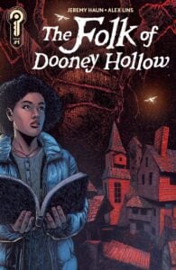 The Folk of Dooney Hollow #1
Writer: Jeremy Haun
Art: Alex Lins
Colors: Trish Mulvihill
Letters: AndWorld Design
Publisher: Ignition Press
Review by Clyde Hall
Think Brigadoon but set in the haint-filled hollers of the Missouri Ozarks. Dooney Hollow is a legend, passed down as folklore. Yet sometimes…those travelling through the area discover this particular legend is more than a campfire tale. Not everyone can see the village, nor the strange standing stone outside it. Those who do risk becoming lifelong residents…though that residency may be very short, thanks to a mysterious entity caretaking the mist-shrouded settlement. As well as judging who stays and who simply fails to return home owing to a sudden case of dead.
The Folk of Dooney Hollow drops its first regular issue of the five-part miniseries this week. It combines with the patented Ignition Press cold open issue last month as a broad canvas for writer Jeremy Haun’s eerie tale of creepy backtrails and folklore regarding a vanished settlement. In the opener, modern grad student Kerri Hayes takes a camping excursion there and ends up becoming part of it.
She meets friendly elderly local Otis, hired to help her set up camp for her outing, and Otis’s wife Maxine. Maxine suffers from a condition brought on years before by what sounds like heatstroke. Which makes her Kerri’s Harbinger character later, Maxine ominously warning her to go back. Apparently before it’s too late, which it definitely is by the time Kerri encounters a child who looks not of our time, and an axe-wielding thing which looks not of our world.
Haun paces the opening segment slowly, letting the atmosphere carry readers into the beautiful, yet foreboding, Ozark hill country. He takes his time, builds a subtle unease, and nails the discomfort home in the final act. Until then, the storyline doesn’t go in for big scares or action sequences.
The characters of Otis and Maxine seem kindly folk of the region, now settled into the last chapter of their lives with a sweet, heartbreaking miasma surrounding them. A similar pall also hangs over Kerri, who worries over a text message, one she tries answering several times but simply cannot settle on the right words.
Otherwise, there are particulars regarding the phenomena of Dooney Hollow mentioned but not yet explained. Those may be hooks enough for some readers, though small ones. This initial entry pulls you in, but the pacing is a slow burn which may not be to everyone’s spooky season story taste. It doesn’t help that what happens in the cold open issue and what happens in this first issue have repetitions setting up the legend and how it works. In the moment, it felt like a double tap, slow burn reduced to slo-mo.
Alex Lins does the Ozark setting proud with his art, and having visited those regions many times, I believe he’s captured a bit of the spirit of the land. The hills, treeline, and caves he renders weave a spell like the places themselves. Even when compared to small towns and rural communities, stepping off the hard road and into the green in such locations really feels like stepping back in time. Lins captures that sensation well.
Color artist Trish Mulvihill collaborates beautifully in the conjuring by using shadows minimally and dwelling on the organic, living color of the backwoods. Her tones affirm that this is a haunted landscape, yes, but one coexisting with a thriving natural heartbeat very much rooted in life.
The creative team for The Folk of Dooney Hollow banks on eeriness and atmosphere to captivate, likely with an initial narrative pace that picks up speed as the title continues. They pepper in elements of the enigma behind the settlement’s legend while keeping answers close to the vest. Patience is required, but you’ll have to decide for yourself if the mystery is planted with roots deep enough in the first issue to bring you back for the next chapter. The title premiere, though, has enough going for it to become someone’s favorite story for the Halloween season fast approaching.
 The Forever Home #1
Writer: CJ Ward
Artist: Sami Kivela
Colorist: Jason Wordie
Letterer: Hassan Otsmane-Elhaou
Publisher: Oni Press
Review by Zack Quaintance
Being stuck inside has made for some great horror stories over the years. Horror master Stephen King has certainly done scary stuff with the concept, from The Shining to Misery. And that concept of horrifying cabin fever has also made for great scary comics, maybe the most notable of which is DC Comics/Vertigo’s Nice House on the Lake series, now in its second season.
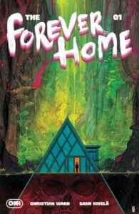
And cabin fever is also the core horror concept in The Forever Home, scripted by Christian Ward, with art by Sami Kivela, colors by Jason Wordie, and letters by Hassan Otsmane-Elhaou. But whereas (most) of those aforementioned stories are grounded in more traditional horror trappings, The Forever Home combines the cabin fever genre with what one might call ecological-horror sci-fi.
Indeed, this is a book whose high concept combines our real world ongoing environmental crisis with the cabin fever, closed environment concept, and then supercharges it by adding a layer of accelerated time. Briefly, this is a story of a family in a very advanced house at the end of the world. The outdoors are dangerous and ruined, but the house gives them all that they need — and for every 20 minutes that pass in the house, a full year passes outside.
I really like this take on both ecological horror and on the cabin fever concept, all the more so because the creative team behind it is excellent. Kivela’s work is always interesting, particularly the spooky 1970s detective comics, Abbott, and Wordie is a colorist who I am always happy to see on the credits page, a colorist who is very much unafraid to take risks.
This book sees Kivela doing great work illustrating the interior of the house (absolutely vital for this type of story) in a way that makes it familiar, yet also futuristic. There’s something striking about the setting as Kivela draws it, from the post-modern, art-laden living/dining room, to the intricate design of the much larger spaces beneath. And Wordie does a great job coloring the outside in over-the-top shades, while keeping the inside more grounded. It’s all augmented of course by the lettering of Otsmane-Elhaou, which was just recognized with an Eisner Award last week.
Ward’s script here is also fantastic, with an intriguing opening, a nice twist in the middle, and a killer cliffhanger at the end. The Forever Home for all its grandiose cabin fever/futuristic sci-fi interests centers itself around small moments and a family, around the relatable, and it’s all the better for it.
It all adds up to a really well-done and intriguing first issue that I highly recommend.
 Six of Us #1
Writer: Tom King
Artist: Gabriel Hernandez Walta
Colorist: Jordie Bellaire
Letterer: Clayton Cowles
Publisher: DC Comics
Review by Jordan Jennings
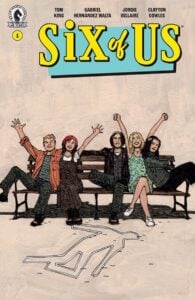
Six of Us #1 kicks off a new mystery thriller from the minds of Tom King and Gabriel Walta that focuses on the cast of a successful 90’s sitcom and the dark history behind it. It is obvious to see from how the issue that this is very much Sunset Boulevard by the way of Friends given that the dramatic opening scene of the issue is the main characters laying dead in the swimming pool and the issue is narrated by the deceased character throughout basically going back-and-forth through time through a series of flashbacks and cutaways.
Tom King’s decision to opt not to follow a linear timeline throughout this issue gives us insight into the characters’ history and how much they have grown. With frequent cuts throughout the history of the characters from the 90s and the beginning of the series of the Six of Us TV series to the character’s death and various moments in between. Additionally, this non-linear storytelling makes the mystery a little bit more complex and builds suspense to the identity of the killer.
King is at his least Tom King-ness, at least compared to his mainstream DC comics work. While I’m sure there will be some sort of trauma-informed storytelling here in subsequent issues, the bulk of the issue is straight up Tom King doing a mystery. It is a successful issue in that regard. My biggest criticism is the overuse of the narration. The story is tonally a dark comedy with the character being self-deprecating throughout in his narration, but it is almost overly narrated as a result. You can compare this to other works by King such as Supergirl: Woman of Tomorrow and see how King reads when he relies heavily on narration.
Now as for the art and layouts, it would not be a Tom King comic without some sort of 9 panel grid layout and oh boy is it used throughout this issue. That said, Walta does a fantastic job with the art in this issue. I think Tom King does his best work with artists like Gabriel Walta and Bilquis Evely. They are able to convey strong emotion through facial work and overall body language, and through that they are able to convey interesting story beats through the formalist 9-Panel grid. Additionally Walta’s detail work remains top-notch. The way he renders backgrounds with hatching and cross hatching gives a nice little bit of texture to the world. Jordie Bellaire colors offer a somewhat subdued color palette, but very effective in how it sets the tone of the story.
Overall, Six of Us #1 is a strong start to the series that promises an entertaining mystery. It will be interesting to see how this mystery plays out as the series progresses. Definitely recommend checking this series out.
 Fixation #1
Writer: Amy Chase
Artist: Savanna Mayer
Colorist: James Fenner
Letterer: Sandy Tanaka
Publisher: IDW Publishing
Review by Khalid Johnson
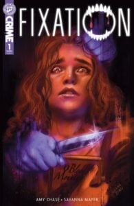
Fandom and parasociality reminiscent of Twilight‘s height are on display in writer Amy Chase and artist Savanna Mayer‘s Fixation #1. From the first page, the hook is there as a fan is murdered in the home that housed the characters she loved in her favorite movie. A solid introduction to the eerie feeling that the city of Vail is a literal tourist trap for “Blood Mountain” fans.
Mayer’s art is beautiful, perfectly capturing the moodiness underpinning Vail and the tension of the characters inhabiting the world. The colors of James Fenner heighten everything with deep saturation and some great lighting setups across the board. The book is gorgeous to look at, with some interesting paneling choices and some were really inventive. There is a moment in the later pages that lets the paneling drop out to bring you in to the world of Blood Mountain and man the dark and gothic vampire vibe shines with this really cool approach to lettering which show up throughout by Sandy Tanaka.
After the murder, the book takes us throughout the experience of two superfans (Taylor and Karrah) who win a contest and get an exclusive experience seeing the area and getting to meet the actors whose work shapes them. What I appreciate is Chase being able to approach these characters with an empathy and care about the experience of being in fandom. Sometimes the characters exposit a bit but this really covers so much of their personality and colors the world even further. The story slows down after the murder to build character relationships and tension across Vail as we find out that Taylor is in the sights of a murderous cyberstalker, who also has one of the lead actors in their crosshairs.
The intrigue built is natural and the flow of the story takes its time in planting seeds. I never had a feeling of being out of the loop on information while still having a sense of mystery and doing some phenomenal environmental storytelling. I had a great time diving into Vail and the slasher mystery building around the Blood Mountain world. If you think fondly back on Tumblr fandom days, I definitely recommend this one.
Rapid Reviews
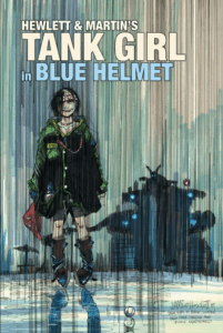 Tank Girl in Blue Helmet (Titan Comics): Jamie Hewlett and Alan Martin’s long awaited return to their second most popular creation, Tank Girl, is an anarchic revelation of style as substance. Hewlett’s iconic art style utilizes a flat colorspace to create a psychedelic cornucopia of chaotic women, horny comic book fans, and, of course, kangaroos. Meanwhile, co-writer Alan Martin sprinkles the narrative with a dry wit that takes the piss in the most delightful of ways. The comic is an absolute blast from beginning to end! —Sean Dillon
The Prog Report
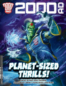 2000AD #2497 (Rebellion): It’s the third bumper Prog of the year, and it’s a big one, with continuing stories rapidly escalating and also a Future Shock. We get some big answers for Dredd in The Oubliette, which to be totally honest are a bit lost on me as as someone who either never read the storyline it references or totally forgot it. However! I should note that last week I get to run a preview of the next big Dredd story, which starts with a prolouge strip in #2500. Check that out here. It’s a follow-up of sorts to Judge Dredd: A Better World, which is my favorite Dredd story in recent memory. So, right now my head is definitely focused on that. But I’ll be back here next week to talk about more of the current group of stories! This week’s cover (above) is by Toby Willsmer. As always, you can pick up a digital copy of The Prog here. And it is also now available weekly in US comic shops! —Zack Quaintance
Column edited by Zack Quaintance
Read past entries in the weekly Wednesday Comics reviews series or check-out our other reviews here!






The Six of Us is published by Dark Horse, not DC
Comments are closed.