

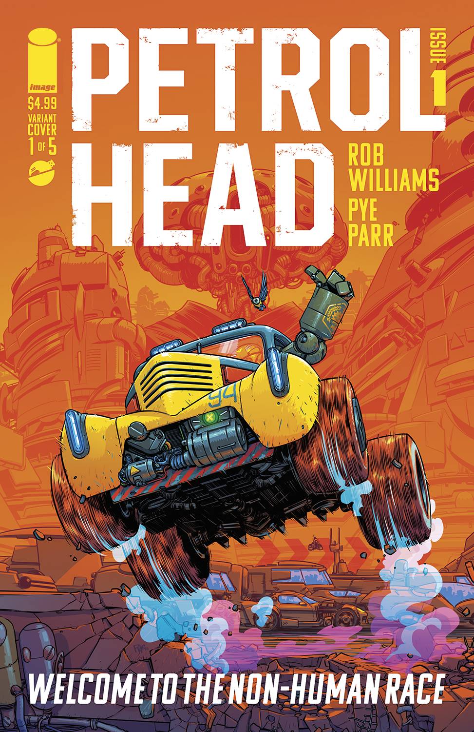
This week’s main review is Petrol Head #1, a colorful car comic that gets off to a fast start and doesn’t slow down. Plus, the Wednesday Comics Team has its usual rundown of the new #1s, finales and other notable issues from non-Big 2 publishers, all of which you can find below … enjoy!
 Petrol Head #1
Writer: Rob Williams
Artist & Letterer: Pye Parr
Publisher: Image Comics
Review by Ricky Serrano Denis
We love to talk about worldbuilding in comics. It’s a point of both fascination and expectation, especially with science fiction. Tales that imagine futures rooted in metaphors that reflect upon our current reality have the capacity to truly impress, though at the risk of being too heavy handed with their messages. Rob Williams and Pye Parr’s Petrol Head certainly worried me for a bit as I was presented to the ‘post-global warming with robots’ scenario it was quick to introduce in its first few pages. But my fears were quickly dismayed as I realized nothing here was done with the intention of treading over well-worn ideas or aging concepts. The metaphors here are potent, and what drives them is the world Williams and Parr have created.
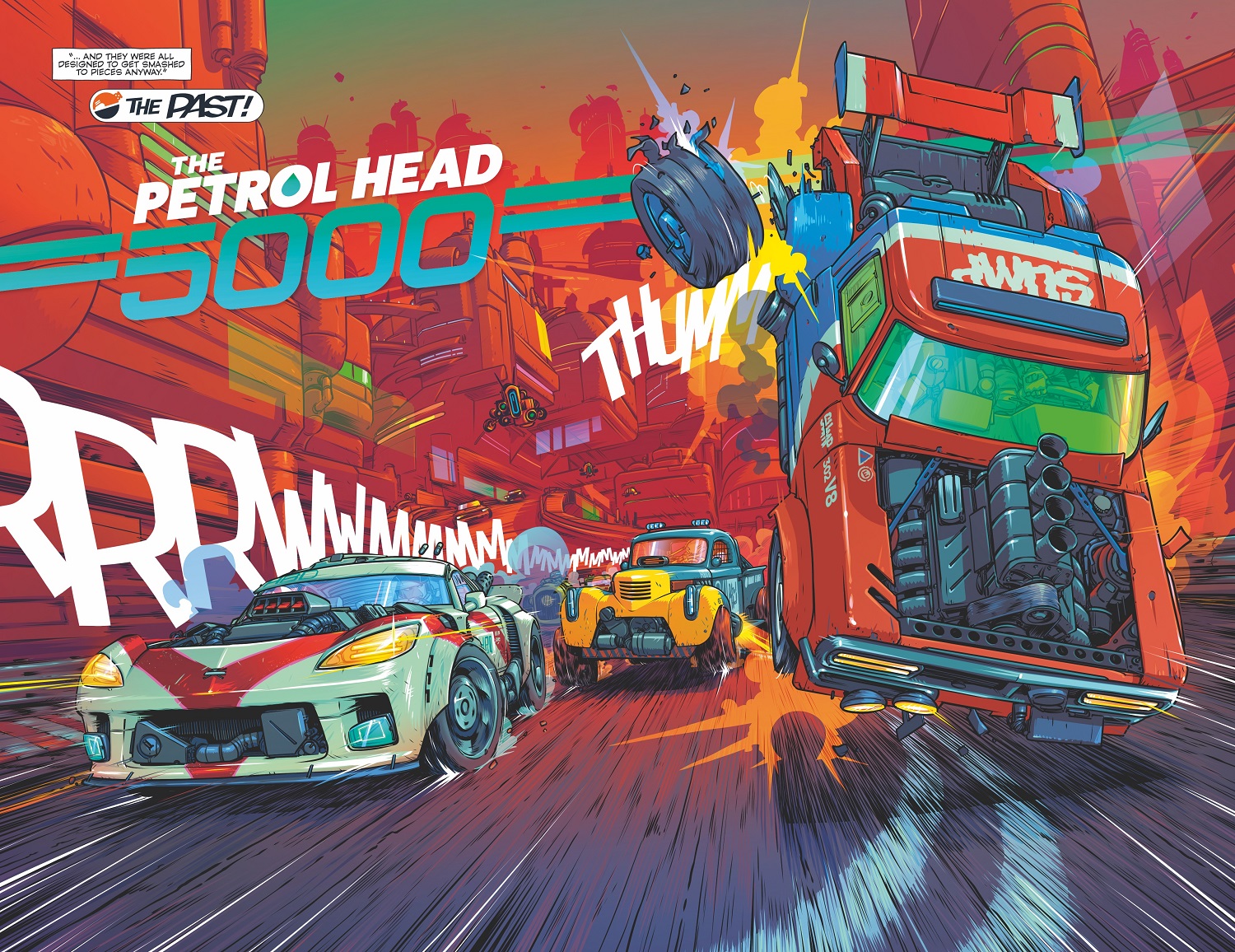
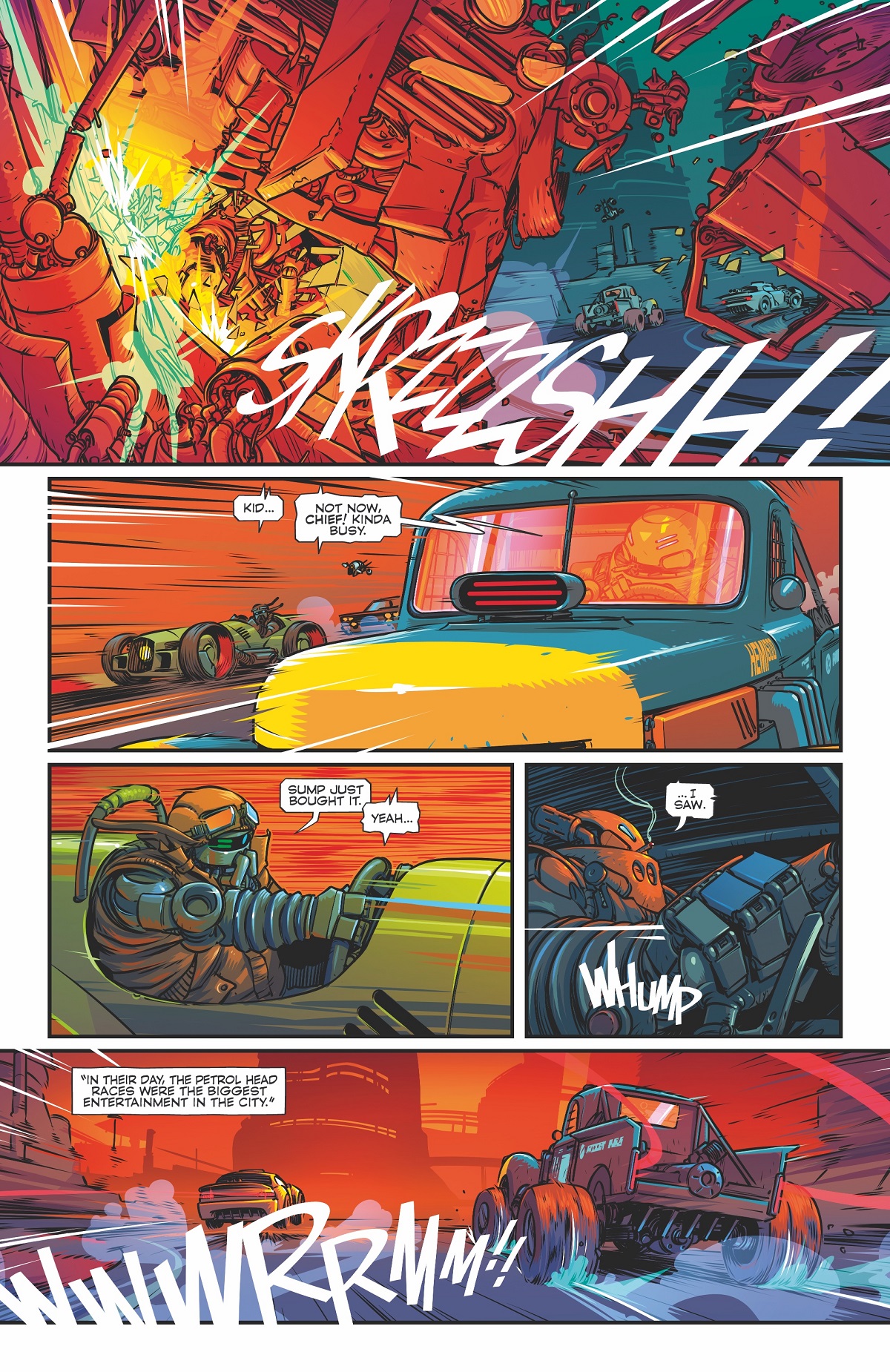
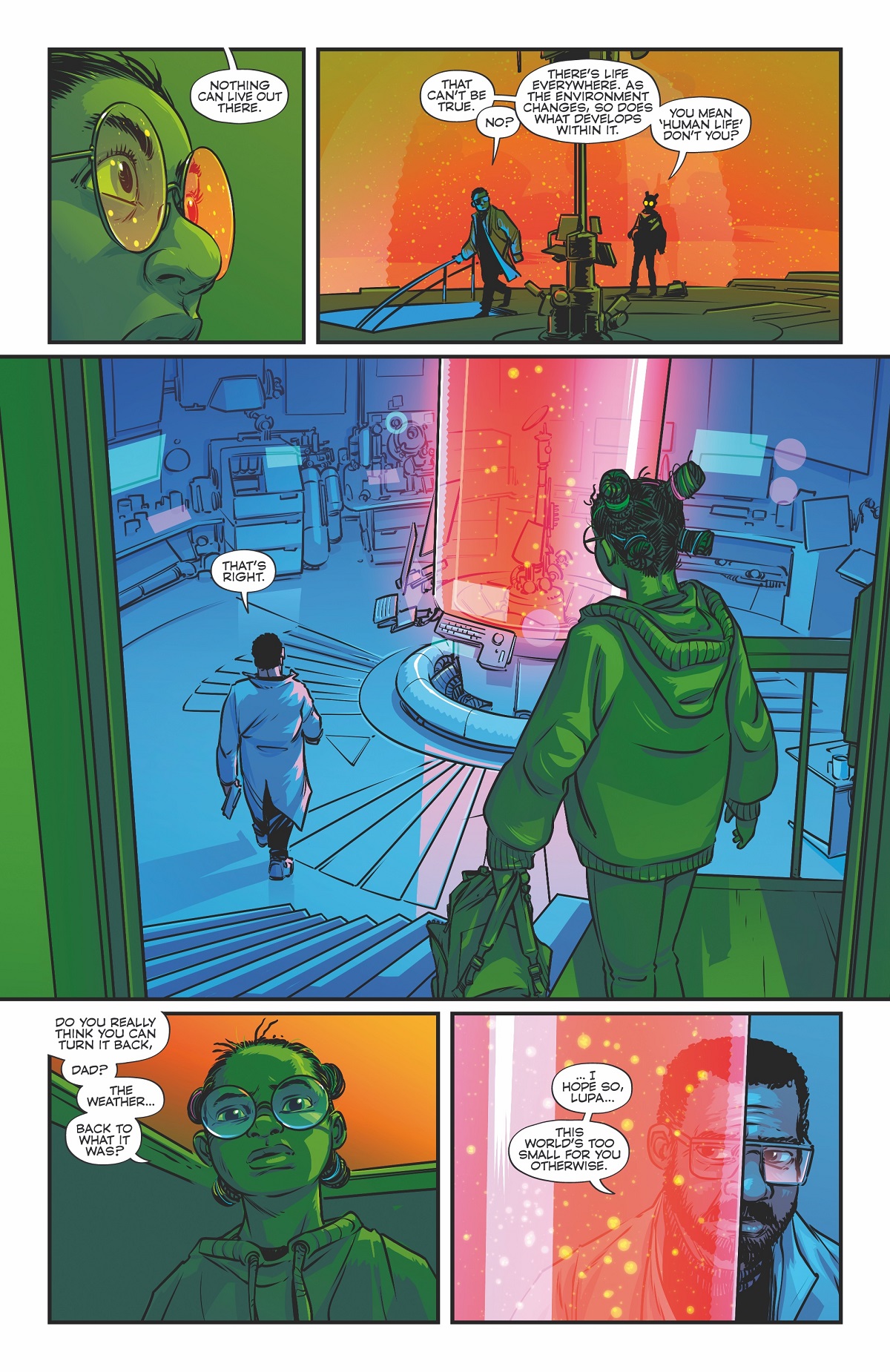
Petrol Head follows a grumpy, old robot that races big muscle cars for a living, a titular Petrol Head. One day he comes across a 12-year-old human girl and her wounded father who are hiding from Robo-Cops, the law enforcers in the robots’ biome. These two humans are on the run, far from their own domes as they hope to restore the climate into something resembling its former self. From there, Williams and Parr set readers on a frantic, kinetic, and wildly colorful ride of the kind that reminds why comics are so great.
Williams’ approach to worldbuilding places the story squarely in dystopian territory. There’s a sense of cold oppression that frames robotics and tech as a standard of life that seeks to keep everything and everyone in its rightful place, with rules and the means to enforce them made aggressively obvious. Domes like The Smogzone and The O-Zone place the reader in those environments with ease as their names alone give an abundance of hints as to who can inhabit them and what their living conditions are like.
Parr is acutely aware of how much of that worldbuilding is to be carried by the visuals, and the challenge is met with unmatched energy. Each environment is like a world within a world, bursting with colors and unique designs. There are enough environments and playful robot designs here to cover multiple comics series-worth of stories. Rather than settling on visuals that point the finger at our reality for its bad climate behavior, Parr opts for a look that celebrates ingenuity. Humanity can be quite creative when it’s forced to survive under extreme conditions. Parr makes sure this quality is a signature feature of the storytelling.
Petrol Head tricks you into thinking it’s about robots racing futuristic hotrods in a post-crisis world where life survives in domes equipped with artificial climates. There’s certainly a bit of that here and I’m hoping it gets explored further in coming issues, but the story is quick to pivot into what’s really interested in: the usefulness of old ideas and our careless rejection of them when they still have some life left to give.
There’s constant commentary on whether Petrol Head robots are obsolete or not, and whether they’ve outlived their entertainment purposes in the races. As other characters get introduced, a sense of replacement starts taking over discussions, putting Petrol Heads in the crosshairs of termination. New robots, with sleeker and cleaner designs, act as reminders of this push towards betterment and replacement, but Williams and Parr make sure the older models don’t just come off as rusty things that really do look like they need to be decommissioned. They’re imbued with personalities and a sense of physicality that argues for their continued existence. New is not always better, and old is not always obsolete.
Petrol Head is one of those great examples of worldbuilding that show just how story a well-built setting can carry. Williams and Parr are onto something special here that’s already shown its commitment to embracing its metaphor without allowing it to become a blunt instrument of storytelling. There’s a lot of nuance, along with an interest in exploring multiple ideas about the future and how the past can still serve it. On top of that, there’s badass robot racing. Can you ask for more? I think not.
Verdict: BUY
Wednesday Comics Reviews
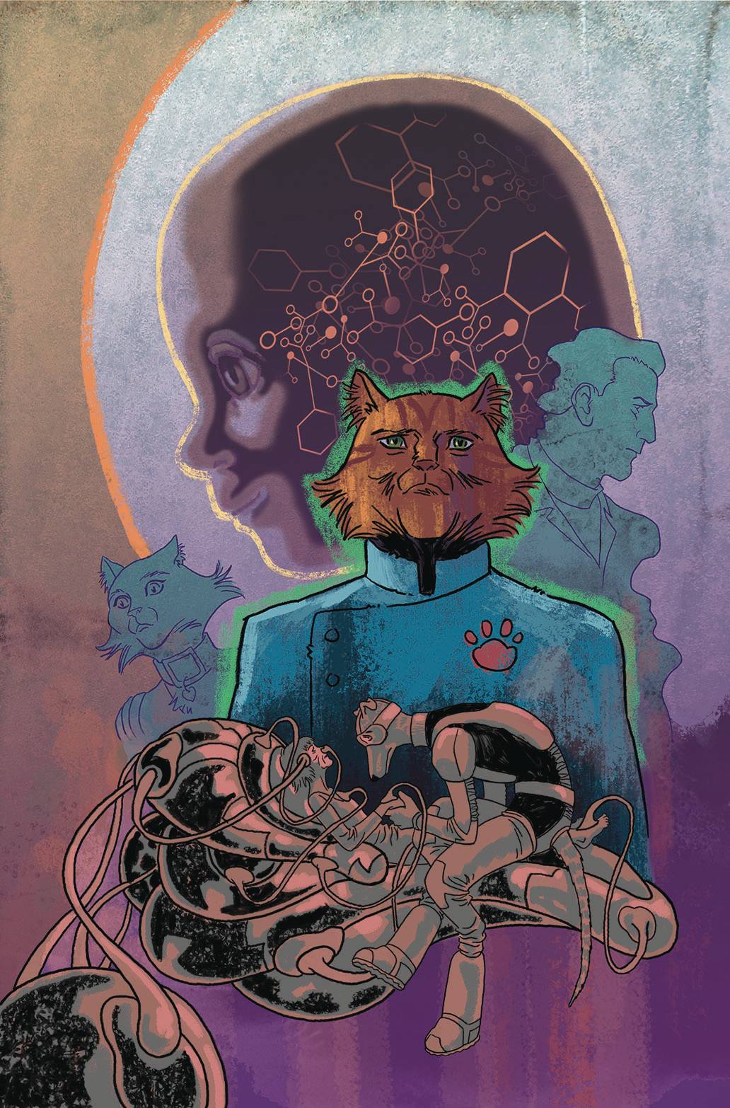
 Captain Ginger and the Last Feeder #1 (AHOY Comics): This comic is (unsurprisingly) a delight. For me, the fun started from just reading the title…The Last Feeder. If you don’t know, Captain Ginger is an ongoing AHOY Comics series wherein the human race has died out and the Earth has been inherited…by cats. There’s been two previous seasons, totaling six issues each, and they’ve just been a romp, combining fun sci-fi comics storytelling with, well, cats. And friends? I’m happy to report that this new issue is more of the same. It’s the first of a two-part conclusion for this series, and it packs in a lot of what’s made me like these books from the start. Stuart Moore’s writing is as funny and sharp as ever; June Brigman’s pencils (inked here by Roy Richardson) look great; and the colors by Veronica Gandini with letters by Richard Starkings and Jimmy Betancourt are a great compliment. If you’re a Captain Ginger fan as I am, you’ll love it. —Zack Quaintance
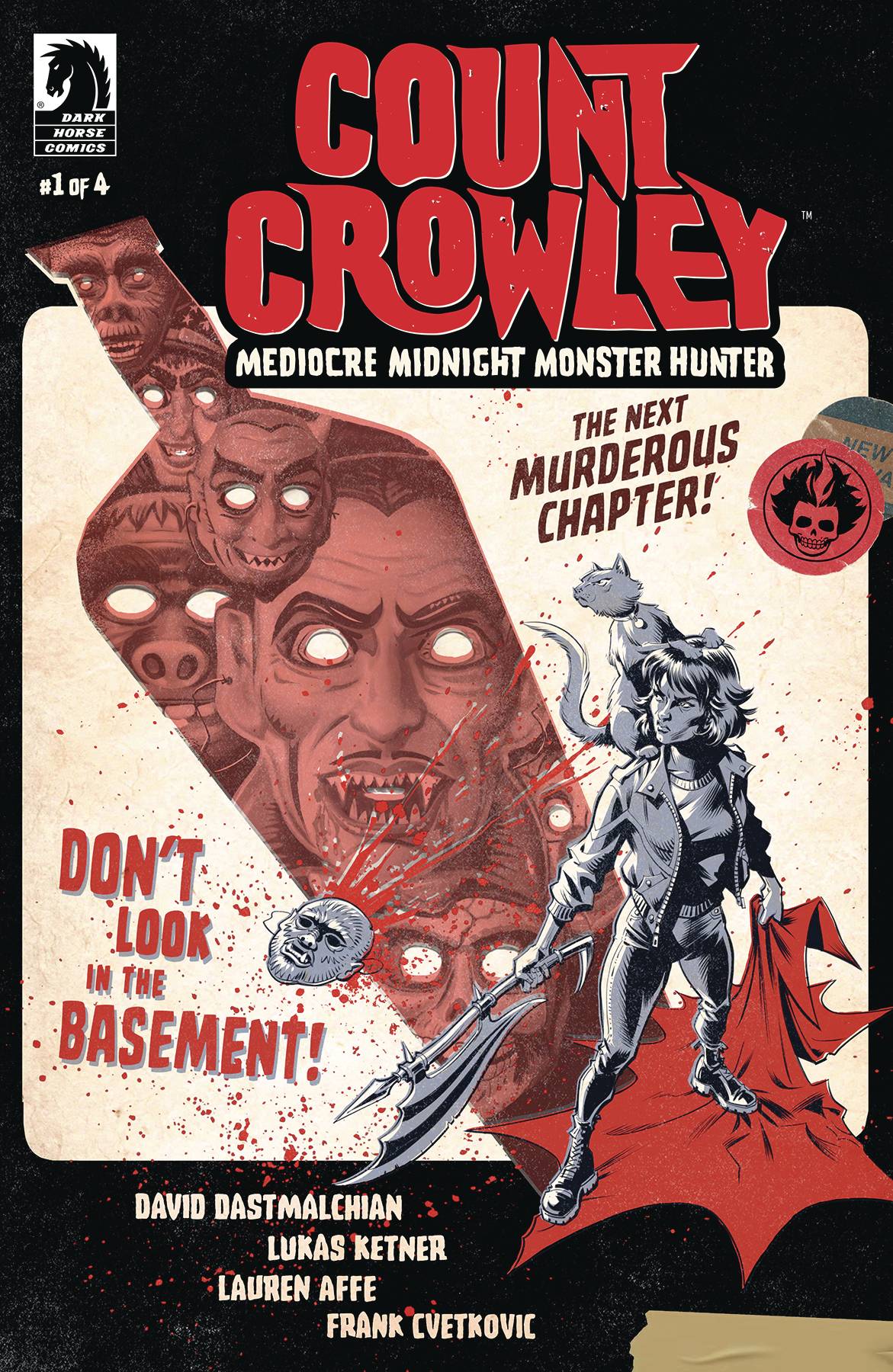
 - Count Crowley Mediocre Midnight Monster Hunter #1 (Dark Horse Comics): This is a fun little romp, but there wasn’t much here that drew me in. I’m not familiar with previous installments in this series, but there’s a lot of exposition at the top (and throughout) that explains the deal: Jerri Bartman is a failed reporter turned monster hunter – and that’s really all you need. It’s always cool to know that David Dastmalchian is also a comic writer, and a fine one at that. Much of this issue is recap and setup for the rest of the series, but there are fun little moments here and there. Lukas Ketner designs some unique layouts that make pages a lot more fluid than I’d have expected, and along with Lauren Affe’s colors, creates some wicked freaky monsters. Along with Frank Cvetkovic on letters, this is a quick but fun read for someone looking to get a little hit of horror. —Cy Beltran
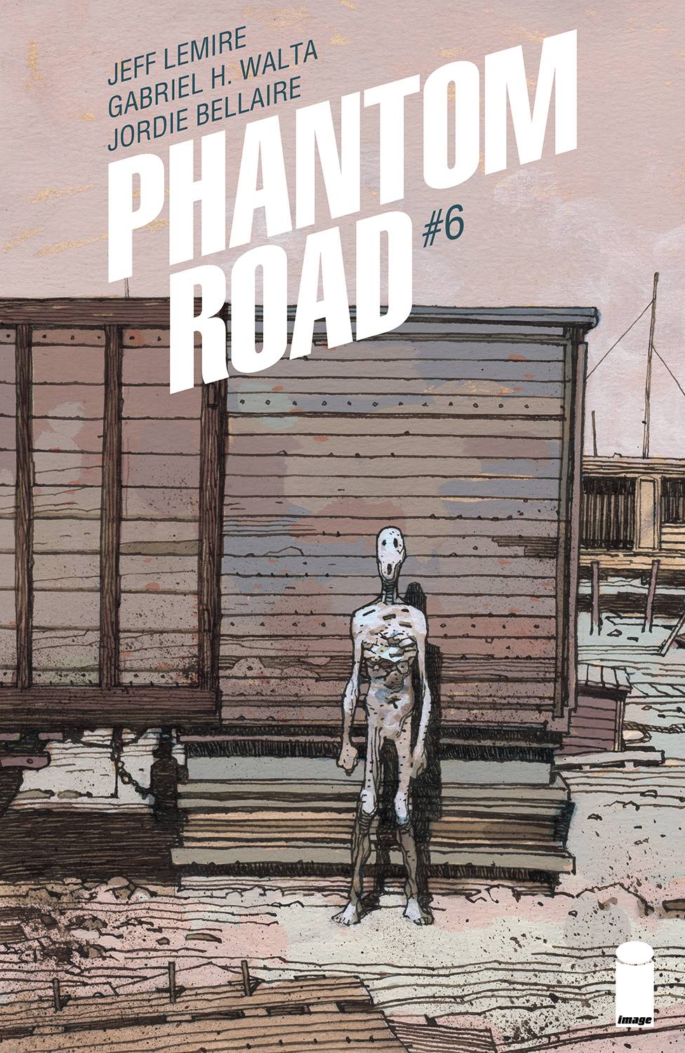
- Phantom Road #6 (Image Comics): Here we are, on the road again. If you haven’t read my Phantom Road vol 1 review, we last left off on a cliffhanger of narrative and theme. For a book heavy on atmosphere and sci-fi mystery, it’s still relatively a breezy read light on moving pieces. Writer Jeff Lemire still pens all his female protagonists of color as the ignorant, unintelligent person of a two-person scene, which makes it easy for the white male protag by their side to point out their flaws, poke at their ignorance, or as has been the case the entire series, save the damsel from her new predicament. It’s particularly a shame when artist Gabriel H. Walta continues quietly, efficiently, and coldly framing each panel with the love and lighting of a prestige tv show. This issue, Walta continues reusing straight lines bundled to create texture, but foregoes a ruler in the process, so the natural waviness of his inks add an unspoken unease to his gridlock layouts. Also adding to this silent distress, colorist Jordie Bellaire keeps her sandy palette in a midtone range, but never confuses the reader’s spatial awareness. This is made apparent in the final scene when Walta crosscuts between scenes and you can tell Bellaire’s brown color hold immediately differentiates panels. Even after six issues, I’m still no closer to a fan of letterer Steve Wands’ whippy tailed balloons with their em dashed lines and thin outer stroke. The lettering mechanics are invisibly effective, but emotionally they don’t reinforce the atmosphere as much as they just tell you who is speaking when and where. I know I’m asking a lot for Phantom Road, but six issues in the potential is starting to wane, and this is what the series wants to be– breezy, bringing up a lot of questions, answering few, never letting their female protagonists drive their own narrative, and written for the trade. —Beau Q.
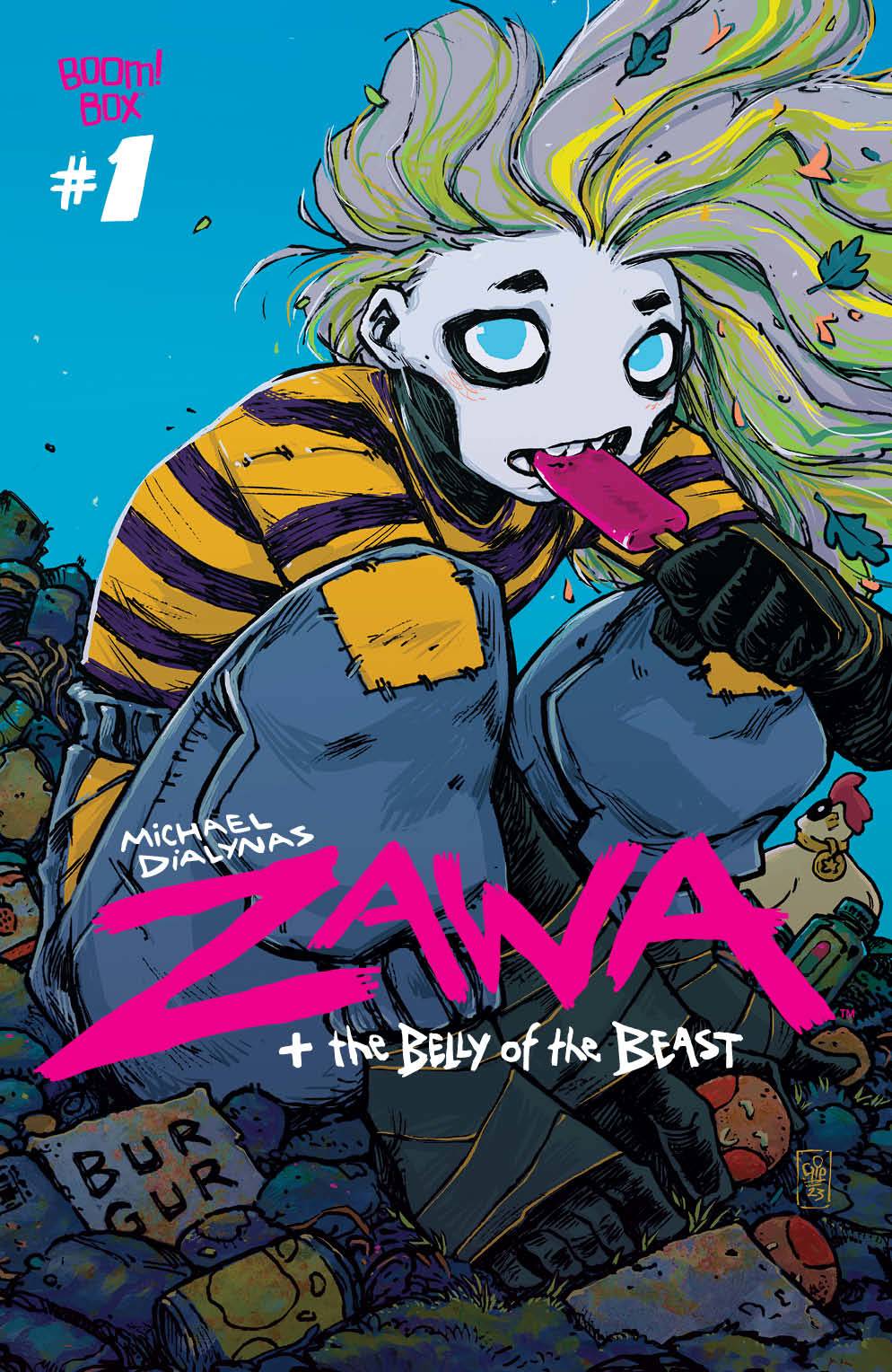
- Zawa and the Belly of the Beast #1 (BOOM! Studios): State suppression and no access to fresh and healthy food leads a group of friends (Leo, Bandit, and Thatcher) to try to liquidate some of the resources that the government has stored away. Instead of being forced to continually eat the stuff that gets mass produced, packaged, and placed into vending machines for consumption, Leo, Bandit, and Thatcher break into the Mayor’s factory and everything kicks into high gear from there. Michael Dialynas does it all here; writing, illustration, colors, and lettering. Dialynas displays a very clear voice and vision in how things come together and mesh in this first issue. The lettering is expressive and fun, integrating seamlessly with the quality of the linework and the coloring. The environment work is stellar, with sweeping shots of a city covered in neon signage, an eerie factory, and a garbage dungeon, really showcasing a range of moods and visual distinctions. This first issue is gorgeous and the last four pages are stunning, both thematically and visually. —Khalid Johnson
The Prog Report
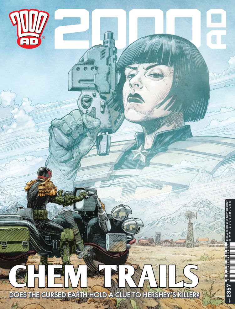
 2000AD Prog 2357 (Rebellion Publishing): After last week’s all ages takeover, we pick up with the regularly-scheduled comics in this week’s Prog. Helium: Scorched Earth 06 was a very solid comic this week, starting to payoff some of the setup we’ve seen of late. I really like the way that D’Israeli’s neon coloring is accentuating how exotic both the sci-fi ideas and landscapes are in this story. It not only differentiates easily between scenes, but it also subtly sets the tone for what’s going on. Also! Look at how nice this week’s cover is by Cliff Robinson (with colors by Dylan Teague). As always, you can nab a copy of this week’s Prog here. —Zack Quaintance
Read more entries in the Wednesday Comics reviews series!


